Quantcast
Channel: Infragistics Community
Viewing all 2374 articles
Browse latest View live

Things to Consider When Creating An Effective User Centered Style Guide

$
0
0

The Benefits of A Style Guide

A style guide is undoubtedly one of the most important elements of any given project. Aside from forcing you to define your style, it also establishes rules for your clients and those who take over the project as well as allowing you to maintain control of the design so that when last minute changes occur, you can refer to something concrete. In my experience, creating a style guide can be somewhat daunting depending on the size of the project so I present to those of us in the user interface design and development space, a few things to keep in mind when creating an organized and effective user centered style guide.

Benefits

- An aid for new participants of the project or product team.

- Allows the designer to maintain control of the design.

- Describe guidelines and standards.


Establish Consistency

Establishing rules regarding colors, icon styles and layout stylesis imperative because by doing so, you establish consistency across your product. This could mean that in the embryonic stages of creating your style guide, a discussion of the term consistency and what it means to you and your client is necessary. Consider the following:

•  Error message

•  General GUI layout or Visual Design

•  Icons

•  Color palette

Below are examples of how the consistencies in icons and colors have been determined:

Icons 

Color Palette


Defining Style Guide Elements According to Design Pattern Libraries

Design pattern libraries are repositories of design solutions and/or resources such as controls which are used as building blocks that help solve common design problems.  In fact, it is quite often that in order for a design pattern library to be fully realized, it is necessary for it to contain several controls which themselves, are essentially design patterns applied through code. They either come preset with any given operating system such as iOS, Android, Windows 8 and Mac OSX or they are established and agreed upon by the designers and stakeholders right from the beginning of the project. Some common examples of these are our very own NetAdvantage Controls such as  WebDataTree, WebTab and WebDataGrid as well as the ones included in the various design pattern libraries in our Quince product.

Applying this early on saves you time as it helps keep everything organized according to the design pattern library used in your project. However, this can require an investment of your time upfront as you need to provide the time to gather which controls or elements will be used and is usually challenging if the project is the type that grows organically. Nevertheless, following this organized approach means that regardless of how big the project gets nor how often the client makes modifications, identifying the most commonly used elements or controls is still less tedious since you can just refer to one section of your entire style guide and either add or subtract pages from that given section.

The example below illustrates the measurements, colors and various states of the buttons and check boxes used across an entire project.

 Buttons


Summary

Ensuring that you have a consistent and effective Style Guide is a great fundamental discipline to follow and apply in all your projects every time yet it can be challenging especially when working on a large project. However, in my experience, a very useful exercise you can use is what is called Group Consistency Inspections wherein you gather the designers, developers and everyone involved in your project to go through the implemented elements and compare them side by side with the established or official Style Guide document.

Useful Book Resource:

Coordinating User Interfaces for Consistency (Nielsen, 1989)


Infragistics Parsing Framework - Removing Ambiguities, Part 5

$
0
0

This post is part of a series on the parsing framework provided by Infragistics starting in version 12.2. The previous post in the series can be found here.

This time I want to talk about another real world ambiguity that can occur when writing grammar rules. This one is known as the dangling else ambiguity and can happen if a language has an if-then-else construct with an optional else. C# is a good example of such a language, so we’ll work with that.

Let’s define a simplified version of C# that has the ambiguity first:

Statement =

MethodInvocation

| Block

| IfStatement;

MethodInvocation =

IdentifierToken, '(', ')', ';';

Block =

'{', {Statement}, '}';

IfStatement =

'if', '(', Expression, ')', Statement, ['else', Statement];

The definitions for Expression and IdentifierToken have been omitted here, but their definitions are pretty straightforward: Expression is a non-terminal symbol representing a valid C# expression (preferably one that evaluates to a Boolean value), and IdentifierToken is a terminal symbol representing a valid C# identifier.

Notice that one type of statement in this grammar is a block. So anywhere a statement can be used, so can a group of statements surrounded with curly braces. This actually isn't necessary to demonstrate the ambiguity, but I included it to show how an if statement with braces and multiple statements could be allowed when if and else clauses only contain a single Statement within them.

Among others, this grammar allows for single-line if statements:

if (x)

       A();

Multi-line if statements:

if (x)

{

       A();

       B();

}

If-else statements:

if (x)

       A();

else

       B();

And If-else if-else statements

if (x)

       A();

elseif (y)

       B();

else

       C();

The last example may not be so obvious, but here is how it is valid based on the grammar: from the 2nd‘if’ keyword to the end of the text is a single Statement belonging to the first ‘else’. The syntax tree for this code would look something like this: (the children of some Expression and Statement nodes have been excluded):

The ambiguity arises when the parser encounters something like the following text, which has had the indenting removed to highlight the ambiguous nature of it:

if (x)

if (y)

A();

else

B();

It is clear that the first if statement has a nested if statement under it, but what is unclear is whether the else clause is the alternative to the root if statement, as in

if (x)

       if (y)

              A();

else

       B();

Or the alternative to the nested if statement, as in

if (x)

       if (y)

              A();

       else

              B();

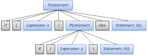
We can also view the parse trees of these choices. The else associated with the root if statement looks like this:

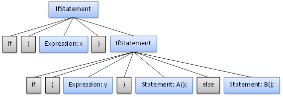
And the else associated with the nested if statement looks like this:

So which one is correct? Well, in all programming languages, the latter is preferred (I believe this is true, but let me know if there is a language where the former is preferred). The general rule is that an else clause should be associated with the (lexically) closest if statement above it with which it can be associated. So the proper indentation of the text above is this:

if (x)

       if (y)

              A();

       else

              B();

This ambiguity is a problem and must be resolved somehow. One way to resolve this issue is to simply change the definition of the language itself. Making braces required under if statements or having some sort of “End If” marker like VB does will remove the ambiguity. But if you don’t want to do this or if it is not possible (maybe you are writing a grammar to parse an existing language which can’t be changed, like C#) there are a couple of ways to fix this without changing the language.

One way is to write the grammar rules in such a way so that no ambiguity occurs at all with the example we have here. To do that, we have to find a way to disallow the 1st ambiguous tree above. The problem with that tree is it allowed an if statement without an else clause to be the first statement of an if statement with an else clause. That else clause should have been matched with the nested if statement and not the outer if statement. To prevent this from happening, we have to split up the concept of statements into matched and unmatched statements. An unmatched statement will be an if statement without an else clause or an if statement which contains an unmatched statement (Note: in the case where an if statement does have an else clause and contains an unmatched statement, meaning it is also considered unmatched, the nested unmatched statement must appear in the else clause, because otherwise, it would allow for the erroneous tree from above again). A matched statement will be any non-if statement or any if statement which has an else clause and contains only matched statements. Here is what the grammar would look like:

Statement =
MatchedStatement
| IfStatementUnmatched;

MatchedStatement =
MethodInvocation
| Block
| IfStatementMatched;

MethodInvocation =
IdentifierToken, '(', ')', ';';

Block =
'{', {Statement}, '}';

IfStatementMatched =
'if', '(', Expression, ')', MatchedStatement, 'else', MatchedStatement;

IfStatementUnmatched =
'if', '(', Expression, ')', Statement
| 'if', '(', Expression, ')', MatchedStatement, 'else', IfStatementUnmatched;

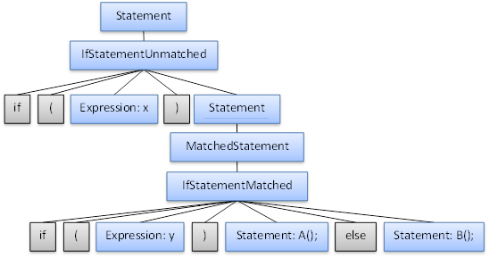
Notice that each if statement with an else clause must have a MatchedStatement before the ‘else’ keyword. This prevents any nested if statement without an else clause from being just before an ‘else’ of an owning if statement and therefore disallows the incorrect tree from above. Here is what the syntax tree would look like using this grammar (some of the nodes here would normally be pruned from the tree but are left in to show which symbols would have been reduced):

While this grammar does remove the ambiguity, I see a couple of problems with it. First of all, if you want to write code to walk over the syntax tree and you have any logic specific to if statements, that logic now needs to be used for two node types: IfStatementMatched and IfStatementUnmatched. But the main problem I see with this grammar is that it is not intuitive. It takes some time to wrap your mind around the relationships between Statement, MatchedStatement, and the different kinds of if statements and there are complex and overlapping ownership roles for the various symbols here. This could cause issues with maintainability. If a new statement type is added in the future, it may be added as an alternative to the wrong statement symbol if someone doesn’t understand the relationships correctly.

So is there a better solution? It depends. If having these ambiguous structures appear in code files is not expected to happen often, which is probably a good expectation, then it might be acceptable to allow the ambiguity since it should not hurt performance negatively in the rare circumstances when it comes up. I am assuming this will be rare because an ambiguous if statement is not only ambiguous to the parser, but it is also ambiguous to the coder. So he or she will probably use braces to disambiguate these kinds of statements so the code is more readable. But if we allow the ambiguity, no matter how rare it may be, we still have to tell the parser that the latter ambiguous tree is preferred over the former, because otherwise it will arbitrarily pick one tree and that may be the wrong one.

And luckily, the NonTerminalSymbol.HasPriority property is great for disambiguating between two alternate parse trees for the same content. In this case, the tree we prefer has the if statement without an else clause higher in the tree than the if statement with the else clause. So if we separate the if statement into two helper non-terminal symbols representing if statements with and without else clauses and give priority to the one without, the tree with that symbol closer to the root (a.k.a. the correct tree) will always be chosen when an ambiguity occurs:

Statement =
MethodInvocation
| Block
| IfStatement;

MethodInvocation =
IdentifierToken, '(', ')', ';';

Block =
'{', {Statement}, '}';

IfStatement =
_ifStatementWithElse
| _ifStatementWithoutElse;

_ifStatementWithElse =
'if', '(', Expression, ')', Statement, 'else', Statement;

?<NonTerminalSymbolOptions HasPriority="true" />?

_ifStatementWithoutElse =
'if', '(', Expression, ')', Statement;

Even though _ifStatementWithoutElse will be pruned from the syntax tree when “based on name” tree pruning is used, its priority setting will still be honored and the tree which would have contained it higher in the node structure is preferred over the other. In addition to resolving the ambiguity, this grammar doesn’t have the problems of the previous grammar: logic which needs to work for all if statements can be written for the IfStatement nodes and this grammar is intuitive because all statements are contained directly under the Statement node and there are no complex relationships here.

Next time I’ll discuss the new APIs available in 13.1 for detecting and resolving ambiguities, both when writing a grammar and while parsing documents. After that, I will most likely move on to a new topic. But if you’d like me to discuss or revisit anything about ambiguities that is unclear or you think is worth mentioning, please let me know.

The examples used in this post and the unambiguous grammar presented as the first solution to the problem were adapted from “Compilers: Principles, Techniques, & Tools – 2nd Edition” section “4.3.2 – Eliminating Ambiguity”.

By Mike Dour

The information contained herein is provided for reference purposes only.

Copyright © 2013 Infragistics, Inc., All Rights Reserved.

Why We Love Stack Overflow (www.stackoverflow.com)

$
0
0

Stack Overflow is a programming focused question and answer site, first launched in 2008 by Jeff Atwood and Joel Spolsky. It was originally set up as an alternative to Experts Exchange, quickly growing to become a hugely popular site in its own right. The site currently has over 1.5 million registered users, and more than 4 million questions have been asked since it launched.

The site is a big favorite here at Infragistics; our developers use and contribute to it all the time. So, to show readers of our blog how much we love it, we thought we’d list the top five things we love about it.

  1. You can only post questions
    • The first thing we loved about Stack Overflow, right from the beginning, was its insistence on a closely defined ‘question and answer’ format. This isn’t another ‘message board’ site, another forum, or general place to hang out online. Posts have to be “practical, answerable questions.” This keeps the usefulness of content really high.
  2. Source code
    • It is very rare to come across a post that doesn't include source code. That includes questions and answers. Again this sets the site apart from other similar alternatives. A question or answer that comes with a code sample is 100 times more useful than one that doesn’t.
  3. Badges
  • As people use the site, post and answer questions, and generally contribute they earn ‘badges.’ They are a great way to learn a little bit more about the people using the site, and to help you work out whether to up/down vote answers. There are now tons of badges, and they include:
    • Commenter - Someone who has left 10 comments
    • Copy editor - Edited 500 posts
    • Publicist - Shared a link to a question that was visited by 1000 unique IP addresses
  • Tags
    • Tags aren’t a unique concept to Stack Overflow, but they are implemented really well on the site. They are a simple way to find interesting questions, and a quick look at the ‘Tags’ pageshows the sheer wealth of content now indexed by the site:
      • C# - Over 45k questions
      • Java - Over 40k questions
      • PHP - 38k questions
      • JavaScript - Nearly 37k questions
      • Android - Over 32k questions
      • jQuery - Over 32k questions
  • Reputation and community
    • We absolutely love the sheer genius of the Stack Overflow community, and are constantly amazed by the quality of answers we see on the site. There really is an enormous amount of very good code being written across its pages. We don’t quite know how the guys have done it, or how they keep it up, but the founders have built a community of very knowledgeable people that keep coming back. Long may it continue.
  • 4 Design Apps that are actually useful

    $
    0
    0

    I constantly come across lists of applications for designers and I think "oooh, cool! Let me download that." Then… I never use them. Ever.

    This isn't a new topic, I first approached it a few months ago when I was going through different categories of design apps and trying to find a free/paid version of each to test. I found this approach didn’t work out well for me because, as the norm, I didn’t find myself using any.

    There are a handful of very useful applications that I use day to day and I tend to stick with them. They have proven themselves time and time again.

    So, to save you the time of drudging through lists and lists of design apps on the web and to save you time (and disk space), I've complied the following list of applications I recommend:


    Paper by FiftyThree - Free but has in app purchases


    I originally downloaded this application to see what the hype was about when it first came out. First thought: It’s a beautiful application. The UX is simple and follows the concept of having a notebook and being able to draw in it. I find myself creating new notebooks for each project I’m sketching for.

    The app starts out with a simple color palette and a pencil, but you can purchase different types of brushes, (i.e. a pen, a water color brush, a marker) and additional colors for the palette. I would recommend saving the money and buy the complete package of brushes. It's worth every penny.

    See how others are using paper


    VSCO Cam - $.99


    VSCO creates plugins for Adobe Lightroom and Apple’s Aperture. They have taken their amazing plugins to the app store with this iphone app.  It has a similar purpose as Photoshop Express so I find myself quickly drawing comparisons.  But why do I like it better? 

    Photoshop Express is free, but it has quite a few in app purchase to gain full functionality, where as you just pay .99 cents for VSCO CAM and you have full functionality. You can actually fine tune exposure or contrast a bit more on the Photoshop app, but its difficult to use. VSCO has taken it into an easy process. In my opinion the amount you can do on VSCO is as far as I would consider doing on an iPhone anyway.  If I wanted more control I would take the time to upload my photo to my computer and adjust it in Photoshop on my desktop.


    If I do want to make a minor adjustment to a photo before uploading it to twitter or facebook, this is the place to look.


    Pinterest– Free


    Pinterest isn’t just for meme’s and stay-at-home moms. There is a lot more than just recipes and decorating tips. The design section of Pinterest is full of color scheme ideas, mockups, texture patterns and info graphics.

    It really is a great place to start mood boards and concept ideas for any project. And even if you’re looking at other sites, you can keep all your ideas together in a board on pinterest for easy access to them all.

    What I love about the ipad app is that I’m able to easily scroll through pages and save pins. Both the ipad and iphone apps create a great browsing environment. Whatever I save to my phone, will automatically update to my pinterst account so I can access it on any desktop computer.


    What the font? -Free


    Its not that I’ve used this app more than a few times, but the truth is the times I have used it, I’ve found some real gems that I actually do use. So even though I only utilize it once in a while, I still keep the app on my phone, just in case something comes up.

    Additional pros for this app revolve around the easy process: take a photo and identify the characters in the photo, then the app matches the font.

    Hey, I just downloaded you and this is crazy, but here’s my SharePoint so… dashboard maybe

    $
    0
    0

    I threw a wish in the well,
    looking for ways how to tell,
    business insight from (data)hell,
    and now R+ is in my way

    SharePoint is a well of corporate data that comes in different formats, such as: tasks, issues, contacts, excel files, document libraries, calendars, and of course custom lists.

    There is precious business insight waiting to be mined in all these SharePoint libraries. For instance Task lists can answers questions such as: are tasks balanced uniformly among team members? Or who are the best performers in my team. Or which task has been hanging around without being completed for the longest? Document libraries would enable to answer who are the top content contributors in a team? Lists used for workflow based processes could open the door to understanding bottlenecks, etc.

    A quick way to start mining all this information and mashing it up is to create a dashboard using ReportPlus.  Since ReportPlus provides built-in support to connect to SharePoint servers, allowing you to create performance indicators, charts and discover trends. All this without a single line of code, without involving IT and without installing anything on the SharePoint server. Sound too good to be true? Let’s go step by step.

    Connecting to a SharePoint server

    First of all you need to start by installing ReportPlus in your iOS device (iPad, iPhone, or iPod Touch). You can do this by downloading it from the iTunes app store. There’s a free version limited to 50 rows per query, a Pro version, and an Enterprise version. For the purposes of this post any version will do.

    Once you start ReportPlus you are greeted by the dashboard selector, by tapping the + button you begin the dashboard authoring process.  Once you select any of the blank templates you should see something like the following in an iPad:

    NewDashboardCanvas ipad

    In order to configure a new connection to a SharePoint site you must tap the add button in the data sources left pane. This prompts the new data source wizard, where you are able to select SharePoint, by tapping the Content Managers>SharePoint Server option. 

    ReportPlus-New-Connection

    Once you do this you will see a set of configuration dialogs requesting connection name, SharePoint site url, user credentials, and optionally the use of client side certificates (these dialogs should be very familiar  for SharePlus users :)

    ReportPlus_SharePoint

    Enter all the required fields, validate the connection with the button at bottom of the dialog, and save it. Once the connection is saved you’ll be able to start navigating the contents of a SharePoint site on the left hand pane, including list of people, sub sites, and lists of the current SharePoint site.

    ReportPlus-SharePoint-Navigation

    Authoring a SharePoint dashboard

    Once a connection has been established to a SharePoint site and you are able to navigate the contents of it creating a dashboard is easy. You need to drag and drop the SharePoint lists, or Excel, or CSV files from a site, or list, to the dashboard canvas on the right hand side. In the iPhone instead of dropping, just tap the + button on a placeholder.

    ReportPlus-SharePoint-List

    As soon as you drop a sharepoint list ReportPlus prompts the widget editor, where you are able to filter, pivot, and sort the data of a list. By default metadata columns such as Created, and Created By are listed along with the rest of the lists’s columns.

    ReportPlus-Widget_Editor

    For instance you can drop the Created field in the Rows placeholder of the pivot table, and the TaskTitle on the values, and you will see content creation over time. You may change the choice of visualization to chart the information.

    ReportPlus-Widget-Chart

    Saving & Sharing the dashboard

    Once you have created a dashboard you have a number of ways to share it with other members of your organization. You can send a picture of the dashboard, or a powerpoint export of the dashboard contents, or the dashboard itself in an email (to be opened by another ReportPlus user).

    ReportPlus-Share

    Or you can save the dashboard to a shared location, such as a SharePoint document library allowing other team members to open the most up to date version of that dashboard as it evolves over time.

    ReportPlus-Save-Cloud

    It’s Mobile!

    One of the great things about ReportPlus is that once you’ve created and shared your dashboard it’s mobile, it can be used anywhere. The following is the same dashboard displayed in an iPhone.

    ReportPlus-iPhone

    This opens the door to valuable scenarios such as arriving to a board meeting and airplaying a dashboard to a HD TV screen, and walking everyone through the contents of it, giving everyone an update on the status of things in the company with nothing but your iPhone.

    So what are you waiting? Get ReportPlus before the 50% Off promotion ends tomorrow (May 1st)!

    Four Differences Between Android and iOS

    $
    0
    0

    Android and iOS users are both fiercely loyalty to their phones of choice. Ask a dedicated iOS user to consider Android and you will often be greeted with a look of bewilderment. Similarly, many Android users can’t understand why anyone would choose to use an Apple device. We have a lot of time for both platforms here at Infragistics, but we do understand users have strong preferences and we recognize the differences between them. In this blog post we will look at four ways the two operating systems differ strongly. Which is better? That is a tough question to answer. Have a look at each of the points below, and see if you can make up your own mind.
    1. Open Source Software
    Android is open source software, released by Google under the Apache license, whereas iOS is proprietary software created and owned by Apple. It is not available to anyone else, and this isn’t likely to change. Developers are free to create and distribute their own versions of Android, and many do. Apple is the only one who releases new versions of iOS.

    Undoubtedly the development community would cite the open source model used by Android as a positive thing, while Apple fans would point to the number of Android variants available to users as being confusing.

    2. Customizing Your Device
    Closely following the first point, Android devices are infinitely more customizable than their Apple equivalents. Apple devices are very much locked down, and operate in only the way Apple intends. Installing a new ‘app launcher’ on an Apple phone simply isn’t possible; on Android, Facebook has done just that very recently.

    Proponents of Android love the way almost every aspect of the OS can be nipped, tucked, and tweaked. Those in the Apple corner cite superior usability and ease of use of iOS as the exact reason why they don’t want to customize their devices in this way.

    3. App Ecosystems
    Google operates the ‘Play’ store, the official destination to find and download apps, but Android apps can also be installed from websites, file downloads, and memory cards. Apple’s app store is the sole proprietor of apps that can be sourced for their platform. If it isn’t in Apple’s app store, and Apple also operates much stricter review guidelines for submissions than Google (just ask AppGratis), then it isn’t going to appear on your phone.

    Apple users argue that their apps are largely superior - better looking, smoother in operation, with less stability issues. Android users, while disagreeing with those points, would additionally content that choice trumps everything else.

    4. Hardware Options
    Android runs on many different types of phones and tablets. Want a high end phone? Samsung and HTC have that covered. Want a low end tablet? There are many, many examples. Choice of hardware is something Android has covered.

    Apple, on the other hand, has a much more limited set of options, though these devices are are said to be more refined than many of their Android counterparts - the latest iPhone and iPad are both leading class devices. Android has struggled for years to have players on the same level, and in the last year their offerings have become more and more competitive.

    Conclusions
    So which is better? iOS or Android? The choice is truly yours. Are you looking for an open platform, with plenty of options to customize and hardware to choose from? A more refined controlled experience, where the experience is tightly controlled at every step? Let us know what you think in the comments below.

    The XamRichTextEditor CTP is Now Available for Download!

    $
    0
    0

    I am very excited to announce the immediate availability of the newest member of the Infragistics NetAdvantage for WPF and Silverlight control suites, the xamRichTextEditor.  What is the xamRichTextEditor?  The xamRichTextEditor is a highly customizable cross-platform WPF and Silverlight control that allows you to edit rich text documents.  Think of it as a version of Microsoft Word that you can drag and drop onto your Visual Studio design surface and program against in your WPF and Silverlight applications.  In fact, you can actually load and save MS Word documents.  You can open a MS Office .DOCX file in the xamRichTextEditor, modify the document, and then save the changes out as a .DOCX file.  Your users are going to love this controls!

    The xamRichTextEditor is currently being released to all our current customers in the form of a CTP (Community Technology Preview).  What does CTP mean?  A CTP is generally an incomplete preview of a technology in progress.  So you can expect to find some missing features, bugs, and other little annoyances that aren’t found in a RTM’d version.  Why release this as a CTP?  Why not wait until it is ready for prime time?  We wanted to get the control in your hands as soon as we could.  This allows you to play with it and provide feedback on current features and features you would like to have.  This is your chance to have an impact on the products you have invested your time and money into.  So take advantage of it!

    Don’t let the CTP label fool you.  This is a very functional and feature rich control, and even ships with an overview document to help you get started, an API help file, and a sample application demonstrating it’s current features.  Speaking of features, let’s take a look at what features you are getting with this initial release.

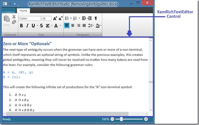
    Infragistics XamRichTextEditor Sample Application

    Features in the CTP:

    • A public API exposed by the RichTextDocument class that allows for complete creation and manipulation of documents via code.
    • Text editing
    • Support of multiple fonts, sizes and styles (including bold, italic, strike-through and multiple underlines types)
    • Support for multiple text colors, including themed colors.
    • Text highlighting (using background colors) as well as paragraph shading.
    • Support for different paragraph properties (indentations, margins, spacing before and after…)
    • Paragraph, Character (i.e. Run), List and Tables styles (note tables are not supported in the CTP)
    • AvailableStyles collection exposed off RichTextDocument that is pre-populated with over 30 styles.
    • Line spacing
    • Vertical alignment of text within a line.
    • Horizontal paragraph alignment (Start, End, Center and Justify)
    • Multi-level bulleted and numbered lists including support for custom level definitions.
    • Support for unlimited undo/redo
    • Clipboard support
    • Load/Save to and from Word 2010 (.docx) and plain text formats
    • Clipboard support for rich text content to and from the XamRichTextEditor as well as from Microsoft Word (only plain text can be pasted to Microsoft Word).
    • Extensible serialization architecture.
    • Asynchronous document layout on load.
    • View splitting
    • View zooming
    • Optional showing of paragraph marks

    Features we plan to on adding by RTM of v1:

    • Images, inline and floating
    • Tables
    • Superscript, subscript and small caps
    • Hyperlinks with dialog
    • Bookmarks
    • Drag/drop support
    • Load/Save to and from RTF and HTML formats with associated clipboard support.
    • Find/replace with dialog
    • Spell checking
    • Context menu
    • Support for some fields (e.g. date, TOC)
    • Support for themed fonts
    • Custom tab stops with ruler including support for right aligned, centered and decimal tabs
    • Optional showing of the tabs, spaces and hidden text

    Features that will eventually be added:

    • Page layout view
    • Headers/footer
    • Mail merge
    • Printing
    • Locking of various areas to the document to prevent changes.
    • Support for other font types, e.g. East Asia, High Ansi.
    • Bi-directional (right to left) support
    • Advanced text features like complex script
    • Change tracking

    Obviously, this list of features is subject to change.  Don’t forget, that your input has a direct impact on this list.  So if you tell me that one feature is more important than another, and other people feel the same way, chances are we will bump that feature up the list.  Of course, you have to let me know what you think is important sooner rather than later.  Why?  The xamRichTextEditor will release as RTM with the upcoming 13.2 release in October.  So if you wait too long to tell me what you think, we won’t have time to implement the feature.  How does the saying go?  The early bird get the worm!

    Download the xamRichTextEditor

    The CTP requires the latest public Service Release of NetAdvantage! Please ensure that you have installed the April 2013 Service Release of the Infragistics WPF and/or Silverlight controls prior to using the CTP. The XamRichTextEditor control will not function properly with earlier releases. Details of the April Service Release:

    1. xamRichTextEditor for Silverlight: Build 2029 – April 9, 2013
    2. xamRichTextEditor for WPF: Build 2032 – April 8, 2013

    Next Steps

    After you download the control, read the docs, and start playing with the sample application, be sure to tell me what you think.  You can leave a comment below, email me at blagunas@infragistics.com, contact me through my blog, or connect with me on Twitter (@brianlagunas).  You can expect to see some blogs that show you how to use the xamRichTextEditor control coming soon.  Enjoy!

    NetAdvantage for Windows Forms Release Notes - 13.1 Volume Release

    $
    0
    0

    With the release of NetAdvantage for Windows Forms 2013 Volume 1, a new resource now available is a set of release notes that reflect the state of resolved bugs and new additions from the previous release. You’ll find the notes useful to help determine the resolution of existing issues from a past release and as a means of determining where to test your applications when upgrading from one version to the next.

    Release notes are available in both PDF and Excel formats. The PDF summarizes the changes to this release along with a listing of each item. The Excel sheet includes each change item and makes it easy for you to sort, filter and otherwise manipulate the data to your liking.

    Note: The release notes are for NetAdvantage for Windows Forms 2013 Volume 1, Build 13.1.20131.1000.

    WinForms 2013 Volume 1 Service Release (Build 13.1.20131.1000)

    PDF - NetAdvantage for WinForms 2013 Volume 1
    Excel - NetAdvantage for WinForms 2013 Volume 1


    What is KnockoutJS?

    $
    0
    0

    Knockout is a JavaScript implementation of the Model-View-ViewModel software pattern (MVVM). If you haven’t come across MVVM before it is an architectural pattern based on the classic Model-View-Controller concept, which basically separates data from a user's interaction with it. MVVM, originally developed by Martin Fowler at Microsoft, was designed specifically for UI development and clearly separates these elements from data they operate on.

    Knockout was created by Steve Sanderson, a program manager for ASP.NET at Microsoft. The project itself is independent of Microsoft, but a lot of Steve’s work is with web technologies so it is clear that he has a passion and a talent for this kind of thing. You can find out more about Steve on his blog, or Twitter.

    Knockout has a number of key features:

    Declarative bindings - DOM elements can be associated with model data

    • Automatic UI refresh - UI updates when model state changes
    • Dependency tracking - Set up relationships between model data
    • Templates - Create nested UIs as a function of model data

    The whole point of this library is to help developers who are trying to create rich responsible user interfaces on the web (the kind of thing people are expecting more and more these days). Specifically, it is useful for those trying to create dynamically updating interfaces.

    Everything is written in pure JavaScript, which should mean you can add it into your project with minimum rework. For the same reasons the code works in any major browser, and the whole library is only 13kb.

    Steve has written some really nice tutorials and guides, and they really are the best way to learn more. We recommend:

    NetTuts is also a really good guide for those just starting out.

    There are now quite a few big sites out there using Knockout in the wild. These include dotnetnuke.com, jsfiddle.net, and thetrainline.com. A further list can be found here.

    Check out the Knockout homepage for more information, or download it here.

    iOS Infinite Scrolling

    $
    0
    0
    For the 13.1 release of our NUCLiOS product we added a LOT of features . So many in fact that its actually quite easy to overlook some of them. So, today i'm going to talk about one of my favorite features added to the IGGridView: Infinite Scrolling . If you've ever seen/used the HBO GO app for the iPad, you should already have a pretty good idea of what i'm talking about. Basically its the concept of having a scrolling list, either vertical, horizontal or both, where you keep scrolling...(read more)

    Quick-Tip: Convert Coordinate System of a UIView

    $
    0
    0

    Introduction

    When performing complex animations during run-time or any task that would require the translation of one UIView's location into that of another UIView, keeping track of the math on your own can be a challenge. Luckily Apple has created a few methods to make conversions simple.

    Converting the Coordinate System

    Converting the Coordinate System

    The conversion of one CGRect's coordinates to another is done by one line of code that returns the converted CGRect.

    CGRect convertedRect = [self.view convertRect:_anInnerSubview.frame fromView:_aSubview];


    You can think of this conversion in this format:

    [TheViewToTranslateTo convertRect:TheSubviewToConvert.frame fromView:SubviewsParentView]

    Additional Conversion Methods

    Apple's documentation has a few of these methods if the example I've shown doesn't fit your requirements.


    Note: A much easier to read format of this post is available here.

    State of BYOD in the Enterprise

    $
    0
    0

    BYOD, or “bring your own device,” is the ability to bring your own personal hardware to work and use it instead of a corporate or company provided alternative. Typically referring to mobile and smartphones, though increasingly tablets are being included, no one is really sure where the phrase came from. It seemed to surface around 2009 (according to sources here) and gradually grew in popularity. But just how widespread is BYOD?

    According to a new Gartner report, BYOD is very widespread indeed, and it is going to get a lot more popular. They predict by 2017, half of all employers will require employees to supply their own device for work purposes. This is quite a statement, and arguably turns “bring your own device” into “you have to bring your own device” (YHTBYOD isn’t quite as snappy, but we digress).

    Dave Willis, Gartner Analyst, see things in a positive light:

    "BYOD strategies are the most radical change to the economics and the culture of client computing in business in decades. The benefits of BYOD include creating new mobile workforce opportunities, increasing employee satisfaction, and reducing or avoiding costs.

    We're finally reaching the point where IT officially recognizes what has always been going on: People use their business device for nonwork purposes. They often use a personal device in business."

    If BYOD does gain a bigger foothold in the workplace (and a quick straw poll we conducted suggested it is as popular as Gartner would have us believe), what impact does this have on the software that goes on these devices?

    Phone and tablet operating systems probably have the biggest hurdles to overcome. They now need to cater to users that store both work and personal data on their devices - a previously “personal” device now needs to consider a whole host of “enterprise” features. Apple has been playing catch up in this area for a while, with its iPhones only gaining features IT departments rely on in the last few years. Windows has good support, with Microsoft being a big enterprise player anyway, and Android has a lot going for it as well. Blackberry, long a staple in the enterprise market, has tried to lead the way a little but more with new ideas. Blackberry’s latest phone offerings tout features like being able to “split” themselves between work and home mode.

    Infragistics mobile business applications such as SharePlus and ReportPlus are perfect compliments to the BYOD paradigm.

    ReportPlus is a dashboard and reporting tool for the iPad that enables you to connect to any data source directly and securely. With ReportPlus’ intuitive UI, you can tap and drag your way to build visualizations of your key business metrics – no assistance from IT necessary or any server side software required. This tool makes remote access to data readily available directly on the iPad, giving you the power to glean the insight from your data and make informed decisions at any time.

    SharePlus is a mobile business application that allows folks to connect to SharePoint from popular mobile devices and fully manage their documents.  With SharePlus, you may use your iPad, Android, or BlackBerry Play device to access and edit SharePoint documents online and even while you are disconnected from the internet.

    It is clear that BYOD is here to stay, and it might not be long before we look back and think it strange that employers ever gave us phones to do our work with. There are of course still many hurdles to look at (e.g. should an employer subsidize our phone costs?) but seems we are seeing the start of an irreversible trend in technology in the workplace, and the Infragistics tools of SharePlus and ReportPlus are key players in assisting with the smooth transition of our devices in the workplace.

    What Are Pixel Shaders?

    $
    0
    0

    When Microsoft released its products such as DirectX 8.0 and Direct3D 8.0 many years ago, developers got an opportunity to create never-before-seen effects. Direct3D 8.0 and later versions brought in shader capabilities which made it possible to render custom effects on conventional graphics hardware.


    A shader is sort of a kernel function, typically executed in parallel for each data element. A shader is an algorithm compiled and loaded into the Graphics Processor Unit (GPU). This algorithm executes once, for every pixel in an input image. GPUs are efficient parallel processors hence your algorithm will be executed thousands of pixels at a time.


    Pixel shaders are specialized shaders that are executed for each pixel of a bitmap. They are typically used to implement per-pixel effects. Pixel shader effects in WPF are effects that one can apply to a UI element.Pixel shader effects allow you to add adjustments such as glow, pixel brightness, red eye removal, and shadows, to rendered objects.


    In WPF, you can use either the built-in pixel shader effects or custom shader effects. You can add these effects to any UIElementusing appropriate XAML with minimal code-behind logic. WPF supports several pixel shaders such as DropShadowEffect and BlurEffect. However, only one effect can be applied directly to an element at a time. For example, you cannot apply both DropShadowEffect and BlurEffect to the same element directly.


    The System.Windows.Media.Effects namespace defines several relevant classes for implementing shader effects.


    Class Name

    Description

    Effect

    Acts as a base class for all bitmap effects.

    PixelShader

    Acts as a managed wrapper around a High Level Shader Language (HLSL) pixel shader.

    BlurEffect

    Represents a blur effect that you can apply to an object.

    DropShadowEffect

    Applies a shadow behind a visual object at a slight offset.

    ShaderEffect

    Provides a custom bitmap effect by using a PixelShader.


    Table: Classes in the System.Windows.Media.Effects Namespace


    The DropShadowEffect has several important properties that determine characteristics of the drop shadow.


    Property Name

    Description

    Color

    Specifies the color of the drop shadow. The default is black.

    BlurRadius

    Specifies how blurred the shadow is. Typical range is between 0 and 1. The default is 5.

    Opacity

    Specifies how transparent the shadow is. Typical range is between 0 and 1, where 1 means fully opaque and 0 means fully transparent (not visible). The default is 1.

    ShadowDepth

    Specifies how much the shadow will be displaced from the object that is casting the shadow. The default is 5.

    Direction

    Specifies in what direction the shadow is cast from the object. It is an angle between 0 and 360 with 0 starting on the right hand side and moving counter-clockwise around the object. The default is 315.


    Table: Properties of TheDropShadowEffect


    The following example demonstrates the DropShadow effect.

    This code will result in the following output:


    As you can see, the button now has a drop shadow. The attributes of the drop shadow can be customized through the various properties of the DropShadowEffectclass.


    Similarly, you can apply the BlurEffect to the control.


    Custom Shaders


    HLSL (High Level Shading Language) was originally created for DirectX. Using HLSL, you can create programmable shaders for the Direct3D pipeline.


    You can derive from the ShaderEffect class to implement a custom effect based on a single pixel shader. This will enable you to create pixel shaders that were earlier unavailable or tweak built-in shaders.


    To create a custom effect:

    1. First, load a PixelShader from precompiled HLSL bytecode in a WPF application. One can create a PixelShader from either a Pack URI reference or from a Stream.
    2. Then, set the UriSource property or call the SetStreamSource method to load the shaderbytecode.
    3. To create a custom effect, assign the PixelShader to the PixelShader property of a ShaderEffect.
    4. Define dependency properties representing parameters of the effect and Brush-based surface inputs.


    Pixel Shader 3 Support in WPF 4


    WPF 4 builds on top of the existing ShaderEffect support that had been introduced in WPF 3.5 SP1 by allowing applications to write custom effects by using Pixel Shader (PS) version 3.0. The PS 3.0 shader model is more sophisticated and allows for even more effects on supported hardware.


    Further Reading:


    How to Create Custom Shader Effects

    How the Shazzam Tool Works with Shaders

    How to Write Pixel Shaders for the Microsoft Silverlight and WPF platform with HLSL

    Going From C# To Objective-C: Boxing and Unboxing

    $
    0
    0
    Speaking from experience, .Net has a tendency to spoil us developers. In this post i'm going to talk about one of those scenarios, Boxing/Unboxing. If you're a C# programmer, and you have no idea what i mean by Boxing/Unboxing that proves my point :). For those of you who are unfamiliar with these terms: Boxing : Taking a value type (int, float, bool, struct, etc...) and placing it into a reference type container such as an object. object obj = 234; Unboxing : Taking that boxed reference...(read more)

    Infragistics Racing - Report #1

    $
    0
    0

    May 3, 2013, Race 1 at New Jersey Motorsports Park

    With the weather predicted to be sunny, windy and a cool 60°F, Infragistics Racing, sponsored by InfragisticsNucliOS and IgniteUI controls, packed up and headed to New Jersey Motorsports Park in Millville, NJ for the first race of the season.

    Infragistic Racing heading to the track.

    Morning Practice

    After setting up the Infragistics Racing canopy in the paddock, it was time to get the bike through the tech inspection process, find my grid position for the race and prepare for the day. For me, race prep means checking tire pressure, making sure the gas tank is filled and getting my race suit on. It also involves a lot of chatting to people walking by who stop when they see the beautiful graphics on the Infragistics Racing bike.

    IG Racing in the paddock

    Race

    The “Thunderbolt” course at NJMP is 2.25 miles long and has 14 turns. It’s a technical track but you can see some decent top speeds on the straightaway, depending on how brave you are in the final corner. Racing rewards bravery. Infragistics rewards showing up for work on Monday. IgniteUI may provide rocket-fast performance and have the fastest jQuery grid on the planet but I try and split the difference.


    NJMP Track Map              IG Racing Top Speed During Race 1


    I got a decent start in the race and managed to stay out of last place (remember the “showing up for work on Monday” thing…). There is an old saying in racing that in order to finish first, first you have to finish. So I can check that one off my list… At least I still have my day job.

    Race 2 is currently scheduled for Friday, June 14 at Virginia International Raceway.

    Infragistics Racing at Top Speed


    Kevin Richardson has been working in the area of user experience for over 20 years. With an advanced degree in Cognitive Psychology, he has experience across business verticals in the fields of research, evaluation, design and management of innovative, user-centered solutions.

    Kevin’s experience includes web sites, portals and dashboards, enterprise software and custom business applications for medical, pharmaceutical, communications, entertainment, energy, transportation and government users.

    On the weekends, you can find Kevin on his motorcycle, riding for Infragistics Racing at a number of different racetracks on the East coast.

    Infragisatics Racing Logo


    How to design a product catalog on the iPad with ReportPlus?

    $
    0
    0

    The arrival of the iPad has had a huge impact on sales forces, we know for a fact that some Fortune 2000 companies have switched the hardware they would provide to sales reps from laptops to iPads. One typical activity for sales representatives on the go is to showcase product catalogs to potential customers, ideally in a snappy way, regardless of what the network connectivity is like. The iPad has proven to be ideal for this type of scenario, it's very visual, intuitive to use, and easy to carry around.

    ReportPlus allows to design dashboards for iPad and iPhone in such a way that it makes it very easy to walk through a collection of items, such as products. It can be used to display different bits of information in the different widgets of the dashboard, making for a very good, one glimpse kind of view of the most relevant aspects of a product. 

    In this article I’m going to show step by step how to create a product catalog dashboard on the iPad with ReportPlus.

    Getting started

    In order to get this dashboard going we’ll need specific information about each product, including:

    • Product Picture or Video.
    • Product specification. The most relevant attributes you’d like to display associated to each product, which may include price, model, description, etc.
    • Product performance metrics you may want to chart.

    This information may be stored in one or several data sets, which may come from the same or different data sources.  In this case we will be using the Excel spreadsheet named Cameras.xlsx as data source, which ships with ReportPlus, and you should be able to find within Local Files>Samples. It includes three sheets: Specification, Pictures and Ratings.

    The important thing to have in mind is that if different data sets are going to be used, you need to define a key field, shared among the different data sets, to be able to bind the information with the current page selection.

    We’ll start by creating a blank dashboard, with the 3x3 layout.

    ReportPlus_NewDashboard

    In this case the data source we are going to be using is stored in Local Files. If that were not the case we’d create a new data source connection by tapping the + button in the Data Sources left pane, and following the new data source wizard.

    Configuring the pages filter with products

    ReportPlus_NewDashboards_PagesExpanded

    By tapping on the bottom right button we expand the pages pane. We must tap and hold the Specifications sheet and then drag it all the way to the pages pane to the right, and drop it there. This applies to any data set we might use as product catalog, the one containing all the product keys, and labels.

    IMG 0712

    While in this case is not really needed, usually we might have to modify the pages configuration to make sure the column displayed is the one carrying the label. We do so by tapping the page setting button, which is displayed on top of the pages pane when the dashboard is on edit mode.

    ReportPlus_PageSettings

    Adding the product picture

    We start adding content by drag and dropping the Pictures sheet, being the data set with the information needed to get the product pictures from the web. Since we don’t have a field with the full url, we’ll have to add a calculated field to create one. By tapping the + button in the fields pane we add a new calculated field, which we'll label CompleteURL.

    The complete url can be achieved by adding an expression that appends a fixed known base url with each camera ending url. Such expression has the following form:

    "http://base-url/"&[URL]

    ReportPlus_Calculated_Field

    Now that we have a field with the full url we can switch the visualization mode to the web viewer visualization, and set the new calculated field in the Url Field configuration attribute of the Web Viewer settings. This should trigger the display of a camera picture retrieved from the CompleteURL field.

    IMG 0715

    By default the image displayed is going to be the one belonging to the first row. In order to make sure we are displaying the picture of the currently selected product we must configure page binding.

    Page Binding

    In order to bind the data in the picture with the page selection, we need to add binding rules in the widget configuration. In the binding tab, by tapping in the + button we add a new binding expression where we specify that the Field Name Equals the Title field in the Specifications page.

    ReportPlus Page Binding

    Adding product specs

    Now we’ll drop the Specifications sheet. In this case we want to show the most important attributes of a product in such a way that the user is able to see them without scrolling, and in some cases, we’d like for some very important attributes to appear highlighted, so they are perceived at first glimpse. For instance we’ll start with the price, let´s say it´s the most important attribute of our product, so we are going to use just one widget to display it and nothing else.

    To do this we hide all fields with the button at the bottom bar of the fields pane, and then we make the Price field visible. Since we know we are displaying a currency, we’ll change the formatting to be currency like. For this we tap on the Price field, and go to Formatting, and set Type as Currency, Fraction Digits as zero, and turn on the Show 1000 Separator option.

    ReportPlus_FieldSettings

    Then we select the Gauge View in the visualisations menu, and we switch to the Text Gauge in the Gauge Type setting. This will render the price in a large font size occupying most of the widget’s display. Being a gauge we have the option to display upper and lower bounds, which would allow us to signal with a red dot when the value is out of the expected limits. We would configure this with the Bounds settings.

    ReportPlus_TextGauge[Image]

    Then we disable the display of the title bar from the General Settings tab, by switching off the Show Title option.

    ReportPlus_ShowTitle Disable

    And we have a price widget.

    ReportPlus_PriceWidget

    Then we duplicate the widget, switch to grid view and make all fields visible. After that we change the visualization method to Text View and reorder fields as we see fit. For instance we'll place Manufacturer right below Release Date. To do this we tap and hold the field re order, and we drag it to the position we want in the fields list.

    ReportPlus_TextView

    Text View offers a number of style options. We’ll pick the labels to the left and small content text to the right with a separator line. Also we’ll turn on the Highlight First Row option.

    Charting metrics

    Last but not least we are going to add the Ratings sheet to the dashboard. After we drop the Ratings data set, and we configure page binding we should see something like:

    ReportPlus_Ratings

    Since the metrics we want to display are columns of the data set we have a couple of options to display them. The first one is use the Text View display which gets along naturally with this type of structure, but since we are looking to chart numerical values, if we do it with the current matrix structure all metrics will be displayed as different data series, in a chart, and using a linear gauge is out of the question, So what can we do? Well, we can use the transpose operation on the matrix, and convert columns into rows. We do this by pressing the button with the axis and the arrows on the fields pane to the left. Once we tap it the matrix should change to:

    ReportPlus_AfterTranspose

    Then we switch to Gauge View, and we select Gauge type as Linear Gauge. Being a gauge we have the ability to configure bounds, and bands within it.  So we establish lower bound as 0 and upper bound as 10, and thresholds in 30% and 70%.

    ReportPlus_Gauge_Bands

    After configuring all the widgets another chapters starts which is styling the dashboard, but we are not covering that in this post. That deserves a post on it’s own. After styling background images, margins, and paddings you can create something like:

    ReportPLus iPad Product Catalog

    Or like: 

    ReportPlus_Styled

    Running in offline mode

    Going back to the sales rep scenario, if you’ve managed to put together a product catalog dashboard and you plan on showing it in a meeting you will want to make sure about two things.

    First one, that everything is cached. This will ensure you get the best browsing experience. You can achieve this by manually walking through all the pages in the collection, or alternatively to turn on the AutoPlay, and leave the dashboard running until it has looped through the collection. You can do this by tapping the play button on the pages pane to the right, which is displayed if the dashboard is in view mode.

    Second, once you’ve cached everything you may want to enable the offline mode before the meeting begins. Specially if you go around with the same dashboard for several days, just to make sure the application won’t try to connect to a server to refresh the information while the meeting is taking place, and spare you of the spinning wheels of data retrieval.

    Wrap up

    In this article we’ve gone through the creation process of a dashboard to be used as a digital product catalog in the iPad. We’ve shown how to add the different widgets and bind them to the product collection page. This of course was only an example with limited information to showcase how ReportPlus may be used.  It’s important to bear in mind is that this same concept could also be applied to other types of entities, such as clients, providers, employees, etc.

    iOS XML Parser

    $
    0
    0
    The other day I was doing some coding on the side, and i was playing with different web services. Some of the web services returned JSON, while others returned XML. Now, JSON was easy to handle, b/c i could simply use the NSJSONSerialization class built into ios and export it to an NSDictionary. However, XML was a different story. To handle that natively meant that i had to parse it using the NSXMLParser . To do this, you need to create a delegate, and build your data model as you go through each...(read more)

    An Overview of Expression Blend

    $
    0
    0

    While it is fairly easy to hand-code XAML in the Visual Studio IDE for small-scale applications, when it comes to large applications such as games, productivity applications, or Windows Phone applications, developers prefer to use XAML authoring tools such as Expression Blend.

    Microsoft Expression Blend is a professional design tool that enables users to create visually appealing and stylish UIs (user interfaces) for WPF and Silverlight applications, as well as Windows Phone applications. The biggest advantage of Expression Blend is that it allows designers to completely focus on the design, while developers give their attention to programming.

    Using Blend, you design applications by drawing controls, creating graphical shapes such as rectangles, ellipses, and so on. Based on your UI, images and multimedia such as audio and video can also be added using Blend. In Windows-based applications, 3D objects can also be imported and then configured as desired. Using storyboards in Blend to hold, arrange, style, and animate the various elements, you can achieve a lot of complexity in the UI in a simple manner.

    Some of the popular features of Expression Blend are:

    ·         Easy-to-use, modern visual interface;

    ·         3D and media support, real-time animation, effects, and transition support for improving user experiences;

    ·         Project templates for Views and ViewModels;

    ·         Advanced, flexible, and reusable customization and skinning options;

    ·         Powerful integration points for data sources and external resources;

    ·         Real-time design and markup views;

    ·         Artwork import capabilities from Expression Design;

    ·         Interoperability with Visual Studio 2010 and Visual Studio 2012.

    The Blend Platforms and the version of Blend recommended for use are:


    Platform

    Go live Blend version

    Windows Store apps, HTML

    Blend for Visual Studio 2012

    Windows Store apps, XAML

    Blend for Visual Studio 2012

    Silverlight 4.0

    Expression Blend 4

    Silverlight 5.0

    Expression Blend Preview for Silverlight 5

    WPF 3.5/4.0

    Expression Blend 4

    WPF 4.5

    Microsoft Visual Studio 2012 Professional

    WPF/Silverlight Prototypes

    Expression Blend 4

    Microsoft Visual Studio 2010 and Microsoft Visual Studio 2012 work effortlessly with Expression Blend to maintain sync between the design and the code-behind logic.

    The outcome of using Expression Blend results in WPF applications, Silverlight websites (.xap and supporting files), and user controls.

    Note that Expression Blend for Windows Phone will be available only when you install the Windows Phone Developer Tools and SketchFlow is available only in Expression Studio Ultimate. (SketchFlow is a tool to model the navigation and composition of an application in a very visual manner. SketchFlow prototypes can be as simple as a series of sketches, but can be built upon to become as complex and real as you need them to be.)

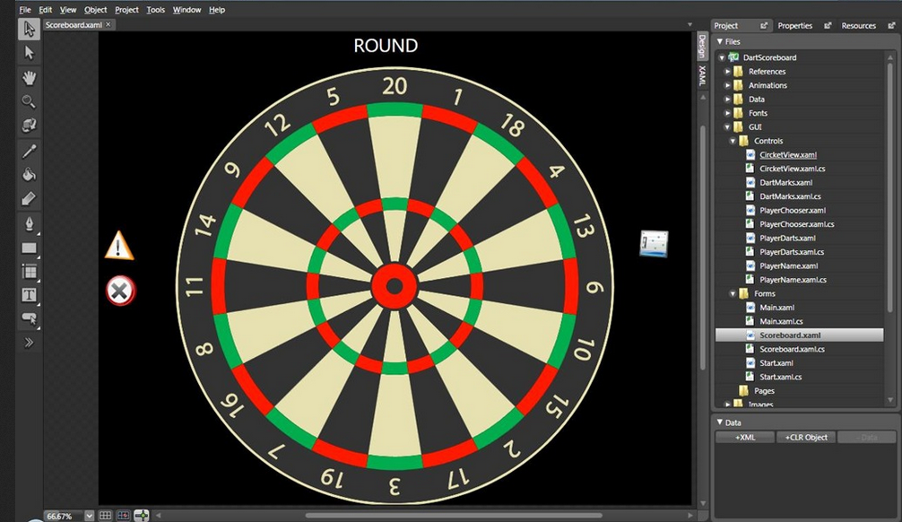
    Figure 1 shows a complex dartboard designed using Blend.

    Figure 1 -  Dartboard Sample

    (Image Source: http://channel9.msdn.com/coding4fun/articles/WPF-Dartboard-scoring-application)

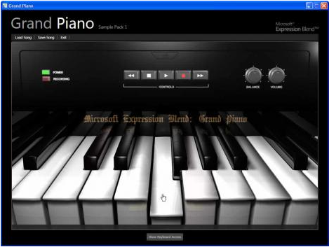
    Figure 2 shows a grand piano designed using Blend.

    Figure 2  - Grand Piano UI designed using Blend

    (Image Source: http://designer-info.com/web/expression-blend/expression-blend-1-review.html)

    Figure 3 shows the New Project dialog box that is displayed when creating a Silverlight project using Blend.

    Figure 3 - New Project Dialog Box

    The Blend IDE

    By default, the Design view shows the Projects windowpane open on the right. In the center, the white artboard or the drawing area is seen. This is where controls can be drawn and items placed.

    On the left, you will see the Toolbox containing the controls and objects that you can use for drawing. Let us look at all these elements in detail.

    The Projects window

    This window shows the default files created for a Silverlight project in Blend.

    The Toolbox

    The Toolbox contains various objects and controls that can help you create a fantastic user interface for Silverlight applications.

    The Selection tools are used to select objects and paths.

    The Magnify or Zoom tool is used to provide different views of the artboard and objects.

    The Pan tool is used to position the artboard in the workspace area.

    The Brush tools are used to configure the color and other visual settings of objects such as controls and paths.

    The Object tools include a number of controls and shapes that you can create or use in Blend applications.

    The Asset tool opens the Asset Library, a collection of various controls and shapes.

    Figure 4- Toolbox Pane

    The Toolbox pane provides options to create various kinds of controls. When you scroll down the Toolbox and click the small triangle next to the TextBlock, you will see additional controls popping up.

    Figure 5 shows the artboard or the workspace and the various panes.

    Figure 5 – Workspace Area

    Figure 6 shows part of a storyboard created in Blend.

    Figure 6 - Storyboard and animations

    Now you’re equipped with the tools you’ll need to design stunning WPF, Silverlight and Windows Phone Applications. After viewing some of the examples above, hopefully you’re inspired to get out there and design something of your own!

    Developing a CRUD grid with IgniteUI, Node.js, Express, Mongoose, MongoDB and Nginx

    $
    0
    0

    In this blog post I am going to create a fully-functional JavaScript & HTML application from scratch, which supports RESTful CRUD operations. I am going to use the out of the box IgniteUI grid functionality for handling the creates, updates, deletes, and the retrieval of records.

    I’ve tried to create a simple architecture which, at the same time, satisfies the following conditions:

    1. High performance
    2. Production-ready - should be able to run an app in production, using the same components, with minimal changes to the configs. The topology and the core of the architecture and frameworks of choice should be unchanged. Should be able to scale easily and be hosted in environments such as Amazon’s EC2 cloud
    3. Use of JavaScript on both the client, and the server. One language to rule them all
    4. Use of popular open source frameworks (such as Node, express, etc.). While we do have a lot of samples, helpers, and content related to ASP.NET MVC, we haven’t spent a whole lot of time showing you the beauty of our toolset when used in the context of other platforms
    5. No custom code should be necessary for the CRUD RESTful logic on the client. This should be all handled by the IgniteUI grid, as out of the box functionality. Since the 12.2 IgniteUI release, the grid component supports RESTful create/read/update/delete operations completely out of the box. You can find more information about this at the following url:

    http://help.infragistics.com/Help/NetAdvantage/jQuery/2013.1/CLR4.0/html/igGrid_REST_Updating.html


    The software stack I’ve chosen consists of the following components:

    IgniteUI– powering our presentation layer. I’ve used the latest 13.1 internal build, you can basically use any build from 12.2 and above

    Nginx– it’s one of the most popular and high-performance http servers, and I am going to use it for two reasons:

    a) To serve static content – images, css, js, and html pages

    b) For load balancing Node.js processes

    Nginx is used by organizations like Netflix, GitHub, Wordpress and is often preferred over Apache. I’ve used the Nginx-1.2.3 for Windows, even though you can pick any of the latest stable versions for your OS of choice

    Node.js– one of the most popular server-side JavaScript frameworks. Has many modules developed by the community - ORM stacks, web servers, etc. Companies like Yahoo and LinkedIn are making heavy use of Node, and it has proven to be a very scalable and high-performance choice for building web apps in particular. And of course, what’s really sweet is the fact that you actually code your server-side logic in JavaScript! I’ve used v0.8.22 of Node, but you can go to http://nodejs.org and grab the latest current binary (which is v0.10.5 at this time).

    Express.js– Express is a web framework built on top of Node.js. What we are going to use it for is implementing the GET, POST, PUT, and DELETE request handlers for our backend part. As you will see from the code, it’s really great in the sense that you only need a couple of lines of code to implement something like that. The version of Express.js that I am using is 3.0.0.

    Mongoose– you are going to be “Wow!” when you see what this ORM framework can do. You can literally model and persist your documents and objects in a matter of minutes. Using mongoose to load and store objects, and bind them to the IgniteUI grid via Express is actually so easy, that initially I did not really believe my own eyes. I am having Mongoose 3.6.9 installed.

    MongoDB– One of the most popular document-oriented NoSQL storage solutions. One of the best features of mongo which I particularly like is the fact that all documents are encoded as BSON (Binary JSON), which makes processing and retrieval of collections extremely efficient and natural. Considering the Ignite UI grid is so JSON-friendly, this makes it a perfect choice for a web app. Also, clustering (sharding: http://docs.mongodb.org/manual/sharding/) is very easy to setup with Mongo.

    The following diagram depicts the architecture of the application:

    Note that starting more than one Node process is not mandatory, but the setup makes it  quite seamless. Nginx will basically take care of the load balancing for you. 

    We are going to setup forwarding in our Nginx conf file, so that we can start multiple instances of our node.js web app, in order to support load balancing. Our RESTful API is going to be implemented in the Node app, using Express, Mongoose and MongoDB, and our HTML pages, including all other resources are going to be served by Nginx.

    Let’s get down to business. First you will need to install Nginx and Mongo, and fire them up. MongoDB may complain that it’s missing some folders when you just start its mongod executable, but you can create those under , and then give it some arguments:

    mongod –dbpath data\db

    Before starting the nginx executable, let’s change the nginx conf file, so that we setup forwarding to our node processes. Open conf\nginx.conf (depending on the OS you’re using, that may be different, please refer to the nginx docs), and add the following in the “http” section – I’ve marked the new lines in bold:

    gzip  on;

    # can be used for load balancing

    upstream igniteui_upstream {

        server localhost:8082;

    }

    server {

         listen       8081;

         #charset koi8-r;

         #access_log  logs/host.access.log  main;


    location / {

        proxy_redirect off;

        proxy_set_header   X-Real-IP            $remote_addr;

        proxy_set_header   X-Forwarded-For  $proxy_add_x_forwarded_for;

        proxy_set_header   X-Forwarded-Proto $scheme;

        proxy_set_header   Host                   $http_host;

        proxy_set_header   X-NginX-Proxy    true;

        proxy_set_header   Connection "";

        proxy_http_version 1.1;

        proxy_pass http://igniteui_upstream;

    }

    location ~ ^/(.+\.html|images/|img/|javascript/|js/|css/|stylesheets/|flash/|media/|static/|robots.txt|humans.txt|favicon.ico) {

        root html;

        access_log off;

        expires max;

    }

    What all of the above does, is:

    • It redirects all requests to the node process, except requests which are for resources that are html pages, that are located in images/ js/ css/ , and so on.
    • It ensures we can add multiple entries in the upstream declaration, if we would like to start multiple node processes for our app.
    • It sets the port on which our Nginx will listen to, that is, 8081
    •  Our node.js process’ web server will listen to 8082, and nginx will forward the :8081 requests to :8082 (except the ones we’ve specified in the second “location” declaration).
    • Our CSS, JavaScript, images and HTML resources will reside in the “html” folder of our Nginx installation, while we can start our server.js node application from anywhere in the file system.

    For your reference, I have attached my nginx.conf.

    Next, we will need to install Node.js, Express and Mongoose. After installing Node, the easiest way to install Express and Mongoose is using npm. Enter the following commands in a cmd prompt with admin privileges: 

    npm install express –g

    npm install mongoose –g

    Then open a text editor, enter the following code and save it as server.js:

    /* 1. setup database */
    var mongoose = require('mongoose');
    mongoose.connect('mongodb://localhost/products');
    
    var Schema = mongoose.Schema;
    var ProductSchema =newSchema({
        name: {type: String, required: true, unique: true},
        unitprice: {type: Number, required: true},
        description: {type: String, trim: true},
        discontinued: {type: Boolean}
    });
    var Product = mongoose.model('Product', ProductSchema);/* 2. setup the express framework, you can install by: npm install express */
    var express = require('express');
    var app = express();/* from the docs: * Request body parsing middleware supporting JSON, urlencoded, 
    and multipart requests. * This middleware is simply a wrapper the json(), 
    urlencoded(), and multipart() middleware. */
    app.use(express.bodyParser());/* simulate DELETE and PUT methods */
    app.use(express.methodOverride());/* REST CRUD API *//* Retrieve all products */
    app.get('/', function (req, res) {
        Product.find({}, function(error, data) {
            res.json(data);
        });
    });/* Get Product by ID */
    app.get('/:id', function (req, res) {
        Product.find({_id: req.params.id}, function (error, data) {
            res.json(data);
        });
    });/* Create new Products */
    app.post('/new', function (req, res) {
        var product_data = {
            name: req.body.name,
            unitprice: req.body.unitprice,
            description: req.body.description,
            discontinued: req.body.discontinued
        };
        var product =newProduct(product_data);
        product.save(function (error, data) {if (error) {
                res.json(error);
            } else {console.log("Added New Product");
                res.statusCode =201;
                res.send();
            }
        });
    });/* Update an existing Product by ID */
    app.put('/update/:id', function (req, res) {
        Product.update(
            {_id:req.params.id},
            {$set: {
                    name: req.body.name,
                    description: req.body.description,
                    unitprice: req.body.unitprice,
                    description: req.body.description,
                    discontinued: req.body.discontinued
                }
            },false,true
        );console.log("Updated Existing Product with ID: "+ req.params.id);
        res.send();        
    });/* Delete Product by ID */
    app.delete('/delete/:id', function (req, res) {return Product.findById(req.params.id, function (error, product) {return product.remove(function (error) {if (error) {console.log(error);
                } else {console.log("deleted product: "+ req.params.id);return res.send();
                }
            });
        });
    });
    app.listen(8082);console.log("Server running at localhost:8082");

    And run it by calling node server.js in a command prompt. If you are on Windows, and you get errors that Node cannot find express or mongoose, please set your NODE_PATH System variable (System Properties -> Advanced -> Environmental Variables ->

    NODE_PATH => C:\Program Files (x86)\nodejs\node_modules

    And the code above is really all we need in order to setup CRUD on the server. It’s less than 100 lines of code, isn’t that simply amazing? The beauty of it is that it’s compliant with the RFC specs for GET, POST, DELETE and PUT, so you can use it with any client-side technology that implements the same requests, according to the specs. And the IgniteUI grid and data source components do all of that. Let me go through the code in sections, so that you can get a better understanding of what we are doing:

    -          First we are connecting to MongoDB using Mongoose’s API, and defining a schema for a Product entity, which has a couple of properties:

    /* 1. setup database */
    var mongoose = require('mongoose');
    mongoose.connect('mongodb://localhost/products');
    
    var Schema = mongoose.Schema;
    var ProductSchema =newSchema({
        name: {type: String, required: true, unique: true},
        unitprice: {type: Number, required: true},
        description: {type: String, trim: true},
        discontinued: {type: Boolean}
    });
    var Product = mongoose.model('Product', ProductSchema);

    Note that you don’t need to do anything specific to Mongo, such as issuing commands to create documents. Mongoose handles all of that for you.

    Then we are setting up Express:

    /* 2. setup the express framework, you can install by: npm install express */
    var express = require('express');
    var app = express();/* from the docs: * Request body parsing middleware supporting JSON, urlencoded, 
    and multipart requests. * This middleware is simply a wrapper the json(), 
    urlencoded(), and multipart() middleware. */
    app.use(express.bodyParser());/* simulate DELETE and PUT methods */
    app.use(express.methodOverride());

    And finally, we are implementing our RESTful API. We need to implement several functions – getting all Products, creating a new product, deleting an existing product, and updating a product. Let’s go through them one by one:

    app.get('/', function (req, res) {
        Product.find({}, function(error, data) {
            res.json(data);
        });
    });

    Here we are retrieving all products, and feeding the results as JSON to the response. The way Express and Mongoose bind together is really beautiful.

    Retrieving a specific product:

    /* Get Product by ID */
    app.get('/:id', function (req, res) {
        Product.find({_id: req.params.id}, function (error, data) {
            res.json(data);
        });
    });

    Note how we are specifying the URL format, this will allow us to process requests in the form of http://hostname/someID. The req.params.id part (Express.js) gives you the “someID” part. For more information on this, please check this out:

    http://expressjs.com/api.html#app.param

    We code our UPDATE and DELETE request handlers in a similar way:

    /* Update an existing Product by ID */
    app.put('/update/:id', function (req, res) {
        Product.update(
            {_id:req.params.id},
            {$set: {
                    name: req.body.name,
                    description: req.body.description,
                    unitprice: req.body.unitprice,
                    description: req.body.description,
                    discontinued: req.body.discontinued
                }
            },false,true
        );console.log("Updated Existing Product with ID: "+ req.params.id);
        res.send();        
    });/* Delete Product by ID */
    app.delete('/delete/:id', function (req, res) {return Product.findById(req.params.id, function (error, product) {return product.remove(function (error) {if (error) {console.log(error);
                } else {console.log("deleted product: "+ req.params.id);return res.send();
                }
            });
        });
    });

    Note that since we’re sending JSON, it’s very easy to get individual properties by using the req.body.propName syntax.

    We have to also implement our CREATE handler, it’s very important to set the response status code to 201, so that it conforms to the RFC:

    /* Create new Products */
    app.post('/new', function (req, res) {
        var product_data = {
            name: req.body.name,
            unitprice: req.body.unitprice,
            description: req.body.description,
            discontinued: req.body.discontinued
        };
        var product =newProduct(product_data);
        product.save(function (error, data) {if (error) {
                res.json(error);
            } else {console.log("Added New Product");
                res.statusCode =201;
                res.send();
            }
        });
    });

    Finally, we start our node server with this line of code:

    app.listen(8082);

    Now, after we have installed mongoDB, Nginx, and have started them, and have started our node.js process for the server (server.js), we can setup our HTML page which will visualize the data in the grid and allow us to do CRUD on the Product objects.

    Go to the html folder of your Nginx installation, and place the js and css folders from your IgniteUI installation there. Then create a crud.html file. I am attaching all of that in the blog post, so don’t worry if you are not sure about something.

    You can check out the full contents of the crud.html from the app.zip, attachment, but basically  this is the main part, our grid definition, the rest is just referencing javascript and CSS resources:

    <body><script type="text/javascript">$(function () {$("#grid1").igGrid({
                    dataSource: "/",
                    columns: [
                        {key: "_id", headerText: "Product ID"},
                        {key: "name", headerText: "Product Name", dataType: "string"},
                        {key: "unitprice", headerText: "Unit Price", dataType: "number"},
                        {key: "description", headerText: "Description", dataType: "string"},
                        {key: "discontinued", headerText: "Discontinued", dataType: "bool", format: "checkbox"}
                    ],
                    autoGenerateColumns: false,
                    primaryKey: "_id",
                    restSettings: {
                        create: {
                            url: "/new"
                        },
                        update: {
                            url: "/update"
                        },
                        remove: {
                            url: "/delete"
                        }
                    },
                    features: [
                        {
                            name: "Updating", 
                            columnSettings: [
                                {columnKey: "_id", readOnly: true}
                            ]
                        }
                    ],
                    height: "400px"
                });$("#grid1").bind("iggridupdatingeditrowended iggridupdatingrowdeleted", function (e, args) {
                    args.owner.grid.saveChanges();
                });/* $("#save").click(function () { $("#grid1").igGrid("saveChanges"); }); $("#rollback").click(function () { $("#grid1").igGrid("rollbackChanges"); }); */
            });</script><input type="button" id="save" value="Save Changes"/><input type="button" id="rollback" value="Rollback Changes"/>--><br/><table id="grid1"></table></body>

    We first import all the necessary CSS and script references, on which IgniteUI depends – jQuery, jQuery UI. After that we import the IgniteUI specific scripts that we need. The configuration of the grid is pretty simple. We can use autoGenerateColumns (true by default), but since our Product objects will contain some properties we don’t want to show, and are for internal use, we’d like to define our own columns collection. In this way we will also make the column headers text better. We don’t have to include the “_id” property (which is autogenerated for us, as soon as a new Product gets created), but I will do it anyway – if you use a tool like Firebug, you can check out the actual request/response structure, when we are manipulating records.

    And now comes the cool part – notice that in order to enable CRUD – all the way from the client , to the server, DB, and back, we only need to enable Updating, and define our URLs for every CRUD action – as simple as that !

                    restSettings: {
                        create: {
                            url: "/new"
                        },
                        update: {
                            url: "/update"
                        },
                        remove: {
                            url: "/delete"
                        }
                    },
                    features: [
                        {
                            name: "Updating", 
                            columnSettings: [
                                {columnKey: "_id", readOnly: true}
                            ]
                        }
                    ]

    We also want to make the _id column non-editable.

    Since the IgniteUI grid and its datasource components can support editing on two levels – client, and server - we have to propagate our changes to the server by calling saveChanges on every edit, that’s why we need the following code in order to persist to the server:

    $("#grid1").bind("iggridupdatingeditrowended iggridupdatingrowdeleted", function (e, args) {

        args.owner.grid.saveChanges();
     });

    In this way, as soon as you create a record, update it, or delete it, you will get a request immediately sent. I have commented some code below the above part, which will also enable you to accumulate edits, and commit them by clicking on a “Save Changes” button, you can also experiment with that, if you wish to.

    Note that when you enable autoCommit in the grid (which also enables it in the data source component behind the scenes), your changes will be persisted to the client store, but they won’t be automatically propagated to the server. You’ll also get two arrays with transactions – the local pending transactions, and a global list of transactions – this includes all of the transactions which have been committed locally, but haven’t been propagated to the backend. You can find more info on this topic by following this link:

    http://www.infragistics.com/help/topic/88cc9763-ce79-4ed8-8da3-c34a61e5a96d

    Now, when you enter the following URL in the browser:

    http://127.0.0.1:8081/crud.html

    (Please ensure that you have Nginx, MongoDB, and the node process running :

    >node server.js

    )

    You will see the following nice grid:

    Now you can add, update, and delete records using the Grid’s updating UI. You can track the requests with Firebug (Firefox) or Dev tools (Chrome):

    You can also enable any other feature in the grid, and check out the CRUD updating functionality working together with the rest.

    Stay tuned for more blog posts on IgniteUI RESTful CRUD apps. If you have any questions or suggestions you can reach me at atodorov@infragistics.com

    C# To Objective-C - The Ultimate Guide

    $
    0
    0
    If you're a .Net developer that has decided or is toying with the idea to start programming for the iphone/ipad then read on! For the past few months I've been blogging about about various topics related to iOS. Including creating some tutorials for C# developers. Now i've finally gotten around to compiling them all into one post so that you can easily follow along or pick and choose what you want to learn as you need to learn it. Enjoy!!! C# - Objective-C Strings - Learn how to create...(read more)
    Viewing all 2374 articles
    Browse latest View live