Quantcast
Channel: Infragistics Community
Viewing all 2374 articles
Browse latest View live

Xamarin Evolve 2013 - Review

$
0
0

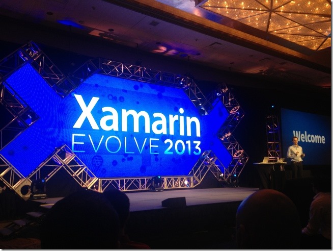
Last week I had the pleasure of attending Xamarin Evolve 2013 as both an attendee, a sponsor, and as a lightning talk presenter. This was one of the best conferences I’ve ever been to and I’m not just saying that because I’ve been involved with Xamarin’s iOS offerings for a long time. The conference was so great it’s incredibly hard to believe this was Xamarin’s first time hosting a conference. 600+ attendees at a beautiful venue in the amazing city of Austin, TX.

evolve-th

Announcements

During the keynote there were some big announcements that will really change the game for developers on this platform and in mobile development on the whole.

async/await

The move to the Mono 3.0 runtime for both Xamarin.iOS and Xamarin.Android opens the door for the async/await pattern as well as other important features from C# 5.0.

F# Support

Didn’t see this one coming, but I can certainly see it being useful for certain types of programs. Always use the right tool for the right job.

iOS Designer

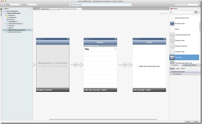
This one is huge. Xamarin already has an Android designer that is better than the designer shipped by Google. Now, the team has gone ahead and tackled possibly one of the biggest shortcomings of its iOS offering. Available now in the Alpha channel of Xamarin Studio is a designer for iOS XIB files. It’s a little buggy and rough around the edges right now but it will be a great addition to their tooling as it gets better. The designer is capable of rendering third party components and custom views which is something that Xcode is not capable of. This means you can see what your view will actually look like at design time. This will be fantastic for NucliOS development!

xamarin-designer-ios-th

Test Cloud

This was a huge “One More Thing”-style announcement made by Nat Friedman at the end of the keynote. Test Cloud is an ambitious new service from Xamarin that promises to “automatically test your app on hundreds of mobile devices”. You upload your application (Android or iOS, native or hybrid, Xamarin or not) to Test Cloud, choose the devices you want to run the tests on, and your app will be run on potentially hundreds of physical devices (depending on what you chose to run them on). The results of the test show you which devices failed the tests and you can even walk through the screenshots of each step in the test for all devices. This is nothing short of amazing and will really help Android developers work through the fragmentation issues they currently experience with respect to testing.

Conference review

The team at Xamarin put on quite a show for their first ever conference. The two day training was full of valuable information for both beginners and experienced Xamarin developers. The keynotes by Scott Hanselman and Josh Clark were very entertaining and informative. The Hilton Downtown Austin was a fantastic venue for a conference of this size. It never felt too big or too small for the crowd. The event staff was second to none and the video production crew rapidly took footage from the night before and turned it into masterpieces for the next day. The sessions I was able to attend were definitely worth the time. All in all, this was a great conference. Looking forward to next year already. I have posted a lot of pictures from the event on my personal blog.

Contact

Next stop for me is Code PaLOUsa 2013 and I leave tomorrow. If you have any questions or comments in the meantime, please feel free to email me at bschooley@infragistics.com or find me on Twitter@brentschooley.


Using SQLite3 as a Data Source in an Xcode Project (Objective-C)

$
0
0

Introduction

One important aspect of almost any application is the data source that provides or store data to the UI elements. In this article we'll wire up the most widely deployed SQL database engine in the world, SQLite, to the IGGridView. In addition you'll learn how to execute a SELECT statement on a SQLite3 database, and turn the results into NSMutableArray of custom objects.

The illustration below will be the final result.

image


Requirements

This article requires the use of the frameworks listed below.

  • CoreText
  • libsqlite3.dylib
  • QuartzCore
  • IG (the trial for NucliOS can be found here)

Create the Custom Object

Before retrieving the SQL data, we need to create the object model that will store data from each row returned from the SELECT statement. The 'Employees' table used in this example contains these fields:

  • Index (primary key)
  • Name (text)
  • Email (text)
  • Department (text)


Using this information about the fields we can create a simple NSObject to hold these values.

@interface EmployeeObject : NSObject
@property (nonatomic, retain) NSString *name;
@property (nonatomic, retain) NSString *email;
@property (nonatomic, retain) NSString *department;
@end


@implementation EmployeeObject
@synthesize department, email, name;
@end


Note:The 'Index' field is not stored in our object because we will not being using it for anything useful in this article.

Obtaining Data from the Database

Now that we have our custom object ready for the returned results we can focus on retrieving the path to the SQLite database file and executing a SELECT statement on the 'Employees' table. First we'll create a method to retrieve the path to our database file that's included in the Xcode project.

-(NSString *)getDatabasePath
{return [[[NSBundle mainBundle] resourcePath] stringByAppendingPathComponent:@"BasicData.db"];
}


Next, we'll create the method that takes the database path as an parameter and executes a SELECT statement on the 'Employees' table. We then loop through the rows and insert the results into the custom object, after which is placed into an NSMutableArray.

-(void)getSQLiteData:(NSString *)dbPath
{
    _sqliteData = [[NSMutableArray alloc] init];
    sqlite3 *database;if (sqlite3_open([dbPath UTF8String], &database) == SQLITE_OK) {constchar *sql = "select Name, Email, Department from Employees";
        sqlite3_stmt *selectStatement;if(sqlite3_prepare_v2(database, sql, -1, &selectStatement, NULL) == SQLITE_OK) {while(sqlite3_step(selectStatement) == SQLITE_ROW) {
                EmployeeObject *employeeObject = [[EmployeeObject alloc] init];
                employeeObject.name = [NSString stringWithUTF8String:(char *)sqlite3_column_text(selectStatement, 0)];
                employeeObject.email = [NSString stringWithUTF8String:(char *)sqlite3_column_text(selectStatement, 1)];
                employeeObject.department = [NSString stringWithUTF8String:(char *)sqlite3_column_text(selectStatement, 2)];
                [_sqliteData addObject:employeeObject];
            }
        }
    }
    sqlite3_close(database);
}

Wiring up the Data

With the methods created to obtain our data, we can now begin wiring up the data to the IGGridView. This article will use the viewDidLoad method for wiring the data. First, we'll set the view backgroundColor and call the getSQLiteData method to fill the NSMutableArray.

self.view.backgroundColor = [UIColor whiteColor];
[self getSQLiteData:[self getDatabasePath]];


Next we'll create the IGGridViewinstance and add it's view to the view controller's subviews.

_gridView = [[IGGridView alloc] initWithFrame:self.view.bounds style:IGGridViewStyleDefault];
_gridView.autoresizingMask = UIViewAutoresizingFlexibleHeight|UIViewAutoresizingFlexibleWidth;
_gridView.headerHeight = 0;
[self.view addSubview:_gridView];


Finally, we'll create the grid's IGGridViewDataSourceHelper instance, assigning our NSMutableArray as the data and the 'Department' field as the groupingKey. After which, the data source helper is assigned to the grid's dataSourceproperty.

_dsh = [[IGGridViewDataSourceHelper alloc] init];
_dsh.data = _sqliteData;
_dsh.groupingKey = @"department";
_gridView.dataSource = _dsh;

Download the Source

The Xcode project source code for this article can be downloaded by clicking this link. You will need to add the IG.framework to the Xcode project after you install the NucliOS trial.

A much easier to read format of this post can be found here.

The Microsoft ‘Most Valuable Professional’ Program

$
0
0

What is a Microsoft ‘Most Valuable Professional’?

The Microsoft ‘Most Valuable Professional’ (MVP) award is given out by the folks at Redmond to members of the Microsoft community that are judged to be leaders and influencers within their fields. In particular, focus is given to people who are very active online (with things like message boards, blogs, Twitter) as well as at conferences and events.

Microsoft has long enjoyed active and enthusiastic communities for many of its products (SharePoint, Dynamics CRM, and .NET platform are excellent examples) and the MVP award both acknowledges people who contribute to these communities, as well as helps to foster the activity in the first place. There are currently 4000 MVPs in 90 countries, covering 90 different Microsoft products. Microsoft estimates that these people answer more than 10 million questions a year.

So how do does one get involved? Let us explain.

Why become one?

MVPs are able to count themselves among a select group of professionals in the Microsoft world, and the various benefits of the program stem from this standing amongst peers. Useful as they are, they can best be categorized as intangible - things like respect among peers, a more direct line to Microsoft, and access to a wealth of useful technical resources.

The best way of thinking about the MVP Award, and its benefits, is not to think about it at all really. Better to focus on getting involved in the community, contributing online, and working to help your fellow professionals. Then, and really only then, should you consider the MVP program. Over the years, Microsoft has become very adept at judging the Award and who is suitable, and it is much better to apply once you have some standing in the community. Treat it as a reward rather than a goal.

How do I become one?

There are no actual set rules for becoming an MVP. This is in part due the varied nature of Microsoft’s products. What makes an Azure expert an MVP, might differ from what makes someone who works with Windows Phone OS an MVP. However, Microsoft does provide some basic guidelines for things they take into account. This list includes:

  • Contributions to Microsoft Answers, TechNet, and MSDN
  • Contributions to wikis, blogs, and other online content
  • Appearances at conferences and user groups
  • Articles and books authored

Here are a few more tips we have garnered from past and present winners, we hope they prove useful:

  • “Don’t focus too much on winning the award, rather sharing knowledge online and being helpful to users in your community.”
  • “The MVP award has always been proud of being independent from Microsoft. Bear this in mind.”
  • “An MVP award is generally for a particular focus on a particular product. This isn’t for ‘jacks of all trades’”
  • “The award is for one year only, so don’t stop doing what you do if you wish to be renewed, Microsoft is always watching!”

Are there Microsoft MVPs at Infragistics?

Yes, there are! Infragistics is proudly home to several Microsoft MVPs, with more to come in the future. Our current MVPs are:

NetAdvantage for WPF Release Notes – 13.1 Volume Release

$
0
0

Release notes reflect the state of resolved bugs and new additions from the previous release. You will find these notes useful to help determine the resolution of existing issues from a past release and as a means of determining where to test your applications when upgrading from one version to the next.

Release notes are available in both PDF and Excel formats. The PDF summarizes the changes to this release along with a listing of each item. The Excel sheet includes each change item and makes it easy for you to sort, filter and otherwise manipulate the data to your liking.

Download the Release Notes

NetAdvantage for Silverlight Release Notes – 13.1 Volume Release

$
0
0

Release notes reflect the state of resolved bugs and new additions from the previous release. You will find these notes useful to help determine the resolution of existing issues from a past release and as a means of determining where to test your applications when upgrading from one version to the next.

Release notes are available in both PDF and Excel formats. The PDF summarizes the changes to this release along with a listing of each item. The Excel sheet includes each change item and makes it easy for you to sort, filter and otherwise manipulate the data to your liking.

Download the Release Notes

NetAdvantage for WPF Release Notes – April: 13.1 Service Release

$
0
0

Release notes reflect the state of resolved bugs and new additions from the previous release. You will find these notes useful to help determine the resolution of existing issues from a past release and as a means of determining where to test your applications when upgrading from one version to the next.

Release notes are available in both PDF and Excel formats. The PDF summarizes the changes to this release along with a listing of each item. The Excel sheet includes each change item and makes it easy for you to sort, filter and otherwise manipulate the data to your liking.

In order to download release notes, use the following links:

WPF 2013 Volume 1 Service Release

PDF - NetAdvantage for WPF 2013 Volume 1 (Build 13.1.20131.2032)
Excel - NetAdvantage for WPF 2013 Volume 1 (Build 13.1.20131.2031)

NetAdvantage for Silverlight Release Notes – April: 13.1 Service Release

$
0
0

Release notes reflect the state of resolved bugs and new additions from the previous release. You will find these notes useful to help determine the resolution of existing issues from a past release and as a means of determining where to test your applications when upgrading from one version to the next.

Release notes are available in both PDF and Excel formats. The PDF summarizes the changes to this release along with a listing of each item. The Excel sheet includes each change item and makes it easy for you to sort, filter and otherwise manipulate the data to your liking.

In order to download release notes, use the following links:

Silverlight 2013 Volume 1 Service Release

PDF - NetAdvantage for Silverlight 2013 Volume 1 (Build 13.1.20131.2029)
Excel - NetAdvantage for Silverlight 2013 Volume 1 (Build 13.1.20131.2029)

Custom Axis Labels on iOS Charts (Objective-C and C#)

$
0
0

Introduction

When visualizing data and presenting it to your users, the readability of your presentation is key. Users should be able to look at the graphic like a body of text and have an understanding of what is being presented. One key element that provides easier readability are axis labels, in this article we'll cover how to customize the x and y axis labels found on the NucliOS IGChartView.

The illustration below is a clipped portion of the final result that shows custom axis labels.

image

Requirements

This article requires the use of the following frameworks. The requirements have been split depending on your use of Objective-C or C# (using Xamarin.iOS).

Objective-C

  • QuartzCore
  • IGChart

C#

  • IGChart.dll

Note: The trial for NucliOS can be found here.

Creating the Custom Data Object

Before customizing axis labels and filling an array full of data, we need to build the object that will represent each data item. The data object contains two properties, one for territory and one for cost.

C#
public class GraphObject : NSObject
{
    [Export("Territory")]
    public String Territory {get; set;}
    [Export("Cost")]
    public Double Cost {get; set;}
    public GraphObject() {}
}


Objective-C
@interface GraphObject : NSObject
@property (nonatomic,retain) NSString *territory;
@property (nonatomic, assign) double cost;
@end
@implementation GraphObject
@synthesize cost, territory;
@end

Generating Data

The data source for this article will create random data based on the custom data object named GraphObject that we created in the last step. Each object created is added to an array that will be used with the IGCategorySeriesDataSourceHelper.

C#
private void generateData()
{
    String[] territories = new string[] {@"Canada", @"Finland", @"Holland", @"Japan", @"USA"};
    for (int i = 0; i < 5; i++)
    {
        GraphObject graphObject = new GraphObject();
        graphObject.Territory = territories[i];
        graphObject.Cost = new Random(i).Next(100000);
        _data.Add(graphObject);
    }
}


Objective-C
-(void)generateData
{
    NSArray *territories = [NSArray arrayWithObjects:@"Canada", @"Finland", @"Holland", @"Japan", @"USA", nil];
    for (int i = 0; i < 5; i++)
    {
        GraphObject *graphObject = [[GraphObject alloc] init];
        graphObject.territory = [territories objectAtIndex:i];
        graphObject.cost = arc4random() % 100000;
        [_data addObject:graphObject];
    }
}

Adopting the IGChartViewDelegate Protocol

Adopting the IGChartViewDelegate protocol in Objective-C is simple and consists of adding IGChartViewDelegate to your @interface declaration.

@interface igViewController : UIViewController <IGChartViewDelegate>
@end


In C#, we must create a class that derives from IGChartViewDelegate and override any methods we wish to take advantage of.

public class ChartViewDelegate : IGChartViewDelegate
{
    //..
}

Customizing Axis Labels

With the IGChartViewDelegate protocol adopted, it's now possible to implement the ResolveLabelForAxis (C#) or labelForAxis (Objective-C) method. This method's parameters consist of the IGChartView instance that called the method, the axis, and the data point item or number item depending on the type of axis that is requesting a label string. The sample source used in this article checks the axis key and returns a label string. Since we'll be using a column series chart type, the x-axis will use the supplied territory name as the label, and the double value y-axis will be formatted using NSNumberFormatter to display the value in a currency format.

C#
public override string ResolveLabelForAxis (IGChartView chartView, IGAxis axis, NSObject item)
{
    if (axis.Key.Equals("xAxis"))
    {
        return ((IGCategoryPoint)item).Label;
    }
    else if (axis.Key.Equals("yAxis"))
    {
        NSNumberFormatter formatter = new NSNumberFormatter();
        formatter.NumberStyle = NSNumberFormatterStyle.Currency;
        return formatter.StringFromNumber((NSNumber)item);
    }
    return String.Empty;
}


Objective-C
- (NSString *)chartView:(IGChartView *)chartView labelForAxis:(IGAxis *)axis withItem:(NSObject *)item
{
    if([axis.key isEqualToString:@"xAxis"])
        return ((IGCategoryPoint *)item).label;
    else if ([axis.key isEqualToString:@"yAxis"])
    {
        NSNumberFormatter *formatter = [[NSNumberFormatter alloc] init];
        [formatter setNumberStyle:NSNumberFormatterCurrencyStyle];
        return [formatter stringFromNumber:(NSNumber *)item];
    }
    return nil;
}

Putting the Pieces Together

Everything is now in place to generate the data we need and provide the customized axis labels. Using the ViewDidLoad (C#) or viewDidLoad (Objective-C) method, we'll put the pieces together. To start, we'll generate our data and wire it up to the IGCategorySeriesDataSourceHelper.

C#
this.generateData();
_source.Data = _data.ToArray();
_source.ValuePath = @"Cost";
_source.LabelPath = @"Territory";


Objective-C
_data = [[NSMutableArray alloc] init];
[self generateData];
_source = [[IGCategorySeriesDataSourceHelper alloc] init];
_source.data = _data;
_source.valuePath = @"cost";
_source.labelPath = @"territory";


Next we'll create the chart instance and add a column series that uses our generated data with custom axis labels.

C#
RectangleF chartRect = this.View.Frame;
chartRect.Inflate(-30.0f, -30.0f);
_chart.Frame = chartRect;
_chart.AutoresizingMask = UIViewAutoresizing.FlexibleHeight|UIViewAutoresizing.FlexibleWidth;
_chart.Theme = IGChartGradientThemes.IGThemeDark();
_chart.Delegate = new ChartViewDelegate();
this.View.Add(_chart);
_chart.AddSeries(new MonoTouch.ObjCRuntime.Class("IGColumnSeries"), "series", _source, "xAxis", "yAxis");


Objective-C
_chart = [[IGChartView alloc] initWithFrame:CGRectInset(self.view.frame, 30.0, 30.0)];
[_chart setAutoresizingMask:UIViewAutoresizingFlexibleWidth|UIViewAutoresizingFlexibleHeight];
_chart.theme = [IGChartGradientThemes IGThemeDark];
_chart.delegate = self;
[self.view addSubview:_chart];
[_chart addSeriesForType:[IGColumnSeries class] usingKey:@"series" withDataSource:_source firstAxisKey:@"xAxis" secondAxisKey:@"yAxis"];


Illustrated below is the final result when the project is ran.

image

Download the Source

The Xcode and Xamarin.iOS project source code for this article can be found at these locations.

Project source for Xamarin.iOS (C#)
Project source for Xcode (Objective-C)


Note: Remember to add IGChart.framework to the project if you're using Xcode, or IGChart.dll to the project if you're using Xamarin.iOS. The trial for NucliOS that contain the necessary files can be found here.

A much easier to read format of this post is available here.


Scratch - The Most Ingenious (and Simple) Programming Tool Ever Created!

$
0
0

In my first programming class back at National Computer Camp (shoutout to NCC grads!), there was no such thing as Scratch, or, a cute way to learn programming concepts. I sat there with my monitor and listened to my counselor, who was younger than I am now, and tried to puzzle out the logic behind these completely foreign concepts. The way things were made simpler for us was to use… BASIC.  

Now, fast-forward to the MOOC world with all kinds of adults from all over the world taking an intro to programming class over the internet. We have our shiny new VMs installed and we’re ready to go. However, some people have no background in programming logic – you know, for loops, if loops, while loops, Boolean statements, I could go on and on.

With the foresight of professors who have been around the block a few times, instead of diving directly into writing code, we started our class off with MIT’s Scratch.

What is Scratch?

The MIT creators describe Scratch as a graphical programming language. It was developed by the Lifelong Kindergarten Group at the MIT Media Lab and was made possible by funding from the National Science Foundation, Microsoft, Intel Foundation, MacArthur Foundation, Google, Iomega and the MIT Media Lab research consortia. The purpose of creating Scratch was to enable students “to think creatively, reason systematically, and work collaboratively.”

How Does That Translate to Programming?

The functionality of Scratch is actually ingenious, in my opinion. In a purely graphical interface, the user can select from a variety of programming functions to literally puzzle together a basic program. When you first install and open Scratch, you’re presented with the following home screen:

From here you can upload your own custom sprites to animate in your program, which is what I would suggest doing first. After you’ve gotten your creative out, turn your attention to the left hand toolbar. In the top left you have a variety of tool categories, which looks like this:

One of the best things about scratch is that it is about as wysiwig programming as you can possibly get. The motion category? Those manage the movement of your sprites. Sound? You guessed it, the audio. Variables? That allows you to create those pesky buggers who hold information! As you navigate through these categories you can get a pretty solid feel for the capabilities (and limitations as well) of Scratch. You’re not going to create the next $50million iOS app in here, but it is a really great place to get started and learn the basic concepts of programming.

How Exactly Can You Create Something With Scratch?

Creating with Scratch is the most fun aspect of the entire process! On the left toolbar below the tool categories, as you navigate through the categories, the tools available appear below the category section, and the category is highlighted (and the colors match, which makes my design brain very happy).

Once you have the toolbars available, all you have to do to create actions in your program is link the commands together. If you take a peek at the image above, you’ll see that each command conveniently even looks like a puzzle piece, to encourage you to build something awesome!  Here’s an example of a basic program that was created in Scratch:

As you can see, it’s incredibly easy to read through the commands and decipher what this program is intended to do – even for the most novice developer.

Bringing It All Together

Overall, this post is basically a big love-fest for Scratch. Coming back into programming cold after not working with code or coding concepts at all for years, being able to solely focus on the logic of what I wanted to build was invaluable. For me personally, Scratch gave me a chance to warm back up to programming without the struggle of syntax and that made my transition much smoother than it would have been otherwise.

Did You Actually Make Anything?

That’s a great question! I made the most in depth and amazing game known to humankind. You can play it live from the Scratch website!

Questions/Comments?

Feel free to comment here on my blog, or find me on Twitter @DokiDara.

By Dara Monasch

Android User Interfaces Resources

$
0
0

One of the biggest challenges for Android developers is the swift development of the operating system. No sooner was ‘Ice cream sandwich’ released (December 2011) then ‘Jelly Bean’ came along (twice actually - June and November 2012 - Google didn’t deem the second release worthy of a new name). This poses a number of issues, not least changes to the user interface standards and styles used in the various versions. ‘Honeycomb’, released in February 2011, is a case in point. This was the first version of the OS designed specifically for tablet devices, and as a result had its own unique interface requirements. ‘Ice cream sandwich’ unified the OS for the first time, and again Google introduced new guidelines to cater for the wider range of devices supported.

So how is a good developer supposed to keep up? What help is available to ensure Android interfaces match their mobile rivals? One of the best ways is to use pattern libraries. These websites and resources provide standard interface patterns (as well as tips and tricks, and code samples) to help developers create beautiful user interfaces. Specialist sites exist, which focus solely on Android devices, and below we present our current favorites. Check them out and let us know in the comments if you use any other good ones.

Android Pattern Libraries

  • The official Android developer’s site
    • Your first stop should be the official Android site. This contains the latest guidelines and documentation, and should be treated as the most up-to-date advice available.
  • Android App Patterns
    • This site includes well over a thousand screenshots across a wide range of categories (such as calendars, maps, menus etc.). This site also includes screenshots of 150 complete apps, which provides a really nice way to look holistically at how an app is made up.
  • Android Patterns 
    • This site contains a great number of wireframes covering all aspects of Android apps. The depth of content is fantastic, with many pages offering extra tips, pros and cons, sample screenshots and more. An essential resource.
  • Android UI Patterns
    • More of a blog than a traditional patterns site, this site offers a number of useful articles and resources.
  • Smashing Magazine
    • Smashing Magazine is a great resource for developers, and generally has a good focus on interface and design articles. The linked article, from last year, includes some very useful tips for designing Android apps.

If you are looking for a High quality book on Android design with a focus on patterns and anti-patterns check out “Android Design Patterns” by Greg Nudelman.  This book was tech-edited by Infragistics Principal Design Technologist, Ambrose Little

ReportPlus v2.0 released!! More than 50% off for April!!

$
0
0

I'm very pleased to announce that a brand new release of ReportPlus is available for download in the app store. It's the second major release, ReportPlus v2.0, and It shipped with some amazing features such as:

  • iPhone support, 
  • Dashboard styling & branding
  • Dashboard Templates
  • Localization
  • Open & Save from repositories in the Cloud
  • Password locked dashboards
  • Plus a host of new data source connectors

This release was aimed at broadening the audience and appeal of the application. It's about giving more options to the user, at very different levels, device, style, languages, and also connectors. Always staying true to the vision of a self service & collaborative approach to generating business intelligence assets anywhere, allowing to share them in different formats.

Not only iPad anymore

With version 2.0 ReportPlus stops being an iPad only application, to include iPhone support as well. Taking after SharePlus, we've made ReportPlus a universal build. Meaning with the same purchase you can get it in all your iOS devices (iPod Touch, iPhone & iPad).

It's a pocket version of the iPad's user interface, but it has all the same features and capabilities of the iPad experience, so you can use it both for viewing, and for creating dashboards.

iPhone Business Intelligence

Dashboard Styling & Branding

From now on, ReportPlus' dashboards don't have to stick with the same look & feel of white background and dark titles. You can style both at the dashboard level, as well as at the widget level background color, title, margins, paddings, etc. 

We did this for two reasons. The first one is to allow the designer of a dashboard to incorporate gestalt principles of visual perception, such as: proximity, enclosure, and similarity into the dashboard design process . By establishing (or removing) margins, and borders between dashboard widgets the user is able to provide grouping and association cues, that will help the viewer digest the information better.

The second one is to enable the designer to incorporate corporate branding material into the dashboard design, something that according to our user base is desirable in some scenarios, specially when dashboards are being shared across organisational boundaries, and you need to leave a very clear mark of where the value was generated from. 

The following are two sample styled dashboards.

NewImage

Mobile BI Dashboard

Dashboard Templates

Dashboard templates are pre canned dashboards meant to minimize the time to value of the application. It's a shortcut to have a dashboard up & running connected to your data, without the need for the user to be savvy on concepts such as data aggregations, and data analysis. It's included in the dashboard creation process as an alternative option. This release ships with 10 preloaded templates, with time, we'll be adding more and improving the existing ones. 

Dashboard Template ReportPlus

Open & Save dashboards from shared repositories

Some users would generate awesome dashboards, and would email them to management. Management would be delighted, but would always request some change, which leads to another email with the modified version, and then another, and before you know it you have different versions of the same dashboard on your inbox. Version 2.0 enhances this type of collaboration by allowing users to save and open dashboards from shared file repositories such as: SharePoint, Google Drive, and Dropbox, making this iterative dashboard design process flow better. By the way the enterprise version has an even improved version of this, but I won't go into that now.

ReportPlus Open Dashboard

Password locked dashboards

Enabled password lock in order to share dashboard for viewing only purposes, retaining control over who makes changes to a dashboard's design.

Dashboard

More & more popular data source connectors

ReportPlus v2.0 ships with support for connecting to many new data sources, among them:

  • Microsoft Dynamics CRM
  • Salesforce
  • PostgreSQL
  • Hadoop Hive
  • Google Drive
  • Google Analytics
  • Facebook Analytics
  • Twitter

Promotional price for the next 5 days

Get a 66% discount by purchasing it before May comes! Then it will go back to it's 29.99 usual price.

Ignite UI Release Notes - April: 13.1 Release and Service Release

$
0
0

With every release comes a set of release notes that reflects the state of resolved bugs and new additions from the previous release. You’ll find the notes useful to help determine the resolution of existing issues from a past release and as a means of determining where to test your applications when upgrading from one version to the next.

Release notes are available in both PDF and Excel formats. The PDF summarizes the changes to this release along with a listing of each item. The Excel sheet includes each change item and makes it easy for you to sort, filter and otherwise manipulate the data to your liking.

Download the Release Notes

Ignite UI 2013 Volume 1

NetAdvantage for ASP.NET Release Notes - April: 13.1 Release and Service Release

$
0
0

With every release comes a set of release notes that reflects the state of resolved bugs and new additions from the previous release. You’ll find the notes useful to help determine the resolution of existing issues from a past release and as a means of determining where to test your applications when upgrading from one version to the next.

Release notes are available in both PDF and Excel formats. The PDF summarizes the changes to this release along with a listing of each item. The Excel sheet includes each change item and makes it easy for you to sort, filter and otherwise manipulate the data to your liking.

Download the Release Notes

ASP.NET 2013 Volume 1

FT. Wayne .NET User Group Follow Up

$
0
0

Well, it has been exactly one week since I presented at the Ft. Wayne .NET User Group in Ft. Wayne Indiana.  Why did it take me so long to write my follow up post?  What can I say, I’m a busy guy.  What matters is that I have time now.  So here it goes.

I flew into Indiana on April 13, because I have family in South Bend.  Which, luckily for me, is only an hour away from Ft. Wayne.  So it was a no-brainer.  After visiting with my family for a few days, I hit the road to the Northeast Indiana Innovation Center in Ft.Wayne Indiana the evening of April 17.  The drive there wasn’t that bad, although I managed to get stuck behind someone going 40 in a 55, which was driving me crazy.  Keep in mind, I am on a two lane road (one lane for each side of traffic), in the back roads of Indiana.  The roads were winding and narrow, so there was no possibility for passing.  Fortunately I made it to the meeting on time.

When I arrived I was met by the group leader Armanda Turney.  A super nice lady, that gave me pizza.  Hmmmmm….. yummy!  Let’s just say she immediately won me over.  This group was very welcoming and we sat around talking about all kinds of stuff for about 30 minutes.  Finally, after eating our pizza and wrapping up our side conversation, it was time to get to business.  The topic chosen by the group was my “Building Composite XAML Applications with Prism” talk.  This has no doubted become my most popular talk.  It seems that the user group ciruit is saturated with Windows 8 and HTML/jQuery, so most groups are relieved to have a topic not related to either of those.  Plus, it seems no one else talks about it, so it has remained a unique talk.  Just so you guys know, I have a lot of other talks :0).

So without further adieu, here are the download links for all the sample code we wrote/covered.

Download the Live Demo source code
Download the Prism DelegateCommand sample
Download the Prism CompositeCommand sample
Download the Prism EventAggragator sample

I would like to thank the .NET Users of Ft. Wayne for inviting me to come speak at their group.  I had a great time, and enjoyed the people and conversations.  I hope I can return to give another talk in the near future.

.NET Users of Ft. Wayne

Elements of a Pivot Grid - XamPivotGridGrouping 3

$
0
0

XamPivotGridGrouping 3 – Elements of a Pivot Grid

In my last blog, we built out a GroupingFlatDataSource which we can use to supply the data to our XamPivotGridGrouping control.Before we start to look at exactly how to go about that, let’s review the requirements of our project, and then take a look at the control itself, and the accompanying XamDataSelectorGrouping control, by examining some of the key elements in the control.

PROJECT REQUIREMENTS:

For our project, we are building a “Statistics” review tool to allow us to examine NFL player stats in a variety of different ways.Our focus, of course, is on the XamPivotGridGrouping.The basics of what we are being asked to do with the control are as follows:

  • The Player Label must show both the Player name and an image of the player. Player name will be bold and font-size 16pts.
  • The Team Label must show the team logo.
  • The Position Label must show an image (silhouette) and abbreviated text regarding player position and will be font-size 24pts.
  • Type (Pass, Rush, Def), Category (Yards, Score, TO) and Statistic columns must be static in their position and cannot be moved, or removed from the row listing. As a result, they should not be visible in the Rows section of the DataSelector nor should they be listed in the Field Selection area.
  • Name, Team, Position must all be sortable (A-Z, Z-A) across the entire data set.
  • The statistic results for Passer Rating, Avg Yards Passing, Avg Yards Rushing, Comp %, FG %, and XP% must be calculated based on the visible values relating to their formulas.
  • These same fields will be highlighted with unique color schemes for the Row Headers and the Data Rows. All other statistical results will be white/white.
  • The Data Selector Field Selection area will not list hierarchal data fields, but rather the specific field (dimension/measure) that is available, and will display a custom icon.
  • The “Measures” area will be hidden, because for the purposes of this application, the only measure will be Statistic Total, and it should not be removable.
  • The Control will be styled based on a specific scheme.

Before we start to dig into these requirements, let’s take a closer look at the control and its elements, so we start to get an understanding of what we will need to do to fulfill the stated requirements.

CONTROL ELEMENTS

There are two specific controls we need to examine to fulfill our required specs, the XamPivotGridGrouping control and the XamDataSelectorGrouping control.We’ve looked at what the XamPivotGridGrouping does in general, so let’s briefly overview the DataSelector as well.

The XamDataSelectorGrouping can greatly aid in the manipulation of your data at runtime.Its purposeis to allow users to select data.Given a DataSource (such as the one we built in the last blog), the XamDataSelectorGrouping can give you an interactive UI component to select a database to connect to (if you are using database data), a choice of which cube to extract data from (if you have multiple cubes), and a set of measures. When you have selected those a tree will be loaded with all the available dimensions with their respective hierarchies along with a list with all the available measures.

Figure 1 - XamDataSelectorGrouping

The XamDataSelectorGrouping along with the XamPivotGridGrouping controls are both required for us to effectively satisfy the project’s requirements.Let’s take a more detailed look at the elements of each one, starting with the XamPivotGridGrouping

XAMPIVOTGRIDGROUPING CONTROL

The image below divides the XamPivotGridGrouping into 4 sectors:

  • Measures & Filters
  • Row Headers
  • Column Headers
  • Data Cells

Figure 2 - XamPivotGridGrouping Sectors

Let’s examine these areas, and their function, briefly.

Measures & Filters

In this area you would normally see the measures (Total in this sample is the Measure) and any hierarchies which had been placed in the filter area, but which are not in any of the other sectors.Any hierarchy can only be placed within a single collection (Rows, RowsGroups, Columns, Filters, Measures) at any given time.Measures can be any numeric dimension of the data.When measures are added the XamPivotGridGrouping will show aggregate computation data for that specific slice.If no rows or columns are specified, the grid will display the sum of the dimension for all the items in the input data.For example, if we were to remove all the columns, our resultant grid would look like this:

Column Headers

When you add a hierarchy to the Columns area, a new slice with the current rows will be created.Adding more hierarchies to the same area dices the data.Unlike in the XamPivotGrid, the XamPivotGridGrouping shows the hierarchy tree in a horizontal structure.When you expand or collapse the columns you can drill down or up into the data.


Figure 3 - Column Headers

Notice that the Parent columns for 2012 and Week 1 are now empty.This means that all data items are assigned to either the First Half or Second Half hierarchies (or their child hierarchies).If there was a Pass Yards statistic that was set for Week 1, but was not assigned a value for any further hierarchies, that remainder would be displayed in Week 1.

Row Headers

Row headers, similar to Column headers, slice the data.The difference now is the data is being sliced based on the current columns.Adding more hierarchies to Rows dices the data.The hierarchy tree for rows is display horizontally as well, and can be confusing because people sometimes fail to understand that these are notdata cells, but rather is a grouping of hierarchical row headers.For example, in the image below, the row hierarchy is highlighted.

As you can see clearly, the Team, Position, Type, Category and Statistic Row headers are all children of the Name hierarchy.Remember our requirement that states “Name, Team, Position must all be sortable (A-Z, Z-A) across the entire data set.”?How do records in a hierarchical set sort?They sort within the confines of the hierarchy.There is an issue here which we will need to resolve.

Data Cells

Our last sector is the Data Cell sector.This sector shows the data computed as a result of the requested slice(s).In other words, this is a query to the data source, which has been defined by the hierarchies in the rows and columns, filtered by those hierarchies in the filters area (if any), and computed based on the measure(s).

You can place conditional formatting on the data cells by providing a template or style for each cell or you can allow the grid itself to display numeric format for the data.

Digging Deeper - XamPivotGridGrouping

The table below lists the key elements of each of these areas that we are going to need to concern ourselves with in order to meet the project requirements.

As you can see, there are a lot of moving parts to concern ourselves with.Let’s finish up this post by looking a little closer at the XamDataSelectorGrouping control.

XAMDATASELECTORGROUPING CONTROL

The image below divides the XamDataSelectorGrouping into 6 sectors:

  • Hierarchies
  • Filters
  • Columns
  • Rows
  • Measures
  • Row Groups


Figure 4 - Data Selector Sectors

Let’s examine these areas, and their function, briefly.

HIERARCHIES

This area can provide both a Database selector, and cube selector if you are connected to a database for data.Additionally, it provides the measures and dimensions that the grid will use.Each item in the list is a hierarchical structure.It can be modified to limit the items which appear in the list.

FILTERS

This area is a drop target for adding dimensions into the filters collection.

COLUMNS

This area is a drop target for adding dimensions into the columns collection.

ROWS

This area is a drop target for adding dimensions into the rows collection.

MEASURES

This area is a drop target for adding dimensions into the measures collection.

ROW GROUPS

This area is a drop target for adding dimensions into the row groups collection.The Rows Groups area allows the pivoted data rows to be grouped by the associated dimension, as shown below:


Figure 5 - Row Grouping

Digging Deeper - XamDataSelectorGrouping

The table below lists the key elements of each of these areas that we are going to need to concern ourselves with in order to meet the project requirements.

Even More Elements

In addition to those elements listed above, we have some other items which we will need to modify/style or behavorialize in order to satisfy the specifications.These are as follows:

FIELD CHOOSER


The Field Chooser is essentially a Popup control.It is sourced by a collection of AreaItemData objects and we will need to adapt this to fit some specific limitations.


FILTERING CONTROL


The filtering control which also is essentially a popup control manages the ability to filter the hierarchies.Based on our requirements, we’ll need to modify this control and add sorting features here for the ability to Sort the associated column/row from A=>Z or Z=>A.

Before I close this post out, let’s take the data source we created in my last post, and apply it to the XamPivotGridGrouping, and the XamDataSelector.

For demonstration purposes, my main window contains 3 user controls.The XAML is as follows:

<local:PivotGridGroupingMainx:Name="CustomGroupingPivotGrid"
                             DataContext="{BindingPath=DataContext,
                                                  RelativeSource
={RelativeSource
                                                  AncestorType=Window}}"
                             Grid.Column="1"Grid.Row="1"
                             Visibility
="{Binding 
                                            ElementName
ShowCustomizedGroupingPivotGrid, 
                                            Path
=IsChecked, 
                                            Converter
={StaticResource 
                                            boolToVisibilityConverter
}}"/>

<local:StandardPivotGrid x:Name="BasePivot"Grid.Column="1"Grid.Row="1"
                         DataContext="{Binding Path=DataContext, 
                                          RelativeSource
={RelativeSource
                                          AncestorType=Window}}"
                         Visibility="{Binding ElementName=ShowBasePivotGrid,
                                       Path
=IsChecked,
                                       Converter
={StaticResource
                                                     boolToVisibilityConverter}}"/>

<local:StandardGroupingView x:Name="GroupingViewPivot"
                           
Grid.Column="1" Grid.Row="1"
                            DataContext="{Binding Path=DataContext,
                                               RelativeSource
={RelativeSource
                                               AncestorType=Window}}" 
                            Visibility="{Binding ElementName=ShowGroupingPivotGrid,
                                            Path
=IsChecked,
                                            Converter
={StaticResource
                                                         boolToVisibilityConverter}}"/> 

As you can see here, I am passing the datacontext of the main window ( an object called GroupingMainViewModel) to the StandardGroupingView.DataContext via a binding.There are several ways I could do this, but this seemed the most effective for this sample.

Inside the StandardGroupingView there is a XamPivotGridGrouping item and a XamDataSelectorGrouping item.The XAML for these is also shown here:

<ig:XamPivotGridGrouping x:Name="BaseGroupingPivot" Grid.Row="1" Grid.Column="1"
                         DataSource="{Binding StatisticResultsDataSource}">
     <ig:XamPivotGridGrouping.RowGroupBySettings>
          <ig:RowGroupBySettings Indent="10">
          ig:RowGroupBySettings>
     <
ig:XamPivotGridGrouping.RowGroupBySettings>
     <ig:XamPivotGridGrouping.FieldChooser>
          <ig:FieldChooser RowsItemsSource="{Binding RowsChooseList}" 
                           MeasuresItemsSource="{Binding MeasuresChooseList}" 
                           DisplayMemberPath="Caption"MeasuresGroupHeader="Measures"
                           RowsGroupHeader
="Columns"
                           FieldUniqueNameMemberPath="ItemUniqueName"
                           FieldOrdinalMemberPath="Index" MaxHeight="500" Width="22"/>
          <ig:FieldChooser.GroupHeaderTemplate>
               <DataTemplate>
                    <Grid>
                         <ContentControl Margin="10, 2" Content="{Binding}"BorderThickness="0"  
                                         FontWeight="Bold"FontStyle="Italic" />
                    Grid>
               
DataTemplate>
         
ig:FieldChooser.GroupHeaderTemplate>
     
ig:FieldChooser><ig:XamPivotGridGrouping.FieldChooser>
ig:XamPivotGridGrouping>
<ig:Expander Grid.Column="2" Grid.Row="1" >
     <ig:XamDataSelectorGrouping x:Name="dataSelector"
                                 DataSource="{Binding DataSelectorFlatDataSource}">
<
ig:XamDataSelectorGrouping>

Both the DataSelector and the PivotGrid are bound to a property of the GroupingMainViewModel:

publicGroupingFlatDataSource StatisticResultsDataSource
{
   get 
   {
      if(DataConstructor.OffensiveStaticstAllTeamsData != null) 
      {
          return DataConstructor.OffensiveStaticstAllTeamsData; 
      }
      DataConstructor.OffensiveStatisticsAllTeams();
      return DataConstructor.OffensiveStaticstAllTeamsData; 
   }
} 

publicGroupingFlatDataSource DataSelectorFlatDataSource
{
    get
    {
          return DataConstructor.OffensiveStaticstAllTeamsData;
    }
}

These properties both return the OffensiveStaticstAllTeamsData property from the DataConstructorViewModel, which is itself a property of the GroupingMainViewModel:

privatereadonlyDataConstructorViewModel m_data;

publicDataConstructorViewModel DataConstructor
{
    get
    {
         return m_data;
    }
}

So you can see, both the grid and the data selector are bound to the same data source.

Without making any further changes, if we run the sample, here is what our XamPivotGridGrouping will look like:


Figure 6 - Standard View of XamPivotGridGrouping

Where are our expanding group columns?This looks exactly like the XamPivotGrid!What’s going on!?!

There are a couple more settings we need to apply to the XamPivotGridGrouping to get us closer to what we expect.In the XAML we need to add the following to our declaration of the grid:

<ig:XamPivotGridGrouping x:Name="BaseGroupingPivot"
                         Grid.Row
="1" Grid.Column="1"
                         DataSource="{Binding StatisticResultsDataSource}"
                                   ParentInFrontForColumns="True"
                         UseColumnGroupByView="True">

UseColumnGroupByView must be set to true to enable the style of column grouping we want.And I am also setting ParentInFrontForColumns to assure that my parent column is at the front of my column hierarchy.

Now when we run it we get a little closer to our desired result:


Figure 7 - XamPivotGridGrouping View

This gives us a pretty solid idea of how much work we have in front of us.As I mentioned before, there are a lot of moving parts in the XamPivotGridGrouping and quite a few in the XamDataSelectorGrouping as well.Now that we have an idea of at least some of what’s involved, we can start the process of implementing our requirements and modifying the XamPivotGridGrouping control to fit what has been spec’d out.

In my next post we’ll look at how we can modify the XamDataSelectorGrouping items so that we can meet the specification of no hierarchies there, and we’ll also look at how to handle adding custom RowHeader Templates to add images and change font sizes for the Name, Team and Position Row Headers.


Adding Keyboard Shortcut Support to the WPF XamOutlookBar

$
0
0

I recently received a question regarding support for keyboard shortcuts for changing groups in the Infragistics WPF xamOutlookBar.  If you are a user of Microsoft Outlook, you may have noticed that you can navigate to the different outlook groups using simple keyboard shortcuts.  For example, you can press CRTL+2 to navigate to the Calendar group, or CRTL+3 to navigate to the Contacts group.  The idea here is that a user can use their keyboard to navigate the groups contained within the Outlook bar navigation.  Unfortunately, I discovered that our WPF xamOutlookBar did not support this behavior.  So began my quest to find a solution.  I actually came up with two solutions.  I will describe them both and you can decide which approach you like best.

The Requirements

Before we run off coding up solutions, we should probably talk about how this feature should work.

  1. The first obvious requirement is that we should be able to change selected groups within the xamOutlookBar control using keyboard shortcuts.
  2. I want to be able to assign which key modifiers (CTRL, ALT, SHIFT) and keyboard key (A, B, C) combination will invoke the changing of groups.
  3. I want to be able to assign multiple key gesture combinations to a single group.  So if I want CTRL+1 and SHIFT+1 to navigate to the same group, that should be supported.
  4. I know the problems you can have with focus and keyboard events in WPF.  So, it is important that no matter which control has focus or where I am at on my screen, I should be able to change outlook bar groups with my shortcut key combination.

That’s about covers it.  Let’s get to the problem solving!

Approach One

The first approach I took was to take advantage of the built-in WPF InputBindings.  Here I will define a number of KeyBindings at the Window level, because I want the shortcuts to execute no matter where I am in my view or what has focus.  This means I am going to need an ICommand to bind to my KeyBindings and invoke the changing of the groups depending on my key combination.  The problem is, this command will need to know the key modifiers, the key pressed, and have access to all the groups in the xamOutlookBar control.  So I can give my command all these items if I use the KeyBinding object itself as the CommandParameter.  I will store the xamOutlookBar control itself through the CommandTarget property.  Which will give me access to everything I need.  I will also use the built-in InputBindings to assign my shortcut combinations/gestures to an OutlookBarGroup.  Let’s take a look at the code.

<Window.InputBindings>
    
    <KeyBinding Modifiers="Control" Key="D1"
                Command="{Binding ChangeGroupCommand}"
                CommandParameter="{Binding RelativeSource={RelativeSource Self}}"
                CommandTarget="{Binding ElementName=xamOutlookBar1}"/>
    <KeyBinding Modifiers="Control" Key="NumPad1"
                Command="{Binding ChangeGroupCommand}"
                CommandParameter="{Binding RelativeSource={RelativeSource Self}}"
                CommandTarget="{Binding ElementName=xamOutlookBar1}"/>

    <KeyBinding Modifiers="Control" Key="D2"
                Command="{Binding ChangeGroupCommand}"
                CommandParameter="{Binding RelativeSource={RelativeSource Self}}"
                CommandTarget="{Binding ElementName=xamOutlookBar1}"/>
    <KeyBinding Modifiers="Control" Key="NumPad2"
                Command="{Binding ChangeGroupCommand}"
                CommandParameter="{Binding RelativeSource={RelativeSource Self}}"
                CommandTarget="{Binding ElementName=xamOutlookBar1}"/>

    <KeyBinding Modifiers="Control" Key="D3"
                Command="{Binding ChangeGroupCommand}"
                CommandParameter="{Binding RelativeSource={RelativeSource Self}}"
                CommandTarget="{Binding ElementName=xamOutlookBar1}"/>
    <KeyBinding Modifiers="Control" Key="NumPad3"
                Command="{Binding ChangeGroupCommand}"
                CommandParameter="{Binding RelativeSource={RelativeSource Self}}"
                CommandTarget="{Binding ElementName=xamOutlookBar1}"/>

    <KeyBinding Modifiers="Control" Key="D4"
                Command="{Binding ChangeGroupCommand}"
                CommandParameter="{Binding RelativeSource={RelativeSource Self}}"
                CommandTarget="{Binding ElementName=xamOutlookBar1}"/>
    <KeyBinding Modifiers="Control" Key="NumPad4"
                Command="{Binding ChangeGroupCommand}"
                CommandParameter="{Binding RelativeSource={RelativeSource Self}}"
                CommandTarget="{Binding ElementName=xamOutlookBar1}"/>

</Window.InputBindings>

As you can see, I defined a number of KeyBindings in the Window.InputBindings element.  Because I want to change groups using numbers, I have to handle both the numbers the run along top of the keyboard as well as the numbers on the number pad of the keyboard.  This means that for each number I will have two KeyBindings.  I am data binding my KeyBinding to a Command that is defined on a ViewModel called ChangeGroupCommand.  The CommandParamter is going to be the KeyBinding object instance.  Lastly, the CommandTarget will be the xamOutlookBar control.  Since the CommandParameter is the KeyBinding instance, I now have access to the key gesture (modifiers and key pressed), as well as all the groups in the xamOutlookBar control in my ViewModel.  Let’s take a quick look at that VewModel.

publicclassMainViewModel
{
    publicICommand ChangeGroupCommand { get; set; }

    public MainViewModel()
    {
        ChangeGroupCommand = newRelayCommand<KeyBinding>(x => ChangeGroup(x));
    }

    privatevoid ChangeGroup(KeyBinding keyBinding)
    {
        XamOutlookBar outlookBar = keyBinding.CommandTarget asXamOutlookBar;
        if (outlookBar != null)
        {
            foreach (var group in outlookBar.Groups)
            {
                foreach (KeyBinding binding in group.InputBindings)
                {
                    if (binding.Modifiers == keyBinding.Modifiers && binding.Key == keyBinding.Key)
                    {
                        group.IsSelected = true;
                        return;
                    }
                }
            }
        }
    }
}

This is a very simple ViewModel that has a single ICommand property defined.  The ICommand is a RelayCommand implementation.  If you are not familiar with a RelayCommand, Google/Bing is your friend.  The ChangeGroup method takes in the KeyBinding parameter, grabs the xamOutlookBar control from the CommandTarget property, and then begins searching each group in the xamOutlookBar for any groups that have InputBindings that match the incoming KeyBinding.  How do we assign KeyBindings to the OutlookBarGroups?  Easy, like this:

<igWPF:XamOutlookBar x:Name="xamOutlookBar1" HorizontalAlignment="Left">
    <igWPF:OutlookBarGroup Header="Group 1">
        <igWPF:OutlookBarGroup.InputBindings>
            <KeyBinding Modifiers="Control" Key="D1" />
            <KeyBinding Modifiers="Control" Key="NumPad1" />
        </igWPF:OutlookBarGroup.InputBindings>

        <Label Content="Content for Group 1"/>
    </igWPF:OutlookBarGroup>
    <igWPF:OutlookBarGroup Header="Group 2">
        <igWPF:OutlookBarGroup.InputBindings>
            <KeyBinding Modifiers="Control" Key="D2" />
            <KeyBinding Modifiers="Control" Key="NumPad2" />
        </igWPF:OutlookBarGroup.InputBindings>
        
        <Label Content="Content for Group 2"/>
    </igWPF:OutlookBarGroup>
    <igWPF:OutlookBarGroup Header="Group 3">
        <igWPF:OutlookBarGroup.InputBindings>
            <KeyBinding Modifiers="Control" Key="D3" />
            <KeyBinding Modifiers="Control" Key="NumPad3" />
        </igWPF:OutlookBarGroup.InputBindings>
        
        <Label Content="Content for Group 3"/>
    </igWPF:OutlookBarGroup>
    <igWPF:OutlookBarGroup Header="Group 4">
        <igWPF:OutlookBarGroup.InputBindings>
            <KeyBinding Modifiers="Control" Key="D4" />
            <KeyBinding Modifiers="Control" Key="NumPad4" />
        </igWPF:OutlookBarGroup.InputBindings>
        
        <Label Content="Content for Group 4"/>
    </igWPF:OutlookBarGroup>
</igWPF:XamOutlookBar>

We are simply adding a number of KeyBindings to the OutlookBarGroup.InputBindings collection.  Remember, because of the different ways to input numbers, we have to add a KeyBinding for each key combination.  That’s all there is to it.  Now run the app, and our keyboard shortcuts will work as expected.  Pressing CTRL+3 will select the OutlookBarGroup to “Group 3”.

image

Approach Two

That first approach worked just fine, but it had some duplication of efforts.  I didn’t want to have to map my KeyBindings more than once.  I would prefer a simple property that I can turn ON/OFF and just have it all work.  So I decided to take a different approach that involves just a little more code, but it much more flexible and easy to implement.  This second approach takes advantage of an AttachedProperty, as well as the built-in KeyBindings.  Our KeyBindings on our OutlookBarGroups haven’t changed one bit.  Those stay where they are.  They are still used to define which shortcut key gestures will invoke the group change.  Next we are going to create an AttachedProperty called EnableInputBindings.  I am just going to provide the code and then talk about the various sections.

publicclassInputBinding : DependencyObject
{
    publicstaticreadonlyDependencyProperty InputBindingBehaviorProperty =
        DependencyProperty.RegisterAttached("InputBindingBehavior", typeof(XamOutlookBarKeyBindingBehavior), typeof(InputBinding), newPropertyMetadata(null));

    publicstaticreadonlyDependencyProperty EnableKeyBindingsProperty =
        DependencyProperty.RegisterAttached("EnableKeyBindings", typeof(bool), typeof(InputBinding), newPropertyMetadata(false, newPropertyChangedCallback(EnableKeyBindingsChanged)));
    publicstaticbool GetEnableKeyBindings(DependencyObject obj)
    {
        return (bool)obj.GetValue(EnableKeyBindingsProperty);
    }
    publicstaticvoid SetEnableKeyBindings(DependencyObject obj, bool value)
    {
        obj.SetValue(EnableKeyBindingsProperty, value);
    }

    privatestaticvoid EnableKeyBindingsChanged(DependencyObject d, DependencyPropertyChangedEventArgs e)
    {
        XamOutlookBar outlookBar = d asXamOutlookBar;
        bool isEnabled = (bool)e.NewValue;

        if (outlookBar != null)
        {
            XamOutlookBarKeyBindingBehavior behavior = GetOrCreateBehavior(outlookBar);

            if (isEnabled)
                behavior.Attach();
            else
                behavior.Dettach();
        }
    }

    privatestaticXamOutlookBarKeyBindingBehavior GetOrCreateBehavior(XamOutlookBar outlookBar)
    {
        XamOutlookBarKeyBindingBehavior behavior = outlookBar.GetValue(InputBindingBehaviorProperty) asXamOutlookBarKeyBindingBehavior;
        if (behavior == null)
        {
            behavior = newXamOutlookBarKeyBindingBehavior(outlookBar);
            outlookBar.SetValue(InputBindingBehaviorProperty, behavior);
        }

        return behavior;
    }
}

publicclassXamOutlookBarKeyBindingBehavior : InputBindingBehaviorBase<XamOutlookBar>
{
    Window _parentWindow;

    public XamOutlookBarKeyBindingBehavior(XamOutlookBar outlookBar)
        : base(outlookBar)
    {

    }

    publicoverridevoid Attach()
    {
        //since we want to listen for all key events no matter which control has focus, we need to listen at the Window level
        //otherwise the KeyUp event will never execute
        if (_parentWindow == null)
            _parentWindow = Window.GetWindow(TargetObject);

        if (_parentWindow != null)
            _parentWindow.AddHandler(Keyboard.KeyUpEvent, (KeyEventHandler)HandleKeyUp, true);
    }

    publicoverridevoid Dettach()
    {
        if (_parentWindow != null)
            _parentWindow.RemoveHandler(Keyboard.KeyUpEvent, (KeyEventHandler)HandleKeyUp);
    }

    void HandleKeyUp(object sender, System.Windows.Input.KeyEventArgs e)
    {
        try
        {
            //We only want to check for shorcuts if we are dealing with modifier keys.
            if (Keyboard.Modifiers == ModifierKeys.None)
                return;

            foreach (OutlookBarGroup group in TargetObject.Groups)
            {
                foreach (KeyBinding binding in group.InputBindings)
                {
                    if (binding.Modifiers == Keyboard.Modifiers && binding.Key == e.Key)
                    {
                        group.IsSelected = true;
                        return;
                    }
                }
            }
        }
        catch (Exception ex)
        {
            Debug.WriteLine(ex.Message);
        }
    }
}

publicabstractclassInputBindingBehaviorBase<T> where T : UIElement
{
    privatereadonlyWeakReference _targetObject;
    protected T TargetObject
    {
        get { return _targetObject.Target as T; }
    }

    public InputBindingBehaviorBase(T targetObject)
    {
        _targetObject = newWeakReference(targetObject);
    }

    publicabstractvoid Attach();
    publicabstractvoid Dettach();

}

What we have here is the making of a little InputBinding framework.  First we have an AttachedProperty that allows me to turn ON/OFF the input bindings.  We have also defined an attached property that will simply hold an instance of a behavior class that will be providing out functionality called InputBindingBehavior.

When the EnableKeyBindings attached property is set, a new XamOutlookBarKeyBindingBehavior class instance in created and stored in the InputBindingBehavior attached property.  If the EnableKeyBindings is true, the behavior is attached, if it is false it is detached.  if you look at the XamOutlookBarKeyBindingBehvaior class, you will see it is actually qute simple.  It derives from an abstract base class called InputBindingBehaviorBase<T> which simply holds a weak reference to the target object (in this case the xamOutlookBar).  When the behavior is attached, we first get an instance to the topmost parent Window control.  Remember, we want to execute our shortcut gestures no matter what has focus in the event.  Once we have the Window instance, we can now add a handler to the KeyUp event, making sure to specify we want to handle “handled” events too.  The KeyUp handler first makes sure we are dealing with modifiers.  If we don’t have any, then we don’t want to run the logic.  If we do, then loop through all the groups and check for any KeyBindings that match shortcut key gesture that was just pressed.  If there is a match, select the group.  The last step is to simply set the attached property on the xamOutlookBar control.

<igWPF:XamOutlookBar x:Name="xamOutlookBar1" HorizontalAlignment="Left"
                     local:InputBinding.EnableInputBindings="True">
    
    <igWPF:OutlookBarGroup Header="Group 1">
        <igWPF:OutlookBarGroup.InputBindings>
            <KeyBinding Modifiers="Control" Key="D1" />
            <KeyBinding Modifiers="Control" Key="NumPad1" />
        </igWPF:OutlookBarGroup.InputBindings>
        <Label Content="Content for Group 1"/>
    </igWPF:OutlookBarGroup>
    <igWPF:OutlookBarGroup Header="Group 2">
        <igWPF:OutlookBarGroup.InputBindings>
            <KeyBinding Modifiers="Control" Key="D2" />
            <KeyBinding Modifiers="Control" Key="NumPad2" />
                        </igWPF:OutlookBarGroup.InputBindings>
        <Label Content="Content for Group 2"/>
    </igWPF:OutlookBarGroup>
    <igWPF:OutlookBarGroup Header="Group 3">
        <igWPF:OutlookBarGroup.InputBindings>
            <KeyBinding Modifiers="Control" Key="D3" />
            <KeyBinding Modifiers="Control" Key="NumPad3" />
                        </igWPF:OutlookBarGroup.InputBindings>
        <Label Content="Content for Group 3"/>
    </igWPF:OutlookBarGroup>
    <igWPF:OutlookBarGroup Header="Group 4">
        <igWPF:OutlookBarGroup.InputBindings>
            <KeyBinding Modifiers="Control" Key="D4" />
            <KeyBinding Modifiers="Control" Key="NumPad4" />
                        </igWPF:OutlookBarGroup.InputBindings>
        <Label Content="Content for Group 4"/>
    </igWPF:OutlookBarGroup>
</igWPF:XamOutlookBar>

As you can see, this approach requires a little more code to get setup, but now it is much easier to enable the shortcut gesture support.  Just set a single attached property to True and define your KeyBindings on your groups, and your up and running.  Same result, just a different way of doing it.

image

Download the source code and have fun.

Out of curiosity, which approach do you prefer?

JSSaturday Bulgaria 2013–Event Recap

$
0
0


On April 13 was held the first in Eastern Europe Conference JSSaturday. JSSaturday Bulgaria is the largest free community event in Bulgaria with nearly 300 participants


What is JS(Saturday)?


JSSaturday (JavaScript Saturday) is :

  • complete one-day training workshop
  • Delivered by the best client-side Web development experts
  • A match for all levels of expertise


Event Organization:

JSSaturday Bulgaria event was driven from the Event Steering Committee and JSSaturday Bulgaria Team

Event Steering Committee consists of 3 members:

  • Chander Dhall, JS Saturday Founder
  • Jason Beres: VP of Product Management, Community and Evangelism @ Infragistics
  • Mihail Mateev – JSSaturday Bulgaria Administrator


JSSaturday Bulgaria Team consists of Volunteers from Infragistics and Evangelism team in Sofia.

In JSSaturday team wa involved more than 20 volunteers from Infragistics


JSSaturday areas just before the event


Special thanks to JSSaturday Bulgaria Team


Volunteers from Infragistics Bulgaria, who moved the equipment


Chander Dhall


Infragistics speakers


Jason in action


JSSaturday Bulgaria Closing Ceremony


JSSaturday Bulgaria Statistics:

  • 20 Sessions
  • 19 Speakers (including 4 MVPs and most popular local speakers)
  • 4 Speakers with 5 sessions from Infragistics (Jason Beres, Konstantin Dinev, Stanimir Todorov and Mihail Mateev)
  • More than 270 attendees (nearly 300 with volunteers and booth guys)
  • 9 sponsors and 1 media partner
  • JS Saturday conference in the world with the most participants to date
  • The most successful event for web developers in the region


More information about the event can be found at JSSaturday website (www.jssaturday.com, http://www.jssaturday.com/sofia/home ) , Facebook page JSSaturday Bulgaria (https://www.facebook.com/JSSaturdayBulgaria) and  on Twitter @JSSaturday

Frsentations from JSSaturday Bulgaria are also available here:

Most of the presentations from JSSaturday Bulgaria 2013 you can see here:
http://sdrv.ms/12nxZ75 

As always, you can follow us on Twitter @mihailmateev and @Infragistics and stay in touch onFacebook,Google+andLinkedIn!

jQuery UK Conference - Oxford 2013–Event Recap

$
0
0

On 19 and 20 April 2013 in Oxford was held jQuery UK - the largest conference for technology related to jQuery. The event was organized by the jQuery Foundation and White October. Infragistics with Ignite UI was a key sponsor of the conference. The company was presented with a booth and had 6 representatives: Vincent Nekhaev, Kiril Matev, Angel Todorov, Plamen Pilev, Damyan Petev and Mihail Mateev


The event had over 600 participants.
The first day of the event had sessions with some of the most famous personalities associated with the development of jQuery, including Richard D. Worth - Executive Director at jQuery Foundation.
On the second day there was a Hackathon where participants had to develop with Node.js  a module for managing remote controlled cars. Infragistics team did an excellent job and the task was one of those who successfully presented a working model.


Infragistics booth


Kiril Matev in action


jQuery UK Conference sessions


Ignite UI branded beer from Oxford


Infragistics Car


Kiril Matev “drive” the Infragistics car


More information about the event can be found at jQuery UK 2013 website  http://events.jquery.org/2013/uk/


As always, you can follow us on Twitter @mihailmateev and @Infragistics and stay in touch onFacebook,Google+andLinkedIn!

SQLSaturday #196 Denmark Event Recap

$
0
0


Infragistics was presented at SQLSaturday Denmark by me by me as a speaker.
The event was held on Saturday, April 20th 2013 at Microsoft Denmark office, Copenhagen.

The event was organized from PASS and supported from the  Denmark SQL user group, Microsoft, SolidQ, Redgate and many other sponsors. It was an extremely well organized event involving many good SQL, BI and. Net professionals.
There was also an interest in the  Infragistics solutions, related to Data Visualization and Business Solutions. Infragistics presentation samples about Spatial Data and  Windows Azure SQL Database includes solutions with WPF and ASP.Net MVC implemented with Infragistics components (NetAdvantage and Ignite UI). Many professionals from Scandinavia knows Infragistics brand and sent a very good feedback about Infragistics products .


Some of SQLSaturday Denmark presentations


Microsoft Denmark


There was 28 presentations in 4 tracks: Development, BI, DBA, Azure and other areas. Event schedule is available here.

Infragistics participation in the event:

There was 1 technical presentation from Infragistics Inc.:

Spatial Data and Windows Azure SQL Database  : Speaker - Mihail Mateev

Presentation could be downloaded here:

Follow news from Infragistics for more information about new Infragistics events.

As always, you can follow us on Twitter @mihailmateev and @Infragistics and stay in touch on Facebook, Google+ andLinkedIn!

Plovdiv UG Spring 2013 Meeting - Event Recap

$
0
0

On April 26 was held Plovdiv UG Spring 2013 Meeting. The event is organized by Microsoft Bulgaria and Plovdiv. Net User Group featuring two speakers from Infragistics Friends / Bulgarian BI PASS Chapter: Ivan Donev and Mihail Mateev

The event was held in the new building of the University of Plovdiv in Bulgaria Blvd 236, Room No. 422, 4th floor in the central university block.

Plovdiv UG Spring 2013 Meeting  was the largest community event, organized in Plovdiv by now


Event Schedule:

14:30 - 15:30:
Subject: SQL Server Performance tuning basics
The session will cover the basics for SQL Server troubleshooting and performance optimization - what we can use to discover where the issue is, what we can use to help us and what are the free tools that can help us in the investigation.
Speaker: Ivan Donev.

Presentation could ne downloaded here:


15:45 - 16:45:
Subject: SharePoint 2013 Apps
Speaker: Radi Atanassov

17:00 - 18:00:
Optimizing WPF Application Performance
Short description: This presentation is for WPF application developers who are looking for ways to improve the performance of their applications. The design of your WPF application can impact its performance by creating unnecessary overhead in calculating layout and validating object references. There are different areas where you can improve your apps performance: Application Startup Time, Application Resources, Data Binding, Optimal usage of hardware, Optimizing the layout and design. In this talk you will see useful examples and best practices when you need to improve your WPF apps performance.
Speaker: Mihail Mateev

Slides could be downloaded here:


Ivan Donev is presenting about SQL Server performance


The event demonstrated a good relationship between Microsoft Bulgaria and different user groups in the cities of Sofia and Plovdiv. Thanks to  Infragistics for supporting our user groups (Infragistics Friends and Bulgarian PASS BI Chapter)  that are actively involved in the local IT community.


Follow news from Infragistics for more information about new Infragistics events.

As always, you can follow us on Twitter @mihailmateev and @Infragistics and stay in touch on Facebook, Google+ andLinkedIn!

Viewing all 2374 articles
Browse latest View live