We are very excited to get 14.1 out the door to you. We are focusing on 3 big areas for this year, all designed to help you deliver the best, most modern apps in any platform to your customers, faster than ever:
- Touch Everywhere, Office Inspired Apps on Every Platform
- Deliver Stunning with Awesome Branding & Styling
- Developer Productivity across Every Device, Every Platform
This isn’t just limited to Web products, we are focused in these 3 areas across major desktop, web, mobile native & mobile hybrid toolsets. Everything we are doing in each product is going to circle back to one of these areas, and of course some features overlap. In this post I’ll outline where I see all of the new features in 14.1 Web products fit into these 3 areas of focus.
Let’s get started on What’s New in the 14.1 Web!
Touch Everywhere, Office Inspired Apps on Every Platform
For web apps, a touch-enabled experience is expected. All of your sites, either browser based or hybrid, are running on phones, tablet or touch computers. We are continuing to deliver the best touch experience across our Web UI controls, both in touch-friendly controls and touch-friendly features in controls.
New OneNote MX Inspired jQuery Radial Menu
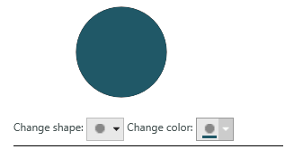
The jQuery Radial menu control is a context menu presenting its items in a circular arrangement around a center button, just like the menu in OneNote MX in Windows 8.1. The circular arrangement of the items speeds up items selection, because each item is equally positioned in relation to the center. The jQuery Radial Menu supports different item types for choosing numerical values, color values, or performs actions.
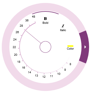
New Touch Features in the jQuery Grid & Hierarchigrid Controls
Improved delete row on touch devices. The delete row user experience on touch-enabled devices has improved in the Grid controls.
- In Cell Edit mode, swiping to the left or to the right displays the Delete Row button.
- In Row Edit mode, the Delete Row button is available along with the Cancel and Done buttons.
Row Editing Updates to ASP.NET Grid & Hierarchical Grid
The Row Editing behavior is an improved editing mode, designed to provide a better editing experience to the user. The Row Editing behavior is an improved editing mode, designed to provide a better editing experience to the user. With Row Editing, the editable row displays all of the cell editors making it more apparent which row is editable. Also, there are new Done and Cancel buttons displayed in a dialog alongside the editable row. These buttons provide better control when committing or cancelling pending edits. We’ve also added a Delete button option when enabled, the Delete button displays over a row providing a discoverable user interface to delete a row.


Deliver Stunning with Awesome Branding & Styling
Delivering a stunning application requires great functionality, but even more important to that first impression is what the app looks like. We are continuing to work hard & innovate on our styling story across HTML5, jQuery & ASP.NET in this release.
jQuery & HTML5 Theme Updates
We we’ve added a new iOS7 inspired theme.
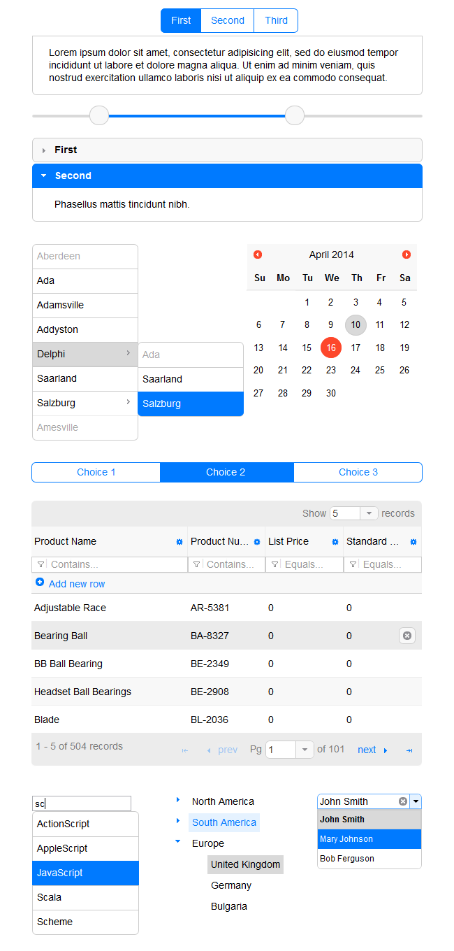
There is a new, modern default theme for the Infragistics ASP.NET controls. In order to keep up with the modern look-and-feel of web applications, a new, modern default theme has been made available for all Infragistics ASP.NET controls.
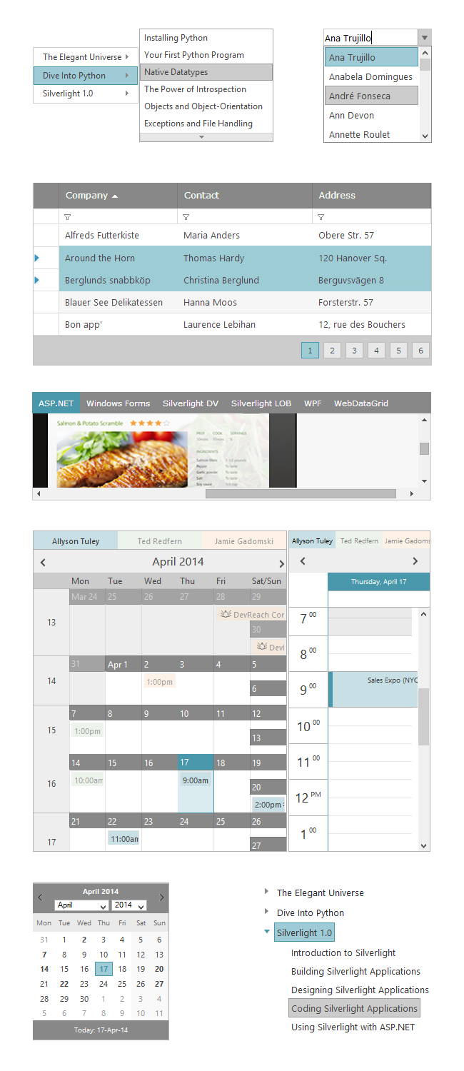
Bootstrap Styling in ASP.NET
As part of a larger strategy around Styling your apps, we are previewing a killer new feature – styling ASP.NET apps with Twitter Bootstrap themes! The benefit of the open source community is in the numbers … there are hundreds (maybe even thousands) of great looking themes on the Internet for Bootstrap. We’d never be able to create that many themes, so we are giving you the tooling that will map Bootstrap themes to the CSS for our ASP.NET controls. This means you don’t have to wait on Infragistics for the next great Nautilus, Black Rubber or Pink Lipstick theme!
You can read all about this new feature and start playing with the preview here:
The roadmap for this tool is to complete for ASP.NET controls & jQuery controls this year. So we’ll have a pretty well rounded styling story with Bootstrap Styling, ThemeRoller and WebAppStlyist to help you design & deliver stunning apps. Remember this is a preview, so your feedback is greatly needed so we can deliver something even more awesome to market later this year.
Developer Productivity across Every Device, Every Platform
We want you to write less code and we want you to look in fewer places in order to find what you need build the code you write. We’ve done a lot of work in 14.1 and will continue to work hard to improve your over productivity which speeds your time-to-market.
Beautifully Designed Visual Studio Starter Kits
You can now find a new set of Infragistics templates in the File -> New Project dialog of Visual Studio. These templates are designed to help you get started with a functional, well-designed, and fully-styled application.
- ASP.NET Energy Dashboard
- Ignite UI Healthcare PhoneGap App
- MVC 3, 4 & 5 ASPX & Razor Starter Kits
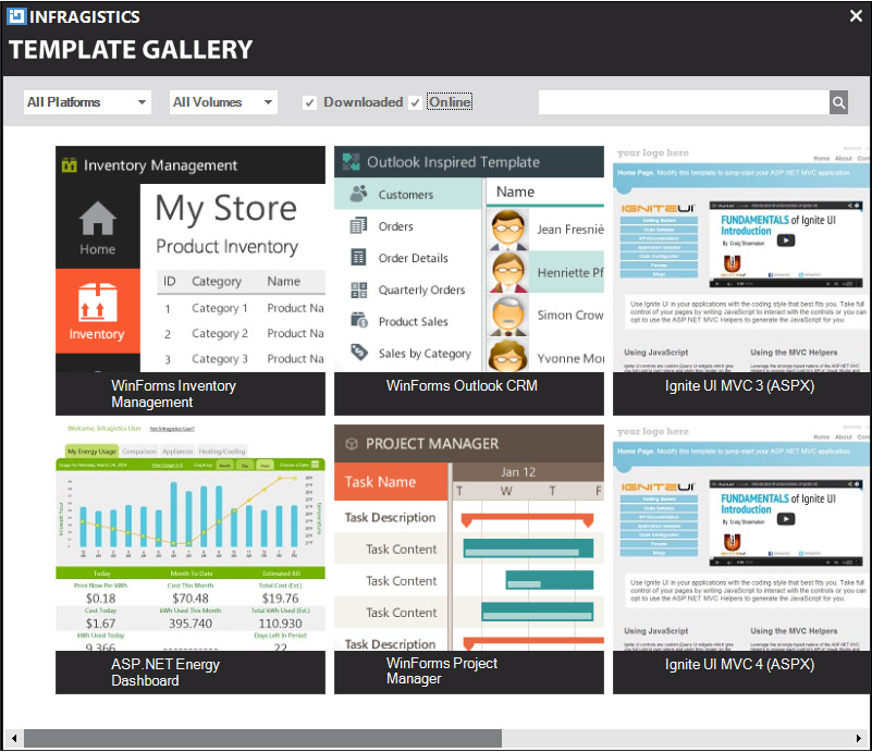
More templates will be added over time to address a wide range of application scenarios, if you have any suggestions for templates you’d like to see, shoot me an email at jasonb@infragistics.com.
WYSIWYG HTML5 / jQuery Page Designer
One of the biggest challenges of starting your first (or next) HTML5 / jQuery app is that Visual Studio does not have the nice WYSIWYG designer that you’re used to using when building ASP.NET, Windows Forms or WPF apps. To solve this problem, we are previewing our new Ignite UI Page Designer. This tool gives you the design time experience you’ve been missing. You can create layouts, add script references, data sources, set properties on controls, and write code in a rich code editor.
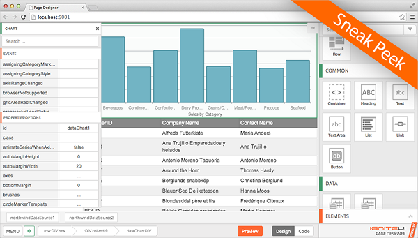
If you are interested in getting in on the ground floor for this preview and helping us set the right priorities for the future of this tool, send an email to igniteui@infragistics.com to get access and start designing your next web app!
New Defaults & Style for jQuery Charting Controls
One of the areas of focus was for styling & productivity was the default style & settings for the chart control. The new default style applies various settings aimed at giving the chart a great default look as well as the right default settings. This means you don’t have to mess around making the chart look great, we are making it look stunning by default!
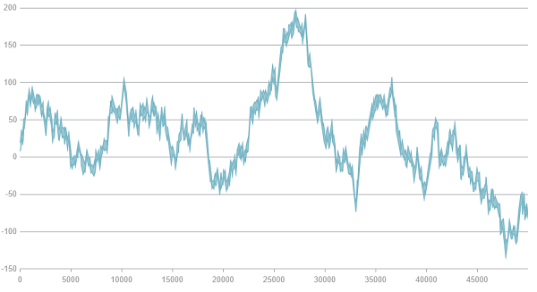
The new default theme includes these changes to what we shipped in the previous defaults:
- All axis (grid) lines use an auto behavior such that if the brush stroke is not set, the chart’s decision logic determines which lines to display based on the series types in use. Thus improving the chart’s performance rendering charts.
- All axis (grid) lines, with the exception of minor lines, always remain visible
- All horizontal category series’ lines, Column, Line, Area, are constantly visible
- All vertical category series’ (Bar) only displays vertical lines while scatter, polar and radial series display all gridlines
- For all category axes, the default ticks length is 5 pixels. (In the previous style, the length was 0.)
- Horizontal and vertical gridlines are now snapped to the nearest round pixel number for a crisper look, e.g. a line set to be at y=2.213 will be drawn at y=2.000. (In the previous template, there was no gridline snapping.)
- A default margin of 5 pixels is added for all axis labels.
- All area-like series (Area, Spline Area, Polar Area, etc.), now use a semi-transparent brush for their area visual. (In the previous style, these are fully opaque.)
- All axis lines include color palate changes, which include the labels font, series brushes & series outlines
With 14.1, we think the chart looks beautiful and has the right default settings right out of the box. If there are areas we missed or something that doesn’t help you build stunning apps faster, please let me know at jasonb@infragistics.com what you’d like to see.
AgularJS Directives in Databound Controls
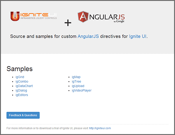
Now available in alpha stages are AngularJS directives for Ignite UI. With these directives you can use Ignite UI controls directly in your Angular views and take advantage of Angular’s two-way data-binding and declarative style. You can get started by cloning or forking the repository at https://github.com/IgniteUI/igniteui-angular.
jQuery Grid and Hierarchical Grid Updates
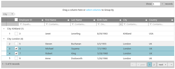
We added 3 really important (and highly requested) features in the jQuery grids.
- Column Fixing now works with Hidden Columns.
- Tooltips are available on text in cells that do not fit in the specified width of the cell.
- The grids now maintain state between re-bindings. This is supporting with Filtering, GroupBy, RowSelectors, Selection, Sorting
- Load on Demand feature adds functionality to append data to the grid. It works in two modes: Automatic and Button. Use the upper grid to experience the Automatic mode. Scroll to the bottom of the grid to see that the new data will be appended to the grid. Use the bottom grid to experience the Button mode. Scroll to the bottom of the grid and then press the "Load more data" button to append new data.
jQuery HTML Editor Updates
New Default Style A new look-and-feel of the toolbar and the buttons gives the HTML Editor a more modern UI.

jQuery Pivot Grid Updates
The jQuery XMLA Data Source now includes built-in support for displaying KPIs defined in a cube. The KPIs supplied by the data source are visualized in the both the Data Selector and the Pivot Grid.
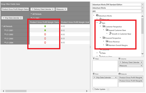
The XMLA Data Source now supports one more remote configuration where ADOMD.NET is used for communication with the SSAS server.
jQuery Upload Control Updates
The igUpload control now supports Web Farm / Web Garden Internet Information Services (IIS) configurations. It has an application-wide CustomDictionaryProvider option which enables third-party provider for igUpload’s data structures.
New Control - Color Picker
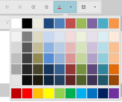
The Color Picker control allows users to select pre-defined colors or to define their own color palettes.
New Control – jQuery Popover
The igPopover control, now available in RTM, adds tooltip-like functionality to DOM elements. The popover is context-sensitive and displays dynamic content, detailed information, overlaid forms, or just about anything that you want to appear over a given element. The popover area is customizable and can be loaded on-demand. Configuration options include the popover’s content, activation, and position.

New Control – jQuery Toolbar
New control (CTP) The Toolbar control allows you to create custom toolbars like those in the jQuery HTML Editor.

New Control – Split Button
New control (CTP) The igSplitButton control is a drop-down button with which the user can select a default value bound to a primary button, or select from a list of values displayed in a drop-down list bound to a secondary button. It is useful when you want to provide a default action/command for a button but also need to supply other, secondary options.
Summary
I hope you are as excited to get your hands on this as we were in building it! There are a ton of features across the board in 14.1, and the web continues to be a huge investment. We are continuing to deliver the best web controls with a big focus in three key areas:
- Touch Everywhere, Office Inspired Apps on Every Platform
- Deliver Stunning with Awesome Branding & Styling
- Developer Productivity across Every Device, Every Platform
To get started with all this goodness, download Infragistics Ultimate 14.1. today from here:
http://www.infragistics.com/products/ultimate
To see all of the new Ignite UI jQuery, HTML5 & MVC samples, go here:
And to see the new additions to ASP.NET, go here:
http://www.infragistics.com/products/aspnet/data-grid/
If you have any feedback, please send me an email to jasonb@infragistics.com, and as always please use our User Voice site to include product feature suggestions for future releases.