One of the defining aspects of Windows 8 is the grid view layout that many application hubs use. These horizontally panning lists of items are used everywhere from the Start Screen tiles to many of the built-in apps such as Windows Store, Bing News, and Sports. The GridView control in XAML, or ListView control in WinJS, allows for a lot of customization. Taking advantage of this customization will allow your application to stand out from the crowd. It will also help establish a visual information hierarchy for the items presented in your application. This tip will help you get creative with the grid view.
(Previous tips can be found here.)

What does variable sizing look like?
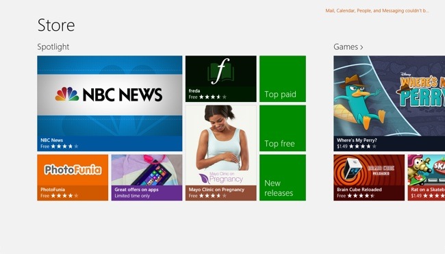
One of the best aspects of the GridView/ListView (from now on I'll just call it "GridView") is how easy it makes it to create great hub layouts. For instance, take a look at the hub design of the Windows Store application:
How does the sizing work?
Looking at the Spotlight section of this hub, I want you to study the various sizes of items that are present. If you take the "Top paid" item as the base size you will find 4 different item sizes. The width of the "Top paid" item is the column width for the GridView and the height is the row height. We will call the size of the "Top paid" item 1x1 (1 row x 1 column). The "freda", "PhotoFunia", and "Great offers on apps" items are all 1x2. The Mayo Clinic item is 2x2 and the NBC News item is 2x4. All of these items conform to the grid as a multiple of the base sized element in the grid.
You can use this variable item sizing to great effect. In the case of the store, it is used to draw attention to the "featured" item, in this case NBC News. Even though the grid is fixed into rows and columns, there is still a lot of flexibility given the numerous size options. For instance, in the "Social" section of the store right now, IM+ is featured and it uses a taller featured size of 3x2:
Again, the point here is to draw attention to important information and avoid the monotony of every element being the same size. Give sufficient size to the elements in your application that you want users to focus on. Take advantage of the creative freedom this control gives you.
Can I see an example?
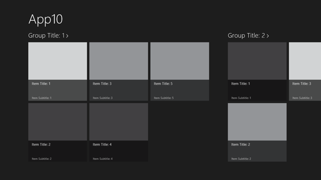
The Grid Application template will start you with this:
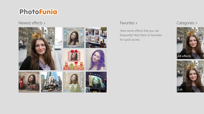
But please, please don't stop there. With even a subtle use of variable sizing, you can make your application stand out. Photofunia is an image editing application that allows you to apply effects to your images. In the "Newest effects" section of their GridView, they set the newest filter apart from the rest to guide users to it:
As I stated, it's subtle but it looks way better than the standard template. In a future tip I will discuss how to accomplish this in XAML and WinJS.
Summary
In my opinion, the standard Grid App template that is available in Visual Studio and Blend do not set the stage for differentiated apps that stand out from the crowd. This template doesn't even attempt to get you started with variable sizing even though most apps will end up using it. Do not let that discourage you! Explore using variable sizing in your design phase and then explore adding it to your app at development time. Play around with different size schemes until you find the one that fits your content best.
Contact
If you have any questions or comments, please comment below or find me on Twitter @brentschooley. You can also email me at bschooley@infragistics.com.


