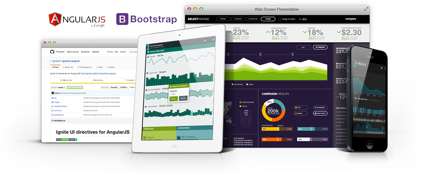
We are pleased to announce the release of Ignite UI 16.1! This release continues our investment in modern app development for HTML on mobile, tablet & desktop browsers. In 16.1, we’ve added support for Angular 2 Beta, Bootstrap 4, we’ve done a ton of work in Typescript enhancements across controls and we’ve invested in updates across the board in major controls. Let’s go through what’s new in 16.1!

Angular 2 Components
Arguably the biggest feature in 16.1 is support for Angular 2 components for Ignite UI controls. Like our Angular 1 directives, we’ve made our Angular 2 components available on Github for immediate availability. With the Angular 2 components come full TypeScript support. You can grab the Angular 2 components here and start using them today. Once Angular 2 comes out of beta, we’ll update Github to ensure everything works as expected. Keep in mind though Angular 2 is still beta, we fully support our components and will update them along the way as Angular 2 nears release. As with anything new as big as this, make sure to keep the feedback and commentary flowing back to us, we are committed to have the best Angular 2 components on the market.
igGrid
the grid continues to see investment. It is the most widely used control in the toolset, and your feature requests continue to drive the backlog. In 16.1, we’ve made improvements in key areas.
- New column option - mapper - For columns with dataType="object" we now allow setting a mapper function, which can be used for complex data extraction from complex objects, whose return value will be used for all data operations executed on the specific column.
- The ColumnFixing feature now works with grid width set in percentage.
- Multi-Row Layout - enables you to create complex grid record layouts, that contain multiple rows with cells in them spanning multiple columns and rows. Such structure allows for greater rendering flexibility for grids with many columns that would otherwise require a horizontal scrollbar or when the data shown is better presented in a non-tabular fashion. Initializing the Multi-Row Layout is done entirely through the igGrid's column collection. Four new properties are added to the column definition that specify the position and size of the column -
rowIndex,columnIndex,rowSpanandcolSpan.

- Checkbox Appearance - Checkbox column visual appearance have changed and it's square box is not going to be rendered when the grid is in display mode. What would be provided is only a plain checkmark. This change is due to refinement of the experience for the end-users, who naturally perceived that this was an interactive element, which they can click to toggle.
- Paste from Excel sample - A new sample is added that demonstrates pasting Excel clipboard data into igGrid
igTreeGrid
When you have hierarchical data that needs column headers for each child level aligned with the parent columns. In 16.1, we improved the updating feature - the "Add new row" user interface is now enabled and along with it TreeGrid Updating supports adding new records not only directly to the root level, but also adding a child records to a specified level as through the UI, as well through the API. The "Add child row" button is available next to the "Delete row" button when a row is hovered with the mouse or swiped left or right when on

The add new row UI is rendered inline next to its parent

igTileManager
splitterOptions now replaces the showSplitter option. Besides showing and hiding, additional functionalities are added. You can configure the splitter to be collapsible as well as attach to its collapsed/expanded events. SinceshowSplitter option will no longer be available
igDataSource
Related to the same feature on the grid column, a new field option –mapper - for field with dataType="object" we now allow setting a mapper function, which can be used for complex data extraction from complex objects, whose return value will be used for all data operations executed on the specific field
TypeScript Support
- Support for union types - widget members now support union types which greatly improves type checking. Union types introduced in TypeScript 1.4 allows for a variable or a member to have one of a set of several types. Previously members that were declared as type
anynow use union types to declare a more specific type.

- Intellisense improvements - Intellisense is improved for options and methods to suggest all widget`s overloads.
- Member descriptions - All members now have a description.
Summary
I hope you are as excited as we are about these new controls and features. As usual, your feedback played a vital role in the 16.1 release. If you have ideas about new features we should bring to our controls, important issues we need to fix, or even brand new controls you’d like us to introduce, please let us know by posting them on our Product Ideas website. Follow and engage with us on Twitter via @infragistics. Also make sure to connect with our various teams via our Community Forums where you can interact with Infragistics engineers and other customers. And as usual, shoot me an email at jasonb@infragistics.com if you have any questions, comments or feedback.
