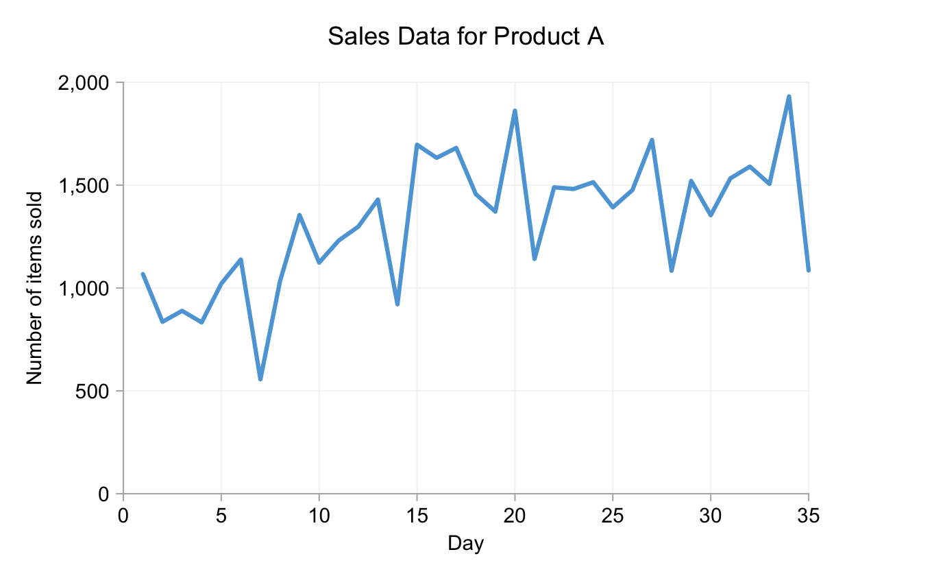
As discussed in Part 1 the quirks of our time-keeping systems can lead to "interesting" patterns in time series charts. Here's the example I used previously for ease of reference:

To summarize the significant bits of this chart in words: The daily totals are dependent on day of the week, with sales on Saturdays being higher than on weekdays and sales on Sundays much lower. This helps create a cyclical pattern superimposed on the longer-term trend, that is somewhat distorted by (apparently) random variations.
There is a less conventional way to visualize this data, one that I only encountered for the first time a couple of years ago via this article by Naomi B. Robbins. Rather than a single line joining consecutive days or a line for each week, we can display one line for each day of the week:

The black bars in this "cycle plot" show the mean for each day of the week and can be easily compared with the distribution of means from Part 1. While there's no direct labeling (it would get quite messy) the first circle on each line shows the value for week 1 for that day of the week, the second circle shows week two and so on. (I omitted vertical grid lines because that appeared to give undue emphasis to the week-3 data points they passed through.)
What do we get from this view of the data? We can see how sales increased from the first week to the second to the third. That is true for all days of the week. After that things get more complicated. For six of the seven days of week 4, sales are down on week 3, with Friday being the notable exception. Week 5 saw the highest total sales for any single day (the Saturday) but sales for the (preceding) Tuesday dropped to around week-2 levels. Picking this level of detail out from the chart at the top would take much more cognitive effort.
There's more. For example:
- Total sales varied much less on Fridays than on other days;
- Despite Sunday sales always being lower than for the preceding days of a given week, from week 3 onwards they were still higher than week-1 sales were for any day;
- All points for weeks 3 to 5 were above average.
As is often the case, one can easily change emphasis by changing color, line thickness and altering the plotting order. For example, if we care more about the weekly cycle than the lon-term trend we can shift the horizontal bars to the front and make the lines and points a muted gray:

The line chart below shows monthly sales of fictional Product B over the course of 9 years.

Cycle plots don't need to be concerned with just days and weeks. They can work with cycles covering months and years too (for example). For the Product B data I've omitted data points for each value because, with twelve lines and nine points per line, it started to look a bit squashed. The basic principles of the design remain the same, however.

What we see in this case is different but no less enlightening. Rather than exhibiting any particular trend, the individual lines appear to oscillate rather wildy around their means. There is, however, a very large seasonal trend. No sales total for the months of May, June, July or August was ever lower than that of any sales total from any of the other months. While sales of Product B clearly declined for the (Northern Hemisphere) winter months, October looks to be something of anomaly, being lower - on average - than November. However, the difference is small and was certainly higher in some years (the penultimate one, for example).
Cycle plots do not display everything perfectly. If we plot the conventional line chart for Product B with a twelve month rolling mean we see a hint of an upward trend. That is really not at all obvious from the cycle plot.

Comparing data for adjacent months (or days in the first example) is also difficult since they're on separate lines. With Product A we could make some inter-line comparisons easier by color-coding the data points. However, because of the space considerations mentioned above (and the need for twelve distinct colors of similar salience), this is not practical for Product B.
In conclusion, cycle plots can be a useful means of showing both short term trends and long term cycles. However, because of the limitations mentioned above, that does not mean we should be throwing out our conventional line charts. They are still better at displaying some aspects of time-series datasets and can complement the cycle plots.
