Bar charts have a distinctadvantage over chart forms that require area or angle judgements. That's because the simple perceptual tasks we require for decoding a bar chart - judging lengths and/or position along a scale - are tasks we're good at. But we also decode dot plots through judging position along a scale. Is there a reason to choose one over the other?
To explore this question I'm going to create several bar charts and dot plots from a real-world dataset. Specifically we'll be looking at the World Health Organization (WHO) table of life expectancy by country. It covers three different years: 1990, 2000, and 2012 and we'll just look at the life expectancy at birth across both sexes combined. Data is rounded to the nearest whole year.
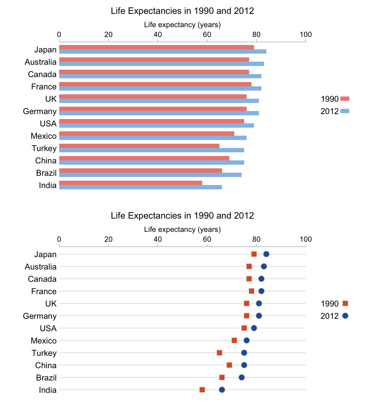
Let's start by looking at the increase in life expectancy between 1990 and 2012 for 12 of the G-20 nations.

Which chart is better? With the bar chart you can compare lengths as well as position, but if you're an ardent disciple of Edward Tufte then the dot plot has the better data-ink ratio. In addition, one could always change the lines in the dot plot so that they only go from 0 to the position of the dot if one wanted to judge based on length. In the end, I think in this simple case it's probably just a matter of personal preference.
What if, instead of looking at the difference between 2012 and 1990 for each country, we just wanted to show the two corresponding values? In the bar chart case we create a grouped bar chart, in the dot plot case we string two different symbols on each line.

It's easy to compare the two bars from the same country, but if we want to compare across countries for the same year we must ignore the presence of half the bars. Because these bars provide quite a dense concentration of color, this isn't all that easy a task. With the dot plot, comparison for the same country is even easier - we just scan along the same horizontal line. I think comparison between countries for the same year is also simpler, there's no large blocks of color to distract us when we want to compare blue circles to other blue circles or red squares to other red squares.
That covers the most obvious decoding tasks, but can we extract any other insights? I think it's immediately apparent from the dot plot that Turkey has seen the biggest increase in life expectancy (as was obvious when directly plotted in the first example). With the grouped bar chart, that information is there but it is somewhat concealed. Similarly, I think that the fact that the life expectancy in India in 2012 was lower than for most of the listed countries in 1990 is more obvious in the dot plot.
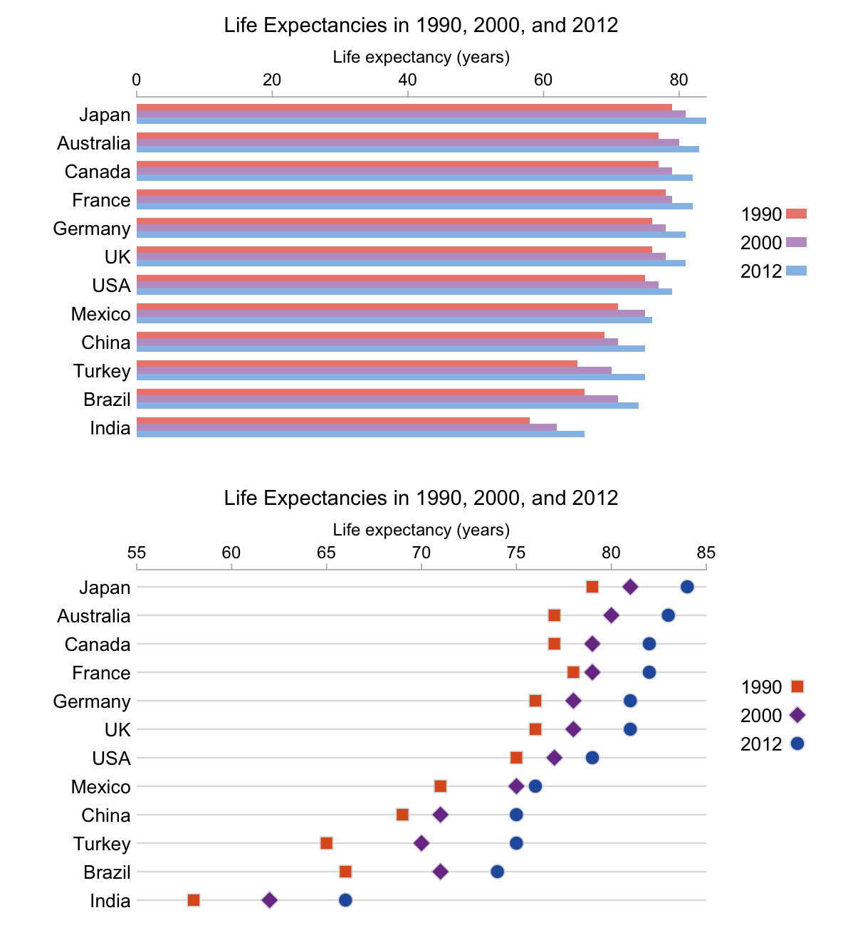
Let's add the middle year of measurement to the chart and see what difference that makes.

Now things look a bit cramped. In the case of the dot plot, for example, there is an overlap between the marker for the year 2000 and one of the other two years in eight of the twelve cases. But we can change things with the dot plot more than we can the bar chart. Assuming we're restricted to the same horizontal and vertical space as above, about the only thing we can do with the bar chart is change the horizontal scale so its maximum coincides with the maximum in the data. But with the dot plot, because line length does not encode anything, we can expand our scale in both horizontal directions to whatever is convenient.

Things are much clearer now in the dot plot while the bar chart is barely any different.
The above discussion gives several reasons for favoring a dot plot over a bar chart. The dataset used is, however, quite well-behaved. Specifically, for each country the life expectancy increased from 1990 to 2000 to 2012. This was not universally the case across the globe. In fact if I'd picked a different sample of twelve countries from the G-20, like the one below, our dataset would not have been so well-behaved.

In the case of South Africa and Russia we have overplotting in the dot plot. That's a problem we can probably deal with. We could use semi-transparent points, for example. The bars of a grouped bar chart do not lie on the same line and so overplotting will never be an issue.
