Did you know that the IGGridView derives directly from UIScrollView? Because of this, you actually have a lot of power. In fact, the IGGridView turns on one of the settings of the UIScrollView, and you might not even realize it. By default, the IGGridView limits the scrolling direction. What i mean by that, is that if you start scrolling in one direction(lets say vertically), then you won't scroll horizontally until the vertical scrolling is done. Likewise, when your scrolling horizontally, you...(read more)![]()
↧
NUCLiOS IGGridView QuickTip: Limit Scroll Direction
↧
XAML Developers - Top 5 YouTube Tutorials
For anyone interested in learning more about XAML and how to get a better understanding of the language, I’ve compiled a list of the best tutorials currently available on YouTube. To start the list off, it’ll be some of the better beginner tutorials so you can start off with a solid introduction.
1. SilverlightShow Video Channel
Here’s a lecture style, recorded webinar of an introduction to XAML on Windows 8 delivered by Gill Cleeren. The webinar uses a combination of PowerPoint slides and screen recordings for one of the more balanced XAML tutorials on YouTube.
Bob provides a quick but gentle introduction for people interested in learning XAML. He provides an informative guide to learning XAML and tries to explain what he can at a high level. This introduction will be able to teach beginner developers a majority of what they’d need to know, all within less than half an hour.
The EPC Group gives a lengthier introduction and guide for XAML. In this video, there are two people trying to explain and help you get a better understanding of these varying lines of code. They present the content on screen very clearly compared to most other videos you may find on YouTube. The channel also provides a few more tutorials for those who may want to delve further into the XAML language.
4. XAML TV
Pete Brown gives a brief introduction to the new style of applications and focuses on what may be new or different for developers coming from Silverlight and WPF.
This comes from a channel that features videos related to Microsoft Visual Studio and Visual Studio Online. This video would be geared more towards those wanting to learn how to develop things within Visual Studio.
These videos should help anyone from beginner to intermediate get a better understanding of the XAML language. If you liked any of the videos, most of them have uploaded more tutorials within their channels for you to check out. Some continue on and expand upon their previous introductory videos.
↧
↧
What's New in Ignite UI and ASP.NET 14.2
As noted in our 14.1 launch in the spring, we talked about three main areas of focus for this year:
- Touch Everywhere, Office-Inspired Apps on Every Platform
- Deliver Outstanding Experiences with Awesome Branding & Styling
- Developer Productivity Across Every Device, Every Platform
These three themes are carrying into 14.2, and when we talk about 2015 later this year, we’ll evolve these themes even further. Coming releases will continue our laser focus on delivering you the best UI toolsets and developer productivity tools for every platform, which means desktop, responsive Web, and native mobile.
Office-Inspired Apps on Every Platform
We are CTP'ing 2 new powerful tools in 14.2 - a tree grid control that gives you an efficient way of visualizing flat or hierarchical data that share common column sets in a hierarchical view, and a new 100% JavaScript Excel library.
igTreeGrid CTP
This new JavaScript tree grid jQuery UI widget is targeted at common line of business scenarios that involve multiple levels of hierarchical records that share the same column sets and usually involve roll up values for columns. A few common scenarios that the tree grid is great for are project management work breakdown structures, organizational/employee structures, and financial accounting structures.
The igTreeGrid is based on our amazing igGrid, so it carries forward all of the applicable features already present in the grid, as well as our industry-leading performance. It includes support for binding to both self-referential flat data structures as well as true hierarchies.
Try It Out Now
JavaScript Excel Library CTP
Business users love Excel. They often ask devs to “make it like Excel,” and they also like to be able to seamlessly move from editing table-based data in applications to editing and extrapolating from it in Excel. Until now, doing that in the browser relied on server-side exporting, but in this release, we are shipping our preview of our 100% pure JavaScript Excel library that makes it so that devs can edit and produce Excel spreadsheets in the browser.
This new library is based on the same Excel library we have in other platforms like Windows Forms, WPF, iOS, ASP.NET. Using our robust cross-platform technologies, we've translated to JavaScript. This means that our customers who are used to working with our server-side and desktop Excel libraries will have a familiar object model to work in, but one that is optimized for JavaScript. As noted, this means it works in the browser, but it will also work in other JavaScript runtimes like Node.
Deliver Outstanding Experiences with Awesome Branding & Styling
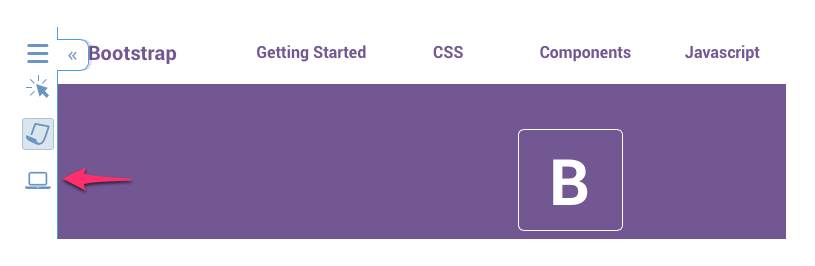
Delivering outstanding experiences requires great functionality, but great looks make a huge difference as well. We are continuing to work hard & innovate to give you beautiful styles that are easy to incorporate into your apps. With this release, we are adding explicit support for Bootstrap themes. Bootstrap is the most popular HTML, CSS, and JS framework for developing responsive, mobile first projects on the web, and it’s important that Ignite UI plays well with it.
Bootstrap Themes
With this release we are shipping four ready-made Bootstrap themes for Ignite UI.
- Bootstrap Default - based on the default theme you get with Bootstrap
- Superhero - based on the dark blue Superhero theme from Bootswatch
- Flatly - based on the modern Flatly theme from Bootswatch
- Yeti - based on the lighter flat Yeti theme from Bootswatch
These themes are ready for you to download and simply reference to have your Ignite UI components look and feel at home with these Bootstrap-based themes.
Bootstrap Theme Generator
In addition to the themes we have created, you can also use our Bootstrap theme generator to generate Ignite UI themes using the LESS variables from any Bootstrap-based theme, so you don’t have to wait on us to make Ignite UI look good with your customized theme. :)
In addition to generating the new theme, you can customize any generated theme right on the Ignite UI site before you download it!
A side benefit of this is that you can now more easily customize Ignite UI themes using our LESS variables, which makes integrating Ignite UI even into non-Bootstrap themes significantly easier.

Updated iOS Theme
In 14.1 we shipped a preview of our iOS7 theme. With this release we are shipping the release version. We have also renamed it to just “iOS” because it is not just for iOS 7. It is a theme that fits well with iOS 7+ styling and replaces the prior iOS theme (that was based on iOS 6 and below).
Developer Productivity Across Every Device, Every Platform
We’re here to make you more productive. And as part of that, we want to empower you to be productive shipping apps across every device and platform. In 14.2, we’re adding some very significant new goodies to Ignite UI to make that a reality.
Ignite UI Page Designer
This summer, we released a public preview of our new HTML5 modern Web page designer. The primary focus for this new tool in this release is to make laying out and configuring Ignite UI controls significantly easier. With that in mind, here’s a quick overview of the key features of the page designer in this release. This is a first step for this tool, and we look forward to enhancing it for you over future releases!

Searchable Toolbox Chock Full of Advanced HTML5 Components
All you have to do is drag and drop them onto the design surface, then you can use the familiar property grid component editor to configure them.
Easy-to-Use Component Editor

This component editor makes it a breeze to set up your Ignite UI components:
- Browse or search through all the component properties and events.
- Easily toggle Booleans, pick from enumerated options, and drill into complex and collection-based properties.
- View the integrated API help while hovering over properties and events.
- One-click to create and edit event handlers.
- Double-click to create or edit CSS classes, and double-click to jump to the code for a property.
- Click the ? at the top to jump straight into API docs for that component.
Simplified Responsive Web Design
Use the built-in Bootstrap row component to easily leverage the Bootstrap grid framework on your page.

Take advantage of the CSS breakpoint visualizer and editor to see and edit your responsive design.

And if you have a responsive breakpoint selected in the designer, when you double-click to create a CSS class for a component, it will correctly declare the selector inside of the current breakpoint.

Code Editor with Clean Code
A key goal with the page designer is to produce clean code that you can copy and use in your projects. We also integrated the world-class ACE code editor to give you a good in-designer code editing experience.

As you can see, the API docs are also incorporated into the code editing experience to further reduce flipping back and forth between docs and working with Ignite UI.
igGrid Improvements
Infragistics data grids are the workhorses of many applications, and the igGrid is no different! So we are always working on improving it to make it more productive and capable. In this release we are including a few improvements.
- Column Fixing & Virtualization - we earlier shipped column fixing, and with this release you can now use it together with virtualization.
- Selection - we have refactored and improved the selection feature so that it is 30% smaller JavaScript size and related operations perform more smoothly.
Append Rows on Demand
In 14.1 we shipped “load on demand” as a preview for the igGrid. In this release, we are completing that feature and have renamed it to “append rows on demand.” We did that both to avoid confusion with other load on demand features and just to generally better describe what it does.

The same experience you get with apps such as Twitter where when you reach the bottom of the currently-loaded list or newsfeed and you can retrieve the next set of items is now offered in the igGrid. The user has two options for achieving this feature, automatically and on request. Automatic will load the next set when the user scrolls to the bottom and on request show a button that lets the user specifically ask to load more.
Try It Out Now
Improved Docs Integration
You may not have noticed yet, but this summer we published a nifty little update to our API docs viewer.

What this means is that we (and you ;) ) can link directly to specific API member docs, like so:
http://help.infragistics.com/jQuery/2014.2/ui.iggrid#options:columns.format
More importantly, we have updated all of the samples on IgniteUI.com to now link directly to related, specific APIs so that you don’t have to go searching for them. A small thing, but it makes finding docs that much easier.
Bugs Be Gone!
No release would be complete without the requisite squashing of bugs, but in this release we smashed a whole TON of ‘em across both Ignite UI and ASP.NET. Reliability is a core product quality for us, and while it may not be sexy, it is an integral part of what we think about as we make software for you. We want you to have confidence when you ship out your apps built with Infragistics that you and your customers won’t be surprised by bugs.
Summary
As you can see, there’s a lot of great stuff coming your way in this release for our Web products. New core LOB tools, new page designer, new Bootstrap themes—it’s all about making you more productive and your apps more useful, usable, and desirable.
To get started using all this goodness, download Infragistics Ultimate 14.2 today!
If you have any product ideas or suggestions, the best place to share them is on our User Voice-driven Product Ideas site. If you need help with anything, feel free to contact us. And if you wanna strike up a convo with me, you can reach me at ambrose@infragistics.com.
Have a great day!
↧
SQLSaturday #311 Bulgaria 2014–Event Recap and Follow-up
After the successful SQLSaturday # 152 and SQLSaturday # 199 for the third time in Bulgaria SQLSaturday was held for the third on 11 of October, 2014. It was the biggest SQLSaturday organized in Bulgaria and the region around. This event is organized from PASS with the major support of Infragistics, Infragistics Friends User Group ( BI & .Net Geeks) and many partners, sponsors and volunteers.
What is SQL Saturday:
- SQL Saturday is a conference of PASS (Professional Association for SQL Server)www.sqlpass.org,www.sqlsaturday.com
- The event was announced officially on site SQL Saturday: http://www.sqlsaturday.com/311/
Infragistics as a company that develops solutions for data visualization and business solutions has many common points in with areas covered from the conference: BI, Reporting, SQL Server related solutions
Our statistics:
- 400 registrations + 91 people in the wait list.
- around 250 real attendees from 16 countries (USA, UK, Portugal, Poland, Holland, Belgium, Turkey, Ukraine, Russia, Bulgaria and Serbia).
- Speakers and attendees from 16 countries
- 27 speakers from 15 different countries( Austria, Germany, UK, Denmark, Nederland, Portugal, Poland, Hungary, Romania, Slovenia, Macedonia, Russia, Ukraine, Turkey and Bulgaria )
- 16 Microsoft MVPs
- 3 Microsoft MCMs
- 30 sessions in 5 tracks
- Attendees from 5 countries ( Serbia, Macedonia, Romania, Ukraine and Bulgaria )
- The biggest event on Microsoft Data Platform ever organized in the region
Some pictures from this event:
Dejan Sarka is talking about Optimizing Temporal Queries

Magi Naumova is presenting

Lunch break:

Milos Radivojevic ( @MilosSQL ) in action:

Some of the speakers:

The SQLSaturday #311 Bulgaria raffle

Some of the raffle winners:

You can see more pictures from the conference here:
Feedback in Twitter about SQLSaturday #311 Bulgaria

Infragistics participation in the event:
- Infragistics was SQLSaturday Bulgaria conference host , main supporter and a gold sponsor.
- Administrators at the conference were Jason Beres and Mihail Mateev
- There was more than 15 volunteers from Infragistics Bulgaria who helped the conference to be held
- There was 1 technical presentation from Infragistics:
- Node.js for SQLServer Nerds : Mihail Mateev
Now SQLSaturday Bulgaria Team is looking for appropriate dates for SQLSaturday Bulgaria 2015.
More information about SQLSaturday Bulgaria is available on the website of the conference http://www.sqlsaturday.com/311/ , SQL Saturday Bulgaria Facebook page and you can follow #sqlsatBulgaria and #sqlsat311 on Twitter.
Follow news from Infragistics for more information about new Infragistics events.
As always, you can follow us on Twitter @mihailmateev and @Infragistics and stay in touch on Facebook, Google+andLinkedIn!
Warm Regards,
SQLSaturday Bulgaria Team

 Saturday
↧
What Is New in Windows Forms 14.2
We are very excited about all the new controls and updates coming in our huge Windows Forms release for 14.2. As you will see through out our other platforms, there are three main areas we are focusing on across all major toolsets:
- Touch Everywhere, Office Inspired Apps on Every Platform
- Deliver Outstanding Experiences with Awesome Branding and Styling
- Developer Productivity Across Every Device, Every Platform
With more than 100+ controls, Infragistics Windows Forms is the most mature, fully-featured Windows Forms Product on the market. With features that cover every aspect of enterprise software development including Microsoft Office Style user interfaces, high performance dashboards and reports, and full modern experiences with touch & gestures.
Touch Everywhere, Office Inspired Apps on Every Platform
In our continued effort to bring you the greatest in Office Inspired Applications on every platform with an awe-inspiring touch experience we are are delivering three brand new controls in our 14.2 release. Our team as done a great job to help improve your productivity while also modernizing your applications with our new Carousel, DataChart and Flat Data Source.

[New Control] Carousel
In an effort to improve the users productivity and navigation, we are introducing the new Carousel control for Windows Forms, similar to our XamlCarousel. A list of items are displayed for the user in a tile-like fashion along a predefined path. The control will allow the user to activate an item and navigate from one active item to another with animation. In addition it will allow the developer to provide a custom path for the items to be rendered on. This control will come complete with a great touch experience and panning gestures that all users want.

This tool will allow to developer to:
- Show a list of clickable items along a specified path
- Style the items (Normal, Active and HotTracked)
- Provide a Custom Path
- Allow the control to automatically rotate the items along the path
- Add items to the carousel control by manually adding items to the controls collection or by binding the control to a bindable datasource.

[New Control] DataChart Control
We are very exited to get this new DataChart control out the door to you that will have a vast majority of features available right off the bat. Along with being able to create composite charts and use multiple series there will be a vast variety of series you as the user will be able to chose from:
- Line, Stacked Line, Stacked 100-Line Series, Area, Stacked Area, Stacked 100-Area, Bar, Stacked Bar Series, Stacked 100-Bar, Column, Stacked Column, Stacked 100-Column, Point, Spline, Spline Area, Stacked Spline Area, Stacked 100-Spline Area, Step Line, Stacked Spline, Stacked 100-Spline, Step Area, Range Area, Range Column, Waterfall, Bubble/Proportional Symbol, Scatter/Scatter Plot, Scatter Line, Scatter Spline, Polar(Area, Line, Scatter, Spline, Spline Area), Radial(Line, Area, Column, Pie), Candlestick, OHLC.

The DataChart will come with 34 Financial Indicators such as Average True Ranger Indicator, Force Index Indicator and Positive Volume Indicator. On top of that, there are 13 different trend lines you can choose from and 2 financial overlays.
- Trend Lines: CubicFit, CumulativeAverage, ExponentialAverage, ExponentialFit, LinearFit, LogarithmicFit, ModifiedAverage, PowerLawFit, QuadraticFit, QuarticFit, QuinticFit, SimpleAverage, WeightedAverage.
- Financial Overlays: Bollinger Bands Overlay, Price Channel Overlay

The Axes comes with support for multiple axes and datetime axis, zooming for both single and multi-axis and zoom interaction with mousewheel and window drag (Mouse / Touch). The user will be able to scale the axis both linearly and logarithmically and cross axis values. Besides being able to support chart title, subtitle, axis titles, text rotation, gridlines and radial chart y-axis the user will also be able to create multiple legends.
[New Control] Flat Data Source
To help prevent developers from getting discouraged by the complexity associated with the production of OLAP data, configuration of an OLAP server and so on the FlatDataSource class can be used to display ‘non-OLAP’ style data in the WinPivotGrid. Instead of generating data from a server-based OLAP data adapter that is based on values stored in an SSAS database, the FlatDataSource obtains its data from an IEnumerable implementation. This compresses a list of items, which each item referencing an instance of a .NET class.
For example, say you as a developer have sales data contained within a collection of 'Order.' objects can instantiate a FlatDataSource instance with this collection. Call the call the FlatDataSource’s GenerateCube method, call the InitializeAsync method, and assign a reference to the FlatDataSource instance to the WinPivotGrid’s DataSource property.

Deliver Stunning with Awesome Branding and Styling
PivotGrid
New Default Color Scheme for Pivot Grid
Along with being able to slice, dice and filter data any way the user wants they can now view their Pivot Grid in a Compact View just like you can in the WPF Pivot Grid. This will help provide users with a better way to look at their data when they have a lot of fields and avoid having a bulky layout.

User-Resizable Headers in Row Area
In an effort to give the user more control over their data in the PivotGrid you can now resize the headers in the row area.
RightToLeft Support
Building off the progress made in 14.1 we have implemented right-to-left support in a few more controls to help care for languages such as Arabic and Hebrew. These controls include Grid, Combo and DropDown and WinTree.

Developer Productivity Across Every Device, Every Platform
Samples Browser Feature Samples Page
[Coded UI Tests] Support for VS2012
Since the release of 12.2 our Windows Forms controls have begun to participate with the Microsoft Coded UI Test Framework to allow record and replay of automated tests. This extension is a technology manager that tells Coded UI Tests to use UI Automation for Infragistics controls, and not to use the older Microsoft Active Accessibility by default. In the new 14.2 release Coded UI Test will now Support Visual Studio 2012.
The Coded UI Test’s record and replay actions support the following controls:
- WinButton, WinCheckEditor, WinCombo, WinComboEditor, WinDateTimeEditor, WinDropDown, WinExplorerBar, WinFormattedLinkLabel, WinFormattedTextEditor, WinGrid, WinMaskedEdit, WinOptionSet, WinPictureBox, WinProgressBox, WinProgressBar, WinScrollBar, WinStatusBar, WinTextEditor, WinTrackBar, WinTree, WinToolBarsManager
Summary
I hope you are as excited to get your hands on this as we were in building it! There are a ton of features across the board in 14.2, i want to assure you that Windows Forms continues to be a big investment area for us.
We are continuing to deliver the best Windows Forms controls on the market today, with a big focus in three key areas:
- Touch Everywhere, Office Inspired Apps on Every Platform
- Deliver Outstanding Experiences with Awesome Branding & Styling
- Developer Productivity across Every Device, Every Platform
To get started with all this goodness, download Infragistics Ultimate 14.2. today from here:
http://www.infragistics.com/products/ultimate
To see all of the new Windows Forms features, go here:
http://www.infragistics.com/products/windows-forms/
If you have any feedback, please send me an email to jasonb@infragistics.com, and as always please use our User Voice site to include product feature suggestions for future releases.
↧
↧
What’s New in Infragistics WPF 14.2
Try to think of your top three movie sequels. Which ones come to mind? Having trouble? Well, that might be because it’s not often that you find a sequel that is just as good, if not better, than the first. Well, grab your popcorn, your drinks, and your candy, because this 14.2 release of Infragistics WPF controls is the MUST SEE sequel of the year! In just a mere six months, we have RTM’d the xamDiagram and xamSpreadsheet controls, created a new property grid control, innovated a new theme manager, added unrivaled MVVM support, improved our APIs, added tons of other features to a number of existing controls, and even had time to write two new sample applications. If this 14.2 release was a movie, it would win an Oscar in the “Best Release Ever” category.
I would like to remind you that this year we are focusing on three main areas, all designed to help you deliver the best, most modern applications to your customers faster than ever.
- Touch everywhere, Office inspired apps on every platform
- Deliver Outstanding Experiences with Awesome Branding and Styling
- Developer productivity across every device, and every platform
This isn’t just limited to our WPF controls. We are focused in these three areas across desktop, responsive web, and native mobile toolsets. Everything we are doing in each product is going to circle back to one of these areas, and of course some features overlap. I would like to also mention, that every single one of these new controls and features we are releasing in 14.2 were asked for by you. You told us what you wanted, and we delivered. This is your release, AGAIN! Have you noticed a pattern yet?
Touch Everywhere, Office Inspired Apps on Every Platform
xamDiagram
In our 14.1 release earlier this year, you had a chance to preview the xamDiagram as a CTP (Community Technology Preview) control. This gave you time to play around with the control early in its development, and the ability to provide feedback on how the control should work. Well, we heard your feedback loud and clear, and those of you that provided us feedback will see your ideas built directly into the control. Now you can tell all of your friends, family, and coworkers, “See that feature there? That was my idea!”.

Besides having support for over 16 predefined shapes, connections with 7 types of line styles and 28 types of connection end caps, and a built-in toolbox that allows you simply drag and drop a shape of your choice onto the xamDiagram, we now have full support for MVVM friendly data binding. In fact, the xamDiagram has the most powerful, highest performing, and flexible data binding support available. Period!
xamSpreadsheet
It’s official! The xamSpreadsheet has shed its CTP label and is ready for prime time. In case you missed it, the xamSpreadsheet is a Microsoft Excel inspired control that gives you the ability to embed Excel document creation and editing experiences into your WPF applications. The xamSpreadsheet is built on top of our existing Excel Framework, and provides an interactive control to our already powerful Excel document capabilities. With powerful editing and cell formatting features, the xamSpreadsheet brings the familiarity of Excel into your customer’s apps.

xamPropertyGrid
The xamPropertyGrid brings the power of Visual Studio’s property grid control into your WPF applications and lets you browse, view, and edit the properties of one or more objects. As you may know, I have been trying to get a property grid in the product for a while now. I even went as far as writing my own prototype and releasing it on my blog. Well, we finally got it!

The xamPropertyGrid support inspecting one or more objects simultaneously. Simply bind the object to the SelectedObject property, or SelectedObjects if dealing with multiple objects, and the xamPropertyGrid will automatically display that object’s properties, which can then be viewed and edited. For complex properties (properties that have nested/sub properties) the xamPropertyGrid allows you to expand and drill into the object to edit the nested property values. All changes made to a property’s value in the xamPropertyGrid will be reflect back into the bound object(s).
The xamPropertyGrid has a number of standard editors that are automatically used depending on the data type of the property. For example, if the data type of the property is a Boolean, then the CheckBox editor will be used; if the data type is an enum, then a ComboBox will be used as an editor. The xamPropertyGrid also has a Brush editor for editing complex brushes and gradients, as well as a collection editor which allows you to add and remove objects from a collection. You can even provide custom editors base on a property type, or even a property name.
For generating properties you have two options. The ReflectionPropertyGenerator, which uses reflection to discover and generate the properties of an object, and the TypeDescriptorPropertyGenerator which uses TypeDescriptor to generate the properties of an object. You can also provide item filters to create complex filtering conditions for the generated properties to control what properties are shown, or excluded, from the xamPropertyGrid.
Need attribute support? No problem. The xamPropertyGrid supports a number of built-in attributes that can be applied to a property or class to control various aspects of it’s display and/or behavior. The xamPropertyGrid supports the following attributes; BrowsableAttribute, CategoryAttribute, DisplayNameAttribute, DescriptionAttribute, DefaultValueAttribute, ReadOnlyAttribute, DefautPropertyAttribute, TypeConverterAttribute.
Deliver Outstanding Experiences with Awesome Branding and Styling
ThemeManager
Besides all the awesome new controls we are delivering with the 14.2 release, we are also releasing a brand new ThemeManager component that will greatly simplify applying themes and styles to your application. You can apply a theme to your entire application by using the ThemeManager.ApplicationTheme property, or you can apply a theme at the control level by using an attached property directly in XAML on the control you would like to apply the theme to. Our ThemeManager supports the most common Microsoft controls, meaning that not only will our ThemeManager control the theme of Infragistics controls, but it will also apply the theme to the Microsoft controls. There is a property on the Theme to turn off this support, just in case the you don’t want us to theme the standard Microsoft controls in your application. But really, who doesn’t want that?
Not happy with one of our themes? No problem, you can easily extend Infragistics existing themes by creating a class that derives from a built-in theme class, overriding the ConfigureControlMappings method, and adding custom resources that will be applied when the theme is used by the ThemeManager.

Or better yet, create your own custom theme. You can easily create custom themes by creating a class that derives from ThemeBase, implement the abstract ConfigureControlMappings method, and then provide the necessary resource dictionaries that should be used when applying the theme with the ThemeManager.

Developer Productivity across Every Device, Every Platform
xamDataGrid
The xamDataGrid has received a lot of love and improvements in its usability, API, and MVVM support. It has never been easier to use the xamDataGrid.
Probably the biggest improvement we made was the addition of field specific editors. This means you can now define a specific editor to use for a field, without having to create styles to set simple editor properties. For example, a you can declare a NumericField to represent a numeric editor for a property, and then set the properties of the NumericField directly on the field level, removing the need to create a style. We also provide a binding markup extension called FieldBinding to simplify the binding syntax when using MVVM and binding field properties to properties in the underlying ViewModel. This greatly improves the usability of the xamDataGrid, greatly improves the discoverability of the API, and reduces the amount of code required to create a FieldLayout. The editor specific fields we provide include the CheckBoxField, ComboBoxField (this one is awesome), CurrencyField, DateTimeField, MaskedTextField, NumericField, and TextField.

The next major addition to the xamDataGrid is the addition of the new TempateField object. You can now supply your own custom controls to use as an editor in the xamDataGrid. Using the new TemplateField, you simply provide a DisplayTemplate to represent the value in a viewing mode, and an EditTemplate to use when the cell is in edit mode. We provide a binding markup extension named TemplateEditorValueBinding to help create the binding between your custom control/template and the TemplateField’s editor host.

Next, we added some great data binding support to help enable your MVVM development techniques even more. We have added a new CellBindings property on the xamDataGrid field objects that allow you to data bind properties of the field editors to properties of the underlying data item. We provide the ability to bind directly to properties of the CellValuePresenter, or the properties of the cell editor, by exposing a Target property. This is huge addition to our MVVM support.

We also added some much needed properties to the field such as IsReadOnly, IsEnabled, and IsTabStop. We also spent a lot of effort simplifying the API of the field objects so that you no longer have to create a FieldSettings object to set the most commonly used properties of a field object.
xamDataTree
The xamDataTree is getting a new SelectedDataItems property which will allow you to data bind a collection of objects from your ViewModel directly to the xamDataTree to get and set the selected items in the UI. The xamDataTree is also getting a new IsSelectedMemberPath which will allow you to data bind the selection state of a tree node to a property of the underlying bound data item.
xamPivotGrid
The xamPivotGrid now has support for printing. The new printing feature is based on the WPF Reporting framework and comes with built-in support for export to XPS. We ship a dedicated printing theme for best printing results. There are also options for customizing the printed grid such as headers repetition, overriding default cell styles, expansion indicators visibility, etc.

xamColorPicker
The behavior of the xamColorPicker has been changed. Before, the SelectedColor would be set if a user were to hover over a color with the mouse in the control. This caused the SelectedColorChanged event to fire multiple times, as well as caused the setters of the underlying data bound property to be called. We have change this behavior to only update the SelectedColor when a user clicks on a new color swatch in the control. To preserve the ability to provide a preview of the color that is hovered over in the control, we have added a new property called SelectedColorPreview. This property will be updated to the color that is currently hovered over with the mouse to give you the ability to access the color before it is set to the SelectedColor.
Let’s Wrap this Baby Up!
Besides all of the great controls and new features I mentioned in this post, we are delivering much more that I didn’t get a chance to talk about. We have tons of other smaller features, and bug fixes, and performance optimizations that we are part of our newest 14.2 release.
I hope you are as excited about this release as I am. As you have probably noticed, things are changing at Infragistics, and your voice is louder than ever. If you have ideas about new features we should bring to our controls, important issues we need to fix, or even brand new controls you’d like us to introduce, please let us know by posting them on our Product Ideas website. Follow and engage with us on Twitter via @infragistics. You can also follow and contact me directly on Twitter at @brianlagunas. Also make sure to connect with our various teams via our Community Forums where you can interact with Infragistics engineers and other customers.
If you are not using our WPF or Silverlight controls yet, remember that a free evaluation download is only a click away.
Lastly, when you do build something cool with our controls, please make sure to let us know.
↧
Infragistics ASP.NET Release Notes - October 2014: 13.2, 14.1 Service Release
With every release comes a set of release notes that reflects the state of resolved bugs and new additions from the previous release. You’ll find the notes useful to help determine the resolution of existing issues from a past release and as a means of determining where to test your applications when upgrading from one version to the next.
Release notes are available in both PDF and Excel formats. The PDF summarizes the changes to this release along with a listing of each item. The Excel sheet includes each change item and makes it easy for you to sort, filter and otherwise manipulate the data to your liking.
Download the Release Notes
ASP.NET 2013 Volume 2
- PDF (ASP.NET 2013 Volume 2, Build 13.2.20132.2255)
- Excel (ASP.NET 2013 Volume 2, Build 13.2.20132.2255)
ASP.NET 2014 Volume 1
- PDF (ASP.NET 2014 Volume 1, Build 14.1.20141.2283)
- Excel (ASP.NET 2014 Volume 1, Build 14.1.20141.2283)
↧
Releasing Version 4 of Indigo Studio with Responsive Web Design Support
It has been a productive release season, and I hope you agree too! Since the release of version 3 in April-2014, we have continued to release product updates with new features!
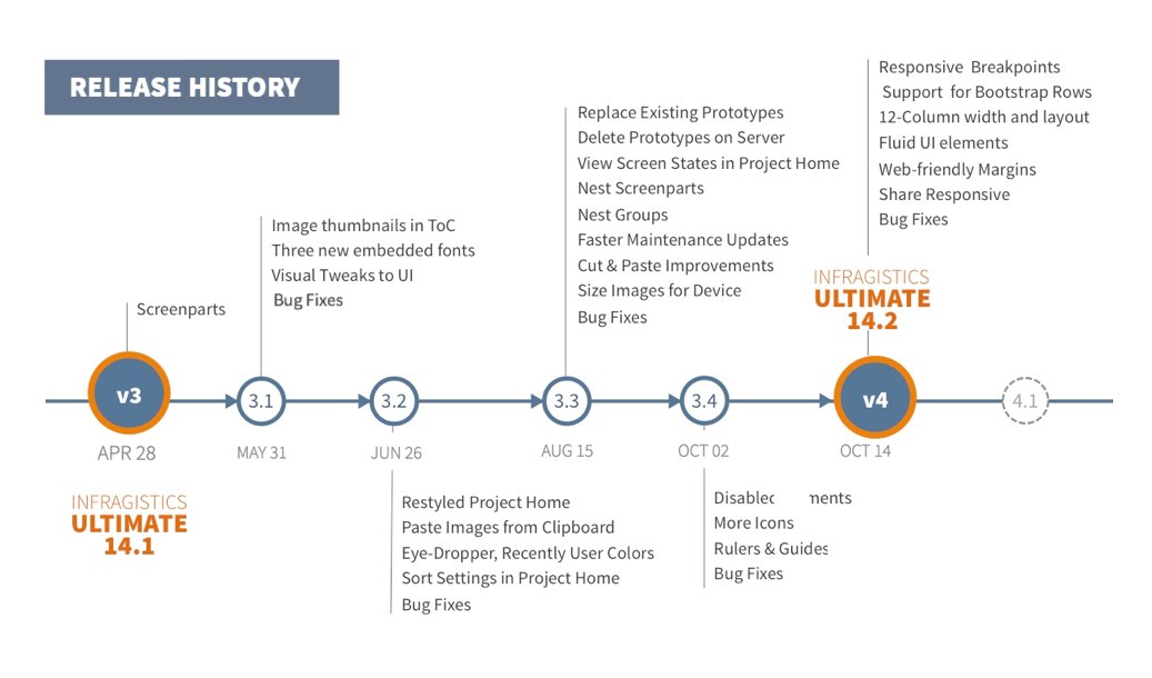
To see what we released till date check out our product release notes. If you haven’t updated your version of Indigo Studio, you should!
With the launch of Version 4, Indigo Studio is laying the foundation for responsive web-pages. And we do this with support from Bootstrap so that HTML markup is consistent and extensible! Here is the list of new features that make responsive web-page prototyping possible:
- Responsive Breakpoints
- Support for Bootstrap rows and cells (columns)
- 12-Column layout
- Fluid UI elements
- Content Layout using Web-friendly Margins
- Preview and Share Responsive Web-page Prototypes
Responsive Breakpoints/Views
When targeting prototypes that emulate responsive websites, Indigo Studio now offers four responsive breakpoints or views that are standardized on Bootstrap:
- XS for Phone (less than or equal to 768 px)
- SM for Tablet (greater than 768 px)
- MD for Desktop (greater than or equal to 992 px)
- LG for very large Desktops (greater than 1200 px)
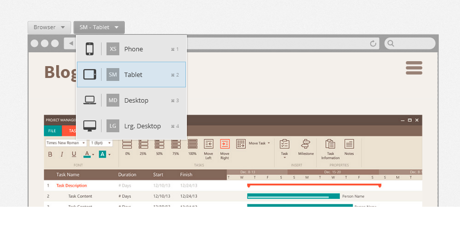
Adopting the bootstrap approach for responsive-grid layout, you are now free to target devices more broadly as opposed to getting lost in the minutia of device resolution vs. viewport widths.
Furthermore, Indigo Studio also allows you to go MOBILE-FIRST, such that the other views inherit from the mobile view (XS —> SM —> MD —> LG). And in typical bootstrap fashion, you can customize/tweak the views for the other breakpoints. So eventually when you need the HTML assets, it follows the Bootstrap conventions as opposed to some home-brew custom layout.
Support for Bootstrap rows and cells (columns)
Picking a responsive layout now adds a bootstrap container to your design canvas. This will allow you to add new rows, and cells inside each row to organize and lay out your content. By making this activity visual, we spare you the details of how bootstrap requires you to define rows and columns.
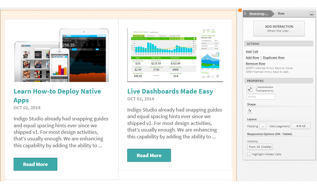
One small tweak we made is to call Bootstrap columns, `cells`. And that’s because depending on the space available and the width of the `cell`, they stack. And continuing to call them columns made less sense since they stack. For example, a row with two columns side-by-side on the tablets may stack vertically on phone. So, calling them cells just seemed to make more sense in such contexts.
All the necessary padding and gutters for a Bootstrap grid come as defaults so that you never have to worry about it!
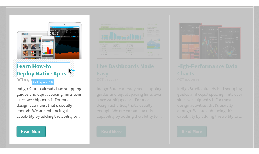
12-Column Layout/Spans
If you are familiar with Bootstrap or responsive web design in general, you may also be familiar with the 12-column structure. This is how the bootstrap grid operates where the cell/column widths are defined in multiples of columns. So instead of setting a specific width (e.g. 400 px), in responsive grids you would set a column-span for the cell. So in order to show two cells side by side, you would set a column span of 6 for each of the cells.
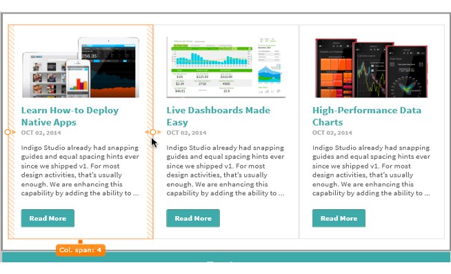
This 12-Column layout is repeated inside each cell such that the UI elements added are sized automatically in terms of column spans. For the most part, you will not even need to think about this. If, for example, you have a large image to be added inside a small cell, simply drop it in and the image is sized accordingly, while maintaining the correct aspect ratio. This really saves you time trying to align and position elements. Everything is automatically aligned and spaced out-of-the-box. You can of course tweak that.
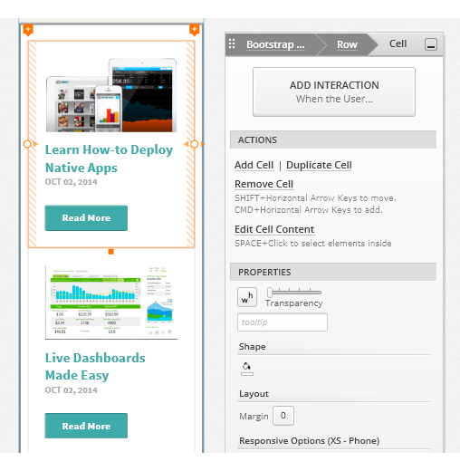
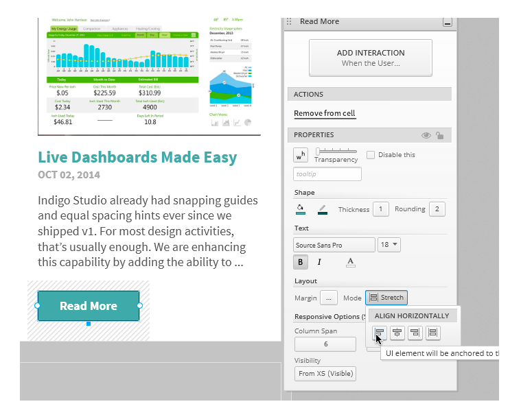
Fluid UI elements
As mentioned earlier, the 12-column layout is repeated inside the cells. UI elements added to a cell take on a full-width (12-column spans). This behavior is governed by the `stretch` property for each UI element. So when you adjust the width of the parent cell, the elements grow or shrink fluidly. You can also adjust the col-span values for the UI elements to make them stack vertically or horizontally.
If specific pixel width is your thing, switch the mode from stretch to align Left, Right or Center.
Content Layout using Web-friendly Margins
Inside a cell, UI elements can be spaced away from each other by specifying margins. By default UI elements have a bottom margin of 15px. You can set custom margins (left, top, right, bottom) via the custom margin editor. As you tweak the values, Indigo Studio helps you visualize the margin being applied.
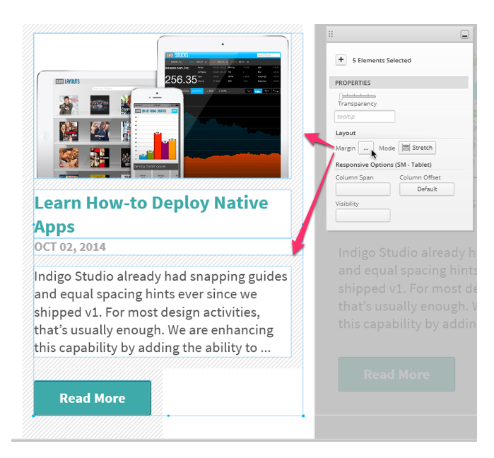
The use of margins for spacing UI elements is something that is different and new for Indigo Studio. It’s different from the absolutely positioning approach used for other viewports like generic or iOS. And since Indigo Studio is targeting responsive web site prototypes, we chose the margin based spacing approach. It takes some getting used to, but in the long run the HTML markup is more predictable and comprehensible. Yes, that means you will be able to export HTML code that is also bootstrap friendly.
Preview and Share Responsive Web-page Prototypes
The responsive web-page layout would never be complete without a way to experience the “responsiveness”. For this reason we tweaked the player for the prototype. You will now find a new option on the player toolbar, one which lets you pick which responsive view to see (phone, tablet, desktop etc.). If you set this option to fit to browser, as you adjust the width you can see the designs adapt according to the space available.
This option is only available when viewing the prototype on a desktop browser. When viewing on a device, Indigo Studio will automatically show you the view meant for the device you are on. Go ahead, and click on the following link to check out a prototype we created to mimic the bootstrap’s own site. After all, isn’t that what we were claiming you can now do?
Launch Responsive Web-Page Prototype
How to get this update?
If you have the option to automatically check for updates on startup checked, you should see a dialog box pop up when you launch Indigo. Simply click update, and Indigo Studio will do the rest. This is the easier approach.
One last thing; you need to have a valid Indigo Studio subscription to receive this major version upgrade (Version 4). If your subscription is still active, a new product key is automatically generated. You can retrieve your v4 product key in the "My Keys and Downloads" section of the Infragistics website. You can also use the Infragistics Ultimate 14.2 product key, if you purchased Indigo Studio as part of the bundle.
Retrieve Product Key/ Verify Subscription Status
This does not mean the version you currently own (e.g., Version 3-Update 4) will stop working. It's for you to use forever. If have questions about the perpetual licensing model for Indigo Studio see FAQ on Indigo Studio Licensing & Pricing
About Indigo Studio for Interaction Prototyping
Don't have Indigo Studio? Download a free 30-day trial which will let you try all of the prototyping goodness.
Looking to suggest improvements and new ideas for Indigo Studio?
If for some reason you are having trouble with Indigo Studio, check out our help topics, forums or contact support.
Follow us on Twitter @indigodesigned
↧
NucliOS Release Notes - October: 13.2.186, 14.1.86, 14.2.162 Service Release
Introduction
With every release comes a set of release notes that reflects the state of resolved bugs and new additions from the previous release. You’ll find the notes useful to help determine the resolution of existing issues from a past release and as a means of determining where to test your applications when upgrading from one version to the next.
Release Notes: NucliOS 2013 Volume 2 Build 186, NucliOS 2014 Volume 1 Build 86 and NucliOS 2014 Volume 2 Build 162
| Component | Product Impact | Description | Service Release |
|---|---|---|---|
| IGChartView | Bug Fix | The radius maximum last line is really close to the interval line. Note: The overlapping axis labels in radial series were fixed. | 13.2.186, 14.1.86, 14.2.162 |
| IGChartView | Bug Fix | IGAverageDirectionalIndexIndicator causes crash. Note: An edge case crash was fixed for average directional indicator containing only one value. | 13.2.186, 14.1.86, 14.2.162 |
| IGFlowLayoutView | Bug Fix | The control stops responding when dragging a hosted IGCalendarView out of view. Note: N/A | 14.1.86, 14.2.162 |
| IGCalendarView | Bug Fix | Message causing appointment orbs occasionally not to render. Note: N/A | 13.2.186, 14.1.86, 14.2.162 |
| IGTreemapView | Bug Fix | Treemap root node offset when treemap's frame origin is not (0,0). Note: Fixed root node bounds when treemap's frame origin is offset. | 13.2.186, 14.1.86, 14.2.162 |
| IGCalendarView | Bug Fix | The text in the week header overlaps when using larger font. Note: N/A | 13.2.186, 14.1.86, 14.2.162 |
↧
↧
Ignite UI Release Notes - October 2014: 13.2, 14.1 Service Release
With every release comes a set of release notes that reflects the state of resolved bugs and new additions from the previous release. You’ll find the notes useful to help determine the resolution of existing issues from a past release and as a means of determining where to test your applications when upgrading from one version to the next.
Release notes are available in both PDF and Excel formats. The PDF summarizes the changes to this release along with a listing of each item. The Excel sheet includes each change item and makes it easy for you to sort, filter and otherwise manipulate the data to your liking.
Download the Release Notes
Ignite UI 2013 Volume 2
- PDF (Ignite UI 2013 Volume 2, Build 13.2.20132.2364)
- Excel (Ignite UI 2013 Volume 2, Build 13.2.20132.2364)
Ignite UI 2014 Volume 1
- PDF (Ignite UI 2014 Volume 1, Build 14.1.20141.2426)
- Excel (Ignite UI 2014 Volume 1, Build 14.1.20141.2426)
↧
NUCLiOS IGGridView: Using the Grid as a UIPickerView
iOS has control called the UIPickerView. It used to be pretty ugly, but in iOS 7 they made it look a lot nicer. However, it still has it's limitations. You can't set a height on it, and its still kind of cumbersome to setup and style. Well, in 14.2 we introduced a new feature that lets you control how Cell's look based on their location within the viewport of the IGGridView. Which actually allows you to pretty easily create your own UIPicker, without any limitations. In fact, you'll...(read more)![]()
↧
Using TestAdvantage in the New UFT 12 Testing Environment
Recently there have been some questions around being able to use Infragistics older TestAdvantage products in the new UFT 12 testing environment. Here are the facts: TestAdvantage (11.1) can be installed and connected to your new UFT 12 testing framework. As long as you have UFT 12 and (if any) UFT patches, you’re good to go.
Just so you’re clear, you have to meet the following criteria to get it to work:
- You have a working installation of UFT 12 with any and all updates;
- You have an installed instance of TestAdvantage (in your case 11.1);
- You wire UFT up with TestAdvantage (through our utility app that is installed in your start menu – essentially updating the SWF config XML file with the TestAdvantage Assemblies / dlls);
- You proceed to run your tests as you have before.
So there you have it!
And if you’re wondering about UFT in comparison to QTP (or if HP did a complete rewrite), wonder no more. We’ve learned that HP did change the name of the product and made some updates:
- changes and additions to the web application testing portion of the testing system;
- changes to support the newer .NET CLR versions; and
- updates to its injection system.
However, the main testing engine components are still the same. The loading, referencing, and configuration modules are essentially the same – still QTP under the hood.
In addition to this, we will continue to test our software to make sure it works in the newer UFT versions so have no fear. And if you encounter any issues with this during your technology migration effort, you can always contact us for help.

↧
Tutorials done right
If I may first ask who likes tutorials? Yeeeeey… And who reads tutorials? Yeeeeey…
I’d rather stop with my clumsy attempts to be ironic and try to reason why tutorials as a concept are flawed, elaborate with a few examples of tutorials done wrong and finish by giving my tips on how to design a tutorial as if there were no tutorial at all.
The human brain is a bizarre entity with a vast number of chemical reactions going on. Already as toddlers we are educated into distinguishing between right and wrong. We are actually being told and educated. As we are quite fresh into the world, we accept this as it seems impossible to reason against it. But later on an interesting hormonal event takes place – a period notoriously known as teenage. Then we go to the opposite side, the dark side of the force. We reject any piece of advice and always do the opposite of what we are told or expected to do. In the end once the hormone levels are more or less in balance again we are somewhere in between drifting one way or the other from time to time. But how does this relate to tutorials you may ask? Simply the concept of a tutorial is by origin telling the user what to do and how to do it. And very often the case is that users don’t want to be told what to do, they don’t need guidance, they don’t want to feel lost, helpless clueless. They just want to get the right piece of information only when they need it. A piece of information that does not resolve the problem but gets them out of the place they were stuck at in order to discover this solution on their own. Do you think that tutorials are presently done that way? My own experience as a user whispers in my ear “NO” (actually it screams it because I have seen more than I wish existed). Let’s look into a few examples!

So what’s wrong with these two samples?
The one on the left is a brainstorming tool. You may think that the one on the left is fine because it presents you with the interface without wasting your time. I thought so as well and tried to interact with the huge white surface as it seemed to be inviting me to write, that is what you do when you brainstorm right? Wrong - this screen is actually showing a list of all your “projects”. Well, opening the app for the first time I obviously have no projects so rather than showing a list of nothing why don’t you simply invite me to create my first project? Then at least I would have a list of one project and will be able to understand at least that it is a list rather than a drawing canvas. And one last thing: when I launched the app there was this animated finger pointing at the help section. It reminded me of the good old clippy fella.
The right example is a slightly better implementation of a tutorial. You are presented with a four-option menu, where only one of the options is tappable (will hold my urge to comment this as I am only talking about tutorials). When you tap it you are presented with a pool table with the cue ball and another ball and are being instructed how to aim and choose the power that you hit the cue with. Not bad and it takes less than a minute but why is this extracted from the game itself. Is it so dangerous if I mess up my first shot in a pool game because I misunderstood the controls? And why do I need to be told to move my finger to aim first and then drag the power meter to select the force I put in the shot. Such simple interactions are the first thing that most of the people are likely to try and succeed. So why is there this separate tutorial at all?
Do you know what the benchmark is for a successful tutorial is? The answer to one simple question: So how did you like the tutorial? And you know you did your job well not when you get a yes, but when you are asked in return: WHAT TUTORIAL? Because well designed tutorials are such a seamless part of the overall user experience that people are unable to distinguish or recognize them as such. Luckily there are many more tutorials like that lately and this gives my UX focused brain some peace. And if you want to know in more detail what effort goes into the design of a brilliant tutorial, I would kindly ask you to google for “How I Got My Mom to Play Through Plants vs. Zombies”. You didn’t know that there was one in the game? This further supports my claim. Take a look at the video and discover how a tutorial can be blended to become a part of the whole game.
↧
↧
Developer News - What's IN with the Infragistics Community? (10/14-10/19)
This week's article roundup is pretty design-centric. I'm enjoying the variety here, are you?
5. Mentoring Humans and Engineers (InfoQ)
4. Product Design Process & Documentation Essentials (Part 1) (Designmodo)
3. Software Design is Just Theory (Mathias Verraes)
1. Designing a Responsive Navigation Your Users Will Love (Vandelay Design)

↧
Have You Seen the New Infragistics.com?
If you've been to infragistics.com lately, you may have noticed a lot has changed. We've made some exciting improvements to make the site easier to use - so you can get what you're looking for faster.
We've created a quick walkthrough video to help you find your favorite areas like those in-depth control pages and forums - and we've even added some exciting new features, like our video and sample application pages! Take a look:
[youtube] width="560" height="315" src="http://www.youtube.com/embed/kLD4MqN_lZ4" [/youtube]

↧
Galaxy Note 4 and iPhone 6+ Go Head to Head
As it happens every year, Samsung and Apple continue their relentless battle within the smartphone market. The two manufacturers usually compete in more of an indirect way, meaning there are always differentiating features when comparing devices. Unlike their previous engagements, Apple is now in Samsung territory. This year may be a bit different than the previous years since Apple finally decided to have a crack at the trend towards phablet type devices.
Samsung has been developing the Galaxy Note series since around 2011, so the iPhone 6+ will undoubtedly lack much experience in this delicate craft. Proof of this may be seen in that some users have been complaining about their iPhone 6+ bending just from sitting in their pocket. Obviously, Samsung took full advantage of this to exploit the weakness of its competitor by glorifying the strength and durability of its own creation. The Note 4 is the first time Samsung is using a metal framing for its device and is trying to make sure the market knows about it.

In terms of performance, both are incredible and the iPhone 6+ seems to win on more of the graphic performance tests. Samsung, however, has managed to create one of the most magnificent displays on the market. The Note 4 features a 5.7” screen with 1440x2560 screen resolution and the Super AMOLED panel has an incredible 515 ppi. The iPhone 6+ has a more standard 5.5” screen with 1080x1920 screen resolution and a smaller pixel density of 401 ppi. The specs are mostly just numbers and to us normal user’s, the difference in pixel density is almost impossible for us to distinguish. The color and display quality is arguably better on the Note and the display measurements slightly favor those on the Note over the iPhone. Both phones manage to present a gorgeous display and ultimately it will be up to the consumer to choose which they prefer.
Despite the superior hardware from Samsung’s Note 4, Apple’s custom A8 chip outperforms on most performance benchmarks. The two processors competing here is Qualcomm’s 2.7 quad-core Snapdragon 805 vs. Apple’s A8 chipset which utilizes two 1.4 GHz Cyclone cores. RAM is a pretty big difference between devices, Samsung’s being 3GB of LPDDR3 RAM vs. Apple’s low amount of just 1GB. The reason for the Note 4’s underwhelming stats is because of its ridiculously high pixel count. In actual user experience, both perform exceptionally and again, it’s up to the user’s preferences. For more in-depth analysis of all the performance numbers and comparisons, you can check out these benchmarks.

When we get down to the software side of things, it’s of course, Android vs iOS. Android will probably always offer more of the customizable options and iOS will always be more user-friendly, but may lack some of the customization features. This is usually the deal breaker for most. If you use Apple products then it’s always easier to sync your devices than having a plethora of others. Android users will of course be able to mesh easily with most other devices as well. iOS will also be including Apple Pay this year, which is also a new feature added to the iPhone 6. This may also be a deal breaker for some consumers since it is likely to be a huge hit.
For those who want the larger screen version of the iPhone, iPhone 6+ is for you. Those that want the feature rich phablet offerings of Samsung’s Note 4 will be satisfied with their choice. The S Pen is something that will always make the Note a relevant competitor in the phablet market. This time around, it should be an interesting battle between the two competitors. Apple may have their work cut out for them although they did get to release a bit earlier and force Samsung to release before they intended. I think that the Note 4 will do well, as usual, and Apple will get to take this opportunity to learn for their next phablet device.


↧
Developer News - What's IN with the Infragistics Community? (10/20-10/26)
Who has shaped development history? How much are developers getting paid today? Last week's most popular Infragistics Developer News articles answer these questions and more!
5. The Birth of Visual Basic (Forest Moon)
4. See Where America's Highest Paid Developers Live (Mashable)
3. The Forgotten Female Programmers Who Created Modern Tech (All Tech Considered)
2. We Need Functional Programming BECAUSE a Large Subset of us are Average or Below (Javalobby)
1. 20 Gorgeous Examples of Timeline in Web Design for Inspiration (Hongkiat)
↧
↧
Feature Spotlight: New Features in the Infragistics WPF XamDataGrid
Since I have been working here at Infragistics, I have been gathering tons of great customer feedback, and have been trying to identify the areas of our WPF product where we can start improving. It became blatantly obvious that the xamDataGrid was way too complicated, and nearly impossible to use without reading the docs, combing the forums, looking at samples, or contacting support. Well, that is just unacceptable. Although our xamDataGrid has more features and is better performing than any of our competitors, it is just too freaking hard to use. So I set out to fix that in our 14.2 release, and fix that I did!
Field Specific Editors
One of the biggest complaints the xamDataGrid had was with how difficult and non-intuitive/discoverable it was to define simple column definitions and set properties for the editors of those columns. For example; let’s say that I want to create a simple column that used a masked text editor and set the mask to some custom string. Sounds like that should be a simple task right? Well, this is what you would have to do in order to achieve that simple scenario.
<igWPF:Field Name="SKU" Label="SKU">
<igWPF:Field.Settings>
<igWPF:FieldSettings EditorType="{x:Type igWPF:XamMaskedEditor}">
<igWPF:FieldSettings.EditorStyle>
<Style TargetType="{x:Type igWPF:XamMaskedEditor}">
<Setter Property="Mask" Value="########-###" />
</Style>
</igWPF:FieldSettings.EditorStyle>
</igWPF:FieldSettings>
</igWPF:Field.Settings>
</igWPF:Field
So, I have to define a Field and set the Name and Label, then create a FieldSettings object, then set the EditorType of that object. Next, I have to create a style that targets the xamMaskedEditor, set its Mask property via a style setter, and assign the FieldSettings.EditorStyle property. WOW! That’s crazy complicated. What XAML developer on earth would just know that’s what they have to do in order to use a mask for a column? None that I know of. How about you?
Well, we fixed it! Now, we have provided you with field specific editors so that you can define a field based on the editor you require, and then have access to that editor’s properties directly on that field object. So now all you have to do is this:
<igWPF:MaskedTextField Name="SKU" Label="SKU" Mask="########-###" />
Now that is so much nicer, and you don’t have to be a rocket scientist to figure it out. Look at all that code that you no longer have to write.
ComboBoxField
But wait, it gets better. You can probably guess that we provide you with field specific editors for all of our supported editors including a ComboBoxField. Yes, that’s right a ComboBoxField! Now this is one of my favorite new field editors. Why do you ask? Well, let’s do a quick review of what you had to do before these new field editors.
First you need to create a ComboBoxItemsProvider as a Resource. But the real issue is trying to bind the ItemsSource to a collection on your DataContext. That’s not so simple. It really only works when you are using your ViewModel as a StaticResource, and honestly, not many people do that. So, it becomes a very confusing and difficult task to even bind your ItemSource at all.
<igWPF:ComboBoxItemsProvider x:Key="stateForDropDownsProvider"
ItemsSource="{Binding StateForDropDowns, Source={StaticResource ViewModel}}"
DisplayMemberPath="Name" ValuePath="StateIdent" />
ItemsSource="{Binding StateForDropDowns, Source={StaticResource ViewModel}}"
DisplayMemberPath="Name" ValuePath="StateIdent" />
Then you had to create an EditorStyle, and set the ItemsProvider using a style setter to the ComboBoxItemsProvider:
<igWPF:Field Name="StateId" Label="State" Width="78" ToolTipService.ToolTip="The state">
<igWPF:Field.Settings>
<igWPF:FieldSettings EditorType="{x:Type igWPF:XamComboEditor}">
<igWPF:FieldSettings.EditorStyle>
<Style TargetType="{x:Type igWPF:XamComboEditor}">
<Setter Property="ItemsProvider" Value="{StaticResource stateForDropDownsProvider}" />
</Style>
</igWPF:FieldSettings.EditorStyle>
</igWPF:FieldSettings>
</igWPF:Field.Settings>
</igWPF:Field>
Well, we fixed it! Not only did we fix it, but we improved the ability to data bind field properties as well. If you have ever used the xamDataGrid, then you already know that trying to bind anything on a Field isn’t going to work because those Field objects did not inherit the DataContext. Well, now you can. Now all you have to do is this:
<igWPF:ComboBoxField Name="StateId"
ItemsSource="{Binding DataContext.StateForDropDowns, RelativeSource={RelativeSource Self}}"
DisplayMemberPath="Name" ValuePath="StateIdent" />
ItemsSource="{Binding DataContext.StateForDropDowns, RelativeSource={RelativeSource Self}}"
DisplayMemberPath="Name" ValuePath="StateIdent" />
FieldBinding
While that is nice and all, it is still too much code to write to create the binding. So, we went ahead and simplified that even more by providing a custom binding markup extension called FieldBinding so that you can do this:
<igWPF:ComboBoxField Name="StateId"
ItemsSource="{igWPF:FieldBinding StateForDropDowns}"
DisplayMemberPath="Name" ValuePath="StateIdent" />
ItemsSource="{igWPF:FieldBinding StateForDropDowns}"
DisplayMemberPath="Name" ValuePath="StateIdent" />
Now that is looking much better. This new FieldBinding markup extension is to be used anytime you want to data bind a property of a field to the DataContext of the xamDataGrid. So for example, you can also do something like this:
<igWPF:MaskedTextField Name="SKU" Mask="########-###" IsReadOnly="{igWPF:FieldBinding IsColumnReadOnly}"/>
But why limit it to just fields? We can use this for FieldSetting too. So we can even do something like this:
<igWPF:FieldLayoutSettings AutoGenerateFields="False"
AllowAddNew="{igWPF:FieldBinding IsAddNewRecordAllowed}"
AllowDelete="{igWPF:FieldBinding IsDeleteAllowed}"/>
AllowAddNew="{igWPF:FieldBinding IsAddNewRecordAllowed}"
AllowDelete="{igWPF:FieldBinding IsDeleteAllowed}"/>
Cell Bindings
Now, you may be thinking to yourself “hey Brian, this is freaking amazing like everything else you do, but what if I want to data bind a property from the underlying data bound item to a property on the editor on a row-by-row basis?”. My answer to you is No Problemo! We also introduced the concept of what’s called a CellBinding. You can create any number of CellBindings to create a binding between a property of the editor to the underlying data item, AND to any property of the CellValuePresenter as well.
Prepare to have your mind blown…
<igWPF:TextField Name="Make" >
<igWPF:TextField.CellBindings>
<igWPF:CellBinding Property="Foreground"
Target="CellValuePresenter"
Binding="{Binding Path=DataItem.Color, Converter={StaticResource ColorToBrushConverter}}"/>
<igWPF:CellBinding Property="IsEnabled"
Target="Editor"
Binding="{Binding Path=DataItem.IsAvailable}" />
</igWPF:TextField.CellBindings>
</igWPF:TextField>
As you can probably see, we are creating a binding for the Foreground of the CellValuePresenter and the IsEnabled property of the Editor to different properties on the underlying data item. Now that is just sick!
Template Fields
So, right about now you are running down the street cheering “Brian for President”, but wait just a minute, because I’m not done yet! Have you ever needed to use a custom control as an editor in a column? I know I have. Before, it was a major pain in the butt, and honestly, I couldn’t even get it to work. That’s how bad it was.
Well, we fixed it! We have now added a new TemplateField so that you can now provide your very own custom control for both the display and edit states of a cell. So, let’s say you want to use the xamColorPicker as an editor in the xamDataGrid. Well, we don’t have one built in, so you would be responsible for writing all the custom code to make it work. I’m not even going to add the code to do that because it was so complicated. Instead, we will jump right into how you do it now with the new TemplateField.
<igWPF:TemplateField Name="Color">
<igWPF:TemplateField.DisplayTemplate>
<DataTemplate>
<Rectangle Width="130" Height="20"
Fill="{Binding Path=(igWPF:TemplateEditor.Editor).Value,
RelativeSource={RelativeSource Self}}"/>
</DataTemplate>
</igWPF:TemplateField.DisplayTemplate>
<igWPF:TemplateField.EditTemplate>
<DataTemplate>
<ig:XamColorPicker Width="130" Height="20"
SelectedColor="{Binding Path=(igWPF:TemplateEditor.Editor).Value,
RelativeSource={RelativeSource Self},
UpdateSourceTrigger=PropertyChanged, Mode=TwoWay}" />
</DataTemplate>
</igWPF:TemplateField.EditTemplate>
</igWPF:TemplateField>
As you can see, we are providing a Rectangle to represent our DisplayTemplate, and the xamColorPicker as the EditTemplate. As you can see, the binding syntax looks a little complicated. So, we decided to make that a little easier for you as well. We added a a new binding markup extension called TemplateEditorValueBinding which simplifies all of that messy binding syntactical sugar. So you can simply write:
<igWPF:TemplateField Name="Color">
<igWPF:TemplateField.DisplayTemplate>
<DataTemplate>
<Rectangle Width="130" Height="20" Fill="{igWPF:TemplateEditorValueBinding}"/>
</DataTemplate>
</igWPF:TemplateField.DisplayTemplate>
<igWPF:TemplateField.EditTemplate>
<DataTemplate>
<ig:XamColorPicker Width="130" Height="20" SelectedColor="{igWPF:TemplateEditorValueBinding}" />
</DataTemplate>
</igWPF:TemplateField.EditTemplate>
</igWPF:TemplateField>
API Improvements
The last thing I want to mention is the improvements we made to the field API. We tried to identify the most commonly used properties that are exposed off of the FieldSettings class and surfaced them on the Field level. What do this mean for you? It means fewer lines of code.
So instead of having to do write this:
<igWPF:Field Name="Make" >
<igWPF:Field.Settings>
<igWPF:FieldSettings AllowEdit="False"
AllowFixing="Near"
AllowGroupBy="False" />
</igWPF:Field.Settings>
</igWPF:Field>
<igWPF:Field.Settings>
<igWPF:FieldSettings AllowEdit="False"
AllowFixing="Near"
AllowGroupBy="False" />
</igWPF:Field.Settings>
</igWPF:Field>
You can remove the FieldSettings object completely, and just do it like this:
<igWPF:Field Name="Make" AllowEdit="False" AllowFixing="Near" AllowGroupBy="False" />
Summary
As you can see, we have made a ton of improvements to the xamDataGrid, and all of these features are available to you now in the 14.2 release of the Infragistics WPF controls. My job here at Infragistics is to improve the Infragistics WPF controls to make your job easier. If you have complaints, I want to know about it. If you have feature requests, I want to know about them. If you have positive comments, those are welcome as well. The point I am trying to make is that you need to let me know what you think, good or bad. You can do that in a number of ways. First you can submit your feature requests to the Infragistics Product Ideas website. If you don’t submit the idea, it will never get considered for implementation. You can follow and contact me directly on Twitter at @brianlagunas. You can even leave a comment on this post. Now you have no excuse of why you can’t provide feedback.
↧
Infragistics Silverlight SR Notes – October: 14.2, 14.1, 13.2
Release notes reflect the state of resolved bugs and new additions from the previous release. You will find these notes useful to help determine the resolution of existing issues from a past release and as a means of determining where to test your applications when upgrading from one version to the next.
Release notes are available in both PDF and Excel formats. The PDF summarizes the changes to this release along with a listing of each item. The Excel sheet includes each change item and makes it easy for you to sort, filter and otherwise manipulate the data to your liking.
In order to download release notes, use the following links:
Silverlight 2014 Volume 2 Service Release (Build 14.2.20142.2021)
• Notes in PDF Format
• Notes in Excel Format
Silverlight 2014 Volume 1 Service Release (Build 14.1.20141.2138)
• Notes in PDF Format
• Notes in Excel Format
Silverlight 2013 Volume 2 Service Release (Build 13.2.20132.2251)
• Notes in PDF Format
• Notes in Excel Format
↧
Infragistics WPF SR Notes – October: 14.2, 14.1, 13.2
Release notes reflect the state of resolved bugs and new additions from the previous release. You will find these notes useful to help determine the resolution of existing issues from a past release and as a means of determining where to test your applications when upgrading from one version to the next.
Release notes are available in both PDF and Excel formats. The PDF summarizes the changes to this release along with a listing of each item. The Excel sheet includes each change item and makes it easy for you to sort, filter and otherwise manipulate the data to your liking.
In order to download release notes, use the following links:
WPF 2014 Volume 2 Service Release (Build 14.2.20142.2024)
• Notes in PDF Format
• Notes in Excel Format
WPF 2014 Volume 1 Service Release (Build 14.1.20141.2174)
• Notes in PDF Format
• Notes in Excel Format
WPF 2013 Volume 2 Service Release (Build 13.2.20132.2284)
• Notes in PDF Format
• Notes in Excel Format
↧