Quantcast
Channel: Infragistics Community
Viewing all 2374 articles
Browse latest View live

My I-90 User Group Tour (Buffalo, Rochester, and Syracuse) Follow up

$
0
0

What an awesome week!  If you have been following me on twitter, then you know that I was on my I-90 User Group Tour last week.  I spoke at three user groups, in three days.  Unlike my BAM! User Group Tour that took me on nine airplanes, this tour only had me on four.

I started my tour by flying into Buffalo on March 25th.  I like to fly in a day early when speaking at events.  You never know what will happen during your travel that may cause you to be late, such as a delayed or cancelled flight, flat tire, or some other unforeseen obstacle.  My flight from Boise to Chicago was right on time.  Everything was perfect.  Until the plane actually landed in Chicago.  For some strange reason, we didn’t have a gate when we landed and we were forced to sit on the tarmac for 20 minutes waiting for a gate.  You may be thinking no big deal right.  Well, unfortunately for me I only had a 45 minute layover for my flight to Buffalo, which just happens to be the last flight to Buffalo for the day.  We finally got a gate at 5:45 pm.  My next flight left at 6:00 pm.  Those of you you who travel often already know that if my plane departs at 6:00 pm, my flight boarded at 5:30 pm.  Yeah, looks like I’m spending the night in the Chicago airport.  Or am I?

Our arrival gate was B21.  Luckily for me I was upgraded to first class so I was at the front of the plane when the door opened.  I literally ran, some call it a sprint, from B21 all the way to gate C29 in just under five minutes.  For you who aren’t familiar with the Chicago airport (ORD), gate C29 is in another concourse on the other side of the tarmac.  I made it to the gate just before they closed the door.  Thank goodness, because I really didn’t feel like spending the night in the airport.

Microsoft Developers of Western New York

My first stop was the Microsoft Developers of Western New York located in Buffalo, New York.  This great group is lead by Richard Nalezynski and the meeting was held at the awesome facilities of Buffalo Computer Graphics on March 26th.  Pizza was served for dinner, and there was no shortage of conversation.  This meeting was all about WPF.  I gave my “WPF for the Real World” talk, and had tons of great questions.  Richard is a a great guy and runs an awesome group.  If you are ever in the area, I would highly recommend stopping by.

Brian Lagunas speaking at Microsoft Developers of Western New York

Visual Developers of Upstate New York

My next stop was the Visual Developers of Upstate New York located in Rochester, New York.  Luckily for me it was a really short 60 minute drive.  I met up with Bob Nims, the group leader, at the New Horizons training facility.  I just happened to show up right when the pizza did.  I like it when I have such good timing.  This was a smaller group than I am used to, but the content was just as good.  We had a great discussion about “Developing Composite XAML Applications with Prism”, and even had a few members that were currently writing Prism applications.  I love that!  There were tons of great questions, and we even got to go into some more advanced details.

Brian Lagunas speaking at Visual Developers of Upstate New York

Central New York Developers Group

My last stop on the tour was the Central New York Developers Group in Syracuse, New York.  The very smart Andy Beaulieu heads up this group of devs.  There was a really good turnout at this meeting and the New Horizons facility barely had room for everyone to fit.  This group also chose my “WPF for the Real World” talk, and I could see why.  There were tons of devs getting into XAML.  This lead to great questions, and an awesome conversation on various aspects of developing WPF applications.  I even got to help them understanf some of the most common mistakes and dos/don'ts of XAML application development and MVVM.

Brian Lagunas speaking at Central New York Developers Group

Sample Code

I would like to thank each and every user group for inviting me come speak at their group.  I would also like to thank all of the attendees that took time out of their day and away from their families to come hear me speak.  I met a ton of smart and talented people.  I am always amazed at the vast amount of knowledge that is shared at each and every group I attend.  My favorite part about traveling to different groups is meeting all these great people.  I always learn more from them, than they probably do from me.

For those of you who attended the “Developing Composite XAML applications with Prism” talk and want the sample code, look no further.  In other words, if you came to the Visual Developers of Upstate New York meeting, you can get the samples below.

Download the Live Demo source code
Download the Prism DelegateCommand sample
Download the Prism CompositeCommand sample
Download the Prism EventAggragator sample

For the other two groups, the “WPF for the Real World” was more of a dynamic talk that was adhoc depending on the direction the group took it.  So, I only have one sample to share, since we basically started from scratch and played around in Visual Studio talking about various aspects of WPF.  You can get your sample below.

Download the WPF for the Real World sample

If you have any questions feel free to contact me through my blog, on Twitter (@BrianLagunas), or leave a comment below.


Principles of Design - Android Style

$
0
0

I recently attended a lecture at the SXSW conference given by Rachel Garb & Helena Roeber.  Rachel Garb leads interaction design for Android apps at Google and Helena Roeber led Android’s UX research from 2007 through 2012.  The purpose of their lecture was to explain the current “Principles of Design” that the Android teams are expected to use when creating their applications. 

The idea behind them is simple.  People use software.  People are emotional beings.  Software should make people feel good, and not bad.  That’s obviously pretty clear to anyone who has done any kind of development or UI design work.  The last thing you want is for the users to hate using the application.   What the Android team did was take that simple idea and try and create a system based on emotional response to help them, guide them, in their design work.

The truth is, emotional responses are integral to every user experience that exists, and software is certainly no exception.  There isn’t a developer alive who hasn’t had someone somewhere tell them how much they “hate” some application or program because it makes them feel “stupid”.   It’s not something new, but it’s worth rethinking. 

What Android did was take into account the research of Nobel prize winning scientist Daniel Kahneman, who began studying exactly how emotional responses impact people.  Their findings aren’t totally shocking, but they are in some ways surprising by the powerful impact that our emotions can have on us.  They found that negative emotions are not only harmful to our health, but may actually shorten our lives.  Positive emotions on the other hand, are actually a necessity for our ensured survival.  We require them on a daily basis.  They also protect us from depression, illness and promote both physical and mental well-being. 

As developers, we may not always take into account how the impact of our design or perhaps a bug in our software can impact a user.  But we should. 

The Android design principles break down like this.  There are 3 “Pillars” which are the fundamental concepts which all their principles are based on.  These are as follows:


Each one of these “pillars” has a set of associated principles.   The idea is that the principles are the pathway to achieving the concept of the pillar.  The principles for each pillar are shown below:

If you look at the principles for each of the pillars, you can see how they are designed to support the overall concept of the pillar. 

Enchant me is, according to Garb & Roeber, filling people with joy.  It’s about giving them beautiful images to look at and providing graceful and seamless transitions.   It’s about letting users customize and design their space to suit them, and allowing them to directly interact with items, touching them, in effect.  

Simplify my life is about making things simple for people.  Explaining things clearly, either using images or brief and to the point words.  It’s about bringing attention to the things that are important.

Make Me Amazing is all about avoiding what I feel is the number one negative impact of software, making people feel like they don’t know what they are doing.  It’s about empowering the user and making them feel capable and smart.  It’s about letting them feel in control of things. 

It’s simple really.  Good design allows user to feel good about using your product.  Bad design isn’t.  

In days gone by I used to train people on using Microsoft Office.   The training was usually based on some kind of basic outline for how to use Word, Outlook, Excel, etc.  And more often than not, it was filled with replicative ways to accomplish the same task.  I remember the rational clearly.  Not everyone wants to do things the same way, and so we’ll show all of them a dozen ways to do anything! 

This only led to users being overwhelmed by options.   The number one complaint I got in these classes was “There are too many ways to do things.  Just show me one way.  It’s all I need. “    Think about that simple statement and how the principals Android has put together apply.  There are pieces to each pillar which apply to just that statement. 

  • Let me make it mine – too many options can prevent a user from feeling like they can make the application behave how they want it to.
  • Keep it brief, Only show me what I need when I need it, If it looks the same it should act the same – all of these can be impacted by too many choices.
  • Give me tricks that work everywhere, it’s not my fault, sprinkle encouragement, make important things fast – an overwhelming option set defeats all of these principals.

While this lecture was clearly targeted at UI and UX design work, I believe it can be applied to ALL aspects of development, and should be.  There is a very simple principal we can all keep in mind which will allow us to incorporate these principals.  Look at the ratio of positive and negative interactions which occur during any given process or experience.  If there are more positives you might be on the right track.  Why might?  Let me explain.

There is a very old saying  - “You only get one chance to make a first impression”.  It’s simple truth.  And underneath that is the concept that negative experiences don’t tend to go away.  They linger.  In fact, think of it like this.  It takes 3 positive experiences to essentially balance a single negative one. 

During their presentation Garb and Roeber used the example of having two jars – one for positive experiences and one for negative.  If you trigger something positive you get to put a marble in the positive jar.  If you trigger something negative, then 3 big marbles go in that negative jar.  It’s very clear how easily a negative experience outweighs a positive one. 

One example came right in to my head when I was listening to this discussion.  I remember doing some debugging work with a friend of mine, and we were trying to determine the cause of a load error for a piece of code.  There were a variety of links that came with the generic Microsoft error code, and finally at one point my friend stood up and just stomped away from his machine.  I wasn’t sure what had actually happened, but when he came back he walked over and he sat down and looked at me and said “You are not going to believe this, you’re just not.”

“So, I’m going through all the recommended fixes for our problem, and none of them work.  Not one.  So there is a link for additional assistance that pops up.  I click on it and you won’t believe what it says.”

“What?” I asked. 

“First it tells me maybe I should ask someone with more experience than me.  Then it says if that doesn’t work, maybe I could ask a friend.”  We both laughed, but I think you can see my point here.

HavingC software basically tell you that you are –

a)      not smart enough to understand this – get a more experienced person  and maybe you should

b)      phone a friend, well it’s not a positive experience.  Clearly.

My point is, if we all can find a way to keep the idea that any process, any GUI, any piece of our application should fall into these concepts, we’ll end up making creating software that is actually useful to our target consumers, and they won’t need to phone a friend to understand how to use it.

VSLive! Las Vegas Event Recap – A Quintet of Mobile iOS & Windows Phone Dev Talks

$
0
0

VSLiveLasVegas2013BlogBanner

I’m exhausted…

I’m still recovering from my days in Vegas last week…

You might say “What happens in Vegas, stays in Vegas”, but then again you’d get the wrong idea about why I’m exhausted. It probably has something to do with presenting FIVE breakout sessions at Visual Studio Live! Las Vegas at the MGM Grand last week, four of which were presented back-to-back on Thursday. Also to blame was the hotel network which decided to wreak havoc on my mobile push notifications demos for Windows Phone and iOS, and my Windows Phone emulators that decided to crap out on me (I hate Hyper-V), both forcing me into late night debugging sessions while attendees & speakers were partying at Tabu.

All my demos worked out fine in the end, but my sleep patterns suffered the most. Well, almost. The true sufferance came when my back gave out at the Vegas airport on Friday morning, forcing me into an excruciatingly painful travel day aboard connecting flights after my direct flight was cancelled “because the pilot did not feel too well”. Two chiropractor appointments and one deep muscle massage later, I’m still on the road to recovery, but thank goodness for Advil!

Back to my talks. I promised attendees I would post all my session slides and demos, and I’m here to keep my promise. Below is a list of all my talks, along with descriptions, links, slides and zipped demos.

I want to thank all the attendees who came to my talks. Prissy networks and emulators aside, I love getting on stage in front of developers and geek out for an hour or so about cool mobile practices and development techniques. I especially want to thank the attendees who came to my Windows Phone & Speech talk on Thursday morning at 8:00AM. Considering the early hour and the fact this was a last minute replacement session where I stepped in for a speaker who sadly couldn’t make it, you guys are troopers!


WPMultitaskingBanner

Designing Your Windows Phone Apps for Multitasking and Background Processing

It may be called "Windows" Phone, but Microsoft's smartphone operating system does not share its big brother's multitasking model. "Fast and fluid" is the motto to insure the best user experience possible while at the same time optimizing power consumption on the device. Windows Phone may only allow only one application to run in the foreground at a time, but several features were introduced in version 8.0 and 7.5 to allow an application to perform some actions even when it is not the active foreground app. This demo-heavy session will focus on those techniques including scheduled tasks & background agents, playing audio & tracking the user location in the background, and we'll also discuss how Voice-over-IP (VoIP) integrate deeply into the OS for better background processing. You'll also learn about Fast Application Switching & Tombstoning should your application ever get terminated. Learn how to make your application a first-class citizen on Windows Phone and put this session in the foreground of your schedule.

Download the slides and demos here

Noteworthy Links from my Windows Phone talks:


WPSpeechBanner

Developing with Speech in Windows Phone 8 Apps

Can you hear me now? Move over Siri, here comes an army of speech-enabled mobile applications on Windows Phone. Mobile applications are not always easy to work with due to the small screen and small on-screen keyboard. Using our voice is a natural form of communication amongst humans, and ever since 2001: A Space Odyssey, we’ve been dreaming of computers who can converse with us like HAL9000. Thanks to the new Microsoft SDKs for voice recognition and speech synthesis (aka text-to-speech), we are now several steps closer to this reality. This session explores the development techniques you can use to add voice recognition to your Windows Phone applications, including in-app commands, standard & custom grammars, and voice commands usable outside your app. We’ll also see how your apps can respond to the user via speech synthesis, opening-up a new world of hands-free scenarios. This reality is here, you’ll see actual live demos with speech and you can now learn how to do it.

Download the slides and demos here


iOSfordotNetBanner

iOS Development Survival Guide for the .NET Guy (or Gal)

The trend continues where .NET developers show their hunger for iOS development. This was the SIXTH time I presented this talk to date, and despite the larger keynote room, I once again had a full house. This session is targeted at developers that know nothing about iOS development, Xcode or Objective C, and everything is presented from the perspective of people already knowledgeable about .NET, Visual Studio and C#. We looked at why you should care about building native iOS apps and I provided a quick intro to the Apple world. I presented everything you need to get started with iOS development (yes, you need a Mac) and we built our first iOS project. I made several comparisons with the Visual Studio world to explain iOS principles, we took a peek at the many iOS frameworks, the many options for third-party iOS controls, and where to go from here.

Download the slides and demos here

Noteworthy Links from my iOS talks:


ModerniPadAppBanner

Modern Apps Live! – Building a Modern iPad App

Co-located with VSLive! Las Vegas, Modern Apps Live! was a novel 3-day event, presented in partnership with Magenic, that brought Development Managers, Software Architects and Development Leads together to learn the latest and greatest techniques in low-cost, high-value application development.

What sets Modern Apps Live! apart is the singular topic focus; sessions build on each other as the conference progresses, leaving you with a holistic understanding of modern applications. Attendees got to dive deep into MyVote, a full-featured polling platform hosted in the cloud with multiple front-ends on Windows 8, Windows Phone and iPad.

In this session I presented a high level overview of how the iPad version of the MyVote client was built, and what were some of the design decisions behind it. Attendees learned how to implement a mobile iPad application that provides a comparable user experience, while leveraging the same back-end code that supports Windows 8 and Windows Phone 8.

Download the slides here

The MyVote application code for all components will be posted as a whole by Magenic. I’ll be sure to update this post once everything is made available.

Additional links for this talk:


MobilePushBanner

Building Multi-Platform Mobile Apps with Push Notifications

The best mobile applications don't live in a vacuum. They are augmented by dedicated servers, the Internet and Cloud services. While it's one thing to reach out to server-side services from a mobile application, it's a completely different affair when the tables are turned and the server needs to reach the phone. Enter push notifications. From iOS to Android, Windows Phone and Windows 8, discover how to send push notifications from cloud-hosted services to a mobile app running on a tablet or phone, and learn how to handle those alerts in your mobile app. We'll discuss the various push notification services from Microsoft, Apple and Google, how to leverage them in your mobile applications, how to deal with push scenarios for any given multi-platform app, and we'll also look at platform-specific notifications, like scheduled alerts on iOS and Live Tiles on Windows Phone and Windows 8. The live demos will include a variety of iOS, Windows Phone and Windows 8 apps, and also include technical details about Android.

Download the slides and demos here

Additional links for this talk:

Until Next Time…

I will be speaking at the next Visual Studio Live! conference at the Hilton in Chicago, May 13-16 2013, as well as the VSLive! Redmond event at the Microsoft Campus on August 19-23. I hope I will see you there.

You can also catch me and attend more of my talks at the following events over the next few months:


If you have any questions about the topics discussed in these sessions, you can post them in the comments below or contact me on Twitter at @ActiveNick.

Come see me at DevIntersection and hangout at the Infragistics Geek Nostalgia Room

$
0
0

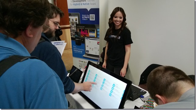
Are you going to DevIntersection?  If you are, then you need to stop by and see me at the Infragistics booth.  Come check out our collection of mind blowing controls for every platform from web, to XAML, to iOS and Android.  No matter what your platform, we have controls to make your application sing that blissful song of awesomeness.  You’ll even get to tingle your touch senses by experiencing our touched enabled controls on a pair of Planar 27” Helium touch displays.  Now how often do you get to do that?

Not only am I just a fun guy to talk too, but I have tons of fee stuff to giveaway.  Everyone who comes to see me at the Infragistics booth will get an awesome new Infragistics t-shirt, created just for this event, a free drink ticket (more on that later), and a free download of our HTML5/jQuery Grid control.

But Wait There’s More!

Not only will you get to talk tech with me, get a free shirt, and some new free controls to add to your repertoire, but you’ll also get a chance to win some AMAZING prizes.

The first prize we will be raffling off is a copy of Infragistics award winning NetAdvantage Ultimate bundle with a one year subscription of updates and new releases.  NetAdvantage Ultimate gives you EVERYTHING in one complete cross-platform, cross-device development toolset - including UX design tools to help transform your project vision into actual user experience. Now featuring Indigo Studio and our Quince Pro design collaboration tool and Icons package, you can build your best applications quickly and easily on any browser, device, or platform with jQuery/HTML5, WPF, Silverlight, Windows 8, ASP.NET, Windows Forms, Reporting, Mobile (including iOS and Android), and Visual Studio LightSwitch.

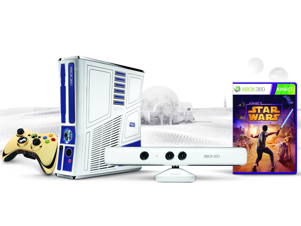
The next prize you’ll get a shot at winning is an Xbox 360 Limited Edition Kinect Star Wars bundle.  This really is a limited edition.  They have already become unavailable on the Microsoft store, and prices have started to sky rocket on sites like Amazon.  If you’re lucky you can go buy one for $452.00.  If you’re really lucky, you will get it for free.

  • Xbox 360 Bundle: Bring the Star Wars characters you know and love into your living room with this custom R2-D2-themed Xbox 360 console with custom sounds. Features C-3PO as an unlockable character for the Dance Mode in the Kinect Star Wars game.
  • Kinect Sensor: Includes the first ever custom white sensor. Immerse yourself into the Star Wars universe with full-body gameplay. Xbox 360 Wireless Controller: Includes custom C-3PO-themed Xbox 360 Wireless Controller.
  • Kinect Star Wars game: Enter the Star Wars universe like never before. Use the Force like a Jedi, become a champion Pod Racer, pilot iconic ships and much more.
  • Kinect Adventures game: Get off the couch and into the game in a whole new way. You and your friends and family will jump, dodge, and kick your way through 20 pulse-pounding adventures set in exotic locations.
  • 320GB Hard Drive: The largest hard drive available on Xbox 360, Xbox 360 Wired Headset, and Xbox LIVE Token for exclusive downloadable content Xbox 360 Limited Edition Kinect Star Wars bundle

The Grand Prize you may walk home with is a brand new Planar 27” Helium touch display.  This is not a joke!  The great people at Planar have graciously provided Infragistics with a Planar Helium PCT2785 display to give away to one lucky winner.  This is the same display you will have a chance to experience at the Infragistics booth. 

Here are some specs at a glance:

  • 27" widescreen interactive display with a 16:9 aspect ratio
  • Multi-touch with up to 20 touch points
  • Ultra-thin profile - less than 2" deep
  • Unique, easy-to-use desk stand capable of 15° to 70° and flat tilt range
  • Smooth zero bezel all glass front surface
  • Built-in Full HD webcam and microphone
  • Multi-touch when using Microsoft Windows® 7 and 8 operating systems

This display retails for $899.00, but there are some places that have it as low as $699.00.  Either way, FREE is one heck of a deal!  Now, if you aren’t the lucky winner of the Planar Helium, we will have a special coupon that you can get at the Infragistics booth which will give you a discount so low, that you will never find it cheaper anywhere else.  If you’re in the market to buy one, now would be the time.

How will you know if you win?  Well, you have to come to the Geek Nostalgia Room to find out.

Geek Nostalgia Room

On the evening of Wednesday, April 10th, from 7:00 pm to 9:00 pm, Infragistics will open the doors to the Geek Nostalgia Room located in the Grand Ballroom 120.  Come hang out with us for an evening of drinks, great conversations, networking, and play with all your favorite old school systems such as a TRS-80, Atari 2600, Nintendo NES, and an Apple 2E. 

TRS-80Atari 2600

Nintendo NESApple 2E

We will not be providing any food so make sure you eat before you come.  With the DevIntersection giveaways ending at 6:00 pm, that gives you one hour to stuff your face.  We will be providing refreshments (soda and water) at no charge.  There will be a cash bar, so if you want alcohol you’ll need to bring some cash.  If you would rather not pay for your alcohol, you can earn free drink tickets by coming to the Infragistics booth.  There are a limited number of free drink tickets available, so it’s on a first come first serve basis.

Besides all the great conversation, drinks, computers and gaming systems, Carl Franklin will be breaking out his guitar for your listening pleasure.  Start making notes for your song requests!

For those of you trying to win one of our awesome prizes, the prize drawing will be at 8:30 pm in the Geek Nostalgia Room.  You must be present to win.  Don’t forget, you must register to win at the Infragistics booth.

Help Spread the Word!

DevIntersection is going to be a great event.  The Infragistics booth will have tons of devices for you to play with, and the Geek Nostalgia Room will be a blast.  Be sure to help spread the word through your various social media avenues.  If you have any questions, feel free to follow me on Twitter (@BrianLagunas), contact me through my blog, or leave a comment below.  Someone is going to leave the Geek Nostalgia Room with some great prizes.  Will it be you?

5 Mobile Development Blogs You Can’t Code Without

$
0
0

A good blog can be a lifesaver for a developer. Some provide good background reading on the industry being worked on. Some provide code help, hints and tips, and other practical resources, while others just provide a well-earned distraction, which can be vital on a complex or challenging project.


Here at Infragistics we provide lots of tools and controls for mobilewebandappdevelopment. As a result we like to think we know a thing or two when it comes to the mobile development blogosphere. So here are our five favorite mobile development blogs at the moment:


1. Toastmo

Toastmo is the blog of mobile development company TwoToasters. They are well known for creating some beautiful sites and apps, including the Airbnb Android app. The blog focuses on things the company has learned and things they wish to teach the wider community. Full of useful advice and code examples, this is a site you will want to check on regularly.


2. Mobiletuts+

Mobile tuts+ is the mobile site of the larger tuts+ site, which is dedicated to hands on practical tutorials. Along with their written, code-sample rich tutorials and a stellar community, the site also offers a ton of video content. If you opt for their premium (paid for) service, Mobile tuts+ offers even more, including access to some very talented instructors.


3. AndroidDevelopersBlog

Those working with Android devices will find a lot to love in this blog. Written by various Google employees (The Google Play team, the Android frameworks team, the Android developer relations team, to name but a few) this blog covers a mix of technical topics (i.e. Usingcryptographytostorecredentialssafely) to softer subjects (i.e. biographies of developers like Smule).


4. NSHipster

NSHipster bills itself as “a journal of the overlooked bits in Objective-C and Cocoa.” This is a really technical blog, offering weekly advice on how to get the best out of the Apple’s programming language of choice.


5. WindowsPhoneDeveloperBlog

The only “official” blog on this list, the Windows Phone Developer Blog is written by various members of the Windows Phone development team. Comprised of lots of useful posts and updated very regularly (7 posts in March so far), this blog is a good place to visit to stay up-to-date in the fast moving Windows Phone world.


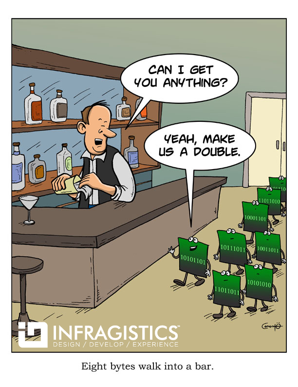
Developer Humor: Eight Bytes Walk Into A Bar

$
0
0

If you’re anything like me, Wednesday afternoons can be almost as difficult as Monday mornings. Frankly I’m not sure which is worse! So in an effort to bring about some more joy to your workweek, I thought I would post something a little more lighthearted than usual. Without further ado, here we go:

Software Developer comics by Infragistics NetAdvantage Silverlight Controls Share the Fun:

You can embed a this comic on your blog or website. Simply copy the below code and paste it into your website.

<p><a href="http://www.infragistics.com/community/blogs/d-coding/archive/2013/04/04/developer-humor-eight-bytes-walk-into-a-bar.aspx"><img src="http://users.infragistics.com/marketing/images/cartoon-1.jpg" border="0" alt="Software Developer Comics" /></a></p>
<p><a href="http://www.infragistics.com">Software Developer</a> comics by Infragistics NetAdvantage <a href="http://www.infragistics.com/products/silverlight/">Silverlight Controls</a></p>

Another look at the Planar Helium 27” Touch Display–Final Grade B+

$
0
0

It has been four months since my last review of the Planar Helium 27” Touch Display.  If you read my initial review, the display didn’t fare so well in my brightly lit home office.  In fact, my final grade was an F, which may have been a little harsh, but that was my feeling at the time with the display I received.

After writing that review, the great people at Planar promptly contact me to help fix the issues I was having and to listen to the feedback I had provided.  While most companies may have been mad and didn’t want to take the time to listen to a poor review, Planar stepped up to the plate and wanted to know how they could improve their product.

Best Support

The Planar support team was amazing.  After just a single email, Planar support called me!  They were knowledgeable of their product, listened to my issues, and were very responsive.  What I loved most about their support is they asked me what was wrong.  They didn’t have a script they read from, or a sequential lists of trouble shooting tasks to put me through.  They didn’t have any preconceived notions or assumptions of my issues.  They asked for my display symptoms, and responded with follow up questions to help them better understand the problem.  After identifying the issue, they sent me a new display within two days.  Literally two days!  They even provided a shipping label to return the defective unit back to them.  It was smooth and painless.

What was Fixed?

With the new Helium unit sitting on my desk, and the old unit in the mail back to support, it was time to start reviewing it again.  Right when I turned on the new Helium display, the color was much better out of the box.  It wasn’t perfect, but it was much closer to what I was expecting.

Before the sound was flaky.  Now, the sound now works perfectly.  The new unit has no issues with sound and my built in keyboard volume controls work as expected.  This makes for a much nicer experience when playing games.

Remember those nasty little particles on my display?  Originally I thought they were blown pixels.  Turns out they were just dust particles that got stuck under the glass during assembly.  This was corrected and there are no particles in my new display.  The screen is perfect.

In my last review I stated that my display only support 10 touch points even though the spec stated 20.  Well, Let’s just say Microsoft Paint isn’t the best program to test the touch point support.  Come to find out MS Paint only has support for 10 touch points.  After working with their great support team, they provided an application to use to test the number of touch points, and in fact I did have 20 touch points.

How I Use it Now

In my last post, I noted the high reflectiveness of the screen, which just wasn’t usable in my bright office environment.  So I moved it upstairs to the bonus room where it isn’t as bright.  This has really made all the difference.  In the lower light, the display really comes to life.  I … uhh… my kids, love playing games like Fruit Ninja and Angry Birds on this display.  Touch based games and applications really come to life on the Helium.  The touch responsiveness is the best I have seen in any display.  Believe it or not, this isn’t where this display shines for me.

I have found a better use for this display for myself.  Most of you know that I am the Product Manager for Infragistics XAML controls.  I give talks at user groups, code camps, and other events all across the country.  This display is perfect for demoing and showing off my awesome touch-based XAML controls, such as the new NetAdvantage for Windows UI controls.  Those are our new controls for building HTML and XAML based Windows 8 applications.  Attendees just can’t get enough play time with our controls on the Helium.

The Planar Helium in action at the Infragsitics booth at Boise Code Camp

Final Grade (Revised) - B+

Now that I have been using this display for four months now, and all my major annoyances are fixed.  This display has really grown on me.  This display is perfect for my tradeshow and events, as well as games and entertainment.  Granted, the web cam is still an issue for me, as well as the reflectiveness of the display in bright environments that I covered in my last review.  To get around those issues, I don’t use the built in web cam, and I keep the display in my upstairs bonus room where it isn’t so bright.  The price tag has also come down.  You can pick this unit up for $699 on TigerDirect, which makes this much more competitive to other similar displays on the market.  I still don’t recommend this for brightly lit environments, unless you can close the blinds.  Other than that, this is a great display.

Okay, I know what you are thinking, "but Brian, in your last review you said you would have returned it if you bought it”.  That’s true, and technically I did return it.  I just got a new one to replace it.  The fact of the matter is that I wrote a review on a defective unit.  Instead of waiting to solve my problems then reviewing it, I just reviewed my first impressions of a bad unit.  That really isn’t fair to Planar, so it was important that I updated my review on a properly working Helium display. 

I would like to thank Planar and their great support staff for taking the time to not only read my review, but to have continuing conversations on improving their product.  Not many hardware companies do that in todays market and it is refreshing to still see that type of customer dedication.

Planar told me to keep my eye out for their new and improved display coming in the next few months.  Oh, I will, and I will be sure to share with you my experiences with it.

If you have any questions, feel free to follow me on Twitter (@BrianLagunas), contact me through my blog, or leave a comment below.

Deep dive into HTML5 Input types

$
0
0

HTML Input Forms: Introduction

As web developers we would know what HTML forms is. And as an end user we deal with them very often. Whether you are searching for a content or signing in to your email, social networking account, you still end up using HTML input form.

HTML forms is easily one of the most frequently used HTML element over the web. The developers and designers, who would create such forms, would also write validation scripts for the same. For instance, making sure that the Mobile Number input field only contains numeric. We have used JavaScript libraries for such functionalities. But what if our HTML Input types could do some advanced validation?

Well that is just one of the things we will talk about in this blog post. We will see the new Input types and attributes which are part of the HTML5 specification.


  1. <form>
  2.   First name: <inputtype="text"name="firstname"><br>
  3.   Last name: <inputtype="text"name="lastname">
  4. </form>

HTML Form


What's new in HTML5 Input types?

HTML5 brings in new input types for forms which allows better input control and validation. These new input types may look like just a minor addition, but i can tell you this brings very interesting behaviours especially for the mobile web developers.

If you are a native mobile application developer you would have experienced setting up Input Scope for different input types, just to enhance the end users’ experience as they would not have to struggle to switch between the appropriate on-screen keyboard types. A common example would be when you have to enter a number in the input field, you would prefer to see the numeric on-screen keyboard on rather than a text on-screen keyboard. Windows Phone and other platforms gives various options for customizing the on-screen keyboard by specifying the input scope for an input box during native development. You can find the details for Windows Phone Input scope here.

But if you would like to simulate the similar on-screen keyboard experience over the mobile web sites, then HTML5 Input types is what you should be looking for. The idea with new HTML5 Input types is also to bring in the similar native experience for the mobile web user.

Note: The input type is interpreted by the browser and hence the blame of not bringing in the appropriate on-screen keyboard totally depends on the browsers ability to understand the new input types. Not all these input types we would talk about below works with all browsers, but for unsupported browsers it degrades gracefully. In line with the HTML5′s design principles.


Table contains the new input types:

Input Type

Purpose

Syntax

tel

For entering a telephone number.

<input type="date" name="usrTel">

search

To prompt users to enter text that they want to search for. This customizes the on-Screen keyboard experience by bringing in Search icon (iOS and Android) instead of ‘Go’ button

<input type="search" name="bingSeacrh">

url

For entering a single URL. Does the validation for the URL

<input type="url" name="homepage">

email

For entering an email address

<input type="email" name="usrEmail">

datetime

For entering a date and time with the time zone set to UTC.

<input type="datetime" name="bdaytime">

date

For entering a date with no time zone.

<input type="date" name="usr_bdate">

month

For entering a date with a year and a month, but no time zone.

<input type="month" name="usr_month">

week

For entering a date that consists of a week-year number and a week number, but no time zone.

<input type="week" name="week_year">

time

For entering a time value with hour, minute, seconds, and fractional seconds, but no time zone.

<input type="time" name="usrTime">

datetime-local

For entering a date and time with no time zone.

<input type="datetime-local" name="bdaytime">

number

For numerical input.

<input type="number" name="quantity" min="1" max="5">

range

For numerical input, but unlike number, the actual is not important.

<input type="range" name="points" min="1" max="10">

color

For choosing color through a color well control.

<input type="color" name="favcolor">


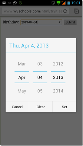
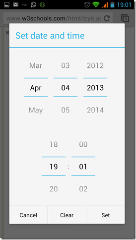
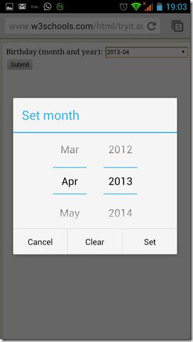
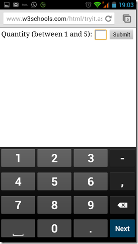
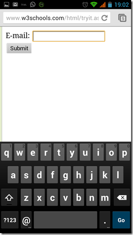
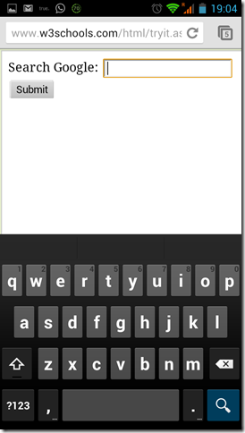
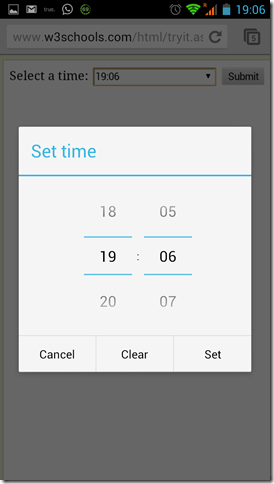
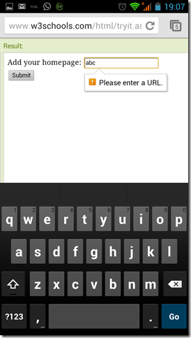
Some screenshots from a Chrome browser(version 18.0.1025469) on an Android device with new input types rendering native on-screen keyboard .

Date 

 Date


Datetime

DateTime


Month

Month


Numeric

Number


Email

Email


Range

Range


Search

Search


Tel

Tel


Time

Time


Url

Ur


Note: The sample pages browsed in the above screenshots are from w3schools page.


What's new in HTML5 Form Attributes?

  • New form attributes
    • autocomplete - it helps users complete forms based on earlier inputs. You can specify if the form should have autocomplete turned on or off. You can selectively set autocomplete on and off for individual input fields. The attribute has been around since long but is now standardized as part of HTML5
    • novalidate - to avoid validation of form data while submission
  • Some new input attributes
    • autocomplete - this is common for form and input.
    • autofocus - sets this input field in focus on page load. For this functionality we used JavaScript in the past. In this approach if the user starts filling in the form before the JavaScript loads, then the user will be returned to the first form field giving them a bad user experience. This was an issue in countries with slow internet connectivity.
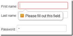
    • required - by adding it the browser requires the user to enter data into this field before submitting the form. This replaces the basic form validation currently implemented with JavaScript.

Form field with Required attribute showing a Browser generated error messagerequired attribute

    • pattern - It makes implementation of specific validation simpler. It specifies a regular expression that the input element's value is checked against
  1. <formaction="demo_form.asp">
  2.     Country code: <inputtype="text"name="country_code"pattern="[A-Za-z]{3}"title="Three letter country code">
  3.     <inputtype="submit">
  4. </form>

Pattern attribute


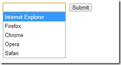
    • dataList - it represents a predefined list of options for form controls.
  1. <inputlist="browsers"name="browser">
  2. <datalistid="browsers">
  3.   <optionvalue="Internet Explorer">
  4.   <optionvalue="Firefox">
  5.   <optionvalue="Chrome">
  6.   <optionvalue="Opera">
  7.   <optionvalue="Safari">
  8. </datalist>
  9. <inputtype="submit"></form>

Datalist element rendered in IE10

clip_image004


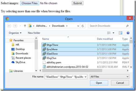
    • multiple - It specifies that the user is allowed to enter more than one value in the input element. It works with input types as email and file. How many times have you faced this issue, where it doesn’t let you upload multiple files using a single file section 'Open' dialog?
  1. <formaction="demo_form.asp">
  2.   Select images: <inputtype="file"name="img"multiple>
  3.   <inputtype="submit">
  4. </form>

Multiple file selection from a single file 'Open' dialog in Chrome (Version 26.0.1410.43 m)

clip_image005


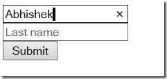
    • placeholder- It specifies a short description of the expected format in the input element. It is displayed in the input field when it is empty, and disappears when it is in focus.

clip_image006

Placeholder attribute support in Chrome, shows the expected input in the second textbox as long as it is not in focus.


You can find detailed documentation of these attributes here.


Summary

We’ve looked at several new form attributes that helps in improving the user experience and cuts down the development time.

Let’s also talk about the browser support for HTML5 forms input types and attributes. With new versions of browsers being released periodically, it can be difficult to keep up with what is or isn’t supported. You can check can I use … or Wufoo’s HTML5 forms research or Mike Taylor’s page for the latest support.

Well we talked about the graceful degradation in case of non supported browsers. This should be a strong enough point to make use of the new input types irrespective of the browser support, as tomorrow it would probably be supported! Future-proof your website!
Mobile web developers can even build hybrid apps containing these input types.


Sample

I have created a sample which you can browse using your mobile device. It demonstrates the above mentioned form input types and the attributes.
You can play around with this sample and live edit these here. (Select ‘Launch in Editor’ option to edit and ‘Run’)


If you have any questions or suggestions regarding this blog post, please feel free to mail me at anarain@infragistics.com.


Cheers
Abhishek
Twitter: @narainabhishek
http://about.me/narainabhishek


HTML Prototype Viewer Sneak Peek

$
0
0

Rove on iPad mini

So you've been using Indigo Studio for a while now, and you're thinking, "Wouldn't it be nice if I could run my Indigo prototypes without requiring Silverlight? I mean, that would be awesome! Then I could see and evaluate my prototypes on mobile devices." We agree!

I've got some good news. Today I'm sharing a sneak peek of the work we've been doing to make that a reality. Above you see our built-in, sample prototype called "Rove" running on an iPad mini!

What's that you say? You want to see it to believe it? Okay!

Rove Thumbnail
Run Rove as HTML Prototype

Rove is a tablet prototype, and if you're on an iPad, I suggest you add it to home screen. This will let you experience Rove as an iPad app (without the browser chrome).

Or maybe you have a phone? Well then here's our "FindFlix" phone sample prototype:

FindFlix Thumbnail
Run FindFlix as HTML Prototype

As with Rove, you can add it to your home screen on iPhone to experience it as an app without the browser chrome. Keep in mind this is a preview, so if you experience any issues/bugs, please let us know by emailing indigo at infragistics dot com.

I don't know about you, but the possibilities this opens up really get my designer juices flowing.

Say you're working on a new mobile app, maybe a tablet app, or maybe you're even starting with responsive Web design in mind. You've captured your stories from your low-cost user research, and now you're ready to roll your sleeves up and start designing. Maybe you start by sketching out ideas on paper or whiteboard, but you're ready to take it to the next level.

So you grab Indigo Studio. You open it up and toss your stories into some storyboards, or you skip that and jump right into the UI and interaction design. You sketch out your ideas in Indigo or just drop in some photos of your sketches and add some hotspots. Before you know it, you have a nifty, interactive prototype that you want to share and evaluate, so you flip to the project tab and click Share Prototype, copy the URL, and email it.

Now you grab your device, click the link, and voila--you're trying your prototype on your device! You walk down the hall, and hand your phone to a user-like substance (someone like your users, if not your actual users) and ask them to do what your story says users will wanna do. You watch them, and doh! they run into a wall. "No problem!" you say to them. "I'll be back in a few minutes."

You step back to your computer, tweak your design, click share, and you're back in a few minutes with your next iteration.

No hassling with code, setting up a dev environment, finding and installing the latest frameworks, figuring out how to make the code do what is in your head, failing, trying again, failing and just generally burning a bunch of design time and energy on fiddling with inconsequential technical details. No painstaking elaborate pixel-perfect static wireframes you are reluctant to change. No time wasted on tons of annotations explaining what your design will do, asking your potential users and clients to imagine what will happen--they can just see it; they can just use it! On the target device class you designed for. In no time, you made and evaluated several prototype iterations, and you're left with confidence in your design. This is Indigo Studio.

Okay, so you're probably wondering, "When can I take advantage of this on my own prototypes??" It's coming soon! Keep your eyes peeled. We will definitely blog and tweet about it, so subscribe or follow us if you're interested. You'll be able to use it on newly shared prototypes and prototypes that you already shared to our servers.

Have a great weekend!


About Indigo Studio

If you haven’t already, why not Go Design Something!? Version 1 is free forever.

If you are using Indigo, we welcome your ideas on how we can better apply and refine these and other good interaction design principles to help you to design awesome UIs. If you have any questions or problems, please don’t hesitate to discuss them with us in our forums. We’re also on Twitter @indigodesigned.

About the Author

Ambrose Little is principal design technologist at Infragistics and has worked on Indigo Studio as interaction designer and product manager along with an awesome team based here in Cranbury, NJ, USA and Montevideo, Uruguay.

Infragistics SharePlus at the Sydney SharePoint conference

$
0
0

This week sees the 2013 Sydney SharePoint conference being run for the 4th year http://www.sharethepoint.com/engage/AU2013/Sydney/Pages/Home.aspx

Infragistics will be in attendance in the exhibition hall showcasing SharePlus. SharePlus is a native iPad application that allows you to connect with your SharePoint server to easily access files from your mobile devices, as well as synchronise document libraries offline, edit documents locally, etc.

I will also be doing a presentation on how SharePlus can help enable mobility in your business processes. This presentation will be given twice:

  • Day 1 - Wednesday 10 April 04:15PM Room 4-4
  • Day 2 - Thursday 11 April 10:30 AM Room 4-4

If you are attending the conference, please come visit our booth and say hi!

Infographic: Tablet Devices and Self-Service Mobile BI featuring ReportPlus

$
0
0

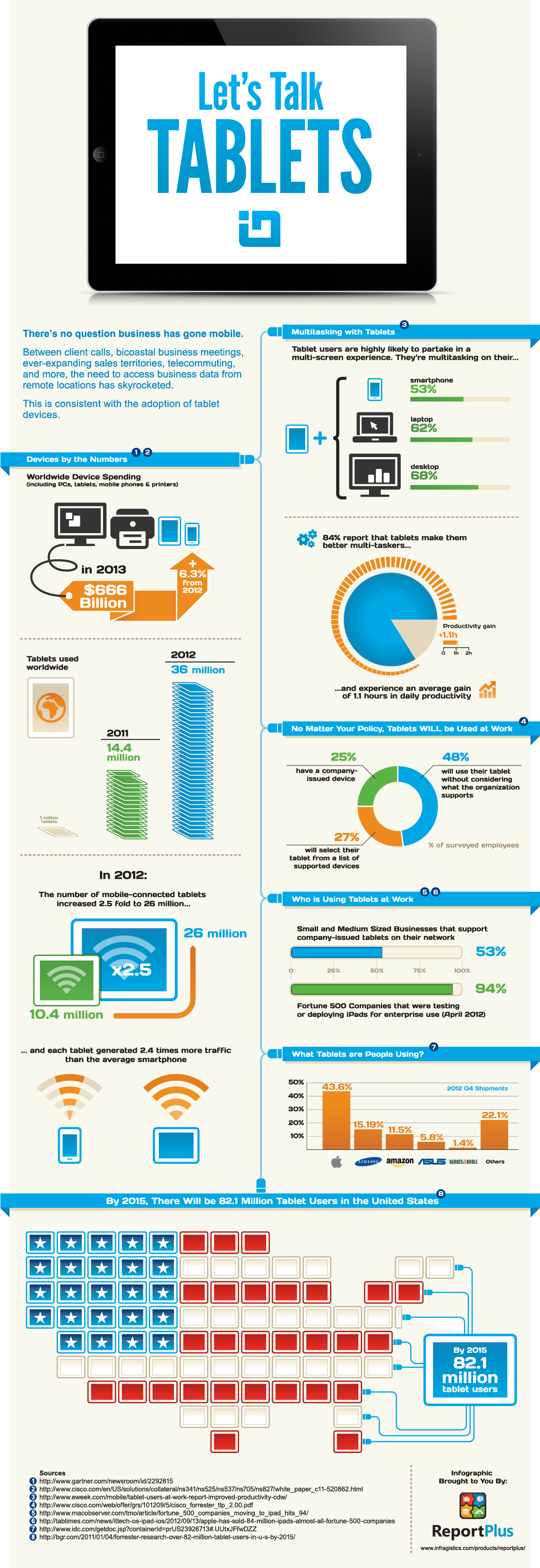
Data Analysis is becoming a hot button requirement for seemingly every facet of organizations today. How are users reviewing and consuming their Data? How do they work most effectively? Check out this Infographic for a quick and easy breakdown.

For more information Download our WhitePaper to find out how ReportPlus fosters self-service BI from your tablet. Download Now!

Tablet Devices and Self-Service Mobile BI Infographic by ReportPlus: Infragistics Mobile Business Apps

Spread the Word:

You can embed a this Infographic on your blog or website. Simply copy the below code and paste it into your website.

<p><a href="http://www.infragistics.com/community/blogs/marketing/archive/2013/04/08/infographic-tablet-devices-and-self-service-mobile-bi-featuring-reportplus.aspx"><img src="http://users.infragistics.com/marketing/images/infographic_tablet.jpg" border="0" alt="BYOD" /></a></p>
<p><a href="http://www.infragistics.com/products/reportplus/">Tablet Devices and Self-Service Mobile BI</a> Infographic by<a href="http://www.infragistics.com/products/reportplus/"> ReportPlus</a> Infragistics Mobile Business Apps</p>

Top Five Usability Sweeteners in Indigo Studio

$
0
0

I doubt any of you may have used Indigo Studio as much as I have, but that can change. Here are my five usability sweeteners/addictions that make time spent building prototypes…sweet! Some are more obvious than others, but you will eventually run into them if you end up using Indigo like we do here at Infragistics. Think of these features as workflow accelerators.

#1 Alt+Click or Alt+Drag to add elements

This has become, by far, my favorite feature because it helps me hide away the toolbox, which leaves me with an uncluttered interface. As it's with any tool, once you have spent enough time working with it, you develop a certain workflow that keeps you efficient. Also, you develop a kind of affinity with some controls or design elements that you tend to use more than others.

Following are five design elements I keep reaching for:

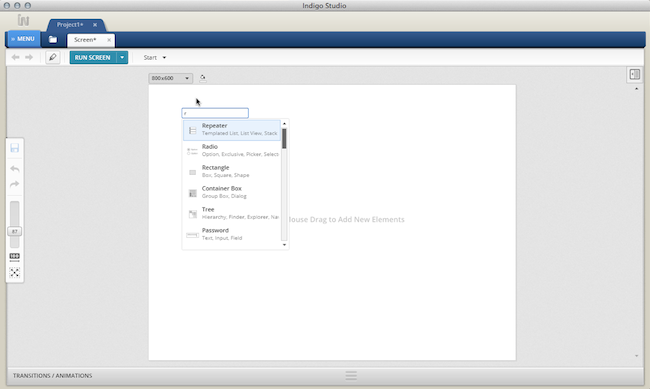
If you are wondering why not a "recently used" section in the toolbox, ALT+CLICK allows me to collapse the toolbox altogether! With this feature, I get a quick in-context search box into which I can type the control/element name, and place it exactly where I clicked. Gone are the days of locating something in the toolbox, dragging it out, and positioning it. To make it sweeter, if I ALT+DRAG, I get to add a control/element that matches my drag dimensions exactly.

Fig1. Using ALT+CLICK shows an in-context search box for adding controls and elements

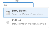
We did not stop there. An under-advertised feature of the ALT+CLICK search box is that you can type in a string of text and add this as a text/label element, provided it does not match on a toolbox item. But if for some reason it does match a toolbox item, you can force it to add it as a text label by typing an extra space. For instance, if you wanted to add text label called "DO" and it matches on "drop-DOwn," you can add it as a text label by typing SPACE and hitting ENTER. You may find this handy. I'm so addicted that I find myself doing Alt+Click on other tools like Omnigraffle and Powerpoint!

#2 What's Below the Cursor

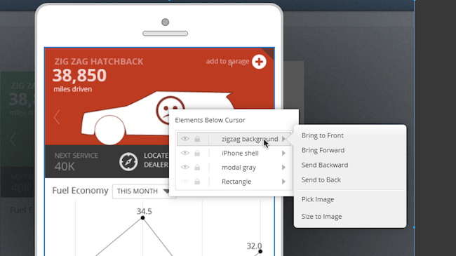
This is another one of the features that I find useful for changing properties of design elements hiding behind a stack of elements; without having to re-arrange anything. You can invoke this by right-clicking on the design surface.


Fig 2. Right-Click to reveal "elements below cursor" context menu

In the list shown in the image, hovering over element names will highlight it on the design surface. As shown in the image, I am hovering on the background image called "zigzag background." Doing so also reveals a fly-out showing me z-order options and specific actions relevant to the image element. With this feature, I can pick a new image and replace the current one without nudging a single pixel. Left-clicking on the item in the list will reveal the contextual property panel for the image control, which will allow you to tweak any of the properties available for the image (e.g., add interaction).

#3 Hide Elements temporarily

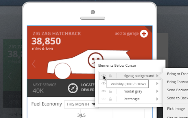
The ability to hide elements on the design surface feels like an obvious thing to do till you realize that not many tools offer it. At least I haven't found it in tools like OmniGraffle or Powerpoint. If you know different, feel free to point it out to me in comments section of this blog article. I conceded that there are tools that let you show/hide layers and lock elements, but they don't let you temporarily hide the element.


Fig 3. Use the "elements below cursor" to temporarily hide something

The HIDE functionality in Indigo Studio works differently than making design elements fully transparent. When fully transparent, you can still select it and move it around. In fact, I use this transparency feature quite often when I want to do a slick in-place appear kind of transition.

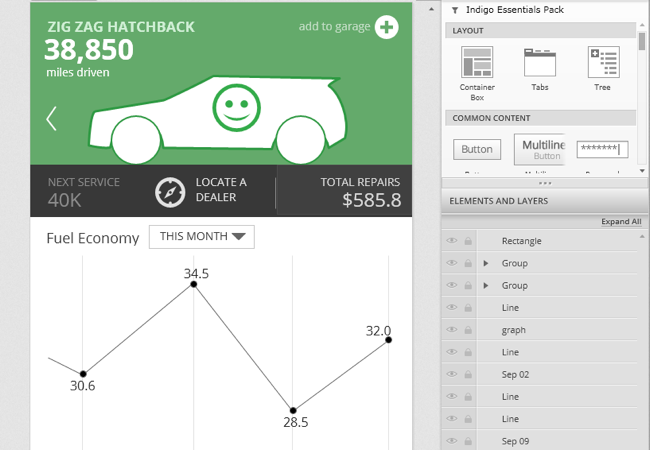
Using HIDE, however, it's as if the element never existed. What this let's you do is, as the feature suggests, HIDE unwanted elements till you need them again. You can hide elements both from the properties panel or the right-click menu. To show an element previously hidden, position your mouse cursor over where it originally was present and use the "What's below the cursor" feature. Or you can pull up the ELEMENTS and LAYERS panel located at the base of the toolbox and hide/show from there. The right-click option is quicker.


Fig 4. Showing elements and layers panel located at the base of the toolbox

In a nutshell, hiding elements directly releases you from worrying about showing or hiding layers, something you might use on other tools to control visibility.

#4 Edit/Move Interaction Flows

If you have already read our previous post on "Revisiting prototyping with Indigo Studio," you have some idea about how we approach interaction flows. For the uninitiated, Indigo studio places a spotlight on designing changes based on user interactions. To support this, Indigo not only offers the "traditional" screens, but also introduces screen states in a novel and useful manner. Each state/screen is connected to another via interactions, and when viewed together represents a flow. But sometimes, as part of design iteration, you will need to change how the user "flows" through the prototype. Editing or moving interaction flows via the interactions explorer will allows you to do that quickly
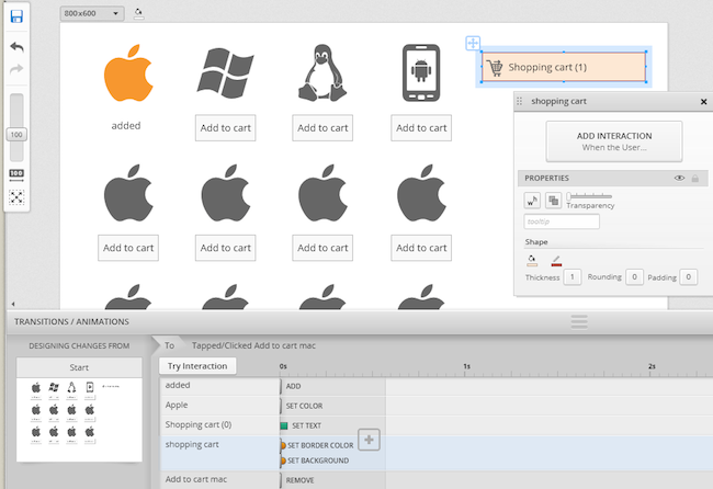
The following image shows an interaction flow for an e-commerce shopping cart experience.


Fig 5.  A linear flow example for an e-commerce shopping cart experience

In this example, the user adds a couple of products to the shopping cart (marked in orange color) before proceeding to checkout. The user then wants to view product details for the "mac" product. To enable this, you design a DOUBLE-CLICK interaction on the "mac" product (in state #3), which reveals the product details (shown in state #4). The following list of actions/screens states will make it clearer if the image is not self-explanatory:

  1. User arrives at on the shopping page (start state), and clicks on add the "mac" product to shopping cart
  2. Shopping cart now shows one item, and the ADD TO CART option is replaced with the text ADDED, and colors changed to orange to indicate that it's in the cart; user then adds the "win" product to shopping cart
  3. Shopping cart shows two items. User then clicks on shopping cart
  4. Shopping cart is expanded to show contents; user DOUBLE-CLICKs "mac" product
  5. User views the ITEM DETAILS for "mac" product

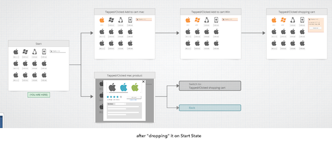
The linear flow implies that DOUBLE-CLICK interaction is ONLY available from state #3 onwards, which is OK for a usability prototype. In fact, linear prototypes are good thing as we do not need to concern ourselves with what_if_the_user_clicks situation. The study moderator will take care of this. But what if you want a different flow to begin with? That is, the user wants to view the "mac" product details before adding it to cart. In this situation, you want the interaction (changes) you designed for ITEM DETAILS to be available earlier (in the start state).

One way would be to add an interaction in the start state, and target the interaction to an existing state (state #4). But a quicker approach would be to do the following:

  1. Expand the interactions explorer
  2. Select the state showing item details (state #4)
  3. Drag and drop this on top of the start state. That's all!

Fig 6. Showing how you can drag and drop states to edit the interaction, and edit the flow.
If you like, you can add an interaction on the ITEM DETAILS page such that clicking on ADD TO CART will take the user to an existing state where there is a one item added to the cart.

#5 Selectively Undo Changes (UNDO)

We are all familiar with what undoing the most recent action in an application implies. This is commonly achieved using the CNTRL+Z short cut key or some visible button to undo/redo an operation. Indigo Studio takes this a step further by letting you selectively undo some of your changes without forcing a sequential undo operation.

When you add an interaction on an element (e.g., button), and choose to create a new state, Indigo creates a copy of the previous state for you. At this point, the previous state and the current state are identical until you make some changes. As in, make design changes to the current state based on what you want the user to see. And any change you make is recorded in the timeline. Consider the following e-commerce flow once again:

  1. User arrives at on the shopping page (start state), and clicks on add the "mac" product to shopping cart
  2. Shopping cart now shows one item, and the ADD TO CART option is replaced with the text ADDED, and colors changed to orange to indicate that it's in the cart; user then adds the "win" product to shopping cart
  3. Shopping cart shows two items. User then clicks on shopping cart

In this example, six changes were recorded in the timeline that visually differentiate the START state from STATE #1 (one item added to cart).

Fig 7. Showing a list of changes made to the current state. Shopping cart is selected in the designer.

At this point, if you start undoing changes using the short cut key CNTRL+Z, Indigo will start undoing changes in a sequential manner, starting with the last change first. In this particular instance, UNDO will bring back the ADD TO CART button which was removed (most recent change). But what if you want to keep the last change but revert some earlier change made. For example, you want want to revert the color of the shopping cart from Orange back to Gray. With Indigo Studio timeline, simply select that change/action, SET COLOR and hit the delete key on your keyboard. That's it. You have now selectively reverted some of the changes.

Anyway, that's my list for now. Of course there are more, but that's for you to find ;).

About Indigo Studio

Version 1.x of Indigo Studio is free forever, and yours to keep. Check out some of the highlighted features here or download it now

If you need help with Indigo Studio or prototyping in general, email us at indigo AT infragistics.com or follow us on twitter @indigodesigned.

Experiencing Mobile Application User Experience

$
0
0

The key to designing a mobile application is not how good it looks or how cool it’s state transitions are (think deleting an email and watching it crumple up into a ball and arc into the trash can icon). It’s important to look professional and feel current but these serve primarily to entice users to download your application from amongst the thousands of others. The degree to which your application is useful and usable is what ensures your application won’t be deleted after the first few minutes. When an application meets a need, takes advantage of the native strengths afforded by a mobile form factor, and designs for the mobile context of use, your audience will say about your application, “Why can’t all apps be this good?”

Here are a few applications that I personally use on my iPhone because their UX teams spent the time, upfront, to understand what folks like me are doing and designed something to help us do those things quickly and easily.


clip_image002Clear

Clear is a beautiful little app that helps you create lists. Big deal, you say? It is. First, there are no buttons. The application was built using native gestures – pinch, swipe, tap, shake. Second, the creation and deletion of new lists and items takes advantage of existing interaction models – no need to learn unique gestures or interaction models.


clip_image004Zite

News aggregator applications are neither new nor scarce but Zite rises above the rest. Why? A clean interface allows me to quickly select news categories of interest and then provides an easy to scan list of recent articles. At the level of an individual item, I am shown only the detail I need (title, author, image, text) unless I ask for more (original web source). It also allows me to vote (thumbs-up/down) to bias the selection of future articles as well as share articles with friends.


clip_image006Amazon

On my mobile device, I use the Amazon application to price check items while I’m walking around a store. I admit it. Sorry brick and mortar stores. If a product of interest is meaningfully cheaper on Amazon, I’ll add it to my cart for later consideration. Amazon knows shoppers do this and make it exceedingly simple. No need to enter a product name in the search bar – just scan the bar code. Like it? Save it for later. After opening the application it takes exactly 3 taps. They could drop it down to 1 but hey, no one’s perfect.


clip_image008 Starbucks

I like coffee and I make no excuses for buying my cappuccino from Starbucks. Want my business? Make consistently good, strong coffee. Starbucks makes this easier for me (and them) because using their application means I don’t need to take out my wallet. I always have my phone, I don’t always have cash and it just bugs me to use a credit card to buy a cup of coffee. A simple application at its core, it is a reloadable debit card that keeps track of my purchases and every dozen drinks or so, gives me a free drink. Open the application, flip the display from “current balance” to barcode and scan. Done.


Kevin Richardson has been working in the area of user experience for over 20 years. With an advanced degree in Cognitive Psychology, he has experience across business verticals in the fields of research, evaluation, design and management of innovative, user-centered solutions.

Kevin’s experience includes web sites, portals and dashboards, enterprise software and custom business applications for medical, pharmaceutical, communications, entertainment, energy, transportation and government users.

On the weekends, you can find Kevin on his motorcycle, riding for Infragistics Racing at a number of different racetracks on the East coast.

IG Racing

Simple trick to silently fallback when CDN’s unreachable

$
0
0

Using content delivery network provides increased performance – since files are copied and replicated, end users accessing content from far off, remote areas do not download content from your web server, but instead from a closer CDN server. Since CDN hosted content is cached; it is a good idea to have JavaScript, Image, and CSS files hosted there as they will be downloaded to the client PC and reused until the client’s browser cache is discarded. This eliminates the bandwidth expense of having to download the same files repeatedly. Google and Microsoft provide their own Ajax Content delivery network which provide JavaScript libraries like jQuery, Knockout, Angular etc..

Since these services come to you free of cost, why wouldn’t you be using it? As a web developer you don’t have to maintain third party JavaScript libraries at all. 

What if they fail?

“Our CDNs are 99.9% uptime guarantee” You would have run into similar statements a number of times with cloud hosting providers. But what if your customer were just unlucky that day(it happens)? Don’t you want to silently fallback to your local servers when that happens? Fortunately there’s a simple trick.

<script src="//ajax.googleapis.com/ajax/libs/jquery/1.8.3/jquery.min.js"></script><script>window.jQuery || document.write('<script src="../common/jquery-1.8.3.min.js"><\/script>')</script>

Add the above piece of code to your web page, change the CDN URL, update the local path of jQuery, and see the magic happen.

This post has been inspired by HTML5Boilerplate’s implementation of effectively falling back when the jQuery load from a CDN fails.

Don’t forget to check out Infragistics Content Delivery network for Ignite UI 

Have a feedback? Find me on twitter @nishanil

Getting Started using NucliOS with Xamarin.iOS Part 2: IGGridView

$
0
0

NucliOS is an Infragistics toolset that allows you to create high performance iOS applications that feature the wonderful data visualization you have come to expect from our developer tools. If you are a Xamarin.iOS developer that wants to add some flair to the data presentation in your app, we have you covered with the Xamarin.iOS bindings for NucliOS. This post focuses on using the IGGridView control to add a basic data grid to your application.  As a bonus, I’ll also show you how to use the Xamarin.Mobile Contacts API to access the Address Book with this cross-platform API.

[If you’re looking for help with IGChartView, check out part one of this series.]

nuclios-xamarin-ii

Using IGGridView with Xamarin.iOS

IGGridView is an iOS layout control that is very flexible and will allow you to create a wide variety of grid-based layouts.  The most common use case for the control is as a standard data grid.  This post will help you get started using the IGGridView in that context.  The app that will be built loads the contacts in the iOS device’s address book and displays the first name, last name, and email address for each of them.  The app looks like this:

app_screenshot_th

Step 1: Creating the project

Start by creating a Single View iPad application by clicking on “New…” under Solution and configure the project as shown in the following screenshot:

create_ipad_single_view_application

This will set up a project that uses a single view (i.e. no navigation) which is all we need for this simple sample. A ViewController with a XIB file will be created to represent the view.  Unlike the first post in the series, we won’t need to customize the XIB file.  Since we only need the IGGridView, we will add our user interface from code.

Step 2: Adding and configuring the IGGridView

The first thing we need to do is add a reference to the IG.dll which is found in /Developer/Infragistics/NucliOS 2012/MonoTouch on your machine. To do this, right-click on References and chose "Edit references…". Go to the .NET Assembly tab and navigate to the IG.dll as shown here:

add_ig_dll

Now open up the NucliOSGridViewAddressBookViewController.cs file and add the following using statement:

using Infragistics;

Next, add fields for an IGGridView and a IGGridViewDataSourceHelper. 

IGGridView _gridView;
IGGridViewDataSourceHelper _dsh;

The IGGridView is our data grid and the IGGridViewDataSourceHelper will help manage the data that is displayed within the grid.  The data source helper is capable of auto-generating columns based on the properties on the objects contained in its Data property.  Using an IGGridViewDataSourceHelper or one of its derivatives also shields you from having to write a lot of boilerplate code.  Your time is too valuable for that so use the helpers when you can!

Add the following code to the ViewDidLoad method in the view controller to set the background color, create an autoresizing IGGridView, and add it to the view controller’s view:

_gridView = new this.View.BackgroundColor = UIColor.White;

IGGridView(this.View.Bounds, IGGridViewStyle.IGGridViewStyleDefault);
_gridView.AutoresizingMask = UIViewAutoresizing.All;

this.View.Add(_gridView);

We will further customize the data grid once we have our data, but first we need to get that set up.

Step 3: Setting up the address book data

The data grid in the sample application will display the contents of the device’s address book.  So, we need to get access to that data.  The easiest (and most cross-platform) way to do this in a Xamarin.iOS project is by using the Xamarin.Mobile Contacts API.  The Component Store within Xamarin Studio is the easiest way to get started with this.  Right-click on the “Components” node under your project and click “Edit Components…” and then click the “Get More Components” button.  Find the Xamarin.Mobile component which should look like this:

xamarin_mobile_component_th

Add the component to your app.  The “Getting Started” section for the component contains the code we need to use the API for what we need to do.  Instead of adding the Contact objects from Xamarin.Mobile, we’ll create a lightweight wrapper object that contains only the properties we actually need to display.  Add the following class after the closing brace of the view controller:

public class AddressBookItem : NSObject
{
	[Export("FirstName")]
	public String FirstName {get; set;}

	[Export("LastName")]
	public String LastName {get; set;}

	[Export("Email")]
	public String Email {get; set;}

	[Export("LastInitial")]
	public String LastInitial {get; set;}
}

Now that we have our wrapper object we can access the address book and build up our list of AddressBookItem objects.  The following code sets up a list of contacts and then iterates over the address book to populate it. 

Add the following code after the fields for the grid view and data source helper at the top of the class:

List<NSObject> _contacts;

Add this code to the ViewDidLoad method:

// Our list of AddressBookItem objects for the data source
_contacts = new List<NSObject> _contacts();

var book = new AddressBook ();
book.RequestPermission().ContinueWith (t => {
	if (!t.Result) {
		// In a shipping application, you'll want to do something to handle
		// the fact that your user did not give you permission to access the 
		// Address Book.
		Console.WriteLine ("Permission denied by user or manifest");
		return;
	}
	// Using Xamarin.Mobile, we can perform Linq operations over
	// the Address Book entries.  Here we order by Contact.LastName
	foreach (Contact contact in book.OrderBy (c => c.LastName)) {
		// Create an AddressBookItem (defined below) for each contact
		// to expose only what we need for the grid...
		AddressBookItem bookItem = new AddressBookItem();
		bookItem.FirstName = contact.FirstName;
		bookItem.LastName = contact.LastName;
		if(contact.Emails.Count () > 0)
			bookItem.Email = contact.Emails.FirstOrDefault().Address;
		else
			bookItem.Email = "";
		bookItem.LastInitial = contact.LastName.Substring(0, 1);
		_contacts.Add(bookItem);
	}
	SetupGrid();
}, TaskScheduler.FromCurrentSynchronizationContext());

The SetupGrid() method will take this data and set it up to be displayed in the data grid.

Step 4: Configure the data grid

Now that we have a list of contacts, we are ready to display them in our IGGridView.  Although the data source helper we are using is capable of auto-generating the columns for us, we will create our column definitions manually.  This is so that we can customize the header text that will appear in the header for each column.  The SetupGrid() method will create column definitions and add them to the data source helper.  The data will be grouped by the first initial of the last name which will automatically create sections for us.  Add the following code to the view controller class:

// We'll manually create the column definitions so that we can customize
// the header text for each.  The string passed into the constructor is the
// property name on the object to use for the column.
IGGridViewColumnDefinition FirstNameColumn = new IGGridViewColumnDefinition("FirstName");
FirstNameColumn.HeaderText = "First";
IGGridViewColumnDefinition LastNameColumn = new IGGridViewColumnDefinition("LastName");
LastNameColumn.HeaderText = "Last";
IGGridViewColumnDefinition EmailColumn = new IGGridViewColumnDefinition("Email");
EmailColumn.HeaderText = "Email";

// We're using the basic IGGridViewDataSourceHelper
// since our data will be displayed in a standard datagrid
_dsh = new IGGridViewDataSourceHelper();

// Since we are manually creating columns, turn off auto-generation
_dsh.AutoGenerateColumns = false;
_dsh.Data = _contacts.ToArray();

// Add the ColumnDefinitions to the DataSource
_dsh.ColumnDefinitions.Add(FirstNameColumn);
_dsh.ColumnDefinitions.Add(LastNameColumn);
_dsh.ColumnDefinitions.Add(EmailColumn);

// We'll group on the first initial of the LastName
_dsh.GroupingKey = "LastInitial";

// Set the DataSource
_gridView.DataSource = _dsh;

// Turn off empty rows
_gridView.EmptyRows = false;

// Update the data!
_gridView.UpdateData();

And that’s it.  The application is ready to go.  Run it and you should see your contacts in an IGGridView grouped into sections.

Summary

This post showed you how to set up a basic data grid to display contacts from the address book on the device.  In future posts I’ll show you how to customize the grid and also interact with the contents.

You can download the solution here: NucliOSGridViewAddressBook.zip

Contact

If you have any questions or comments please feel free to email me at bschooley@infragistics.com or find me on Twitter@brentschooley.


Improved Exporting and Sharing

$
0
0

Hi y'all! Just wanted to let you know that we released a pretty useful update (Build 1.0.113) that includes:

  • Added Ability to Generate Prototype to Local Folder for Sharing on Internal Servers, Public Folders, etc.
  • Improved Share and Export Experience
  • Added Export of Screens with any Referenced Image Assets (Including Optional Zipping)
  • Share/Export from Project & Design Tabs Right-Click
  • Hit Enter on Image and Icon Control to Pick Image/Icon
  • And of course lots of bug fixes. :)

So here's a bit more explaining these updates.

Generate Prototypes to Local Folder


Generate Prototype to Local Folder.jpg

Now in addition to the simple one-click sharing on our servers, you can choose instead to generate the prototype to a local folder and then share it on your own servers (which is useful for those designs that need to stay behind firewalls). With this capability, you can also opt to share your prototype in some cloud services like Dropbox and Google Drive. And of course it gives you total control over the prototype, so you can overwrite, remove, etc. at will.

Improved Share and Export

We give you more control now on Exports--you can pick screens, states, folders.


Select for Export.jpg

When you select one or more screens, you can optionally choose to export only selected states within those screens. We also added optional zipping, so if you want export a bunch of PNG and zip in one step, you can do that.

Coming Friday: Quick Snapshot!

Although it didn't make it into this update, we'll be delivering a new special update on Friday that builds on this enhanced export capability--Quick Snapshot.


Quick Snapshot.jpg

This is one of those no-brainer things that just didn't make the initial cut, much to my own personal dismay. But it'll be there tomorrow! In any screen or storyboard, you can click the little camera icon in the global tool bar to take a snapshot. For storyboards, it will create a PNG of the whole storyboard in the same folder that the storyboard is in (or Desktop if not saved yet). For screens, it is the same, except that it will take a shot of the current state and the current animation segment (if you have more than one)--in short, whatever you are currently looking at will be exported to PNG.

You can also use CMD+R on Mac and CTRL+R on Win to execute this same capability. Note that we will never overwrite prior shots, so you can go crazy shooting with it if you want and not worry about that.

Export of Screens with any Referenced Assets

This is one of those things you don't know you need until you need you know it. If you have ever tried to just send someone a screen you are working on, and they get it, and it is missing images, you need this feature.


Export Screens.jpg

If you're going to work on a project regularly together, probably GitHub, TFS, Dropbox, or whatever is a better choice. But if you need to just send someone a screen for temporary/one-off purposes, this is very helpful. Select the screen(s) and then click Export Selected. Then you pick the Indigo File & Assets option. If you don't opt into the free ZIP, it will just put the selected in a folder, but it's more useful, IMO, to use ZIP. Then it's easier to ship that off to someone. What we put in there are:

  • the .screen files you picked
  • any images used by those screens (these are kept in the /assets folder of your project)
  • the project file

This way, when someone gets your stuff and opens it, they won't be missing your images.

Bonus: This could also be a way to fork the project if you wanted to, e.g., create a new alternative starting with a few select screens from the current project. In that case, not zipping is probably better.

Share/Export from Project & Design Tabs Right-Click

Now it is easier to just share or export the current screen--just right-click the tab and pick Share or Export. In OS X, you can also pick this from the application menu (that's been there since launch).

Hit Enter on Image and Icon Control to Pick Image/Icon

Now you don't have to switch from keyboard to mouse when you add an image or icon using the quick add options (Alt+Click/Drag). After picking to add one, just hit enter, and you can launch the appropriate picker.

That's it for this one! To get this update, you should be notified when you open Indigo Studio the next time (if you don't already have it or if you haven't turned off automatic checking). If you don't see it, go to Help and About and check for updates there.

Enjoy! And of course, if you have more suggestions, feel free to vote for and suggest them!

What is MonoTouch?

$
0
0

MonoTouch allows developers to create iPhone applications using C# and the .NET framework, instead of Apple’s official development environment and the Objective C language. It is based on the Mono framework, which is an open source project now lead by Xamarin (an Infragistics partner). Mono was first released in 2004 with the initial aim of providing C# development tools for Linux machines. This quickly turned into a larger ambition of providing a cross-platform runtime for .NET applications.

One crucial difference between MonoTouch and Mono is that applications created using
the former are compiled down to machine code. Mono is different; it is a Just-in-time (JIT) compiler. This means that code is only compiled into native code just before it runs. Apple does not allow that kind of execution on the iPhone, so MonoTouch apps are “proper” iPhone apps.

Even though it produces native iPhone apps, the future of MonoTouch looked bleak a few years back. Apple decreed that apps had to be developed in a pure Apple development environment, with no layers of abstraction or third party tool sets allowed. Only a pretty fierce public backlash caused Apple to rethink this policy, and since then MonoTouch has risen in popularity.

Now renamed Xamarin.iOS, the platform allows developers to easily share code between iOS, Android, and Windows devices. On the iPhone it supports all the APIs of the latest iOS (version 6) and has an impressive client base.

Here at Infragistics we have an iOS toolset that works brilliantly with Xamarin.iOS to help you create state of the art, totally native, iPhone applications. NucliOS provides powerful controls for data visualization and analysis, including 20 different chart types.

NucliOS also comes with the great support you’d expect from an Infragistics product. Our support staff is available 24 hours a day, 5 days a week, via phone, email, or chat. On top of that we also give you access to our community of developers, currently standing at over 850,000 members. Get started here, and see how easy it is to create powerful beautiful iOS applications. 

NetAdvantage for ASP.NET Release Notes - April: 12.1, 12.2 Service Releases

$
0
0

With every release comes a set of release notes that reflects the state of resolved bugs and new additions from the previous release. You’ll find the notes useful to help determine the resolution of existing issues from a past release and as a means of determining where to test your applications when upgrading from one version to the next.

Release notes are available in both PDF and Excel formats. The PDF summarizes the changes to this release along with a listing of each item. The Excel sheet includes each change item and makes it easy for you to sort, filter and otherwise manipulate the data to your liking.

Download the Release Notes

ASP.NET 2012 Volume 1

ASP.NET 2012 Volume 2

NetAdvantage for WPF Release Notes – April: 12.1, 12.2 Service Releases

$
0
0

Release notes reflect the state of resolved bugs and new additions from the previous release. You will find these notes useful to help determine the resolution of existing issues from a past release and as a means of determining where to test your applications when upgrading from one version to the next.

Release notes are available in both PDF and Excel formats. The PDF summarizes the changes to this release along with a listing of each item. The Excel sheet includes each change item and makes it easy for you to sort, filter and otherwise manipulate the data to your liking.

In order to download release notes, use the following links:

WPF 2012 Volume 1 Service Release

PDF - NetAdvantage for WPF 2012 Volume 1 (Build 12.1.20121.2286)
Excel - NetAdvantage for WPF 2012 Volume 1 (Build 12.1.20121.2286)

WPF 2012 Volume 2 Service Release

PDF - NetAdvantage for WPF 2012 Volume 2 (Build 12.2.20122.2151)
Excel - NetAdvantage for WPF 2012 Volume 2 (Build 12.2.20122.2151)

NetAdvantage for Silverlight Release Notes – April: 12.1, 12.2 Service Releases

$
0
0

Release notes reflect the state of resolved bugs and new additions from the previous release. You will find these notes useful to help determine the resolution of existing issues from a past release and as a means of determining where to test your applications when upgrading from one version to the next.

Release notes are available in both PDF and Excel formats. The PDF summarizes the changes to this release along with a listing of each item. The Excel sheet includes each change item and makes it easy for you to sort, filter and otherwise manipulate the data to your liking.

In order to download release notes, use the following links:

Silverlight 2012 Volume 1 Service Release

PDF - NetAdvantage for Silverlight 2012 Volume 1 (Build 12.1.20121.2271)
Excel - NetAdvantage for Silverlight 2012 Volume 1 (Build 12.1.20121.2271)

Silverlight 2012 Volume 2 Service Release

PDF - NetAdvantage for Silverlight 2012 Volume 2 (Build 12.2.20122.2147)
Excel - NetAdvantage for Silverlight 2012 Volume 2 (Build 12.2.20122.2147)

Viewing all 2374 articles
Browse latest View live