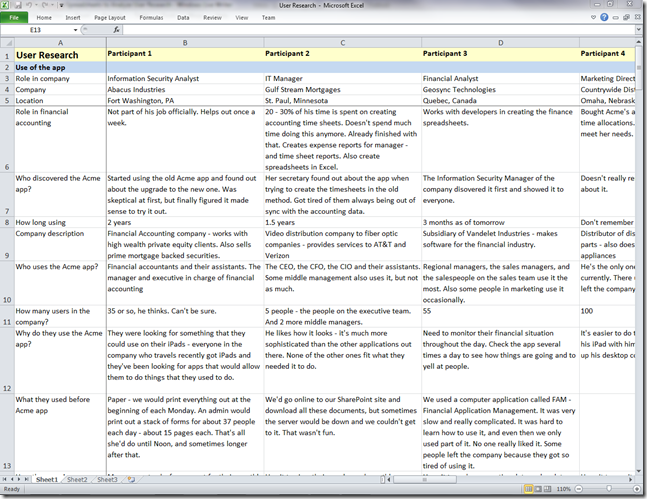
Which is a better method of analyzing user research and usability testing data, typing up your notes in a spreadsheet or creating an affinity diagram? In part 1 of this series, I discussed the advantages and disadvantages of using a spreadsheet. Here, in part two, I’ll discuss the advantages and disadvantages of affinity diagrams.
Analysis Spreadsheet
To review, in an analysis spreadsheet, each participant is listed in a column and each row can describe task performance, answers to a question, common problems experienced, or themes observed.
Affinity Diagram
With an affinity diagram, you transfer your handwritten notes to post-it notes, including one observation per note. Then you group related notes together, forming various levels of related groups and sub-groups, which results in common themes, as shown below.
Advantages and disadvantages
In part one, I discussed the pros and cons of using a spreadsheet for analysis. Now, let’s look at the advantages and disadvantages of affinity diagrams.
Affinity Diagram Advantages
Group analysis | Multiple people can combine their notes by writing them all on post-it notes and organizing them together. The act of organizing and labeling generates useful discussions. |
Flexibility | Post-it notes can easily be moved and organized into various levels of groups and sub-groups. |
Labeling | If you do your affinity diagram on a white board, you can easily add headings, sub-headings, draw borders, and add other indicators to show relationships. |
Ability to see the big picture | You can step back and see the big picture of the diagram. When you label groups and sub-groups, you can visually see where the main issues are. |
Visibility | It makes your analysis highly visible to others in the company. People are less likely to wonder why the analysis is taking so long. |
Appearances | Hundreds of multicolored post-it notes on a wall looks impressive. At a glance, it looks like you gathered a tremendous amount of information. |
Promotion | Affinity diagrams can generate excitement. They’re unusual and they attract attention. People ask questions and want to know what’s happening. It gets them excited to hear the results. |
Deliverables | Photos of affinity diagrams look impressive in deliverables and in other documents that explain your process. |
Affinity Diagram Disadvantages
Space | It requires reserving a space for several days or weeks to work on and save the affinity diagram. |
Mobility | You are tied to the physical location of the affinity diagram. Once you begin working on it, it stays in the room. |
Timing | Most often, you have to wait until the end of research to begin the affinity diagram. |
Materials | You need post-it notes and markers. |
Time and effort | Writing out each observation on post-it notes can be time consuming. |
Detail | The size of post-it notes and the effort of writing forces you to be brief, which means less detail, but can also force you to think and summarize. |
Backup | An affinity diagram is temporary and fragile. Someone could take it down, the post-it notes could fall off the wall (tip: use the extra sticky kind), or there could be a fire. |
Archival | Eventually, you have to take the affinity diagram down. You can take photos of it from a distance to show what it looked like, but to view the details you have to take close-ups. Close-ups allow you to read the text, but it’s difficult later to see how these photos fit together. You lose the sense of organization. |
Searching | You have to do a manual search by scanning the entire affinity diagram trying to find a particular note. |
Counting | Summarizing issues on notes, combining notes from several people, and moving the post-it notes around the diagram make it difficult to accurately count the number of times an issue occurred. |
Seeing which participant each note came from | Unless you carefully note participant numbers on each post-it note, you can lose track of which participant each note came from. |
So which is better?
Both spreadsheets and affinity diagrams have their pros and cons, but are there times when one method would be better than another?
Consider a spreadsheet when
· You’re doing analysis alone.
· You want to type up your notes and begin organizing them before the end of the research sessions.
· You’re analyzing usability testing results and you want to track things such as task completion, task time, error rates, questionnaire answers, ratings, or other metrics. It’s easier to keep information together and to add up the results by reading across the rows in a spreadsheet.
Consider an affinity diagram when
· Several people are combining their notes
· You want to analyze the data as a group
· You want to attract attention to promote the research, increase its visibility, and to expose others to the idea of research
· You’re analyzing user research findings, which are often more about higher-level issues and themes, rather than focused on specific tasks, as in usability testing
Ultimately, the best method comes down to personal preference. Whichever method best helps you understand the data is the one you should use. I encourage you to try both to see how they work for you.


