In my 15 years in the field of user experience, I’ve analyzed a lot of user research and usability testing data. For most of that time, I’ve typed up and organized my notes in spreadsheets. I find a spreadsheet to be an ideal format for research notes, because it allows me to list participants in each column and tasks, problems, and themes across rows.
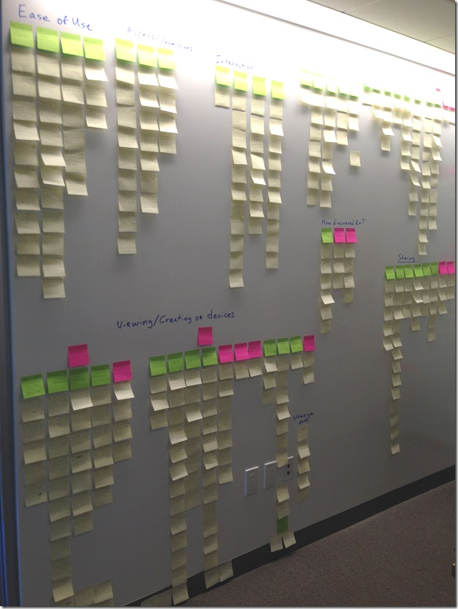
On larger projects, when analyzing data with a group of people, I’ve used an affinity diagram instead. An affinity diagram is an ideal way for a group of people to combine their findings by listing each observation on individual post-it notes, organizing those notes into groups by common themes, and then labeling those groups. But on a recent project, even though I was analyzing alone, I decided to abandon my usual spreadsheet to see how well an affinity diagram would work. It worked out well, and it caused me to notice the advantages and disadvantages of each technique. First, let me briefly describe each of these methods.
Analysis Spreadsheet
I find a spreadsheet to be a good method to organize usability testing or user research data because I can list each participant as a column and each row can describe how they performed a task, their answers to a question, common problems they experienced, or themes I observed. Looking across the rows, you can easily see how each participant answered a question, how many experienced a common problem, or how many had similar comments, as shown below.
Affinity Diagram
With an affinity diagram, you transfer your handwritten notes to post-it notes, including one observation per note. Then you group related notes together, forming various levels of related groups and sub-groups, which results in common themes, as shown below.
Advantages and disadvantages
Both of these are valuable ways to analyze data, but each has advantages and disadvantages. In part 1 of this post, let’s look at the pros and cons of using an analysis spreadsheet. In part 2, I’ll discuss the pros and cons of affinity diagrams.
Spreadsheet Advantages
Space | A spreadsheet doesn’t take up any additional space. |
Mobility | You can work on it anywhere you have your laptop or tablet (the office, at home, in a hotel room, waiting in the airport, on a plane, between research sessions, etc.) |
Timing | You can begin typing up your notes and organizing common issues while research is going on. Instead of waiting until all sessions are over, you can work on the analysis between sessions, at the end of the day in your hotel room, or while traveling. |
Materials | You don’t need any materials other than your computer. |
Time and effort | For most people, it’s quicker and easier to type notes than to write them out on post-it notes. |
Detail | You can include more detail as you type in the cell of a spreadsheet than on a post-it note. |
Backup | Although a digital file could be lost, it’s easy to back up in a secure location. |
Archival | All of your notes are organized neatly in one Excel file, which can be easily archived and understood at a later date. |
Searching | You can easily find specific items by doing a Find in the document to find each instance that a specific term was mentioned, such as seeing each time a participant mentioned “shopping cart.” |
Counting | You can easily read across a row to see how many participants successfully accomplished a task, experienced a particular problem, or complained about an issue. |
Seeing which participant each note came from | If you forget where a quote or issue originated, you can do a Find in the spreadsheet to see which participant it came from. |
Spreadsheet Disadvantages
Group analysis | Spreadsheets are ideal for individual analysis, but don’t work well for group analysis. Only one person can work on a spreadsheet at a time. It doesn’t lend itself to discussion. |
Flexibility | You can move rows around and reorder things, but it’s not as easy to group items in a spreadsheet as it is in an affinity diagram. |
Labeling | You can add headings above rows, and you can add titles to rows, but it’s not as flexible as an affinity diagram. |
Ability to see the big picture | You can only see what’s visible on your monitor, which is a limited number of rows and columns. You can’t see the big picture as you can when you step back from an affinity diagram. |
Visibility | When you sit at your desk updating a spreadsheet, no one sees what you’re working on. It doesn’t advertise the user research you’ve done. It doesn’t become a conversation piece. |
Appearances | Unlike an affinity diagram, a spreadsheet is not unusual or impressive. |
Promotion | Since no one sees what you’re doing, a spreadsheet doesn’t have much promotional value. |
Deliverables | A spreadsheet does not provide good process images to include in a deliverable. |
Affinity diagrams have some advantages over spreadsheets and also some disadvantages. I’ll discuss those and make some conclusions in part two.


