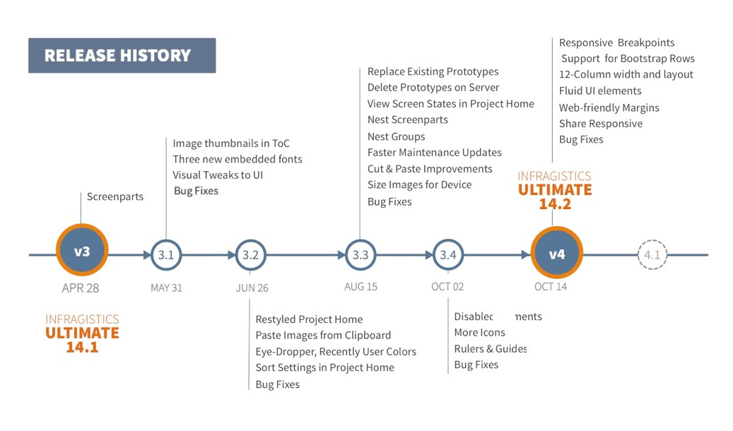
It has been a productive release season, and I hope you agree too! Since the release of version 3 in April-2014, we have continued to release product updates with new features!
To see what we released till date check out our product release notes. If you haven’t updated your version of Indigo Studio, you should!
With the launch of Version 4, Indigo Studio is laying the foundation for responsive web-pages. And we do this with support from Bootstrap so that HTML markup is consistent and extensible! Here is the list of new features that make responsive web-page prototyping possible:
- Responsive Breakpoints
- Support for Bootstrap rows and cells (columns)
- 12-Column layout
- Fluid UI elements
- Content Layout using Web-friendly Margins
- Preview and Share Responsive Web-page Prototypes
Responsive Breakpoints/Views
When targeting prototypes that emulate responsive websites, Indigo Studio now offers four responsive breakpoints or views that are standardized on Bootstrap:
- XS for Phone (less than or equal to 768 px)
- SM for Tablet (greater than 768 px)
- MD for Desktop (greater than or equal to 992 px)
- LG for very large Desktops (greater than 1200 px)
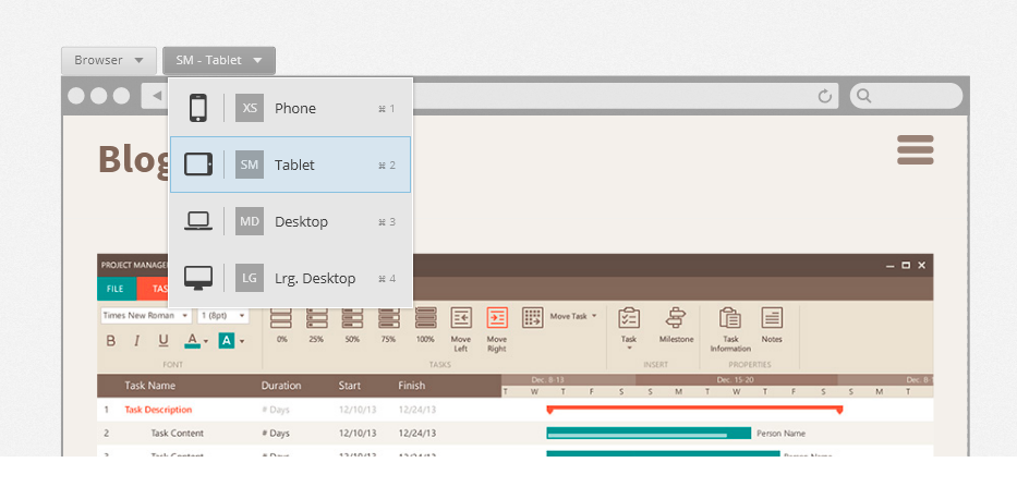
Adopting the bootstrap approach for responsive-grid layout, you are now free to target devices more broadly as opposed to getting lost in the minutia of device resolution vs. viewport widths.
Furthermore, Indigo Studio also allows you to go MOBILE-FIRST, such that the other views inherit from the mobile view (XS —> SM —> MD —> LG). And in typical bootstrap fashion, you can customize/tweak the views for the other breakpoints. So eventually when you need the HTML assets, it follows the Bootstrap conventions as opposed to some home-brew custom layout.
Support for Bootstrap rows and cells (columns)
Picking a responsive layout now adds a bootstrap container to your design canvas. This will allow you to add new rows, and cells inside each row to organize and lay out your content. By making this activity visual, we spare you the details of how bootstrap requires you to define rows and columns.
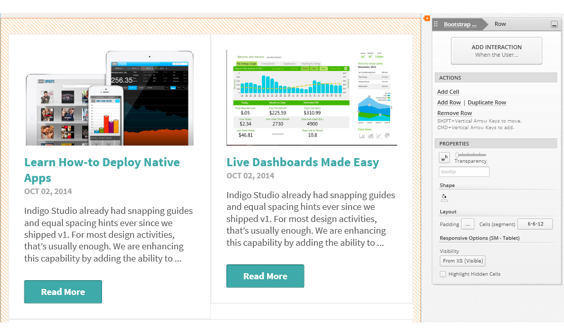
One small tweak we made is to call Bootstrap columns, `cells`. And that’s because depending on the space available and the width of the `cell`, they stack. And continuing to call them columns made less sense since they stack. For example, a row with two columns side-by-side on the tablets may stack vertically on phone. So, calling them cells just seemed to make more sense in such contexts.
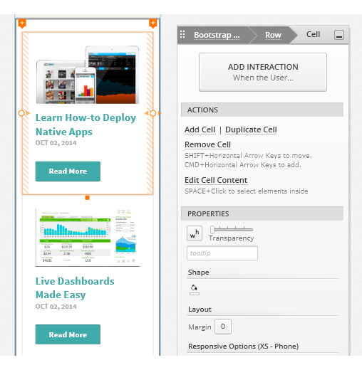
All the necessary padding and gutters for a Bootstrap grid come as defaults so that you never have to worry about it!
12-Column Layout/Spans
If you are familiar with Bootstrap or responsive web design in general, you may also be familiar with the 12-column structure. This is how the bootstrap grid operates where the cell/column widths are defined in multiples of columns. So instead of setting a specific width (e.g. 400 px), in responsive grids you would set a column-span for the cell. So in order to show two cells side by side, you would set a column span of 6 for each of the cells.
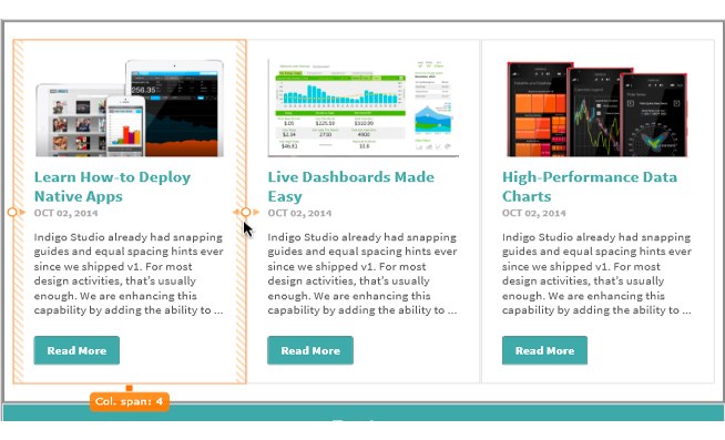
This 12-Column layout is repeated inside each cell such that the UI elements added are sized automatically in terms of column spans. For the most part, you will not even need to think about this. If, for example, you have a large image to be added inside a small cell, simply drop it in and the image is sized accordingly, while maintaining the correct aspect ratio. This really saves you time trying to align and position elements. Everything is automatically aligned and spaced out-of-the-box. You can of course tweak that.
Fluid UI elements
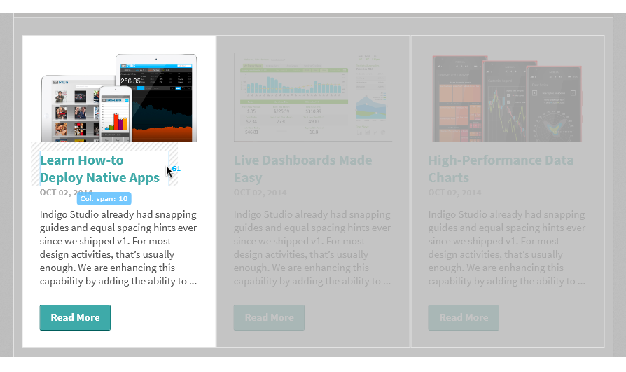
As mentioned earlier, the 12-column layout is repeated inside the cells. UI elements added to a cell take on a full-width (12-column spans). This behavior is governed by the `stretch` property for each UI element. So when you adjust the width of the parent cell, the elements grow or shrink fluidly. You can also adjust the col-span values for the UI elements to make them stack vertically or horizontally.
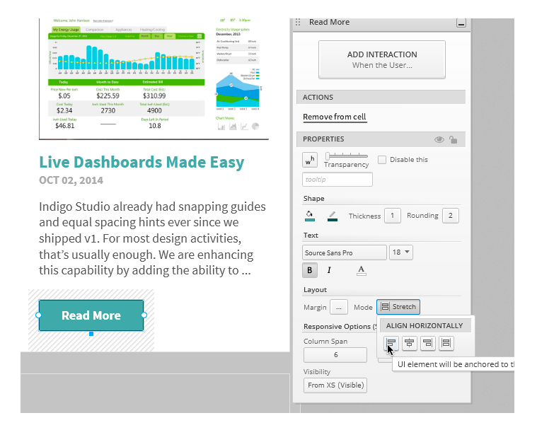
If specific pixel width is your thing, switch the mode from stretch to align Left, Right or Center.
Content Layout using Web-friendly Margins
Inside a cell, UI elements can be spaced away from each other by specifying margins. By default UI elements have a bottom margin of 15px. You can set custom margins (left, top, right, bottom) via the custom margin editor. As you tweak the values, Indigo Studio helps you visualize the margin being applied.
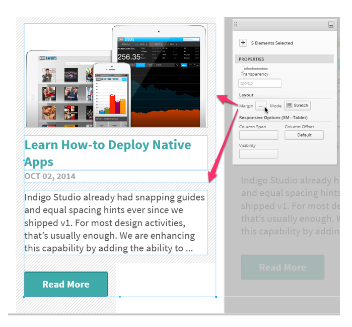
The use of margins for spacing UI elements is something that is different and new for Indigo Studio. It’s different from the absolutely positioning approach used for other viewports like generic or iOS. And since Indigo Studio is targeting responsive web site prototypes, we chose the margin based spacing approach. It takes some getting used to, but in the long run the HTML markup is more predictable and comprehensible. Yes, that means you will be able to export HTML code that is also bootstrap friendly.
Preview and Share Responsive Web-page Prototypes
The responsive web-page layout would never be complete without a way to experience the “responsiveness”. For this reason we tweaked the player for the prototype. You will now find a new option on the player toolbar, one which lets you pick which responsive view to see (phone, tablet, desktop etc.). If you set this option to fit to browser, as you adjust the width you can see the designs adapt according to the space available.

This option is only available when viewing the prototype on a desktop browser. When viewing on a device, Indigo Studio will automatically show you the view meant for the device you are on. Go ahead, and click on the following link to check out a prototype we created to mimic the bootstrap’s own site. After all, isn’t that what we were claiming you can now do?
Launch Responsive Web-Page Prototype
How to get this update?
If you have the option to automatically check for updates on startup checked, you should see a dialog box pop up when you launch Indigo. Simply click update, and Indigo Studio will do the rest. This is the easier approach.
One last thing; you need to have a valid Indigo Studio subscription to receive this major version upgrade (Version 4). If your subscription is still active, a new product key is automatically generated. You can retrieve your v4 product key in the "My Keys and Downloads" section of the Infragistics website. You can also use the Infragistics Ultimate 14.2 product key, if you purchased Indigo Studio as part of the bundle.
Retrieve Product Key/ Verify Subscription Status
This does not mean the version you currently own (e.g., Version 3-Update 4) will stop working. It's for you to use forever. If have questions about the perpetual licensing model for Indigo Studio see FAQ on Indigo Studio Licensing & Pricing
About Indigo Studio for Interaction Prototyping
Don't have Indigo Studio? Download a free 30-day trial which will let you try all of the prototyping goodness.
Looking to suggest improvements and new ideas for Indigo Studio?
If for some reason you are having trouble with Indigo Studio, check out our help topics, forums or contact support.
Follow us on Twitter @indigodesigned
