
The Ignite UI radial gauge control is one of the many widgets for Data Visualization that you can find in the Infragistics package. This tool is capable of displaying a gauge containing a number of visual elements like scale with ticks,ranges, a needle and of course labels.
Introduction
To get started you just need to add references to the required resources such as: jQuery, jQuery UI, Ignite UI CSS files and scripts.
To create a basic radial control and visualize it in you project all you have to do is set width and height.
HTML:
- <divid="gauge"class="gaugeContainer"></div>
JS:
- $("#gauge").igRadialGauge({
- width: "450px",
- height: "450px"
- });
MVC:
- @(Html.Infragistics().RadialGauge()
- .ID("radialgauge1")
- .Width("150px")
- .Height("150px")
- )
So far so good,but before we continue with the various properties of the gauge, lets take a look at its structure. The radial gauge has a round shape, that is why we can use coordinate system to help us set the start and end angle of various visual elements of the control. The scale and all of the elements connected with the scale(tick marks, needle value, etc.) have clockwise orientation by default. Although a normal coordinate system has its 90 degrees at the top of the system, the control has it flipped. The example picture demonstrate how you should perceive the gauge.
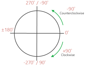
If you want for example to make a gauge that starts and ends at the same point – for example at the –90 degrees, you can set the start angle property to –90 or to 270 degrees and for the end angle set a value equal to the start angle value plus 360 degrees. For a scale that starts and ends at different points, you can just use the degrees from 0 to 360 to determine the range of the scale.
- scaleStartAngle: "270",
- scaleEndAngle: "630"
The scale sweep direction property can be used to change the scale orientation from clockwise to counterclockwise.
Features
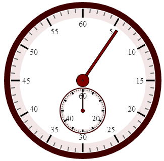
As any other Ignite UI control the radial gauge supports plenty of features, which can make your application unique and easy to customize. While we are examining the control we are going to create a stopwatch like the one shown in the example image to demonstrate the different properties.
Tick Marks
As we said the gauge is capable of displaying number of visual elements, such as scale with tick marks and labels, a needle and a number of ranges. The tick marks are the elements which display lines at a set interval. There are two types of ticks - major tick marks and the minor tick marks. You can specify the interval for the scale by assigning a value in which the major ticks will appear. For both the major and the minor ticks you can determine the start and the end position , measured from the center of the gauge by using respectively the tickStartExtent and thickEndExtent for the major ticks and minorTickStartExtent and minorTickExtentCount for the minor tick marks. Pay attention that the value of these properties should be between 0 and 1. You can also change the thickness and the brush of the tick marks by using the tickStrokeThickness and tickBrush for the major ticks and minorTickStrokeThickness and minorTickBrush for the minor tick marks. Choosing how many minor ticks to be displayed can be done with the minorTickCount option. For our stopwatch we need major tick mark at every 5 seconds and four minor ticks for more accurate time.
JS:
- interval: 5,
- minorTickCount: 4
MVC:
- .Interval(5)
- .MinorTickCount(4)
Labels
To determine the start and the end value of the gauge you should assign the required values to the minimumValue and maximumValue properties. The labels are vital part of the gauge. They display numeric values at a specified interval on the scale. In our sample we need labels at every major tick mark so we set the labelInterval property to 5 just like the interval for the major ticks. Because of that value for the label interval we are in a case where the first tick will have two labels (because we start and end in the same point). To prevent this we use the duplicateLabelOmissionStrategy property, which has several options – omitLast, omitFirst, omithNeither, omitBoth. Labels can be manipulated in one more way – by labelEXtent property. This option sets the position at which to put the labels as a value from 0 to 1, measured from the center of the gauge.
JS:
- minimumValue: 0,
- maximumValue: 60,
- duplicateLabelOmissionStrategy: 'omitFirst',
- labelInterval: 5,
- labelExtent: 0.45,
MVC:
- .MinimumValue(0)
- .MaximumValue(60)
- .DuplicateLabelOmissionStrategy(RadialGaugeDuplicateLabelOmissionStrategy.OmitFirst)
- .LabelInterval(5)
- .LabelExtent(0.45)
Needle
The needle can be remodeled in plenty of ways. You can choose the shape , the size, the brush as well as the position of the needle and the needle pivot. First of all you need to set the value property and that way you will specify where should the needle point. Using the needle shape option you can set one of the predefined shapes like : needle, triangle, trapezoid, rectangle and other. You can see the whole list in the API documentation. The needle start and end extent properties determine the position of the needle, measuring from the center of the gauge. The value can be between 1 and –1. There are two properties the needleStartWidthRatio and the needleEndWidthRatio that determine the width of the needle respectively at its point and at its base. Those properties take value between 0 and 1. Pay attention that the second one affects only needle of those shapes: rectangle, trapezoid, rectagleWithBulb and trapezoidEithBulb. For the sample we use the following lines:
JS:
- value: 0,
- needleShape: 'rectangle',
- needlePivotShape: 'circleOverlayWithHole',
- needlePivotWidthRatio: 0.01,
- needleEndWidthRatio: 0.02,
- needleStartWidthRatio: 0.02,
- needleBrush: '#800000',
- needlePivotBrush: '#800000',
- needlePivotOutline: '#000',
- needleOutline: '#000'
MVC:
- .Value(0)
- .NeedleShape(RadialGaugeNeedleShape.Rectangle)
- .NeedlePivotShape(RadialGaugePivotShape.CircleOverlayWithHole)
- .NeedlePivotWidthRatio(0.01)
- .NeedleEndWidthRatio(0.02)
- .NeedleStartWidthRatio(0.02)
- .NeedleBrush("#800000")
- .NeedlePivotBrush("#800000")
- .NeedlePivotOutline("#000")
- .NeedleOutline("#000")
You can see how to make the needle draggable in the sample browser.
Animation
The Radial Gauge control supports Motion Framework animations. The transitionDuration property makes it easy to animate the radial gauge and control its speed. This control animates almost every feature like scale range, color range, needle position and etc. In the Gauge Animation sample you can see how to animate between different configuration states of the control. In our sample we use this option to make the needle move smoothly.
MVC:
- .TransitionDuration(1000)
Background
By default the gauge has a circle shape, but we can change that using the backingShape option. The background shape can either be circular or fitted. A fitted shape creates a filled arc segment that encompasses the scale. We can customize the background by using the backingBrush, backing outline options as well as determining the inner and the outer extent of the gauge’s background. But the last two options will have effect only if the gauge has fitted shape. Making a stopwatch means that we need two gauges: the main one for the seconds and a little one for the minutes. To make it look as a real stopwatch the little one should be positioned in the main one. To accomplish that we need the background of the main gauge to be transparent. Making the background of the gauge transparent is useful if you want to create a complex background. You can do that by adding an image or CSS backing and place the gauge over it.
JS:
- backingOutline: '#400000',
- backingBrush: 'transparent'
MVC:
- .BackingOutline("#400000")
- .BackingBrush("transparent")
Scale
The scale is used to represent the values of the gauge visually. It defines a range of values in the control. All of the gauge’s elements are connected to the scale and are relevant to it. More information about the scale properties can be found in the documentation. For our sample we use the scale brush option to customize the gauge and the scaleStartAngle and scaleEndAngle that we mentioned earlier in the blog.
Conclusion
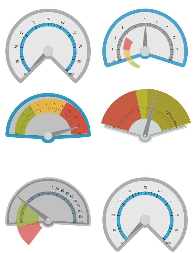
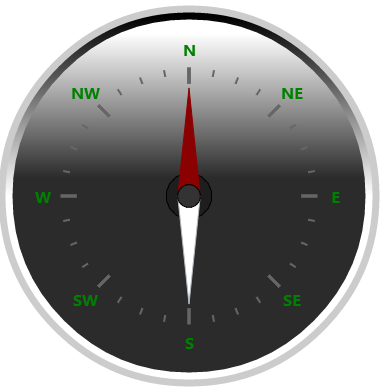
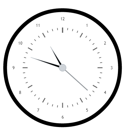
Basically, these are the essential properties needed for building a fully-functional gauge. You can see the samples in the sample browser and read the documentation for more detailed information about the Radial Gauge. The Ignite UI Radial Gauge can be used to create different visualizations like stopwatch, clock , compass, thermometer , mileage and etc.. It is an easy customizable and comprehensible widget that can enrich your web or mobile apps.
Coming soon a samples demonstrating how to create the following apps:
You can see a live demo of the stopwatch in jsFiddle or download the ASP.NET MVC project.
You can follow us on Twitter @Infragistics and stay in touch on Facebook, Google+ and LinkedIn!
