Good website navigation is about good wayfinding. Wayfinding describes how we best orient ourselves by the use of signs and landmarks. So good navigation should clearly inform us as to where we are and what we can find.
Post websites place site navigation toward the top of the page. As we scroll down the page, the navigation scrolls up and out of view. Hey, the navigation is gone! Where am I? To get back to the navigation we must scroll up to the top. The task of having to locate the navigation each time we want to go to another section can be daunting and frustrating. To eliminate this excessive back and forth scrolling, one solution has been to fix the navigation to the top of the page—as you scroll down the navigation does not move. Fixed navigation is a good solution but does have limitations, one is that it’s a static element that doesn’t react to users needs; a new pattern has emerged which achieves a flexible navigation bar that can serve many goals.
The Sticky Navigation Pattern has emerged as a powerful way to achieve good wayfinding: it is easily located, offers multiple display options, can display information just when we want it and remove unnecessary stuff when we don’t.
Let’s look at some examples that illustrate some innovative solutions to complex design challenges.
A 3 state navigation example
Google Plus (https://plus.google.com/local/Livingston,%20NJ/s/vegan%20restaurants?gl=us&hl=en)
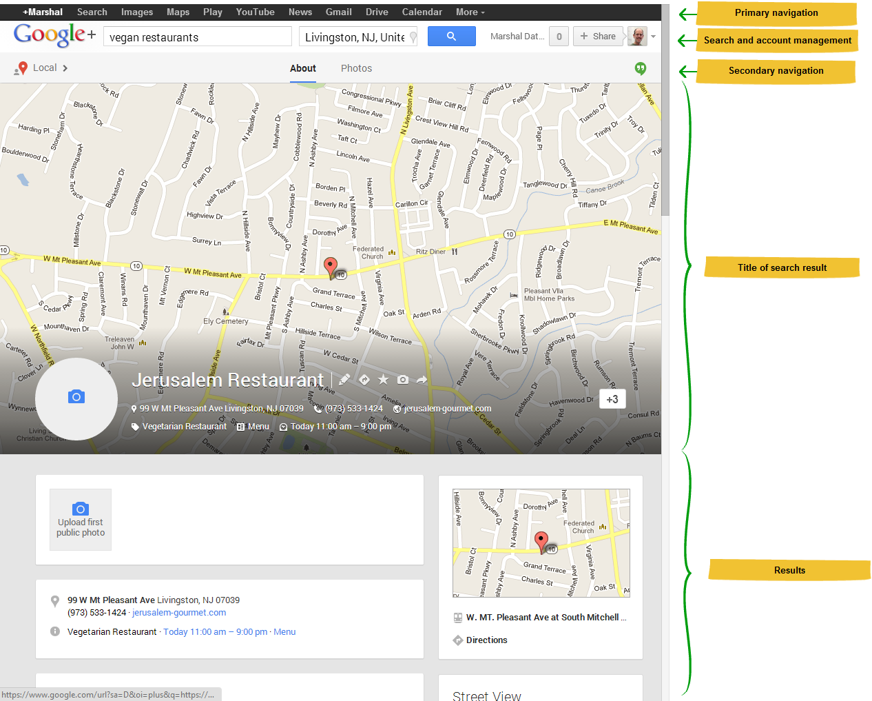
Google’s implementation is one of the best. There are 3 states for this sticky navigation, each having its advantages. In this example, I am searching for a Vegan restaurant in Livingston NJ – hope you like yummy food that’s good for you too.
State 1. I executed the search and here are the results: primary and secondary navigation at the top of the page, figure 1. Navigation clearly shows us where we are and what we can do.
Figure 1
State 2. Next, I selected a result, I am on a new page, the primary navigation is eliminated, but that’s OK because the secondary navigation includes the Google Plus logo and the Local icon so I know where I am, figure 2. The page is scrolled down a bit, the scrollbar position hints that there is more content above and the title is positioned over a map of the location, which hints of a larger map. The hints of the scrollbar position and partial map whet my appetite to explore – cool!
Figure 2
I partially scrolled up; the map is revealed, showing me the location in context, figure 3. Secondary navigation hasn’t moved but the title section is actually showing me more information. Here is what I am here for, now I know where the restaurant is.
Figure 3
Now I scrolled all the way up, back to state 1, we are at the top of the page, primary and secondary navigation has returned, figure 4. So we never lost the primary navigation after all, it was always at the top of the page. Actually, the secondary navigation is the sticky element, but that’s not the only sticky element -- one more state to look at.
Figure 4
State 3. Now as I scroll down the page the map title moves out of view and a smaller title bar slides down, figure 5. As I continue to scroll down, the restaurant title with the same information as before (but in a more compressed layout), remains stuck to the top of the page. At all times, we know where we are.
Figure 5
Google’s implementation of the 3 state pattern is great example that solves many wayfinding challenges elegantly.
A 2 state Sticky Navigation example for a single page website
The Fashion Photography Exposed DVD (http://www.fashionphotography.com/)
Here is a single web page site that takes advantage of a 2 state sticky navigation pattern. It is a simple implementation but it makes a strong impression without losing good wayfinding. This style is used often, a large image when we first enter the site designed to make a big impression.
State 1. Large “hero” image header, navigation at bottom of image, figure 6. It’s clear to me where I am, the image and copy clearly communicates what the site is all about, the topic areas are easy to spot and navigate.
Figure 6
State 2. As I scroll down the page, the bottom navigation sticks to the top, figure 7. As I navigate down the page, the section I’m viewing is highlighted in the navigation bar. This example is a very simple implementation that has good wayfinding.
Figure 7
A 2 state sticky navigation example for an ecommerce website
Kathmandu (http://www.kathmandu.com.au/)
In this more complex example, Kathmandu uses the 2 state sticky navigation pattern, illustrating how the branding in the header is persistent and reduces the navigation footprint by removing elements when not needed.
State 1. I just entered the website, figure 8. There is a large hero image (that is lying beneath the navigation), online retail utilities at the top, logo and search followed by primary navigation. We clearly see all our choices.
Figure 8
State 2. Next, I navigated to the Women’s page and scrolled down a bit, figure 9. The logo has slipped into the utilities area pushing the text links slightly over to the right. The branding is still consistent but now takes up less room. I notice a nice design choice here that supports the sticky menu affordance in that both the utilities bar and primary navigation are translucent. As I scroll down the page, I see the content pass under the elements—nice!
Figure 9
Conclusion
The sticky navigation pattern is starting to catch on. It offers excellent wayfinding and when executed imaginatively, adds a delightful visual appeal that enhances the User Experience wow factor.
There are several articles that gathered some sticky navigation examples worth sharing, here are two worth checking out: 20 Examples of Fixed & Floating JQuery/CSS Menu Bars in Web Design Inspiration and 21 Examples of Fixed Position Menus in Web Design.
Here is one article I found that discussed some usability research on the sticky menu pattern, Sticky Navigation research Sticky Menus Are Quicker To Navigate.
I just completed some usability research for a site that included a sticky menu and I found the same positive result: people liked the navigation, used it with no issues and didn’t notice it. I feel that is what we should be striving for, solutions to difficult problems that are transparent to our users.


