If you ask enough people what they think about the Windows 8 UI, you would begin to think that every single application looks the same. Many people seem to have this mistaken opinion that we're restricted to hard edged squares and rectangles and there's no room for creativity on the platform. That's simply not the case and in this tip I will provide a few examples. At the very least, I hope you'll take away from this tip a fresh view on what can be created on Windows 8. Sometimes you have to break the mold (even in subtle ways) to truly stand out.
(Previous tips can be found here.)

What does the mold you're talking about look like?
I think the mistaken perception that everything has to be boxy starts at the Start screen. In case you're not completely familiar with Windows 8 yet, here's a screenshot of the Start screen with the App Bar showing:

I have deliberately left this Start screen very "default" without any live tiles animating. I think this is what a lot of people think of when they think of Windows 8. And honestly, it's pretty boring. As I mentioned in the previous tip, the templates provided for getting an app like this started don't help very much in terms of thinking outside of the "box." The templates are very bland and unimaginative (probably intentionally so) and most developers aren't working with a designer or even design guidance at this point. So, we end up with a lot of applications that look like the Grid App template. It doesn't have to be this mundane though.
Example #1: Autodesk SketchBook Express
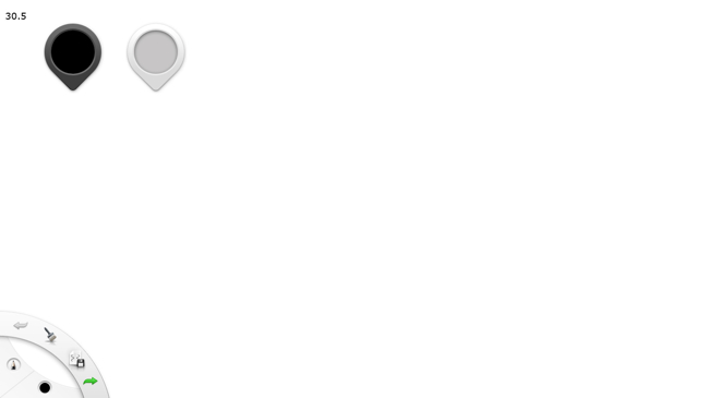
Autodesk started SketchBook Express way before Windows 8 was available for the public. In fact, as soon as the Windows Store was available in the preview stages of Windows 8, this app was there. It employs some very interesting touch-friendly features that at initial glance violate all kinds of ideas from the common conventions of Windows 8. Here's a look at the application upon first launch:
What I want you to pay attention to in this screenshot is the UI on the surface in the top-left and lower-left of the screen. One of the often misconstrued guidelines of Windows 8 design is that commands should be aggressively moved off screen into the app bar. This guidance is the heart of the "content before chrome" push that Windows 8 design shoots for. However, the same guidance that suggests this also acknowledges that there are some pieces of your user interface that probably do need to have always available on screen.
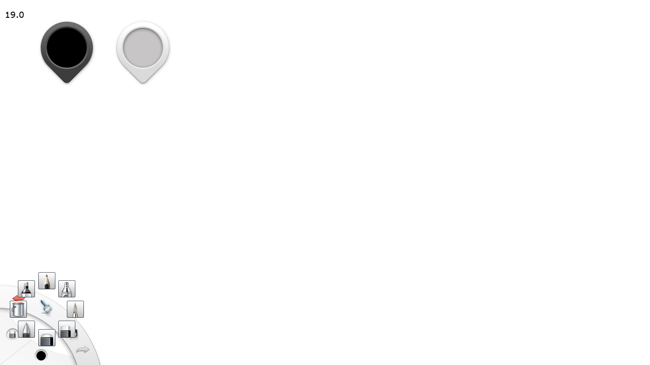
Since the application is a drawing app, the brush tools are very important and should definitely be elevated to the surface of the application. The App Bar would be the typical place for these controls on a first pass of the design, but there are two implications of making that decision. For one thing, if the app bar was constantly hidden it would require to frequently swipe to bring it up to make changes. This would allow more of the screen to be visible at any given time at the cost of usability. On the other hand, if the App Bar was always on-screen then it would be taking up significant space that could be used for drawing. Also, by not putting this functionality in the App Bar, the designers were able to make some creative decisions with regards to presenting these options. In the top-left, the leftmost control is used to change the color of the active brush. The rightmost control changes the width of the active brush. Perhaps the more interesting control is the one in the bottom-left. Tapping on the "brush" icon brings up a sort of radial menu:
This little bit of UI flair really adds something to this app. Only thing I would caution when exploring options like this is to aim to make it fit the style of Windows 8. In the next example, I'll show you another attempt at this that does fit more in-line with the platform styling.
Example #2: OneNote
Navigation structure
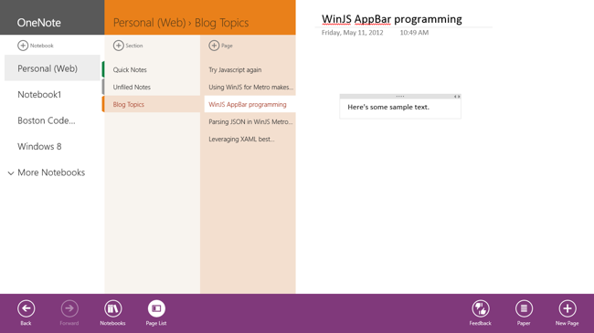
Microsoft has done an amazing job bringing OneNote to Windows 8. This application should be treated as a showcase for anyone who wants to make an application that requires a lot of text entry and document management. The notebook navigation is seamless. Here is a view of the application with the full navigation structure open:
One thing to keep in mind in this design is that the developers provided two ways to access this navigation. The App Bar provides a Notebooks button which will bring up the notebook list. The Page list within a notebook can be hidden at any time. However, you can also just tap the current page name (which is near where a back button usually would be) and it navigates to this view as well.
Another radial menu…this time with Microsoft design style
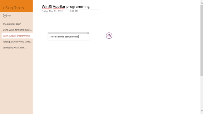
Coming back to our previous example, I mentioned that it would have been good for the Autodesk brush picker control to match the Microsoft design style. It should be no surprise that Microsoft's attempt at a radial menu is much more in like with this design style. Here's a look at the menu before it's opened:
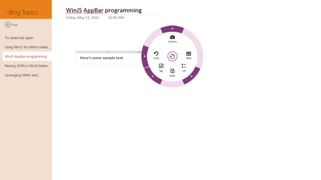
The "app bar" looking icon to the right of the text that I am currently typing in this screenshot is a radial menu that upon tapping will present a variety of options based on the current context. Here's what it looks like if I open it now:
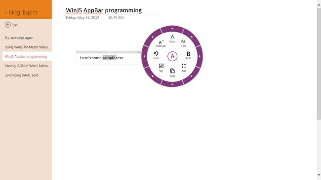
Notice that the icons and color choices are very much in line with the style of Windows 8 on the whole. I think this is a very creative way to approach this problem. The animations are fun to watch too. I mentioned it was contextual. Here's the first level of the radial menu if invoked with text selected:
All of the options in this menu have to do with text. This is great from a usability standpoint. Download OneNote for Windows 8 and try this radial menu out for a while and imagine trying to shove all of that functionality into the App Bar. I don't think the end experience would be very good.
Summary
In Windows 8 application development we are blessed with a lot of design guidelines. It helps us fit in with the platform. However, we run the risk of ending up with a lot of applications that look identical or at least very similar. When you are designing your application you need to take a step back and figure out how you can differentiate your app. Sometimes this might require stepping outside of the comfort zone of the design guidelines in order to break the mold a little. Have no fear, go ahead and break it!
Contact
If you have any questions or comments, please comment below or find me on Twitter @brentschooley. You can also email me at bschooley@infragistics.com.
