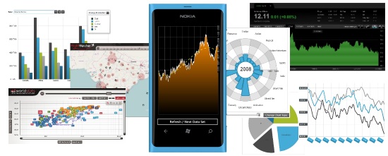
There are now more than 100,000 applications in the Windows Phone Marketplace, from games like Angry Birds and Civilization Revolution to common mobile apps like Netflix, Audible and Skype, including other gems like Carbon, 4th & Mayor and TouchDevelop. But Windows Phone is not just a mobile platform for consumer applications. Windows Phone can thank its big brother for the "Windows" part of its name as, just like its desktop counterpart, it is an ideal platform for business and enterprise app development. Windows Phone development does benefit from a 10+ year heritage in the .NET world, especially with amazing features like data binding, simplified versioning, reflection, XAML UI’s, simplified cryptography, object serialization and more. If you’re gonna write any business app, you’re gonna need data.
I've always said that "applications without data are sitting ducks" and mobile applications are no exception. Whether the data comes from REST services in the cloud or it's gathered locally and stored in a client-side mobile database, mobile developers can truly benefit from data visualization techniques when designing the user interface of an application. In fact, data visualization is doubly important in mobile applications since you don't have the luxury of large displays to show large data sets in their "raw" form. Grids may be the king of the business desktop, but it’s not necessarily so in mobile applications. The reduced screen real estate forces the mobile designer to optimize the information architecture to properly convey the proper message, or story, to the user on the go.
Storytelling Through Data Visualization
I use the term story because while it's easy to simply shove data in any given user interface, properly organizing and displaying this data for user assimilation is both a science and an art. Looking at the relationships and progression from data to user knowledge, we have:
- Data is gathered from multiple sources and persisted in a storage medium (e.g. XML or CSV files, databases, spreadsheets, OLAP cubes, etc.)
- Data is organized, aggregated, filtered, grouped, sorted and transformed based on domain or business rules to become coherent information.
- Information is laid out using a visual architecture and presented within an application (or report) based on a questions-driven story to be assimilated by a user, thus becoming knowledge.
This "story" is what you need to understand as a mobile designer (or any app designer, really). In the book Beautiful Visualization, Matthias Shapiro teaches us in chapter 2 about the importance of storytelling in information visualization, and how it takes shape by simply asking the right questions, such as:
- How have the sales been for this quarter compared to the previous quarter? To the same quarter last year?
- What are the projected trends for the next 6 months and will we hit our target for the year?
- Which products are the most popular based on sales or satisfaction ratings?
- From which countries do the people I follow on Twitter come from? What about those that follow me?
Once you ask the right questions, you transform your data into information to get the right answers, and then present the whole as a story that makes sense to the user.
Data visualization can indeed be a form of art since there are 1,001 ways to present the same data, but only a few of them will truly be effective. Looking at the questions above, a products table or grid sorted by sales or customer satisfaction is the best way to visualize the data if you have 100's of products, but a chart with multiple series per quarter would be the best way to visualize past trends and future projections for sales data. You could group your Twitter friends by country in a long list, but a thematic map showing each user as a pushpin or data point would be a much more effective way of conveying the user location story.
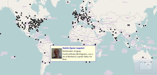
A sample map showing the location of some of my Twitter followers in early June 2012 (those that shared their location info at least)
Data Visualization Using Charts
While there are many fascinating types of visualizations, in this post I'm mostly concerned with charts-based data visualizations. Charts are quite popular because they are easy to understand and can effectively help visualize hundreds or thousands of data points, millions even. Let's consider common charting scenarios:
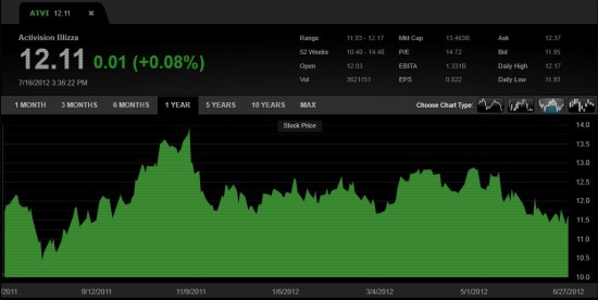
- Stock price valuation over time during trading hours (line or area chart)
- Budget allocation by company departments (pie chart)
- Sales figures by product by quarter
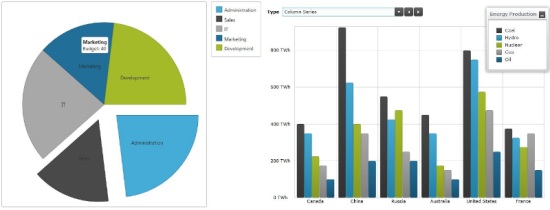
All these charts have something in common: they are two-dimensional, i.e. they show data plotted against 2 axes, such as price over time, satisfaction level by product, sales by quarter, etc. What happens when you need to take a third axis of data into consideration, such as:
- Cloud cover by geographic region throughout the day
- Product Sales vs. Customer Satisfaction on a weekly basis
- Smartphone adoption by country over time
There are exceptions, but when 3 axes of data are in play, time is most often one of them. When representing 2-dimensional data against two or three snapshots or “time stamps" (e.g. this year's sales by product vs. the last two years), we can solve this problem by simply plotting multiple series on the same chart, as illustrated below:
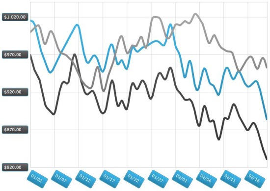
If you need to plot data against a wide range on the third axis, adding dozens or hundreds of series would just make the chart unreadable in the end. Three-dimensional charting is another possibility but save for a few niche scenarios, 3D charts are typically hard to read and remain confined to the realm of fancy marketing presentations only.
Since time is a linear concept we humans understand all too well, time can be used to cycle through multiple sets of data by "playing" through the sequence, just like we can play through a movie as a sequence if images. The following are examples of three-dimensional data visualizations where the Infragistics Motion Framework is used to play through the third time axis to observe data variations and shifts:
- World Stats: Average GDP vs Life Expectancy by country over time
- FlightWatcher: Flights within India throughout the day
- Number of movies produced by category from 1888-2010
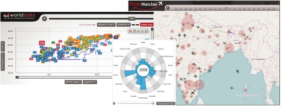
Plotting Data in Motion Using NetAdvantage for Windows Phone, xamDataChart and the Infragistics Motion Framework
The sample I'll walk you through below is based on the xamDataChart control in NetAdvantage for Windows Phone by Infragistics. The xamDataChart control is an enterprise-class charting control that supports 39 chart series types, 13 trend lines, 30+ financial indicators, composite charts with multiple series and the ability to plot hundreds of thousands of data points, even millions. You can find more details on the NetAdvantage for Windows Phone product page here, and you can also download a fully-supported 30-day evaluation version for free here.
The main feature of the xamDataChart that enables the scenario presented here is the Infragistics Motion Framework, which is a powerful data animation engine that can create smooth transitions between data sets. Using the Motion Framework, you can create charts against two axes of data and "play" through the third axis. The Motion Framework then creates smooth animated transitions as the data points, lines, areas, shapes or curves shift from one position to another, resulting in a fluid data visualization experience.
Click the embedded video image below to see the final result of this sample in action directly on YouTube:
Building the Windows Phone Motion Framework Chart Sample
Let’s get started and see how you can easily build this in Visual Studio. Create a new Windows Phone 7.1 Application project in Visual Studio 2010.
Drag the xamDataChart to your MainPage.xaml, or you can manually add the following assembly references first:
- InfragisticsWP7.v12.1
- InfragisticsWP7.Controls.Charts.XamDataChart.v12.1
- InfragisticsWP7.DataVisualization.v12.1
Next, add namespace declarations in your XAML header:
- xmlns:igChart="clr-namespace:Infragistics.Controls.Charts;assembly=InfragisticsWP7.Controls.Charts.XamDataChart.v12.1"
- xmlns:local="clr-namespace:TestMotionFrameworkWP"
Then add the XAML markup within a simple Grid element to configure the chart, axes, area series, and trend line, as well as a button at the bottom:
- <igChart:XamDataChart x:Name="theChart">
- <igChart:XamDataChart.Axes>
- <igChart:NumericYAxis x:Name="yAxis"
- MinimumValue="0" MaximumValue="40"/>
- <igChart:CategoryXAxis x:Name="xAxis"
- ItemsSource="{StaticResource data}"
- Label="{}{Label}"/>
- igChart:XamDataChart.Axes>
- <igChart:XamDataChart.Series>
- <igChart:AreaSeries
- x:Name="series"
- ItemsSource="{StaticResource data}"
- XAxis="{Binding ElementName=xAxis}"
- YAxis="{Binding ElementName=yAxis}"
- Outline="White"
- Thickness="2"
- TrendLineType="CubicFit"
- TrendLineBrush="Yellow"
- TrendLineDashArray="5"
- TrendLineThickness="3"
- MarkerType="None"
- ValueMemberPath="Value"
- TransitionDuration="0:00:01">
- <igChart:AreaSeries.Brush>
- <LinearGradientBrush StartPoint="0,0"
- EndPoint="0,1" Opacity="1.0"
- ColorInterpolationMode="SRgbLinearInterpolation">
- <GradientStop Offset="0" Color="DarkOrange"/>
- <GradientStop Offset="1" Color="Black"/>
- LinearGradientBrush>
- igChart:AreaSeries.Brush>
- igChart:AreaSeries>
- igChart:XamDataChart.Series>
- igChart:XamDataChart>
- <Button x:Name="refresh" Content="Refresh / Next Data Set"
- Click="refresh_Click" Grid.Row="1">Button>
Some notes about the XAML code above:
- The chart has 2 axis declarations, X & Y. The Y axis has a range of 0 to 40, while the X axis is driven by the data resource, which is an instance of the TestData(see declarations below).
- The chart displays a single Areaseries, without any markers. the xamDataCharts supports multiple series to create advanced composite charts.
- The area uses a gradient brush from Black to DarkOrange, which is defined as a child element of the AreaSeries.
- Note how the yellow trend line is defined at the series level.
- Note the TransitionDurationproperty which is used to tell the Motion Framework how long to animate the data when the dataset is refreshed.
- A Button is also included to allow the user to refresh the data.
- <phone:PhoneApplicationPage.Resources>
- <local:TestData x:Key="data" />
- phone:PhoneApplicationPage.Resources>
Let’s now define the TestData class, which is used to generate random data within a preset range:
- public class TestData
- : ObservableCollection<TestDataItem>
- {
- private Random _rand = new Random();
- public TestData()
- {
- for (var i = 0; i < 500; i++)
- {
- this.Add(new TestDataItem() { Label = i.ToString(), Value = 0 });
- }
- RefreshValues();
- }
- public void RefreshValues()
- {
- double curr = 20.0;
- for (var i = 0; i < Count; i++)
- {
- if (_rand.NextDouble() > .5)
- {
- curr += _rand.NextDouble();
- }
- else
- {
- curr -= _rand.NextDouble();
- }
- if (curr < 0)
- {
- curr = 0;
- curr += _rand.NextDouble();
- }
- if (curr > 40)
- {
- curr = 40;
- curr -= _rand.NextDouble();
- }
- this[i] = new TestDataItem() { Label = i.ToString(), Value = curr };
- }
- }
- }
- public class TestDataItem
- {
- public string Label { get; set; }
- public double Value { get; set; }
- }
About the TestData class:
- The TestDataclass contains 500 randomly generated data points.
- Each data point is generated by adding or subtracting a random value between 0.0 and 1.0 to/from the previous value. This insures the linear data is volatile enough while still producing consistent trends.
- Since the TestData class is bound directly in the XAML markup, you’ll see the randomly generated area series displayed within the designer in Visual Studio.
That’s it! You’re done. Simply run the application and tap the button to refresh the data, putting the Motion Framework in action. As you refresh the data, the new graph is not plotted immediately, instead, the Motion Framework creates a smooth transition to show the data shift from the origin data to the destination data. The trend line gets updated and animated as well, providing the user with an accurate simulation of the change in trends.
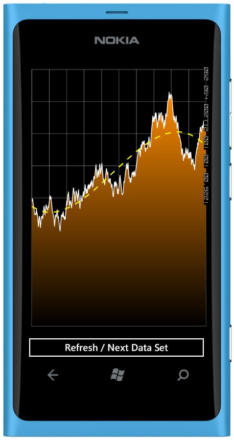
You might notice some color banding in the Black-to-Orange gradient in the area series. That’s because Windows Phone uses 16-bit colors by default. You can switch to 32-bit colors by setting BitsPerPixel="32" property within the element in the WMAppManifest.xml file (you can insert it right after the Publisher property. Be aware that not all Windows Phone devices support 32-bit colors, and even if they do, the graphics performance might be degraded in 32-bit color mode. That’s why it’s recommended to play it safe and use the default 16-bit colors.
Click here to download the complete Visual Studio solution and source code covered in this post.
Motion Framework on Other Platforms
Note that in this post I used Windows Phone as my platform of choice to illustrate my example, but you could easily reproduce these techniques on other mobile platforms like iOS or in HTML5 using our charts and Motion Framework in NetAdvantage for iOS and NetAdvantage for jQuery. These three products are now available as a bundled called MobileAdvantage. The same applies on the desktop with the xamDataChart in NetAdvantage for WPF or Silverlight.
Summary
Charting three-dimensional data using controllable animations can be quite a powerful data visualization technique, allowing you to easily tell the story of your data and facilitate its assimilation by your users. Mobile applications can greatly benefit from this practice given how complex data sets can easily be navigated through on smaller screens. The Infragistics Motion Framework built within the xamDataChart in MobileNetAdvantageis the perfect tool to very quickly animate such visualizations with very little code.
Do you have data that needs to be visualized on mobile charts? How did you deal with data sets that required a third axis? Do you use 3D charts? Post your comments here or contact me on Twitter at @ActiveNick.
