Introduction

Recently, we've been adding some really awesome Data Visualization capabilities to our Angular offerings, and I thought it might be a good idea to give some quick examples of some of the power this unlocks.

Here's a quick tour of the available Data Visualization components available so far (and more on the way!):
- igx-category-chart
- This is our business charting component which helps you quickly chart lines, columns, areas, etc. The truly neat part is that you can feed it some data, and it will try to predict what kind of plot you might want with no configuration. We'll see exactly why that's so cool later in this article.
- igx-financial-chart
- This is a financial charting component which provides a really rich suite of features to analyze financial specific data, all built-in to the component rather than requiring reams of extra code for you to write. Furthermore, it will also try to predict how to plot your data automatically.
- igx-radial-gauge
- This is great for dashboards, allowing you to plot a value along a circular scale. With insanely rich animation support built in, this can really create an eye popping display.
- igx-linear-gauge
- This is also great for dashboards, and all sorts of other use cases. Allows you to plot a value along a horizontal or vertical scale. Again, super rich animations will create compelling visuals.
- igx-bullet-graph
- Packs a lot of dense information into a very readable format. Allows you to compare values to various measures efficiently, without excess visual noise.
The Plan
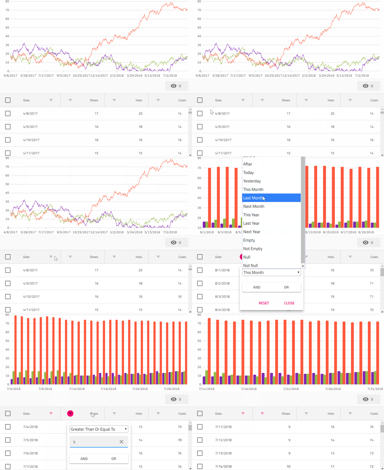
Since igx-category-chart gives us so much power to visualize data dynamically, why don't we leverage this to create some really tight integrations between a chart and a grid bound to the same data? Let's see if we can:
- Plot the same data in a chart and a grid simultaneously.
- When we hide a column in the grid, let's also hide that data from the chart.
- When we filter the data in the grid, let's also hide the non visible data from the chart.
- When we select rows in the grid, let's have only those items be visible in the chart.
The Setup
First, make sure you have the latest stable version of Node installed in your environment.
Now, Let's create an Angular project using the Angular CLI. If you don't have this installed, run:
npm install -g @angular/cli
Once that is installed, go to a directory you'd like to hold the sample project and run:
ng new chart-and-grid
Next you can open that up in VS Code:
code chart-and-grid
And open the integrated terminal View => Integrated Terminal and type:
npm install igniteui-angular igniteui-angular-core igniteui-angular-charts
The preceding installs the Ignite UI Angular Material Components, and our Charting suite.
Adding the Grid
Next, we'll add an igx-grid to the app and bind it to some data.
First, change the app.module.ts to read as such:
import { BrowserModule } from'@angular/platform-browser';
import { BrowserAnimationsModule } from'@angular/platform-browser/animations';
import { NgModule } from'@angular/core';
import { AppComponent } from'./app.component';
import { IgxGridModule } from'igniteui-angular';

@NgModule({
  declarations: [
    AppComponent
  ],
  imports: [
    BrowserModule,
    BrowserAnimationsModule,
    IgxGridModule.forRoot()
  ],
  providers: [],
  bootstrap: [AppComponent]
})
exportclass AppModule { }
Here the IgxGridModule is being imported so that the igx-grid can be used in some Angular templates.
Next, change app.component.ts to read as such:
import { Component, ViewChild, OnInit } from'@angular/core';
import { IgxGridComponent } from'igniteui-angular';

@Component({
  selector: 'app-root',
  templateUrl: './app.component.html',
  styleUrls: ['./app.component.css']
})
exportclass AppComponent implements OnInit {
  title = 'app';

  @ViewChild("grid1", { read: IgxGridComponent })
  public grid1: IgxGridComponent;

  data: SalesDataItem[] = [];
  chartData: SalesDataItem[] = [];

  ngOnInit() {
    this.data = this.generateData();
    this.chartData = this.data;
  }

  private generateData(): SalesDataItem[] {
    let data = [];
    let now = newDate();
    let shoes = 18;
    let hats = 19;
    let coats = 15;
    for (var i = 0; i < 500; i++) {
      shoes += Math.round(Math.random() * 4.0 - 2.0);
      if (shoes < 0) {
        shoes = 0;
      }
      hats += Math.round(Math.random() * 4.0 - 2.0);
      if (hats < 0) {
        hats = 0;
      }
      coats += Math.round(Math.random() * 4.0 - 2.0);
      if (coats < 0) {
        coats = 0;
      }

      let date = newDate();
      date.setDate(now.getDate() - (500 - i));
      data.push(new SalesDataItem(i, date, shoes, hats, coats));
    }

    return data;
  }
}

exportclass SalesDataItem {
  constructor(public index: number, public date: Date, public shoes: number, public hats: number, public coats: number) {

  }
}
Here we create an array of SalesDataItem, and then assign it to the data property.
Next, we can bind that data property to the grid in app.component.html:
<igx-grid
  #grid1
  width="100%"
  height="300px"
  [data]="data"
  [showToolbar]="true"
  [autoGenerate]="false"
  [columnHiding]="true"
  [rowSelectable]="true">
  <igx-column
    field="date"
    header="Date"
    [dataType]="'date'"
    sortable="true"
    filterable="true"
    [disableHiding]="true">
  </igx-column>
  <igx-column
    field="shoes"
    header="Shoes"
    [dataType]="'number'"
    sortable="true"
    filterable="true">
  </igx-column>
  <igx-column
    field="hats"
    header="Hats"
    [dataType]="'number'"
    sortable="true"
    filterable="true">
  </igx-column>
  <igx-column
    field="coats"
    header="Coats"
    [dataType]="'number'"
    sortable="true"
    filterable="true">
  </igx-column>
</igx-grid>
Here, we are binding an igx-grid to data and are individually configuring its columns to indicate that they are sortable and filterable.

To run the application type:
ng serve
at the console, and then navigate a browser to http://localhost:4200
Adding the Chart
Now that we have bound an igx-grid to the sales data, we should be able to add a chart bound to the same data, and then take things further from there.
First, we need to add IgxCategoryChartModule to app.module.ts:
import { BrowserModule } from'@angular/platform-browser';
import { BrowserAnimationsModule } from'@angular/platform-browser/animations';
import { NgModule } from'@angular/core';
import { AppComponent } from'./app.component';
import { IgxGridModule } from'igniteui-angular';
import { IgxCategoryChartModule } from'igniteui-angular-charts/ES5/igx-category-chart-module';

@NgModule({
  declarations: [
    AppComponent
  ],
  imports: [
    BrowserModule,
    BrowserAnimationsModule,
    IgxGridModule.forRoot(),
    IgxCategoryChartModule
  ],
  providers: [],
  bootstrap: [AppComponent]
})
exportclass AppModule { }
Next, we can also add the chart to the app.component.html markup, just prior to the igx-grid:
<igx-category-chart
  width="100%"
  height="300px"
  leftMargin="20"
  rightMargin="20"
  [dataSource]="chartData"
>
</igx-category-chart>
All we had to do in order to plot the data in the igx-category-chart was bind it to the dataSource property. That's it. The chart figured out everything else automatically.

Now we have both the chart and the grid pointing at the same data, but before we move on, we can clean up the visuals a bit with a couple tweaks. First, let's use a shorter date format for the Date column and the x axis, and exclude the index property from being plotted in the igx-category-chart by adding this code to the AppComponent class in app.component.ts:
  public excludedProperties: string[] = ["index"];

  public formatDate(val: Date) {
    return val.toLocaleDateString()
  }

  public formatDateItem(val: any) {
    return val.date.toLocaleDateString();
  }
And then, in app.component.html adding these properties to the igx-category-chart element:
  [xAxisFormatLabel]="formatDateItem"
  [excludedProperties]="excludedProperties"
and then amending the igx-column element for the date property to read:
<igx-column
  field="date"
  header="Date"
  [dataType]="'date'"
  sortable="true"
  filterable="true"
  [disableHiding]="true"
  [formatter]="formatDate"></igx-column>

excludedProperties will tell the igx-category-chart not to consider a set of properties for inclusion in the automatic visualization it performs on the provided data shape. We'll be able to do some even more impressive things with this property next.
Connecting Things Together
Since the igx-grid has some UI gestures to let us show and hide columns, wouldn't it be great if we could have these visibility changes reflect themselves in the chart also? All we need to do is at this code to AppComponent:
onColumnVisibilityChanged(args: { column: any, newValue: boolean }) {
    if (args.newValue) {
      if (this.excludedProperties.indexOf(args.column.field) == -1) {
        let newArr = this.excludedProperties.slice(0);
        newArr.push(args.column.field);
        this.excludedProperties = newArr;
      }
    } else {
      if (this.excludedProperties.indexOf(args.column.field) >= 0) {
        let newArr = this.excludedProperties.slice(0);
        newArr.splice(newArr.indexOf(args.column.field), 1);
        this.excludedProperties = newArr;
      }
    }
  }
And then add this event binding to the igx-grid element:
(onColumnVisibilityChanged)="onColumnVisibilityChanged($event)"
This has the effect of updating the excludedProperties array, which is excluding properties from the igx-category-chart, every time the user shows or hides columns from the grid.
Now, that's cool, but we also made all the columns filterable right? So can we make sure that is reflected in the igx-category-chart also? No problem. While we are at it, we'll also have selecting some rows filter down to just those rows also!
First, let's add a few more event bindings to the igx-grid element in the app.component.html file:
(onRowSelectionChange)="onRowSelectionChange($event)"
(onFilteringDone)="onFilteringDone($event)"
These will fire when the row selection state changes, or the filtering changes are complete in the grid. So we just need to react to those changes by updating the data to which the chart is bound.
All we need is to implement those two event handlers:
  public onRowSelectionChange(args: any) {
    window.setTimeout(
    () => {
    let sel = this.grid1.selectedRows();
    if (sel == null || sel.length == 0) {
      this.chartData = this.data;
    } else {
      this.chartData = sel;
    }
    }, 0);
  }

  public onFilteringDone(args: any) {
    this.grid1.selectRows([], true);
    window.setTimeout(() => {
    this.chartData = this.grid1.filteredData ? this.grid1.filteredData: this.grid1.data;
    });
  }
These just take either the selected rows, or the current filtered view of the data, and assign those to the igx-category-chart. Super simple, but the results are very compelling.
You can see a preview here:

Or check out a running version on StackBlitz, and the code that powers it.
We truly have some very neat Data Visualization capabilities in Ignite UI for Angular now that we are excited for you to check out!
