Introduction
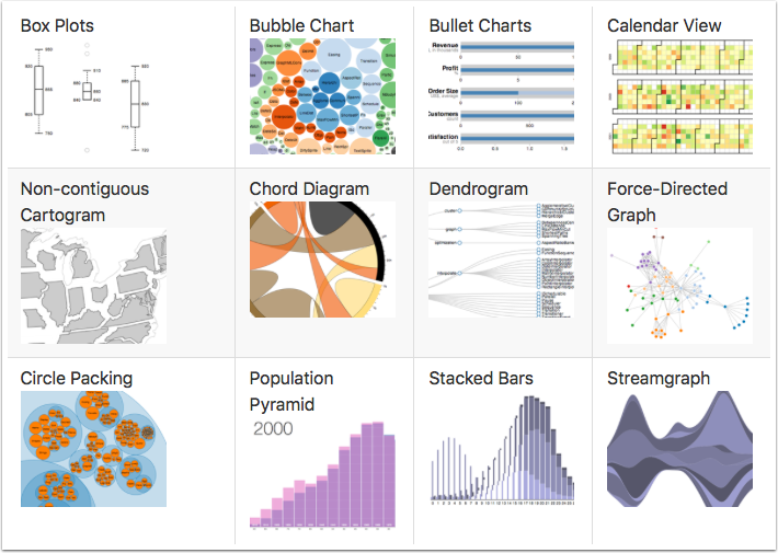
One of the most powerful data visualization frameworks on the web is D3.js. The visualizations can be simple or really complex. If you're curious for more examples, the D3.js visualizaiton gallery has some real amazing work. With such a powerful and flexible framework comes the tradeoff of being familiar with HTML, CSS, JavaScript, SVG, etc. Despite needing a basic knowledge of all those topics, there's quite the plethora of tutorials online for using this framework.
This exploratory blog post will dive into creating a D3.js visualization using data from ReportPlus in a dashboard.
Data

[custom] width="600" height="80" src="https://pastebin.com/embed_iframe/KBptpFYw" [/custom]
With the rplus_bridge_utils.js file reference in place a new SCRIPT tag is created to house the RPBridgeListener as well as the notifyExtensionIsReady method call to signify that the extension is ready when the page loads.
[custom] width="600" height="350" src="https://pastebin.com/embed_iframe/tQxLsEaT" [/custom]
The tabularData parameter object has many properties that can be used with custom visualizations. A few include:
- tabularData.data.length - Returns how many rows of data
- tabularData.data[index] - Returns a row data array
- tabularData.metadata.columns.length - Returns total columns
- tabularData.metadata.columns[index] - Returns column object (this returned object has .name and .type properties)
Using these properties a generic visualization could be made to display the row data on a web page.
[custom] width="600" height="1025" src="https://pastebin.com/embed_iframe/Ciav8gTc" [/custom]
When the above web page is added to the DIY Visualization the widget will look similar to the example below.
Integration
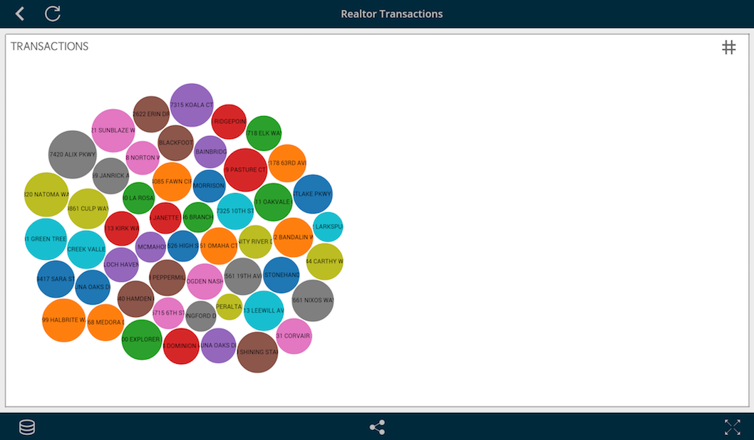
The visualization that this blog post will create is a bubble chart based off an example found on the D3.js gallery page. Instead of using a CSV for data, ReportPlus will supply the data through the previously mentioned RPBridgeListener. Once the data is received all that's necessary is to iterate through and add each data item to an array. Afterwards, a method is called to draw the visualization.
[custom] width="600" height="480" src="https://pastebin.com/embed_iframe/gmxWRfMA" [/custom]
If you're confused on where the rowData index numbers came from, take a look at the previous image. Each line is a row of data that is comma separated; the address corresponds with index 0 and the value with index 1.
Next, when the drawBubbleChart method is called the visualization is setup in similiar fashion to the example from the D3.js gallery page. This includes the diameter, color palette, circle shapes, clip path and text.
[custom] width="600" height="980" src="https://pastebin.com/embed_iframe/RFNSq8E4" [/custom]
The current visualization is nearly complete, with the exception of automatically resizing when the window changes size. To achieve this, a listener is added for resize when the page loads.
[custom] width="600" height="75" src="https://pastebin.com/embed_iframe/xXERY7CU" [/custom]
The listener will call the redraw method any time there's a size change to the webpage.
[custom] width="600" height="130" src="https://pastebin.com/embed_iframe/csHgjXtN" [/custom]
With the webpage complete, you'll need to host it on a webserver. The URL from this will be added to the DIY Visualization. The following is a link to the HTML we've built from this post.
Visualization
Once you've added the visualization page URL to the DIY Visualization you'll see something similiar to the image above. If you'd like to experiment with the same data source I used, feel free to download or directly use this link as a web resource within ReportPlus.
https://dl.dropbox.com/s/nrc1lv1n9xuz20n/Sacramentorealestatetransactions.csv?dl=0


