Essential to the process of creating and developing engaging interfaces for our users are thoughtful animations. In conjunction with wireframe testing and validation, we also need to be considering the overall design language and aesthetics. There are so many things to consider. As designers we want clean typography for the content, a beautiful color palette, expressive yet immediately understandable iconography but this isn’t enough. A successful product is one that can connect to the user on a personal level. Animations make this connection.
It’s only natural, as humans, to expect motion in our lives. I pull out my desk chair and it rolls. Drop a basketball and watch it bounce. These expectations, whether we realize it or not, are in our minds when interacting with our apps.
Communicate Status and Provide Feedback
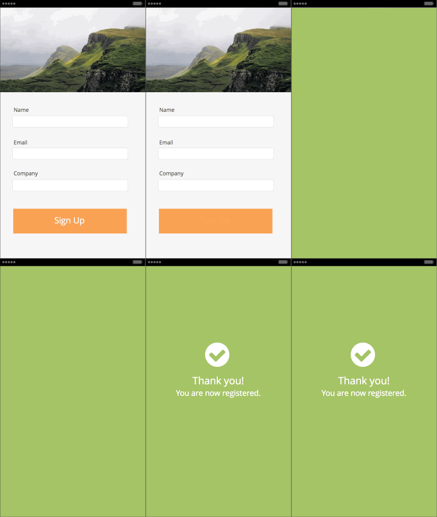
Great transitions have meaning; we don’t want to water down our products with needless animations. These will distract users from the content. For example, a meaningful transition may occur after a user completes a form, or to notify a user that the information they submitted was received by the app.

*created with Indigo Studio
Sure, you could just have the confirmation appear over the login form, but it would feel forced and unnatural. The result would require attention and place an additional, albeit small, cognitive load on the user in order to make the connection between their action and what happened on their screen. By having a well thought out transition, the user is guided on a journey from one visual state (the sign up form) to the next visual state (confirmation message), minimizing attentional and cognitive requirements.
Direct the User’s Attention
Transitions may also be used to direct your user’s attention to certain aspects of the content. In doing so, you help the user focus on what is relevant as they complete their task.
In this example, as the side panel transitions in, the main content animates to the lower right corner of the viewport. This puts the user’s attention solely on the content that is in the navigation drawer, allowing them to focus on what is important in this visual state. When closing the navigation panel, notice how the content transitions to its original position. This technique also help users remember the “resting” location of the navigation.

Be smart about your transitions and don’t be afraid to experiment. Test with users to validate ideas. Remember to have your transitions guide the user from one visual state to the next without distracting them from the content. When returning back to a visual state (ie: closing a menu), all elements should animate back to their original locations. You’ll learn that by providing transitions that delight, users will feel a greater connection with your app.