It’s full of much requested features, and we know that you are going to love it! :)
FYI, we are changing how we name major releases for Indigo Studio. Instead of calling it version 6.0, it’s now Indigo Studio 2015 Vol.2. The first number is for the year of release (e.g., 2015) and the volume number indicates whether it’s the first or second major release for that year (e.g., Vol. 2). In addition to the two major releases every year, we ship periodic updates. The update number is appended to the major release name. For example, Indigo Studio 2015 Vol. 2 (Update 1).
We feel this naming convention will be simpler to understand and emphasize our unrelenting focus in delivering the most capable and rapid UX-Flow prototyping tool!
If you haven’t been updating regularly, here is the list of highlighted features we added since the last major version of Indigo Studio:
- Add comments to prototypes
- Install sharing and collaboration server on premises
- Using collections to organize and share prototypes
- Inline text formatting support (rich text)
- Docking the properties panel
- Revisiting UI Guides
- Download Screenpart libraries
- All of the fontAwesome icon set
- Ability to flip and rotate icons
- Text field value based interactions
Check the following link for a complete list of past releases: http://indigo.infragistics.com/help/releasenotes
Add Comments to Prototypes
Commenting is part of indigodesigned.com, our free prototype hosting service for unlimited number of prototypes. We announced indigodesigned.com a while back, and is the quickest way to share your prototypes in the cloud.
Any prototype you share on indigodesigned.com will have support for commenting. To enable comments, simply upgrade to the latest version of Indigo Studio, and share your prototype with the Enable Commenting option checked.
Manage Comments
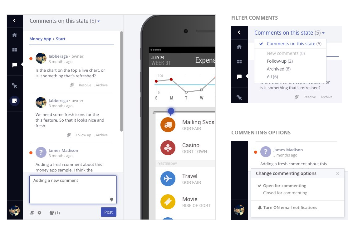
Comments are shown in a side-bar as opposed to on top of the prototype. This way, you can read and add comments without interfering with the navigation. Comments are unique to each UI state, so as you navigate, the comments panel will update accordingly.
The prototype owner will have the ability to mark comments for follow-up or archive previous comments. Once you do this, you can use the filter in the comment sidebar to filter those comments.
You can also open or close commenting at any time. When comments are closed, reviewers will be unable to add new comments, but existing comments will still be shown. Comments are not available for prototypes marked as community.
Email Notifications, Real-time Comments, and Adding Markers
Naturally, that’s not all! In addition to adding comments, we have also added the following related features:
Email notifications Anyone you share the prototype link with can subscribe to receive email notifications when new comments are added to the share.
Real time comments As the name suggests, comments panel will update automatically without requiring you to refresh the prototype.
Adding comment markers You will be able to drop a marker to visually connect a comment with the UI/prototype.
Install indigodesigned.com on Premises
Enterprise customers can opt to install indigodesigned.com on premises behind their corporate firewall. This will allow you to control where the prototypes and UI libraries are stored, and provides an additional level of security and privacy. In nutshell, get all the capabilities, for sharing and collaboration, available just for your users. You can even authenticate using your existing credentials without requiring an infragistics.com account.
Go ahead and share prototypes or UI libraries that others in your organization can freely access and download! Contact us for details
Use Collections to Organize & Share Your UX Prototypes
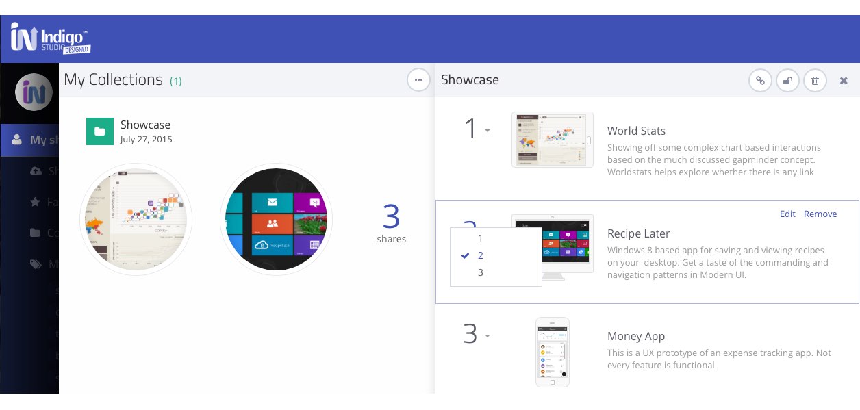
Collections are like folders for your shares on indigodesigned.com, with the following tweaks:
- You can reorder the items/shares in a collection like a playlist.
- You can grab a single link to the entire collection, which you can then send someone
- Deleting a collection does not affect the contained shares
- You can password-protect a collection, and bypass passwords on individual shares.
To create a collection, select a set of prototypes you have shared on indigodesigned.com, and use the add to collection action to create a new collection or add to an existing one.
Inline text formatting or Rich Text Support
It seems like a small thing, but it’s big! So big that it was the second highest voted idea in uservoice. And now you have it.

Docking Properties Panel
Dock/pin the properties panel to the right of the design surface, so that it’s integrated with the toolbox. When docked, this panel will share the space with the other toolbox items (i.e., UI elements, screenparts). You can make the PE taller using the splitter or double click the splitter to fit.

Rulers & Guides
Add a new guide by either clicking in the ruler area or by using the click + drag action. You can still double click on a guide to type in a precise value.

Download and Import UI Libraries from indigodesigned.com
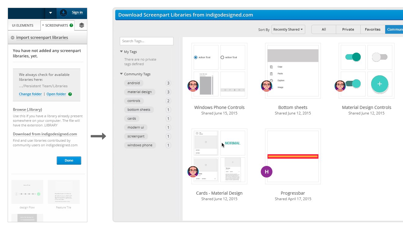
You can explore, download and import UI libraries shared by community users without leaving the Indigo Studio application. UI libraries, also known as screenparts, are reusable custom UI elements created using Indigo Studio.
Downloaded UI libraries are added to a common default folder on your desktop, accessible to all new Indigo Studio projects. You can also change this folder to point to a shared folder anywhere on your network. This way different users can have access to the downloaded libraries as long as they have access to the shared folder.
All Icons from FontAwesome
We have added all the icons from the FontAwesome collection, which increases the tally to 800+ icons ready for use whether you are offline or online. All icons are vector, so you can be assured that these will render perfectly irrespective of screen resolution.
![]()
Options to Flip and Rotate icons
You have new options to quickly mirror icons vertically or horizontally in addition to rotating them clockwise or anti-clockwise. For now these actions are only available for icons.

Text Value based Interactions
Specify interactions based on the value specified in the text field. When adding an interaction on a text field, pick changes as the interaction, and specify a target value. You can add more than one text field value to define multiple if-then scenarios.
For example:
- When user changes the text field to “Foo," do X.
- When user changes the text field to “Bar," do Y.

How to get this Update?
Here’s how you can update the version of Indigo Studio installed on your machine:
- If you have the option to automatically check for updates on startup checked, you should see a dialog box pop up when you launch Indigo. Simply click update, and Indigo Studio will do the rest. This is the easier approach.
- If for some reason you chose not to automatically check for updates, go to MENU > HELP & ABOUT and use the “CHECK FOR UPDATES option.

About Indigo Studio for Interaction Prototyping
Don’t have Indigo Studio? Download a free 30-day trial which will let you try all of the prototyping goodness!
Looking to suggest improvements and new ideas for Indigo Studio?
If for some reason you are having trouble with Indigo Studio, check out our help topics, forums or contact support.
Follow us on Twitter @indigodesigned


