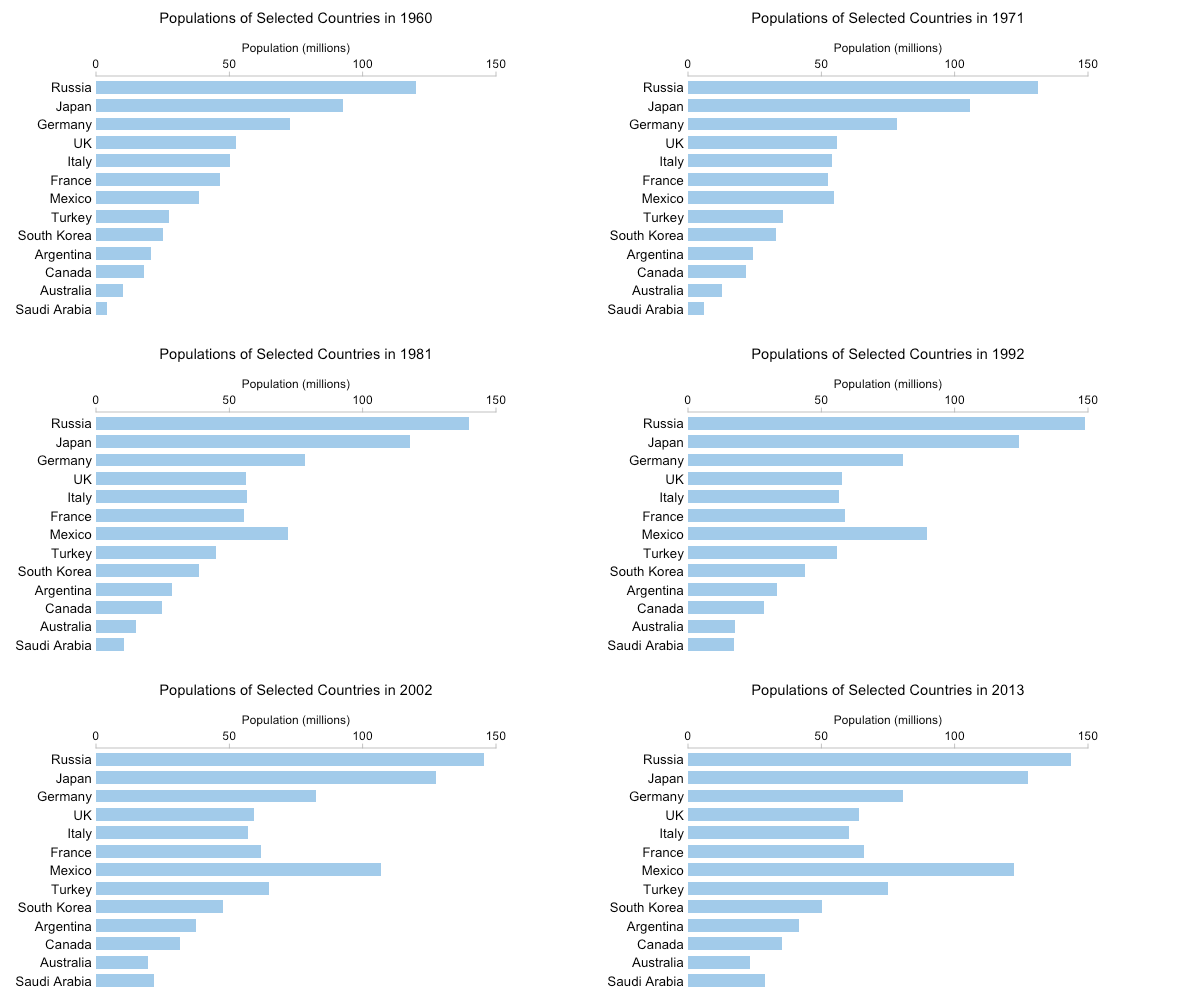
In my last article I argued that there's still a place for GIFs in data visualization on the web. A GIF can be used to illustrate how a measure or measures have changed over time or vary based on a third, categorical, variable. Small multiples — collections of small (obviously) graphics where the same variables are plotted in each graphic but the data in each graphic are conditioned based on another variable (or two) — can be used for similar purposes, with some advantages and some disadvantages.
Here's the GIF of changes in population over time from my previous article (data comes from the World Bank):

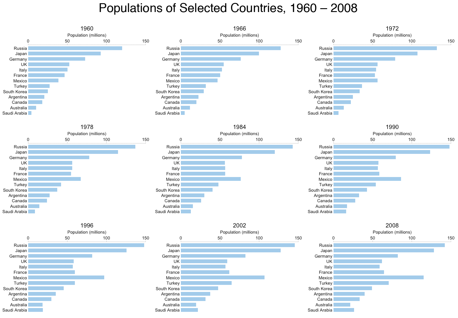
That GIF has 54 separate frames. It's not particularly practical to create a small multiple graphic with 54 separate charts, but we can still get a good idea of the changes taking place by "sampling" the data every six years:

Obviously you can browse the small multiple layout at your leisure. You can clearly see the rapid rise in the population of Mexico, for instance. You can see that the population roughly doubled from just over 50 million in 1972 to a little over 100 million by 2002. To get his kind of information from the GIF you have to keep details in working memory while you wait for the frames to progress.
However, I think the GIF makes more subtle changes more obvious. The "wobbles" (small increases and decreases) in the German population that are easy to see in the GIF are absent from the small multiple graphic. This isn't just because of the lower temporal resolution. Even if there was a graphic for every year, the small size of each graphic and the distance between them would mean the small, subtle, oscillations would likely go unnoticed.
In the article on GIFs I also referenced an earlier chart I created using the same data, a variant on the slopegraph:

Deconstructing this view of the data into separate line charts and then creating a GIF-frame for each country was not particularly useful. But what if we create a small multiple graphic instead? I've done this below, omitting Australia (rather arbitrarily) to facilitate use of a 3 by 4 grid.

This is more useful than the GIF version. It is, for example, much easier to compare countries that aren't spatially adjacent in this graphic than it was to compare countries whose frames weren't temporally adjacent in the GIF. But both seem inferior to the slopegraph variant that allows us to see line crossings (indicating changes in population rank) and more detail in population oscillations (like Germany's) due to the greater vertical extent. However, data for other countries may not match the basic slopegraph design so well. As I've mentioned previously, slopegraphs frequently suffer from issues involving overlapping labels. This isn't an issue with the small multiple set-up.
Another reason the slopegraph variant works well in the previous example is because we have only one line per country, showing population. If we have more than one line per country (or other categorical variable) then this design no longer makes sense. But a small multiple design can excel in such a situation.
The graphic below shows crude birth rateandcrude death rate estimates (again from the World Bank) for a (fairly arbitrary) selection of nine G-20 nations.

From this figure we can see a whole range of interesting (and, unfortunately, frequently sombre and depressing) data stories concerning individual countries, such as:
- The increase in birth rate and drop in death rate in 1960's China following the end of the Great Leap Forward period;
- The increase, from the mid-1990's onwards, in the death rate in South Africa due to the AIDS epidemic and the decline in recent years as antiretroviral drugs became more widely available;
- The hinoeuma year (1966) in Japan.
At the same time, the figure permits us to contrast and compare. For instance, a pattern of low death rates and even lower birth rates leads to an aging population (at least in the absence of any significant migration). Consequently, a quick perusal of the figure and you'd probably not be surprised to learn that recent years have seen concerns over pensions and the retirement age in Italy, Germany and Japan.
Up to now, the examples haven't drawn any distinction between the horizontal and vertical components of a small multiple "grid". But, as with line charts and scatter plots, we can encode different variables in our two different dimensions. The graphic below from NASA's Scientific Visualization Studio (it's well worth downloading the high-resolution TIFF file for yourself) showing the variation in ice extent at the North Pole encodes the year in the horizontal direction (from 1979 to 2014) and the month in the vertical direction. Each column shows how the ice extent changed over the course of the year while each row shows the long term changes for a particular month.

Once again it's important to stress that the choice of chart depends on where it's going to be placed and who is going to see it. Despite each individual chart being small, a small multiple grid can take up considerable space. With small browsers on phones this can be a significant obstacle.
