This month, we're giving you an inside look at the creation and development of our new Project Management Dashboard, which we built using our jQuery controls along with ASP.NET MVC Helpers. You'll find the use of the controls with this application to be pretty interesting, so let’s dive in and give you a quick glance at how this app was built!

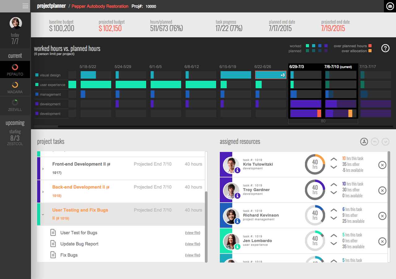
For this dashboard, we utilized the Infragistics jQuery doughnut chart, hierarchical grid, grid, and linear gauge. Taking a look at the Resource Weekly Hour Allocation section, you’ll be able to see two of the four controls in action: the grid and linear gauge. In this section, we combined the two in order to clearly represent each resource’s hour allocation by week in a concise and easy-to-read manner. Using the grid control, we were able to form the structure of the display by having each row represent an individual resource on the project while the columns were weeks of the project.

Now looking at the grid more, you can see that we provided an extra column at the beginning to provide some extra context for the row. This will tell us what the resource’s discipline, or skill set, is. Now, following the row along you’ll see the header labels show date ranges, and they represent that date range for a particular column.
So, what about the linear gauge? While the grid served as the structure, the linear gauge represents the hourly breakdown for a resource during a week. Looking at each cell within a weekly column, you see these graphs scattered around. Utilizing the linear gauge in this fashion allows us to quickly tell a story by showing how many hours have been worked, planned, or signify problems areas such as overtime or overbooking a resource. Looking at the picture above you’ll see various colors and opacities. So how are the hours represented in the gauge? The brighter colors are worked; the darker colors are planned; gray is available hours; and the yellow and red colors represent over-planned and overtime, respectively.

In the image above, you see a red block, that simply means the resources worked X amount of hours over what they were planned while the yellow block shows that the resource has X amount over-booked. In the instance where you see a yellow or red outline with an accompanying number hovering on top of the graph, that shows that there is X amount of hours (over-booked or overtime) past the normal 40-hours worked window.
Next, let’s talk about how the Hierarchical grid was used. We needed a clean way of showing project tasks along with a list of task deliverables. The Hierarchical grid served this purpose well by allowing nested tables of information. On the surface, we have the task item in a collapsed display, but if you were to click on the item, it expands to reveal the deliverables.

Finally, the doughnut chart was used in two ways: presenting overall progress of project with status notification and as an hourly breakdown for a resource on individual tasks. In the navigation, the doughnut chart was used to show if a project was in danger (red), potential danger (yellow) or normal (green) while using also showing task completion. The red, yellow, or green shows the amount of complete tasks while the light gray shows the amount remaining to complete. Now, for the Assigned resource section, we use chart in a slightly different manner. In this section, we show the breakdown of hours for the current week of the resource -- hours on task, hours on other tasks, and hours available.

Overall, these controls — when used together or separately — make for something amazing! Now that you’ve taken a quick glance at some of the behind-the-scene details, be sure to grab a free trial of our controls. Plus, if you enjoyed this article, please make sure to take a look at the complimentary web series for the Project Management Dashboard that highlights some of the cool features within the app, and don’t forget to get the code for yourself, so you can start creating a dashboard of your own - Happy coding!