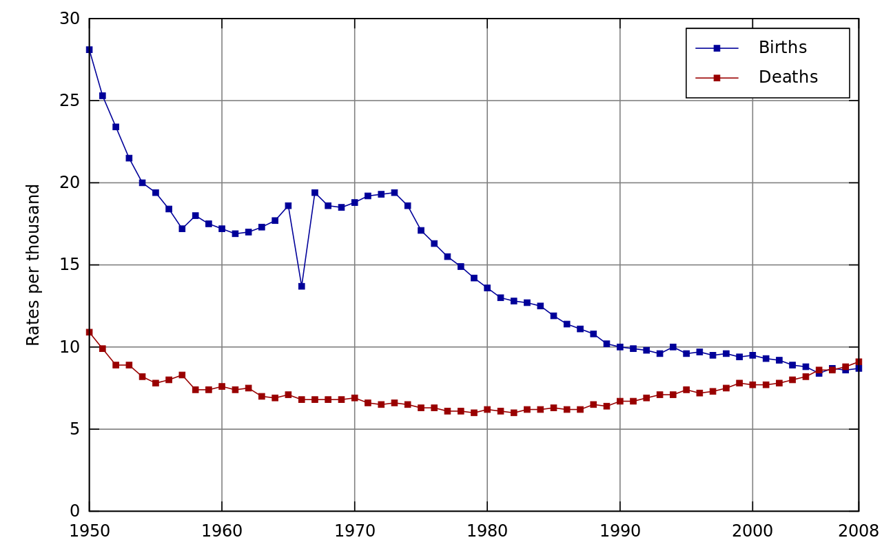
While writing my recentarticles on slopegraphs I became intrigued by the unusual shapes of some of the population curves of the countries and decided to read around the subject a bit. It was through this that I stumbled across a Wikipedia article on the Demographics of Japan. A chart concerning birth rates and death rates in the country piqued my curiosity:

The big picture is one of (generally) declining birth rates and a fairly steady death rate. But the real question that sprang to my mind was "what on Earth happened to the birth rate in 1966?".
My first thought was that this was an error in the data; someone, somewhere had transcribed a number incorrectly for example. But the discrepancy is in the original source data - from the Statistics Bureau of Japan - and the dip wasn't just a mistake. It also had nothing to do with war or famine or anything I thought of as being an intuitive reason why birth rates might drop for a short period. Slightly surprisingly perhaps, the dip isn't actually mentioned in the article on the Demographics of Japan. But it is mentioned when the image is used in another article - the one on Astrology.
In short, 1966 was the year of the fire horse or hinoeuma. It comes around every sixty years and girls born in those years are/were believed to be "of harsh temperament" and "should be avoided as marriage partners". So many would-be parents avoided having children that year.
From a data visualization perspective I found this intriguing for a number of reasons. First of all there's an interesting (perhaps uncomfortable) story that the outlying data point tells. A data point that arose from a cultural phenomenon (a culture that I'll confess to being largely ignorant of). And yet the chart still communicates the broader picture. We still have over a hundred other data points that do seem to behave fairly well. We can link these points with the knowledge that the population of Japan has ceased to grow and understand, to an extent, why (though, admittedly we don't learn of the underlying factors in the changes of the birth rate).
I think the visualization - or perhaps the data it contains - also serves as a reminder of the importance of specialists or experts. With a little knowledge we might be able to interpret the general patterns seen in similar charts. In the case of populations, birth rates and death rates we can probably get a long way with a modest amount of understanding of history and demographics. But in the case of Japan, the remarkable outlier can only be understood with the addition of specific, non-generic, cultural knowledge too.
Finally, I'd like to mention interpolation and extrapolation. Both concern the act of predicting or estimating values of variables based on their relationship to one or more other variables. While interpolation concerns estimation within ranges already measured, extrapolation refers to judgements beyond the current range of measurement. For this reason, the latter is generally subject to greater uncertainty and must be done with some care. Oversimplification can lead to estimates that are very very far out from reality. I think the data in the visualization above might serve to make us wary of interpolation too.
Let's suppose that for some reason we only had birth and death rate data for Japan for the odd years between 1951 and 2001 (I'll admit this is a contrived example). We can still plot those as points:

Now suppose we want to estimate the population in the even years. The simplest solution is a linear interpolation between the data for the odd years. In short, our estimates for the even years (hollow points below) are just the average of the values for the even years either side.

Now let's compare that to reality:

In general the match is very good. That is apart from the birth rate in 1966 of course. We could try a more sophisticated fit to the data, but we're never going to reproduce that dip from just the initial data.
As I stated before, this is a contrived example but I hope it illustrates a point: simple interpolation works well until it doesn't. Without specific knowledge of when things may not follow the interpolated path - here that means specific cultural knowledge - you can get estimates that might be as bad or worse than extrapolations beyond the realm of known data. Having said that, trying to extrapolate the birth rate for 2026 - the next hinoeuma year looks like a particularly difficult (but interesting) task. A good understanding of how Japanese culture has changed over the last half a century would seem to be essential for doing this well.
Want to build your desktop, mobile or web applications with high-performance controls? Download Ultimate Free trial now and see what it can do for you!
