While it's obviously essential to label charts properly, it's sometimes easier to think about chart design by stripping away some of these components. For example, what kind of information can we learn from the chart below (assume the missing vertical scale is linear and increases from bottom to top according to common convention).

Here's a few (not entirely independent) suggestions:
- A trends upwards with time in a linear fashion;
- B trends upwards with time in a linear fashion;
- A is always greater than B;
- A increases at a faster rate than B;
- The values of A and B are never even roughly comparable;
- Year-to-year variation is greater for A than B.
Here's another example:

From this we might conclude:
- A trends upwards with time in a linear fashion;
- B trends upwards with time in a linear fashion;
- A is greater than B to begin with;
- B increases at a faster rate than A;
- From around 1850 to 1900 the values of A and B were roughly comparable;
- Year-to-year variation is greater for B than A.
Clearly there are some similarities between the conclusions we can draw from Example 1 and Example 2 but also some massive differences.
The datasets are computer-generated and completely ficticious. If you think line A in Example 2 looks similar to line A in Example 1 than well-spotted - it is the same data. What's impossible to tell is that the data used for line B is also the same across the examples. Here's those examples again, this time with "proper" y axes.


Ok, so that was a sneaky trick. But was the trick the omission of axes or the use of two of them in Example 2? It's easy to think it was the former, after all, "label your charts properly" is one of the basics (quite rightly) taught at school. And dual-axis charts are everywhere. (Sometimes the units in which the two datasets are measured are the same, sometimes they are completely different.) But take a moment to think about the purpose of data visualization - why, do we not just put all the numbers in a big table? It's not just a matter of saving space. With visualizations we're not limited to a handful of values we can store in working memory. Instead we can see patterns and trends. Things go up, things go down, things change relative to each other.
It's that last bit that's the real problem here. When we place two data series in the same chart area we encourage our users to compare them. When the scales are the same that's great: we can visually compare gradients and fluctuations while line crossings have real meaning. With dual-scale axes these will generally be graphical false friends. In the example above the two datasets appear equal around the mid-to-late 19th century. They're not, they differ by an order of magnitude! To make use of the chart we must mentally tune-out certain clear and obvious patterns whilst simultaneously searching for other meaningful ones.
There's nothing particularly unique or special about the dual-axis setup above. As Stephen Few points out, with dual-axis setups you can change the axis ranges and get a different picture. In the alternative below, A and B appear to start out equal but quickly diverge; fluctuations around the general trend appear to be of similar magnitude.

We can eliminate the extra cognitive load by using two separate, but aligned, chart areas as below (color-coding of lines here is optional). Now the false crossings are completely gone. There's still a sense in which relative scales play a role in exactly what we perceive, but a direct comparison isn't being forced upon us. It's still straightforward to cross-check for potentially salient temporal patterns - do positive fluctuations in one dataset correlate with positive or negative fluctuations in the other? (In this case the answer is no.)

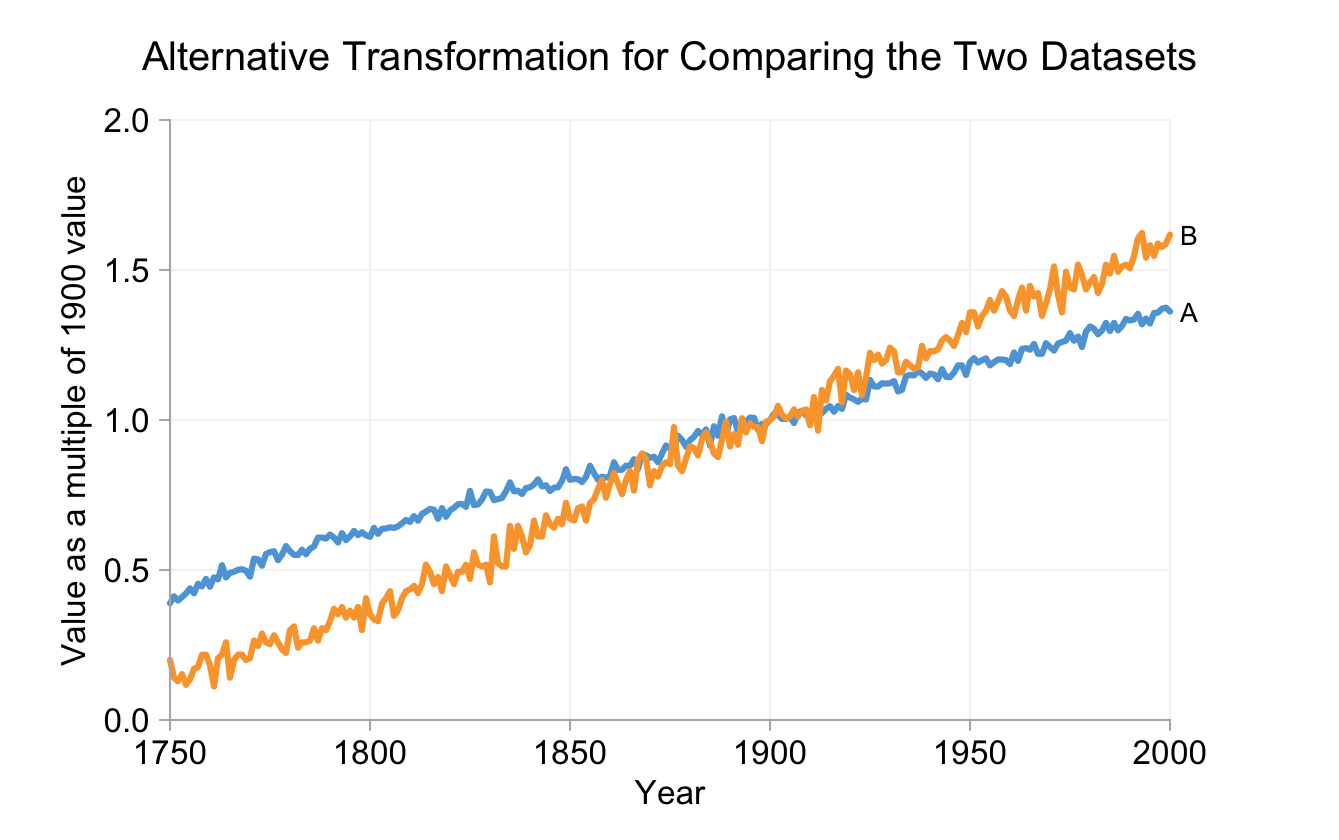
There's another alternative - transform the datasets so that relative gradients and crossings do have meaning. Stephen Few suggests displaying each value relative to a reference, such as the initial value for the corresponding dataset (below). Crossing points now tell us something meaningful but they're not points where the absolute value of one dataset matches another.

Aside from the loss of absolute values, there's another potential problem with this option: the visual patterns are heavily reliant on the two reference values. Was 1750 a special year? If not the, quite different, chart below is just as valid.

Dual-axis charts can be appropriate when the axes are complimentary, for example displaying temperature in both Celsius and Fahrenheit. We're not restricted to timeseries either. One (minor) benefit of using a bar chart in place of a pie chart (that I omitted from my previous analysis) is that we can use two complimentary axes - one to show percentage values and another to show absolute values. There's no requirement to have two distinct datasets.
The key point I'm trying to make is that all axes attached to a chart area should be equally applicable to all the datasets included in the chart area. Anything else risks conveying a false message to your audience. That's often worse than no message at all.
